

It’s been a year since I published my Google Ads Pacing Dashboard to Search Engine Journal, and digital marketing changes pretty quickly in a year.
Google Data Studio changed how it handles blended data, then changed its name altogether (Hello, Looker Studio!).
What hasn’t changed is that we still can’t add goals and targets to the Google Ads platform, so we still need separate dashboards to track pacing and progress.
In this tutorial, we’ll cover how to access and use the pacing dashboard, what’s new, and how to get the most out of it.
Then, we’ll take a broader look at what a great pacing dashboard must have to help you in your career.
Step 1: Access And Prep Your Templates
A fully automated pacing dashboard requires actuals, targets, and a way to combine the two:
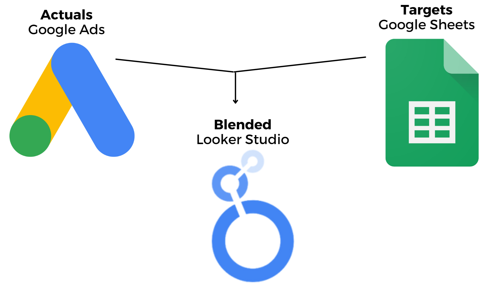
- Actuals: Google Ads Account Performance Data: A direct connection to a Google Ads account gives you real-time spend and conversion data and historical trends.
- Targets: Internal Goals and Targets Set Manually in Google Sheets: By recording KPI goals in a Google Sheet, you can populate month-to-date and daily pacing targets.
- Combined: Looker Studio Blended Data: Looker Studio will use blended data to calculate metrics from both Ads and Sheets.
Now that you understand how this will work, it’s time to get your templates.
1. Grab The Templates
First, use this link to download your free templates.
There are two dashboard variations to choose from:
- Conversions (for lead generation).
- Revenue (for ecommerce).
As explained above, you need both the Looker Studio and Google Sheets files for this pacing dashboard to work correctly.
2. Update Your Copy Of Google Sheets Pacing Template
This is where you’ll enter important information like your account name and targets.
- Click “Make a copy” of the Google Sheets Pacing Template.
- Change the name of the Google Sheet to reflect your account(s).
- In Column A, enter the name of your Google Ads account. (The account name functions as the blended data “join key,” so it must match exactly!)
- Enter your spend and KPI goals in Columns D and E.

That’s it for this sheet! Everything else is calculated automatically.
3. Update Your Copy Of The Looker Studio Dashboard
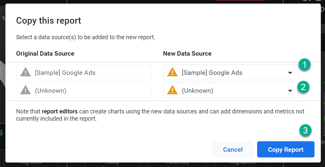
- Open the Looker Studio Pacing Report and click the three dots on the top right to “Make a copy.”
- You’ll be prompted to choose New Data Sources. Select your Google Ads account and the Google Sheets pacing template you just created. You may need to “Add New Data Source” to access them.
Step 2: Review The Dashboard Layout
We’ll go through the Revenue Dashboard section by section here.
Update your data and templates before walking through the dashboard, so you can check for inconsistencies and identify customizations you’ll make in the next step.
Your Google Ads data and monthly targets should be accurate, but you’ll need to make some adjustments to the daily pacing charts and widgets later on.
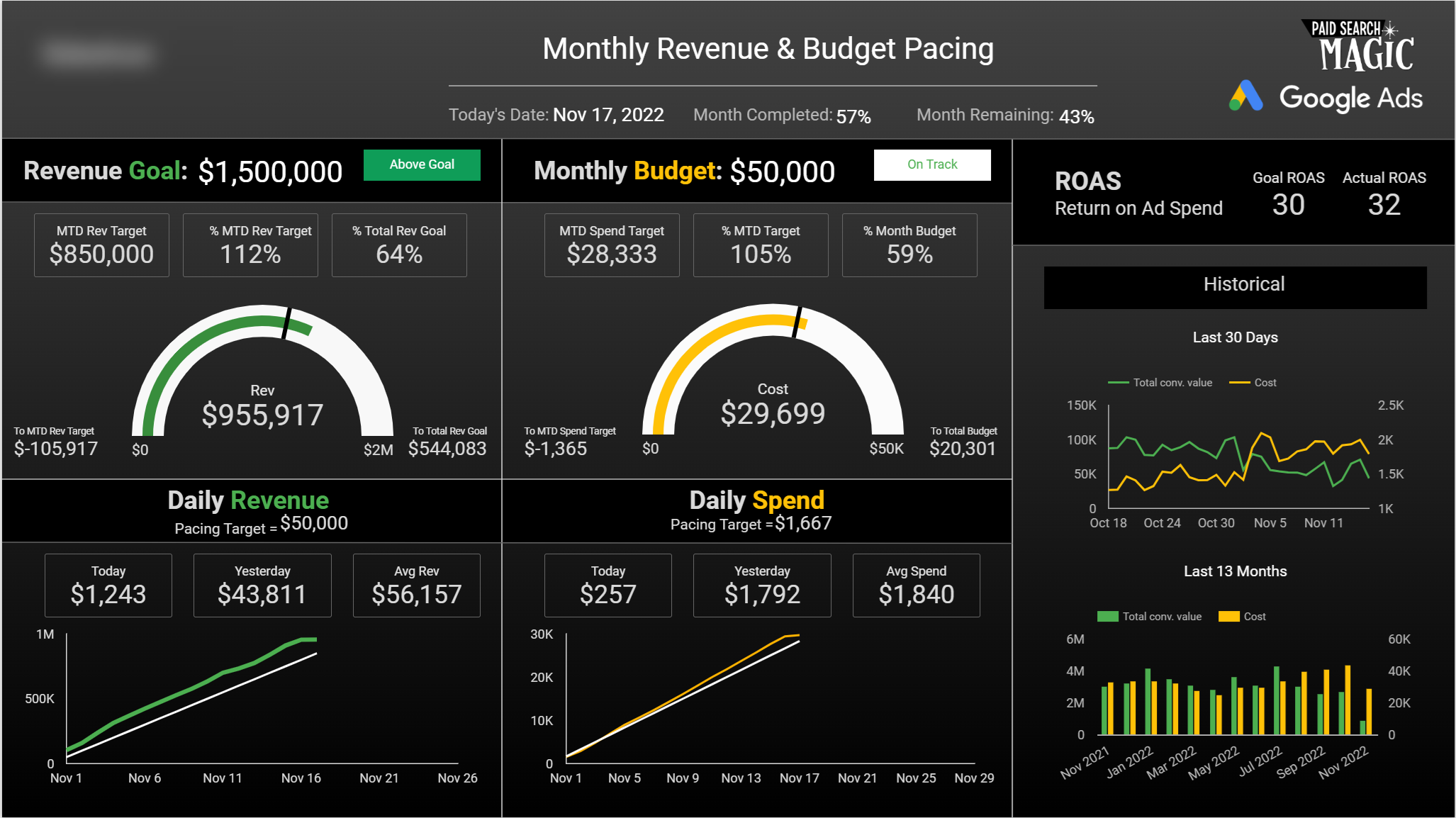
KPI Relationships Section
The dashboard leads with KPIs for spend and revenue (or conversions, depending on which version you’re using). You’ll know exactly what the goal for the month is, what real-time performance is, and how you’re pacing.
Tracking MTD goal progress against how much of the month has passed lets you know whether it’s time to observe or time to act.
Key performance indicators in multiple formats (raw numbers, ratios, percentages) provide pacing and data relationships without requiring you to divide large numbers by 30.4 in your head to arrive at daily averages.
Charts And Scorecards Used:
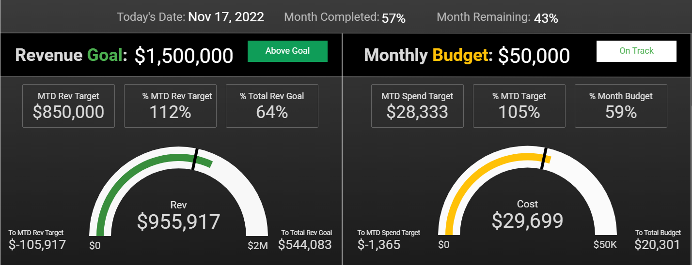
- Month Progress: Today’s date, percent of month completed, and remaining.
- KPI Goal Scorecards: Revenue (or conversion) goal and monthly budget.
- KPI Pacing Widget: A single-cell table that returns a statement based on pacing.
- MTD Target Scorecards: MTD target value, percent completion of MTD target, and total monthly goal.
- Gauge With Range: KPI performance to date with progress visualization.
- MTD Scorecards: value difference between actual performance and goals.
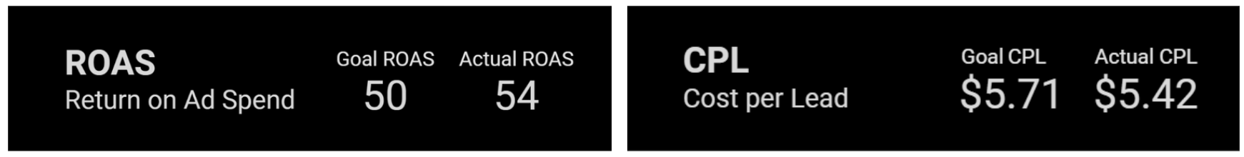
Return Ratio
This section compares spend to return. The target is automatically populated based on goals and does not need to be set separately.
You’ll see a different section depending on whether you’re using the Revenue or Conversion Dashboard.
The Revenue Dashboard for ecommerce displays ROAS (return on ad spend). The Conversion Dashboard for lead generation and general conversion tracking displays CPL (cost per lead).
Daily Progress And Course Correction
Here, you can see how you’ve been doing (average daily performance) and how you are doing (recent daily performance).
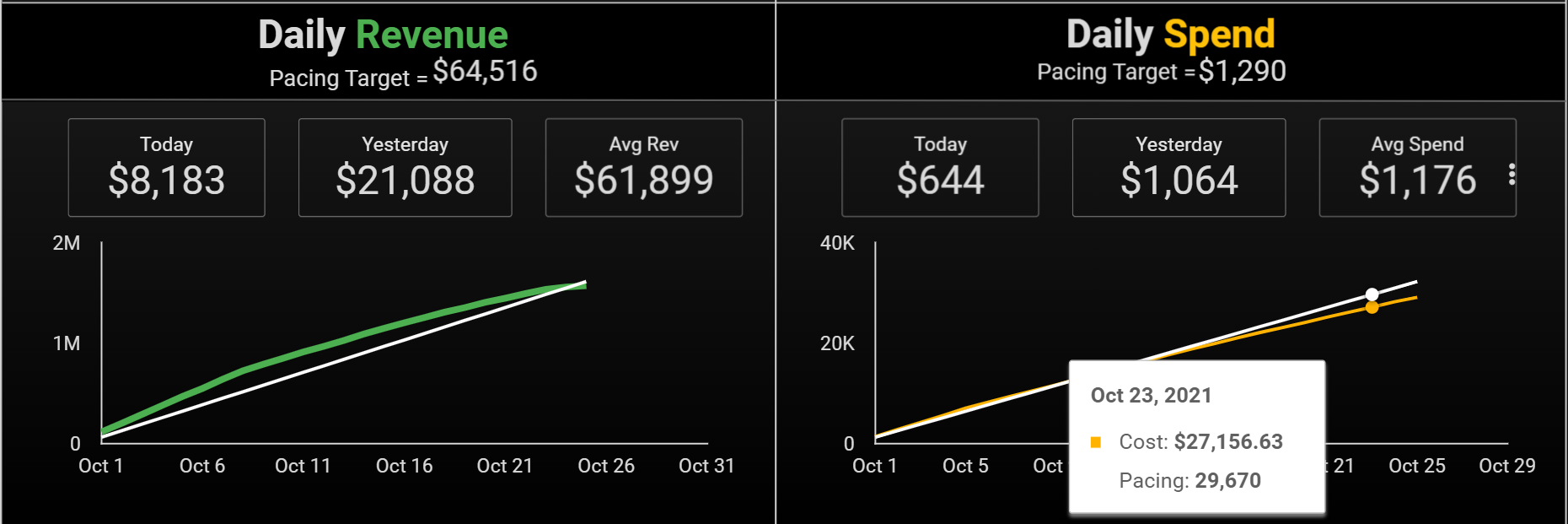
In the account used in this screenshot, my daily revenue will always trail below the target. That’s because of conversion lag time, and I’m going to note it but not worry about the fact that yesterday’s revenue is only a third of the daily goal. In two weeks, it will tell a different story.
Charts And Scorecards Used:
- Daily Pacing Target: Target divided by days in the month.
- Performance Scorecards: Today, yesterday, and average.
- Time Series Chart: Cumulative performance compared to pacing target.
I’ve found that extra details, such as MTD tables with daily variance, distract my focus from the bigger picture (are we pacing to hit our goals?), so I didn’t include it in the dashboard.
If you’re the kind of person who wants to see the specifics of past daily performance every time you check in on pacing, you can certainly add it to your report.
Historical Performance Section
Most of us don’t have a photographic memory of how seasonality affects each account, so there’s a reference section for that in the dashboard.
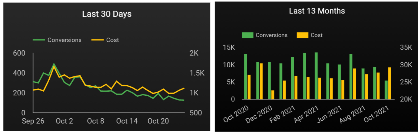
These historical charts give you trend data and context for real-time performance.
Charts Used:
- Time Series Chart: Last 30 days for KPIs.
- Time Series Chart: Last 13 months for KPIs.
If your base data looks accurate, it’s time to move on to customizations. (If you see errors, jump down to Step 5 for troubleshooting help.)
Step 3: Customize And Update Your Dashboard
These edits and customizations will give you full control over the dashboard to reflect your own needs and preferences. Do not skip this section, or your targets won’t match your actual goals.
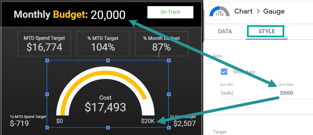
1. Update Chart Pacing Targets
To get chart ranges to match your targets, you’ll need to do some light customization. Because it involves hard coding, you’ll want to keep them up-to-date when you get new targets.
Hardcode The Gauge Chart Max Axis
The “Axis Max” on the gauge charts won’t reflect your target without manual input.
Enter the axis of your gauge charts by doing the following:
- Select the gauge chart in the dashboard.
- Select the Style panel.
- Change the Axis Max to match the month’s goal shown above the chart.
Hardcode The Time Series Pacing Metric
Create a constant daily pacing target with these steps:
- Select the daily pacing time series chart in the dashboard.
- From the Setup panel, select the calculated Pacing metric.
- Update the first number in the formula to match the pacing target above the chart. (Note: “[Metric] * 0” doesn’t need to be updated, it simply calculates as “0”, which is required for the formula to validate.)
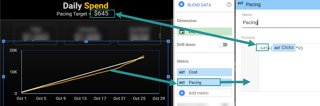
The Daily Pacing Target above the chart will automatically update as the days in a month change. You’ll just need to edit the hardcoded Pacing Metric in the time series chart to match that new value.
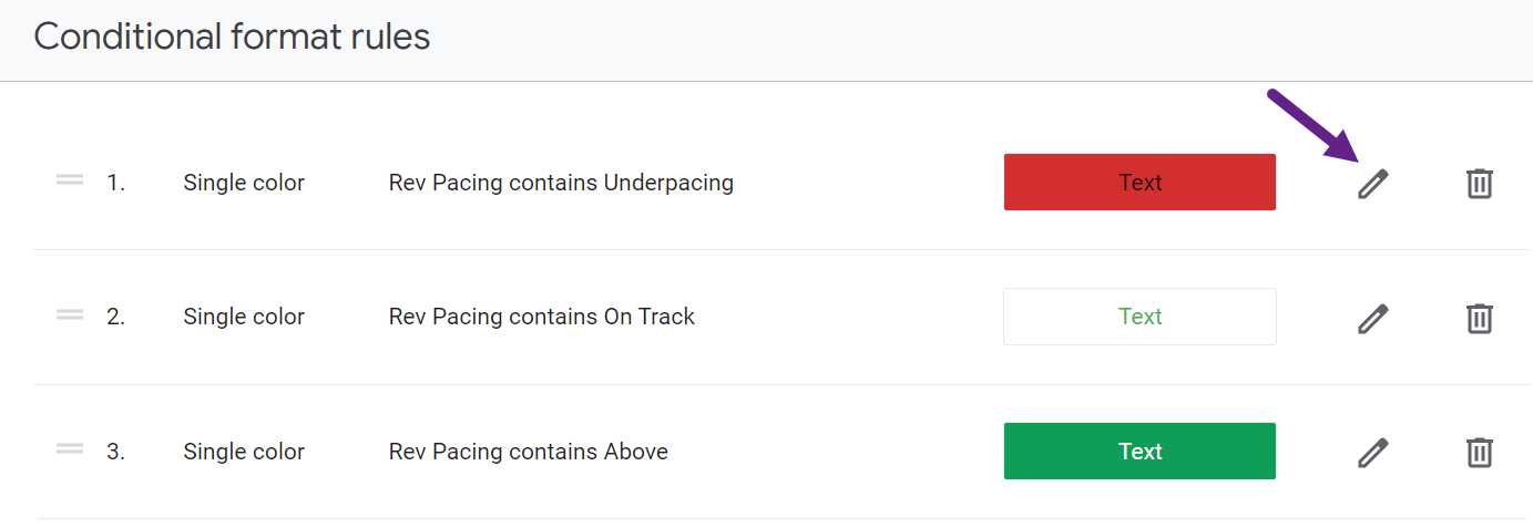
2. Modify The KPI Pacing Widget (Optional)
Next to each KPI is a color-coded button indicating the pacing status. You can customize the colors, text, and intervals.

Edit the dimension’s calculated field to change phrasing or interval. The budget pacing field will look like this by default:
CASE

WHEN (Cost/MTD Spend Target) < .9 THEN "Underpacing"

WHEN (Cost/MTD Spend Target) >= .91 and (Cost/MTD Spend Target) < 1.1 THEN "On Track"

WHEN (Cost/MTD Spend Target) > 1.1 THEN "Overpacing"

END
You can change the values if, for instance, you want “on track” to be within 5% of the goal rather than 10%. You can also create more variants or edit the return statements.
To change the background and text color, simply edit the conditional formatting in the Style panel.
Other Customizations
Because the template is 100% customizable, you can make any updates you want, from changing the currency to setting different weekend/weekday or even daily pacing goals. You can also set up a single Google Sheet as a data source for all your reports.
Step 4: Use Your Dashboard To Make Decisions
I don’t like the phrase “let the data decide” because data doesn’t make decisions. We do.
The beauty of this pacing dashboard is that it gives you instant access to the data you need to make strategic, informed decisions.
A script can automatically pause campaigns when spend is high, but it can’t consult with your client about how to respond to market changes.
Since most of us manage accounts that need to hit conversion goals and not simply “spend X budget every month,” knowing exactly how spend and returns are pacing against targets can elevate your management skills.
Here’s how you can take action on dashboard insights in a way that positions you as a strategic partner for your clients.
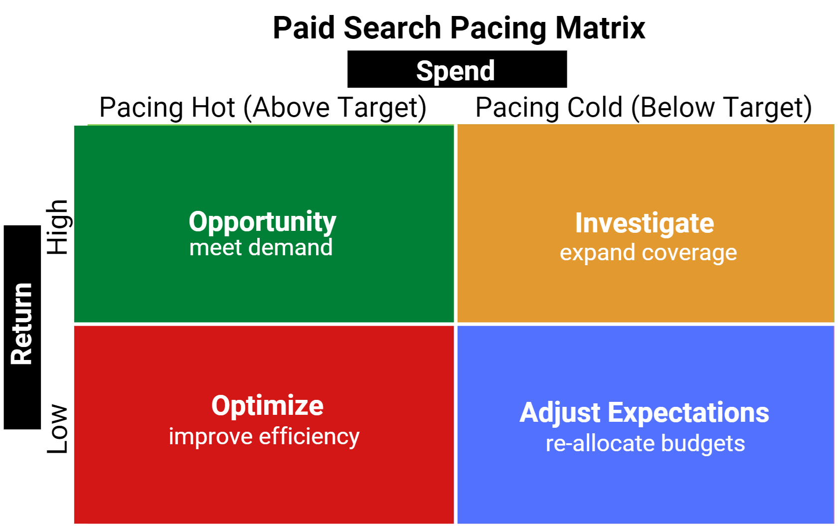
Hot/High: Opportunity.
When performance is stronger than expected, talk to your client about increasing the budget to meet the demand, so you don’t leave sales and leads on the table.
Hot Spend/Low Returns: Optimize.
When you’re overspending and don’t have much to show for it, it’s time to optimize for efficiency. Lower bids and budgets, and pause or remove poor performers.
Cold Spend/High Returns: Investigate.
When the spend is low, but the return is above the goal, the temptation is to celebrate. Before you do, take a deeper look into how to use the available budget for top-of-funnel efforts or greater returns.
Cold/Low: Adjust Expectations.
If the demand just isn’t there, it might be best to adjust the budget, shifting allocated funds to a period that needs it.
Step 5: Troubleshooting And Maintenance
If something isn’t working in your dashboard, start by checking these areas:
“Null” Or “No Data” Errors
- Is the blended data “join key” in Looker Studio exactly the same in both your Sheets and Google Ads data sources? Check the name of the account in the top left corner of the dashboard and make sure there are no typos in the cell AI of your Google Sheet.
- Are you using the correct data source? Note that this template works directly with the Google Ads platform, not Google Analytics data about Google Ads campaigns.
Pacing Or Accuracy Errors
- Is the date range set to custom (month to date, etc.)? It should be on custom, not auto.
- Have you correctly hardcoded the axis and pacing fields with your targets? Review Step 3 above.
Remember that because the pacing template requires some hard coding for visualizations, you’ll need to edit your targets in the dashboard to stay current when your goals change.
The Use Case For The Google Ads Pacing Dashboard
As paid search managers, sometimes we don’t have all the tools we need to do our job. Even simple tasks like Google Ads pacing can be much harder than they should be.
That’s because you can’t enter your budget or conversion targets directly into the platform.
Without that basic context of goals vs. actuals, it becomes hard to know the right action to take.
Most third-party software and DIY pacing sheets attempting to solve this problem just aren’t useful to paid search managers.
They’re either too basic to provide insights or too busy to be understood at a glance.
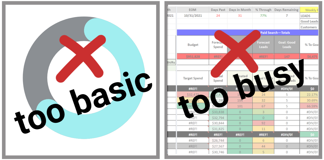
Because I couldn’t find the perfect automated dashboard, I decided to build my own.
Pacing Dashboard Requirements
A pacing dashboard needs to give you easy access to data that drives strategic decisions and action.
Here’s my own top-five wish list for what I want in a pacing dashboard. As you can see, this list directly informed the template I ultimately built:
- KPI snapshots and relationships. I need to understand the relationship between what should happen (goals and month-to-date targets) and what is happening (actuals).
- Show daily progress. I want to see the daily pacing targets needed to reach monthly KPIs and whether the account is consistently hitting those targets. What course correction, if any, has happened? What changes still need to be made?
- Provide context. I want to see how this month’s performance compares to recent and longer-term trends.
- Automated. Unless my budget or revenue goals change mid-month, I shouldn’t have to touch or update anything.
- Accessible and shareable. Let me access and share with my team or clients without logins, downloads, or attachments. (Reports are easily sharable from Looker Studio.)
Conclusion
Having instant access to performance goals and actuals gives you insights that can make you a more strategic paid search marketer.
This Google Ads pacing dashboard isn’t entirely plug-and-play, but hopefully, you’ll find that the value you get from it far outweighs the “investment” of keeping it updated.
Use the dashboard to meet the demands of your own pacing needs and drive better management decisions for your clients.
More Resources:
- Google Ads Performance Max New Features & Best Practices
- Step-By-Step Guide To Earning Your Google Ads Certification
- State Of SEO: Performance, Salaries & Budgets For 2023
Featured Image: fizkes/Shutterstock
