

Mobile landing pages must perform at their absolute best.
Slow loading, clunky design, and poor user experience all drive down search rankings and conversions.
So who’s doing it right — and what can you learn from them to improve your own mobile landing page performance?
In this column, learn how to turn mobile landing pages into sales and lead generation machines.
1. ASPCA Makes It Easy to Convert on Mobile
Creating a mobile web page that is easy for visitors to make a purchase seems like a no-brainer.
Designing a web page that is intuitive for users to navigate to the content they want is also important.
Many landing pages seem to be able to do one or the other but doing both can be tricky. This is especially true when the landing page is the home page, where it’s extra difficult to optimize for a sale.
The ASPCA home page is a great example of balancing the needs of site visitors while optimizing for conversions.
In the example below, the menu and search bar are tucked at the top of the page. But the donate button is front and center; it’s hard to miss.
The orange background immediately catches your eye and the one-word call to action, donate, is written in all caps.

The ASPCA mobile home page is a great example of making it super easy for a site visitor to perform a conversion action (donate) while also conveniently providing search and menu navigation.
It’s a perfect blend of serving the visitor and making it easy to check out with a donation.
Los Angeles, California based PPC expert Kenny Hyder offered this insight:
“It’s always been true, but even more so on mobile: you need to make your offering easy to purchase with as few clicks and forms as possible.
Remove any barrier to your add to cart process that isn’t necessary.
Also, as soon as a user adds to cart, you need to immediately give them the option to check out, and you need to make it even easier to pay.”
Top Factors That Make It Easy to Buy
- Easy to purchase in the fewest number of clicks and forms.
- Remove barriers to add to cart.
- Add to cart should trigger option to check out.
- Payment process should be easy.
2. Check Out Peacock’s Goal-Focused Landing Page
Back to the home page as a landing page — the best way to improve that scenario, apart from promoting a more appropriate inner page, is to make the home page clearly focus on a goal.
The Peacock TV landing page is a great example of how to handle a home page/landing page. One notable aspect of the Peacock TV landing page is its lack of clutter.

The next notable factor is how goal-oriented the page is above the fold.
There are two goals for the Peacock TV home page:
- Join Peacock TV as a customer.
- Log in to the service.
That’s all.
Nothing about multiple plans. Nothing about what shows they offer.
It’s a beautiful example of a goal-focused mobile landing page.
The prominent message on the page is:
“Watch Peacock for Free or Unlock Everything with Peacock Premium. Only $4.99/Month.”
The words used on that page are so concise they could effectively be used as a PPC advertisement.
There’s more that can be said about this home page but for right now, the key insight about that page is that it does not waste words or screen space.
I showed the Peacock.com mobile landing page to Kenny Hyder. He smiled and commented on the efficient use of space and how it doesn’t require scrolling.
He said:
“That’s an efficient use of real estate. On mobile, users are very familiar with both horizontal and vertical scroll. But scroll fatigue is still a real thing.
Use your mobile screen real estate wisely.”
3. Kayak.com: Easy Tap Targets on Pages That Look Like Apps
Another feature of great mobile landing pages is the ability for consumers to see where they need to tap to get what they want.
Easy tap targets contribute to the success of goal-focused landing pages and they make them easy to buy.
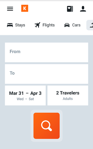
I asked Cindy Krum, founder of the online mobile benchmarking software MobileMoxie, about the Kayak.com landing page.
She agreed that it was ideal:
“Yes, make buttons bigger than your designer wants to. The design should feel more like an app, rather than a website that has been shrunk down to fit.”
That’s a great description of the Kayak.com landing page, which does indeed look like a mobile app and not a shrunken-down desktop site.
4. Lyft Captures Attention with High Contrast Buttons
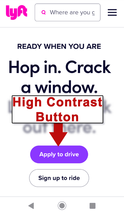
A call to action that contrasts with the rest of the page is an oldie but goodie. Buttons that called attention to themselves were well known by affiliate marketers for helping to drive conversions.
Snarky affiliate marketers in the early 2000s remarked that if you want the monkey to press the buy button, color it a garish yellow and make it as big as you can.
The same effect can be achieved by using buttons that scream for attention just with color choice. The actual color doesn’t matter as much as the contrast.
Read: Ugly Sites Sell
Colors can be categorized as cool and hot. If the page features predominantly cool colors, make the call to action a hot color (and vice versa).
This is important for buttons and encapsulated calls to action. An encapsulated call to action is one within a colored box that contrasts within its surroundings.
5. Walmart’s Mobile Landing Page Has a Persistent Buy Button
As mentioned earlier, a key to improving conversions is to make it as easy as possible for a consumer to make a purchase.
But that’s not always easy to do on a mobile ecommerce site.
Many ecommerce sites force users to scroll past product images and dropdowns for making selections, then scroll a little more to find the button for making a purchase.
Not so at Walmart.com.
Walmart has a persistent buy button that stays glued to the bottom of the mobile screen.
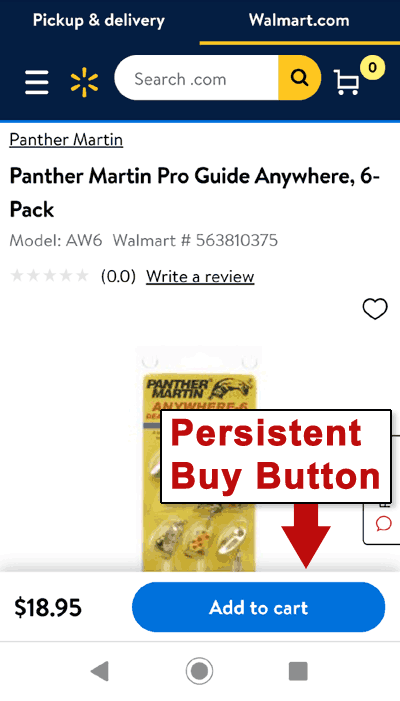
A consumer can scroll up and down, making selections and viewing product images, and the Add to Cart button remains fixed to the bottom of the mobile screen.
Consumers don’t need to become frustrated scrolling around on a web page trying to figure out how to buy something. The buy button is always front and center.
This is a great solution for both the consumer and the store.
It’s surprising that more stores don’t do this. Adding a persistent button is simple to do with a minimal amount of CSS work.
Mobile Landing Pages Can Be Conversion Machines
The mobile format at first seems like a limitation — but it’s not.
With the right keys, mobile can open doors to as many or more sales as what can be achieved on a desktop computer.
If there’s a single overarching key takeaway, it’s this — do not make landing pages that resemble scaled-down desktop sites. Create mobile landing pages that behave, resemble, and function more like mobile apps instead.
More Resources:
- 10 Examples of Awesome B2B Landing Pages
- Landing Page Best Practices: 10 Top Tips for Writing Copy That Converts
- Content Marketing: The Ultimate Beginner’s Guide
Image Credits
Featured image created by author
All screenshots taken by author, April 2021
