
How many leads have you received this week?
Based on the number of visitors to your landing page, how many leads should you have received this week?
Your business spends time, resources and capital to attract users to your landing page.
Spent is what it is and how you feel.
Spent rather than invested.
You look at your stats and see users do click the ads.
However, when they get to your landing page they pull a Harry and Meghan and just leave unexpectedly and without a trace.
No email for you to send a drip campaign to.
No phone number for you to have a follow-up call.
Fortunately, there is one simple fix that you can use to get more leads from the same amount of site visitors.
It all involves thinking one step beyond the default settings.
The Problem: Your Call-to-Action Button Inspires No Action

You know the problem is visitors don’t convert to leads.
You also know this isn’t a traffic quality or offer issue.
Could the problem be your call-to-action button?
The call-to-action button is the most important button on your landing page.
Yet, many businesses completely overlook their call to action.
They leave their call-to-action button as the default word: Submit.
Submit is the worst of all words when it comes to a call-to-action button:
- It doesn’t get users excited by letting them know what they get by clicking the call-to-action button
- It doesn’t put users’ minds at ease by addressing and overcoming objections to clicking the call-to-action button.
Even worse, the word “submit” triggers the flight or fight in our minds.
It signals that we’re “about to accept or yield to a superior force or to the authority or will of another person” – (probably) not the message you are trying to send to a potential customer.
The Solution: Replace the Default CTA Button With a Known Best Practice
The solution is to change the default Submit button on your landing page.
Realistically, anything is better than Submit.
However, let’s use research and known best practices to get you as many conversions as possible from visitors to your landing page.
Remove the Submit button and replace it with a create clear, concise and compelling call-to-action button that gets users to convert.
In the following section, I’ll show you four best practices for creating a high-converting call-to-action button.
All you have to do is:
- Delete your current Submit call-to-action button.
- Replace it with a new call-to-action button by modeling known best practices.
- Track the data. Discover what call-to-action buttons get the most conversion and deliver you real-world business results.
What follows are four call-to-action button best practices that get conversions (with examples).
These best practices deliver real-world business results to high performing companies.
1. Focus on Benefits
One core concept of marketing is to sell benefits instead of features.
A benefit is the goal the consumer wants to achieve.
Features are attributes of the product or service.
The example I always heard was if you want to sell a drill what you actually sell are the benefits of the hole.
You can use the benefits vs. features concept to create an uplift in conversions from your call-to-action button.
A great real-world example of a benefit-driven call-to-action button, which you can model, comes from CXL.
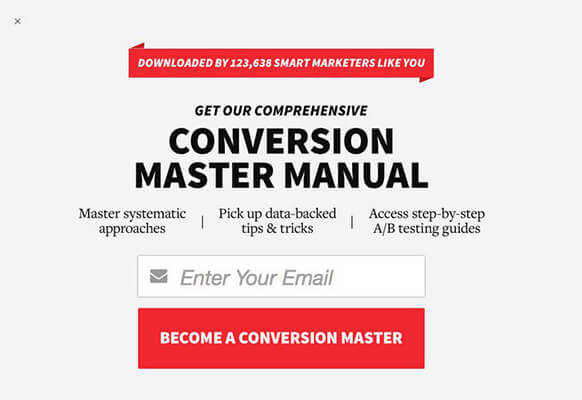
CXL could have used the features (a 12-page manual) as their call-to-action button.
If they had focused on features their call-to-action button would read something like “Download Your 12 Page Conversion Master Manual”.
However, Peep and the team over at CXL are way too smart for that (I think).
Instead, they used the benefit – Become a Conversion Master – as their call to action.
I think it’s obvious how becoming a conversion master is a much stronger call to action than something like: Download Your 12-Page Conversion Master Manual.
You can model this best practice by:
- Figuring out the benefit the user receives by clicking your call-to-action button.
- Creating compelling copy around it.
2. Write User-Focused Copy
Dale Carnegie stated that a persons’ name is the sweetest and most important sound in any language.
He is right.
It doesn’t stop with our own names though.
Users are just like the rest of humanity: self-centered.
They want to know what is in it for them.
One great way to capitalize on the self-centered nature of users is to write user-focused copy in your call-to-action button.
Words like “me,” “my,” or “I” let the user know it is about them.
It also mimics the conversation that is already going on in the users’ head.
Additionally, verbs such as “get,” “receive,” and “take” let the user know what is in it for them.
An example of a call to action with user-focused language comes from my company Nerds Do It Better.
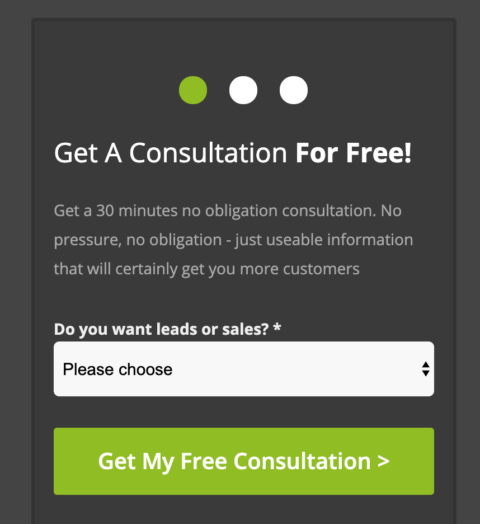
Our call-to-action button is Get My Free Consultation, which you can see above.
You can follow this best practice by using those words or verbs to let the user know it is about them and what is in it for them.
3. Address & Overcome User Objections
Objections are any thoughts or ideas that prevent a user from clicking the button.
There are many (many) objections your user may have.
Some of the most common objections are:
- Users don’t want to enter a credit card.
- Users are concerned canceling will be a big hassle.
- Users are afraid that you will sell or otherwise use their information improperly.
- User are afraid that they will get constant emails and/or sales calls.
Objections are not something you can just ignore and hope will go away.
Try using your call-to-action button to address and overcome objections.
In the example below, Basecamp does an excellent job with their call-to-action button. Then address and overcome two of the most common objections:
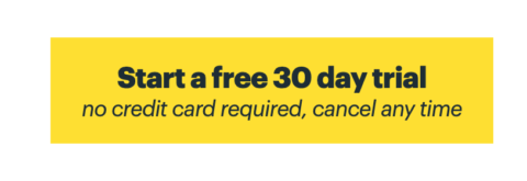
- I don’t want to take out my credit card.
- Is it hard to cancel?
You can create a compelling call-to-action button by finding what your users are don’t want to happen, and then finding ways to tell them that those issues will not happen.
4. Use the Soft Sell
Sometimes when dealing in compliance, it is best to use the soft sell.
Words like “submit” may just freak your customer base out.
It is a big step after all.
It can be better to give them a non-threatening call to action which users do not fear clicking.
A good example comes above from Sarah Noked who gently, and non-threateningly invites prospects to “Learn More” in her call-to-action button.

Test & Iterate
As in anything with marketing, you have to test and see what the data actually says.
Put the call to action on your page, and split test your new call to action vs. the current submit button.
See what actually increases your conversion rate and what gets more conversions.
What CTA are you using for your company to get more conversions?
More Resources:
- Optimize Your CTA: Better Alternatives to ‘Click Here’
- 5 PPC Calls-to-Action Tips & 4 Gotchas You Need to Know
- 101 Tips & Tricks That Will Boost Your Conversion Rates
Image Credits
Featured Image: Created by author, March 2020
All screenshots taken by author, March 2020
