

What compels a person to engage with a call-to-action (CTA)?
Is it the color of the button, the language used, or the context around it?
Undoubtedly, all of these factors play a role, but unusual CTAs have a way of standing out and converting.
There is no magic guide on how to create a call-to-action that guarantees results, and that’s why both boring and unusual examples can work.
Typically, marketers A/B test to improve conversions around a CTA, and part of this process can involve changes to the actual CTA itself.
These types of micro-improvements could focus on color, the words used in the CTA, or even the shape of the button.
Placement is a whole other topic.
With so many possibilities available inside one tiny button or phrase, it’s up to marketers to make educated decisions about what works best.
Often, there is no rhyme or reason and for no seemingly good reason at all, the weirdest possible CTA option is the winner.
In order to understand what makes a CTA unusual, marketers have to understand what’s common, so let’s start there before we move on to the wacky and wonderful.
The Psychology of CTA Best Practices
Human emotion is the driving factor behind human behavior.
This is a marketer’s most powerful cultural truth.
Knowing this, marketers can make reasonable attempts to understand how their audience is thinking about the things they interact with.
This empathy map can help marketers think through this process:
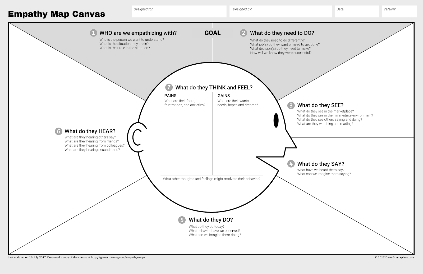
By mapping out the hopes, dreams, and fears of the target audience, marketers can begin to speak to each of these in their CTA context and copy.
And while each audience is unique, there are also broad behavioral traits that we share as humans that can lead to common practices around CTAs.
For example, it doesn’t make sense to create a button that is hidden, difficult to read, or difficult to understand.
For CTAs, there is a lot to be said for giving users clear expectations, with succinct language.
This combination is more likely to reduce the fear and friction being felt by the user before they take an action.
This type of CTA best practice is recommended on web pages far and wide, along with other common recommendations:
- Be brief.
- Create urgency.
- Use reverse psychology.
- Personalize.
- Use a button styled in a contrasting colour.
These techniques are effective because they work with elements of human psychology. Being brief, and creating bright-colored and/or contrasting buttons, helps skimming eyes understand the action that is wanted from them immediately.
Urgency and reverse psychology plays into a potential buyer’s fear of missing out (FOMO). Personalization can give the user the necessary context they need to take an action.
To bring these principles to life, let’s look into language and color.
Language
When it comes to writing compelling CTAs, being brief doesn’t mean being boring. Marketers have to capture their audience’s attention and motivate them in one short phrase.
Examples of ineffective but brief language would look something like this:
- Click here.
- Submit.
- Download.
These phrases fall flat on the user and don’t connect with the reader.
Without being too wordy, these examples could be completely transformed into emotion-evoking CTAs.
Here are a few examples of brief CTAs that are far from boring:
- Give Me More.
- Join the Fun.
- Watch Right Now.
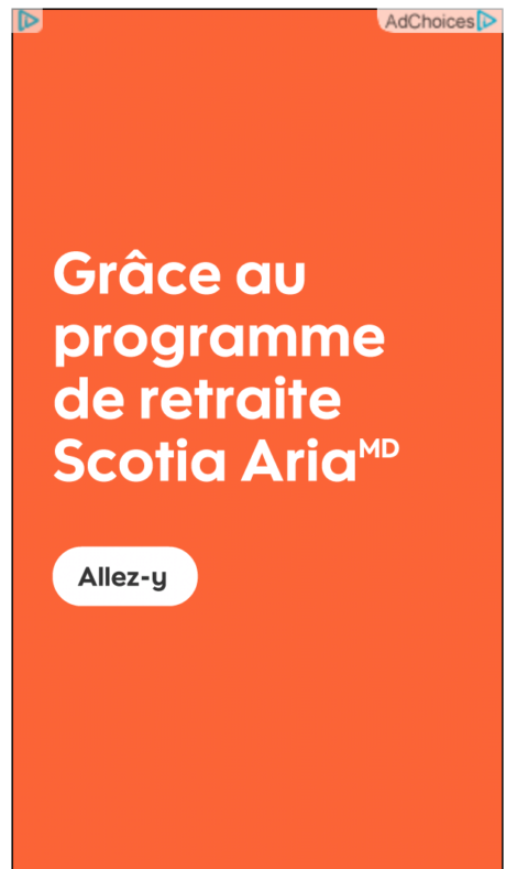
Marketers writing international CTAs may have a harder time keeping character count low, and more playful language can help.
The French phrase “Allez-y” translates to “Go Ahead” and helps Scotia Aria create a friendly but less conventional CTA that stands out for their audience using all best practices:
Marketers trying to increase engagement can also lean into the potential for FOMO by creating CTAs that leverage reverse psychology.
The FOMO CTA technique works by forcing users to either select the desired action, or one that isn’t very flattering. It uses their fear against them.
We see this here, where the opposing action is given less emphasis below the CTA with no corner “X” to close the window so the user is forced to “miss out” if they don’t convert.

When marketers aren’t shaming their audience into working with them, they may turn to another best practice known as personalization.
HubSpot found that by creating Smart CTAs based on buying funnel positions, they were able to increase conversions by over 200%.
In practice that meant actually changing the CTA language and color, depending on what type of user was on their site:
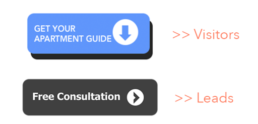
These CTAs are completely different from one another, and yet both were effective for different types of users on the same website.
Attempting to gather data without this information, could lead to assumptions that potentially only serve a fraction of the traffic.
Marketers can’t ignore the top of the funnel or the bottom, and yet they can’t create marketing pages for every possible buyer at every stage of the funnel- personalization is the answer.
Color
It is interesting that HubSpot uses different colors in their CTAs above for users at different parts of the buying funnel.
In fact, the black/dark grey used in the CTA button for leads is not what CTA-colour enthusiasts would recommend.
Black, grey, and brown are considered the least popular or worst colors to use for a CTA, and yet, HubSpot has likely tested many colors.
In fact, color psychology kind of goes out the window when looking at top-performing CTAs.
From the road to the workplace, red is often a color that humans associate with stopping or a sense of alarm.
Those aren’t exactly the warm and fuzzy, action-inducing feelings that can coax users to click a call-to-action.
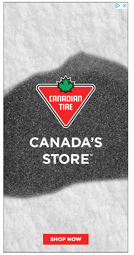
Yet, red was the most popular CTA color in an older study done on 200 global ad creatives.
And while the study is now dated, there are plenty of recent examples of red CTAs:

Although the study above has been cited widely, it’s interesting to think of how the prevalence of this limited study could influence future generations of red CTAs.
Here’s a nice visual of that study from a recent citation of it:
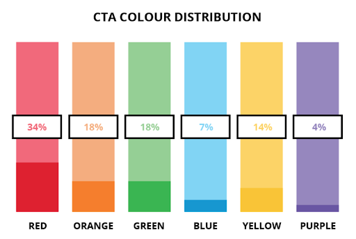
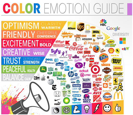
Perhaps it’s no coincidence that these mostly coincide with the top colors for brand logos, and the emotions they tend to evoke.
Again, red isn’t seen as a friction color, rather one of bold excitement.
But going against basic color psychology isn’t that unusual, especially since in many cases it could just be what matches the branding of the company.
So with all these best practices and psychology in mind, what makes a CTA unusual?
Wacky CTA Goodness
In the world of CTAs, perhaps it isn’t that red means stop, or that it means go… maybe red works so often simply because it stands out.
The internet is saturated with advertising, and banner blindness is rampant.
Standing out is the name of the game, and wacky works.
What we’ve seen and learned from the best practice examples is that rhyme and reason isn’t the name of the CTA game, and while there are best practices to lean into, what works for one audience won’t necessarily work for another.
Marketers find themselves going against the grain in order to stand out.
That could mean CTAs that are super wordy, like the example below, or the other from Convince and Convert.
It may also mean focusing on potential buyer fears rather than a specific action.
Knowing that trust and confidence mean everything in finance, the creators of the ad below focus on building confidence with their audience:

This is an unusual CTA, but it’s not inappropriate by any means.
Going against the grain doesn’t mean creating ads that are standing out at all costs.
Marketers can create unusual CTA examples that stand out and still resonate with their audience.
They won’t necessarily check all the best practice boxes, and yet they work (you may even see some in actual ads embedded in this post as you scroll).
Here are some of my favorite unusual call-to-action examples with a summary of why they work.
1. Huemor
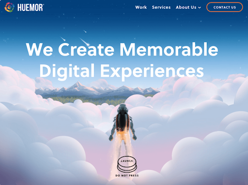
Collected by: HubSpot
Works because:
“If you went to a website and saw a ‘Launch’ CTA accompanied by the copy ‘Do Not Press’ … what would you do? Let’s be honest: You’d be dying to press it. The use of harmless reverse psychology here is playful, which is very much in keeping with Huemor’s brand voice.”
2. Firebox
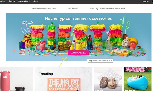
Collected by: econsultancy
Works because:
“Meaning a variation of ‘hurry up’ or ‘let’s go’ in Spanish, the phrase cleverly coordinates with the fiesta-themed product category, while its playful and motivational nature further entices customers to click-through.”
3. Point Blank SEO
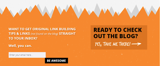
Collected by: Wordstream
Works because:
“rather than ask you to click a boring ‘Sign Up,’ or worse, ‘Submit’ button, Point Blank SEO make signing up for their newsletter fun and even somewhat comical – after all, who doesn’t want to ‘Be Awesome’?”
4. Whale and Dolphin Conservation
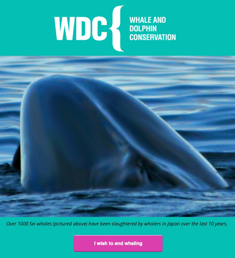
Collected by: Campaign Monitor
Works because:
“It appeals to the emotions of the reader, and compels them into taking action because of their beliefs. Clicking on the CTA means they’re making a pledge against the statistics they’re reading above the CTA.”
5. Humboldt County’s Tourism Website
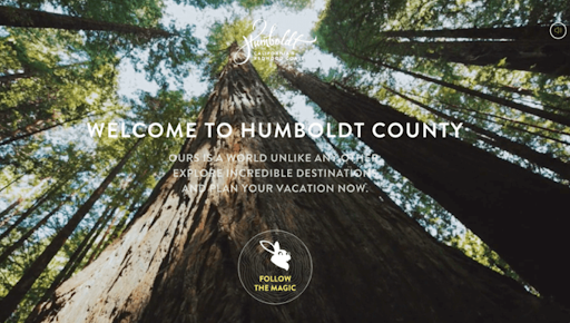
Collected by: HubSpot
Works because:
“It enhances the sort of fantastical feel of the footage, making you feel like you’re about to step into a fairytale.”
And my absolute favorite unusual CTA example that I’ve seen lately is below.
6. Unqork
Collected by: yours truly.
Works because: This unusual CTA works because it pulls in best practices and it stands out. I was just going about my day when this CTA stopped me in my tracks, made me chuckle, and I actually shared it with my colleagues. It spoke to me as a marketer, and I could appreciate the tone of confidence and authority.
Crafting Unusually Wonderful CTAs
To start writing CTAs that stand apart from the rest but still make sense for your brand, and connect to your readers, pull from the advice shared in this post.
Start with the empathy map, and think about how your audience behaves, the things they say, what they like to hear, and any other patterns you can attribute to the way that they feel about the world around them and communicate it.
Take the insights from your empathy map, and build on it by layering in the buying stage. Think about what creates fear for your audience at different stages of the buying cycle, and what other feelings they may be having.
If you can identify traffic on your website as a lead versus a new visitor, it’s recommended that you attempt to personalize your CTAs for each group.
Next start crafting CTAs with best practices in mind. Create a sense of urgency or action, while being succinct and doing something that makes sense for your brand.
Contrasting colors should be used to draw attention to the CTA, typically in the form of a button or hyperlinked sentence. Succinctness is typically recommended as well.
Overwhelmingly, the key factor behind unusual CTAs is that they stand out. So while leveraging best practices is good, sometimes getting wacky and wonderful means coloring outside the lines.
Take risks that make sense for your brand, but be calculated when you do it by testing.
You may find that longer copy helps you craft clever CTA sentences, or that a simple but unconventional phrase like “Follow the Magic” can capture your audience’s imagination.
While red seems to be a popular CTA color, regardless of its use in other aspects of our life, you may find that unpopular CTA colors actually work for your audience, like dark grey or black.
As users scroll your website, slowly consuming the content with their eyes, give them CTAs that make them feel something.
You can focus on their fears, you can focus on their FOMO, or you can find some other way to connect with them. Pulling their heartstrings, or making them laugh can be very effective.
Just a moment of delight in an otherwise dull or predictable web browsing experience can be enough to make users click, and make others screenshot.
More Resources:
- 3 Stupid Easy Ways to Drive Conversions
- 101 Tips & Tricks That Will Boost Your Conversion Rates
- What Makes a Good Landing Page: Calls to Action
Image Credits
Image 1: Via Gamestorming
Image 2: Via Scotia Aria
Image 3, 4: Via Neil Patel
Image 5, 9: Via Absolute Digital
Image 6: Via HubSpot
Image 7: Via BMO Wealth Management
Image 8: Via Canadian Tire
Image 10, 11: Via Optin Monster
Image 12: Via Convince and Convert
Image 13: Via AdEspresso
Image 14, 18: Via HubSpot
Image 15: Via econsultancy
Image 16: Via Wordstream
Image 17: Via Campaign Monitor
Image 19: Via Unqork
All screenshots taken by author, February 2021