

I never realized it back then, but growing up in church, I learned an important marketing lesson:
You have not because you ask not.
That’s a loose translation of a Bible passage (I don’t recommend building an entire theology around that verse alone) that conveys an important point in life: If you want something, you typically have to start with the ask.
A Lesson In Life… And Business
A typical case in point. Every now and then my wife wants my help with something she’s doing. But unless she actually tells me she wants my help, she’s not inclined to get it.
It’s not that I’m being a jerk. I’m just not aware that my assistance is needed.
As happy as I am to help when needed, I’m not going to follow her around the house asking, “Do you need help with that?” My guess is that would do more to annoy her than be of any help.
So, in light of that – and unless it’s obvious that help is warranted – I wait until asked. Sometimes that works out, and sometimes it doesn’t.
But I always tell her there’s one surefire way for her to get what she wants: Ask.
I am always happy to help when asked.
Volunteer organizations have to learn this lesson as well. So many people are willing to help, but more often than not, those people will only volunteer after someone asks them specifically for their help.
Anyone who doesn’t learn this lesson will quite likely find themselves in the “you have not” category of life.
Or business.
How to Ask on Your Website
Which brings us to our three so-easy-it’s-stupid ways to get more engagement and conversions on your webpages.
All three of these tips revolve around the concept of communicating your options and asking for a decision.
The image below is a quick snapshot of all three. Take a look and then I’ll explain.
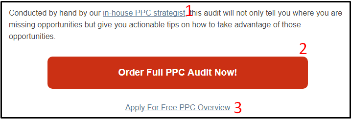
1. Contextual Links

Every visitor is on a different shopping journey.
Ultimately, the goal is to get them to convert, but because their needs and experiences vary, the same conversion path won’t work for everyone.
That’s why a good marketing strategy consists of understanding the various personalities and personas of your target audience. They all want something but require different motivational factors.
And if there’s one solid truth to understand, not every visitor on your site is ready to become a customer.
Even if they’re on the landing page that presents the best opportunity to do so, there’s little you can do to get them to pull the trigger right now. That’s because they require more information.
This is where contextual links come into play.
In the example above, the link to the PPC strategist is there specifically to build trust. The text is referring to the person who will be responsible for performing the audit, but how does the visitor know that person is trustworthy?
By following the link.
That takes them to the bio page of the strategist, complete with their credentials, history, and certifications.
The content of the page is designed to give visitors an understanding of the strategist’s skills, experience, and value.
All of those things can be important factors in convincing a visitor to convert.
2. Primary Call-to-Action
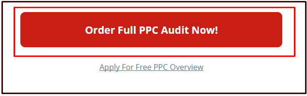
It might surprise you how many pages lack a single, primary call-to-action.
I know it surprises me, especially when I found out that we lacked something so fundamental on our own site not long ago.
Yeah, I know <hangs his head in shame>.

I’m a firm believer that every page – and I mean every page of your website – must have a particular purpose. And one of those most important purposes should be to tell, ask, or beg your visitors to take the next action.
While you can have multiple actions on any given page (as this post suggests), each page should have a single, primary action.
That primary action should be the most obvious action on the page.
It’s the action that, despite all others, can’t be missed.
What the action is depends on the goals for the page.
Some pages are there to:
- Move the visitor further through the conversion process.
- Secure the conversion.
- Only provide introductory information and encourage the visitor to keep reading.
It doesn’t matter what the primary call-to-action is, other than being the correct action for the page and being clearly labeled.
If the primary action on the page can’t be identified in a fraction of a second, then it has failed you.
3. Secondary Calls-to-Action
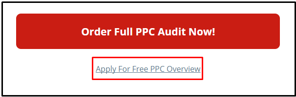
As with point number one above, not every visitor will be ready to convert to your primary action.
But they may be interested in a lesser conversion point.
The goal of the secondary action is to keep those who reject the primary action from doing nothing at all, or worse, leaving your site!
If they don’t like what’s behind option #1, perhaps they’ll be interested in what’s behind option #2!
This secondary action is a way to keep the visitor engaged and get a foot in the door, if not the whole body.
This action helps both you and the visitor get something rather than nothing out of their onsite interaction.
And it often proves to be a powerful action.
Keep in mind that you don’t necessarily need or want a secondary call-to-action on every landing page. It is, however, a good idea to test various options to see what does or doesn’t work.
If a secondary action causes too many people to reject the primary one, then it’s not serving you well.
Only use secondary actions that either enhance the primary action or capture those who would have rejected the primary action anyway.
It Never Hurts to Ask
People today are bombarded with information.
Too often they are paralyzed, not knowing what to do. They don’t want to make the wrong decision, so they make no decision at all. This is especially true if the visitor doesn’t see the path forward.
That means if you want to get visitors to make a decision, you have to provide the path for them. And that requires the ask. Or at least a point, nod, tilt of the head, or look in the direction they should go.
Any kind of indicator is better than none.
If one option isn’t to your visitor’s liking, give them a couple more for good measure. After all, you just want to give your visitors more of what they want.
More Conversion Rate Optimization Resources:
- Taking a Deeper Look at Conversion Paths in Google Analytics
- 6 Ways to Increase Soft Conversions Before the Sale
- 7 Uncommon Conversion Rate Optimization Tactics
Image Credits
Featured Image and In-Post Photos: Created by Stoney deGeyter, January 2018
