

Editor’s note: “Ask an SEO” is a weekly column by technical SEO experts Jenny Halasz and Kristine Schachinger. Come up with your hardest SEO question and fill out our form. You might see your answer in the next #AskanSEO post!
Welcome to another edition of Ask an SEO! Here’s today’s question from Benu at Santa Clara:
Should we have the same content or different content for mobile-first and desktop?
Same. Next question?
OK, just kidding, that might be too simple a response. Let me elaborate.
Google announced in 2016 it would be moving sites from being evaluated on the desktop version of the site to the mobile version of the site.
This move by Google is known as “mobile-first indexing” or MFI. This means the index from which Google pulls all content in the search engine results pages (SERPs) would now be content that was evaluated and ranked on factors derived from the mobile version of sites.
“Although our search index will continue to be a single index of websites and apps, our algorithms will eventually primarily use the mobile version of a site’s content to rank pages from that site, to understand structured data, and to show snippets from those pages in our results. Of course, while our index will be built from mobile documents, we’re going to continue to build a great search experience for all users, whether they come from mobile or desktop devices.” – Google Webmaster Central Blog
Why Would They Do This?
Google made this change because mobile usage has exploded exponentially over the last 6-8 years and they felt it would be a better representation of the site for users in the SERPs to use the mobile version to evaluate a site’s rankings.
This way, when you reached a site on your mobile device, it would be a quality mobile site.
A site based on desktop factors might be great for desktop, but when encountering limitations of the mobile environment it can become a very poor user experience. Google wanted to fix this.
“Today, most people are searching on Google using a mobile device. However, our ranking systems still typically look at the desktop version of a page’s content to evaluate its relevance to the user. This can cause issues when the mobile page has less content than the desktop page because our algorithms are not evaluating the actual page that is seen by a mobile searcher.” – Google Webmaster Central Blog
So What Does That Mean for Content?
The first thing you need to know is if your site has moved to “Mobile First”.
If it hasn’t, your site is still being evaluated on the desktop content, unless the site is brand new. All brand new sites are mobile-first by default.
How Can I Tell If My Site Was Moved to Mobile-First?
The way you can tell this is to go to Google Search Console and look to see if you have been moved and if so, when you were moved.
Note: These dates on Google Search Console may differ from the date of the email you received from Google about being switched to Mobile First. These dates in Google Search Console are more accurate. The best way to tell however, is if you check your log files for the change from the desktop crawler to the mobile crawler. If you find the date you hit approximately 80% mobile crawl, you were flipped.
You’ll find two new indicators in several reports:
1- Primary crawler used for specific reports 🎊
2- Chart annotation showing when your site was switched to mobile-first indexing 🎊Learn more about mobile-first indexing https://t.co/yo4mGRgVhP pic.twitter.com/R2tZW9pPyr
— Google Webmasters (@googlewmc) June 26, 2019
This means that the mobile site content is now how Google evaluates for search intent when it is looking for a document to match to a user’s query terms – even when searching from a desktop computer.
So when a user puts something in the search box the SERPs that comes back will only be retrieved from mobile content. This means any content not in your mobile site won’t be found.
If you have a responsive site, this should not be an issue, as desktop and mobile content should be the same.
The one exception is when you are hiding content from the browser using CSS or another method.
As long as Google can see the content in the mobile site, it should apply value to it even if it is in a collapsed or tabbed state.
This is different than how Google evaluated content on desktop. Google would “devalue” content on desktop based on that content being hidden from the user in a collapsed or tabbed state.
However, the physical space on a mobile device is much smaller than a desktop and so there are UI/X elements that Google interprets differently under mobile-first indexing (or at least they should*).
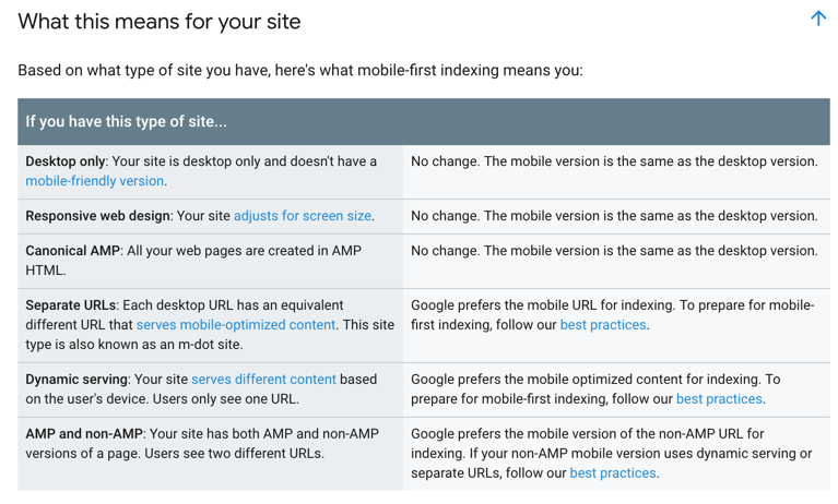
Here are all the scenarios for sites and what you need to do to make sure Google is getting the content you need it to retrieve.
 *Earlier this year there was testing done by some SEO professionals that showed Google was still treating collapsed or tabbed content as “devalued” regardless of device, even if the site was moved to mobile first.
This means you will want to test this if you are using visual design elements to hide content. Note this is different than hiding the content from the browser entirely.
If it is not displayed in the browser rendered code, then Google will not see it no matter the method of indexing.
What If My Site Has Not Moved Over to MFI?
If your site has not moved over to mobile-first indexing, then your site is still being evaluated on desktop ranking signals, including content.
However, this does not mean you can ignore MFI.
All sites will be moved over to MFI sooner rather than later, most likely before the holiday season, so if you have not made the move to make sure your mobile content is equivalent to desktop content you will want to do that quickly.
In Summary: Mobile-First vs. Desktop Content
So we started with this question: does the content need to be the same on the mobile site as desktop?
And the answer is yes, if you want to rank for it.
And if you have an m.?
Start making a plan to move off of it. Google prefers responsive sites to m. and m. sites can cause issues with Google’s MFI, especially if you have other mobile pages like AMP or even a partially responsive site.
Google can get confused on which one is the proper mobile site, so as hard as it may seem, it is time to kill the m. as soon as you can.
For all the technical details of mobile-first indexing, use this Google Developer Document to guide you.
More Resources:
- An Introduction to Mobile SEO
- Mobile Optimization: 12 Best Practices for the Mobile-First Era
- Fact or Myth: Mobile Killed Desktop
Image Credits
Featured Image: Paulo Bobita
Screenshot taken by author, August 2019
