

We’ve all heard that data tells a story. But sometimes that story is difficult to follow – especially if you’re not really a numbers person.
As SEO professionals, we know what we do has an effect on a business’s bottom line. So how do we convey that to our clients in ways that resonate?
Data visualizations are growing in popularity, and rightfully so.
These visualizations illustrate the compelling stories that SEO data can tell.
Whether you’re just getting started with data visualizations or looking for inspiration to improve your reporting, you’ll find what you need here.
What Is Data Visualization?
Data visualization is the act of turning numbers into visual graphics.
Those graphs you made in grade school? Visualizations.
Gradient maps? Visualizations.
Data visualization is also how you present your numbers.
It all paints a picture.
As an SEO expert, visualizations can greatly improve your reporting.
Not only do visuals make your data easier for clients to digest, but they also make it more interesting.
And when you’re trying to get executive or client buy-in, that’s essential.
11 Examples Of Stunning Visuals For SEO Reporting
The good news is that you don’t have to start from scratch.
There are plenty of data visualization tools and examples you can draw from to make quicker work of telling the right stories with your SEO data.
Here are 11 you can check out in your pursuit of visualizations to improve your SEO reports.
1. Datapine Dashboard
On the lefthand side of the datapine dashboard, there are six rectangles in different shades of blue.
At the top is the lightest shade of blue which represents the least qualified audience; at the bottom, you’ll see a dark blue rectangle representing the converted audience.
-
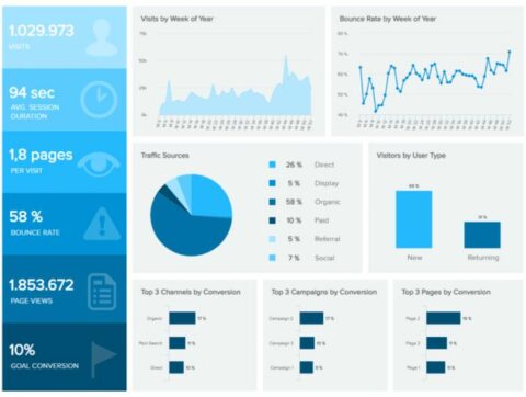 Screenshot from datapine on Twitter, January 2022
As SEO professionals, we are often working with people to solve a specific problem.
No matter what that problem is, there are different key performance indicators that can illude to whether or not we are on the right track.
The best way to determine these key performance indicators is to start at the end and work backward through the pipeline.
If the goal is to get more people to reach the end of the blog post and click on the “related articles,” you will obviously need to track those clicks. But scrolls to the bottom of the blog post, 75% scrolls, 50% scrolls, 25% scrolls, page visits, and page impressions are all also indicators of whether or not we are headed in the right direction.
It is also a great way to be able to quickly see where drop-offs may be happening.
Personally, I’d create make this left-hand side overview a workshop with the client to identify all of the KPIs we will focus on.
Then, I’d choose graphics with the client for each of those clients so they can put a picture with the name and jog their memory as to what that KPI means.
Lastly, if you report each month, you could also put a comparison number under the name of the metric to let the client know if you are performing better month over month.
2. Oneupweb ROI Report
There is one section of every report a client’s eyes always looks for first… the one that talks about money.
Far too often, we get hyper-focused on the nitty-gritty of the work we’ve done and want to show that off, even though we know that is not what is most important to our clients.
Whether ROI is up or down, the reality of it is that clients always go there first, so own it.
Make the numbers big and show your impact.
-
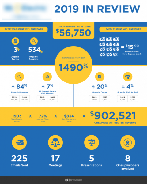 Screenshot from OneUpWeb, January 2022
This example from OneUpWeb sets the numbers up in a way that draws your eye right to what matters.
At the top, you see the price of the retainer.
Right in the middle in a large font, you see the ROI percentage and towards the bottom, the formula that makes up the ROI in dollars.
This report is transparent and really plays to the wants of the clients.
3. KeySearch.co Keyword Tool
The KeySearch keyword tool spits out a lot of information, but the table that lays out the information by URL is extremely useful.
In just a second, you can see which URLs have the most good (and which have the most bad, too).
While it’s not overly complicated or artistic, it simplifies the data in a stunning way.
While this table is used to layout metrics for certain URLs, it could easily be used for tracking important keyword metrics for clients.
For instance, you could track:
- what position you currently rank,
- whether there are any owned rich snippets,
- how much traffic was sent to the site from that keyword,
- buying intent, etc.
-
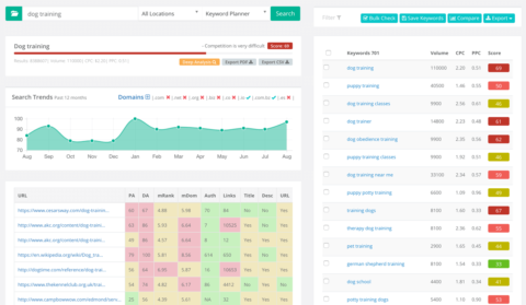 Screenshot from KeywordSearch.co, January 2022
4. Smart Insights Bot Traffic Report 2016
Smart Insights is constantly putting out beautiful reports, and this one is no exception.
They published this infographic to explain the types of bots hitting websites.
The color green represents good bots and red are bad, a concept we are very familiar with from a young age – that was their first win.
-
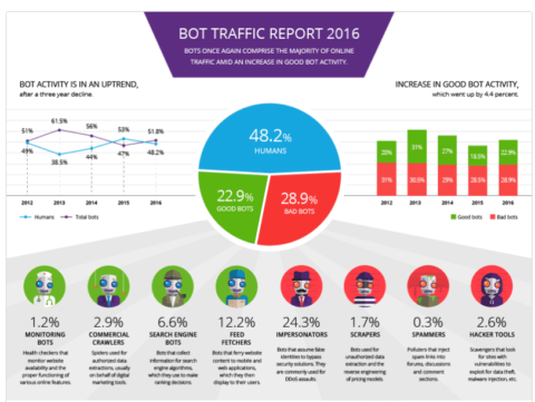 Screenshot from Smart Insights, January 2022
The infographic has a pie chart in the middle. There is nothing too special about that, except that the bottom half of the pie chart down is broken down a bit further right a bit further down the page.
Under the pie chart, the same color scheme is followed to break the information down a bit further and give the view context as to how the “good” and “bad” bots are made up.
This concept could easily be replicated for device reports in your SEO reporting.
You could use a pie chart for the device category and you could break it down further by browser type or device model further down the page.
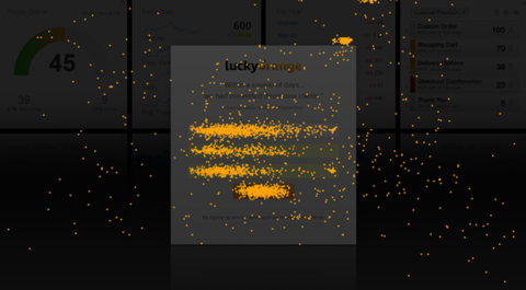
5. Lucky Orange Heatmaps
Much of our job as SEO experts is making a site more user-friendly.
At times, this can be hard for our clients to really understand.
Therefore, one of my favorite things to do is share click maps with clients.
Here’s an example from Lucky Orange that gives them a visual of what people click on the most on their pages.
As you can see, a glance at this visual can give anyone an idea of where clients might get lost.
-
 Screenshot from Lucky Orange, January 2022
The best time to pull out heatmaps is for forms. You’d be surprised how the click density shrinks the longer the form goes on.
This may be especially useful for comparing how forms perform on mobile vs. desktop.
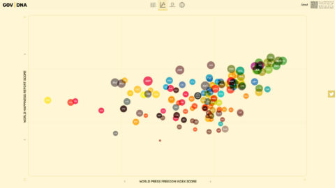
6. Gov | DNA By Werner Helmich
It’s no wonder this next visual was a winner of the World Data Visualization Prize.
This bubble graph from the Gov | DNA site is beautifully simple.
-
 Screenshot from Information Is Beautiful, January 2022
Unlike traditional scatter plots, this bubble graph is color-coded and has different size bubbles.
This is a great way to plot a lot of metrics in one place in an understandable way.
On the other hand, the bubble graph is much like a scatter plot in the sense that it makes spotting outliers very easy.
In my mind, this would be a great way to map out sessions vs. conversions of different keywords.
I would also use the color groups to represent different keyword groups and have the size of the bubble represent the total monthly volume of the keyword.
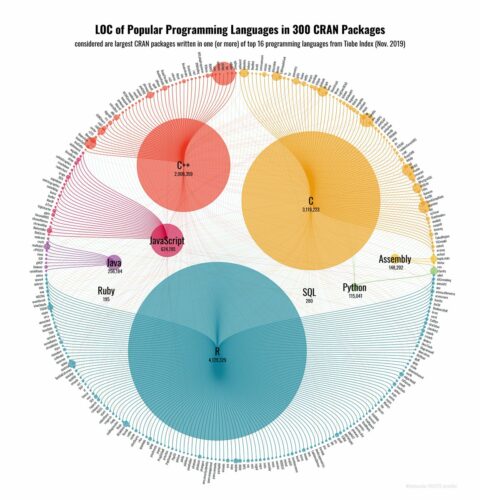
7. Popular Programming Languages On The Cran Network Visual
Much like tracking keywords, tracking the performance of blog posts and categories of blog posts can get a bit complicated.
However, after taking a look at this visual, it seems there may be an easy way to do it.
-
 Screenshot from Dr. Torsten Sprenger, January 2022
The visual above shows the different programming languages, how many CRAN packages were written in the languages, and what the different types of packages were.
The languages are color-coded and found in the middle of the visual while the types of packages are attached to the respective languages in the outer circle.
We could use the same setup for blog content.
The colors and large cells in the middles could be based on the categories and how much traffic they bring in and all of the large cells could be attached to the individual blog posts in each category in the outer circle.
This type of setup could make it easy for anyone to see where the biggest wins are coming from as well as which categories may need more attention.
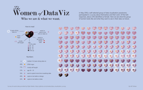
8. The Women Of Data Viz
This visual is a unique one with a lot of moving parts.
I’m not too sure I would keep all of the parts, but I think the concept could be used to track progress for an audit.
-
 Screenshot from Data Viz Today, January 2022
On the left side, you see a heart with all of the potential attributes.
These attributes indicate whether or not a qualification is met. If the qualification is met, it goes on the heart, if it’s not, it doesn’t.
So, this visual could be made to represent an “optimized page checklist.”
If you created attributes for all of the things that need to be done for any given page, you could easily show the progress made on the site as a whole in an easy-to-digest way.
You can look at this visual and see that most of the hearts at the bottom have a larger white ring, if that larger white ring represented content length, we could see that the other pages (hearts without rings) still need a bit more content.
9. The Invisible Heartbeat Of New York City
There are a ton of ways to show geography, but none of them are overly exciting anymore.
At some point, you start to look past the visuals that you’ve seen many times before.
But this visual of New York City by Justin Fung is sure to get your attention.
-
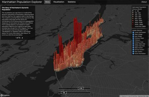 Screenshot from manpopex.us, January 2022
This map uses 3D bars going up and down to represent each block of the city’s population.
Color is also used as a secondary indicator of population.
For local SEO marketers, this could be an awesome way to shake up your reporting and show your clients something new.
Imagine showing your clients where directions were requisitions from on their Google Business Profile with this awesome visual!
10. Hoaxy
Hoaxy is a tool used for identifying spreaders of misinformation on Twitter.
However, it can also just be used to identify sharers of information and the circles they influence.
-
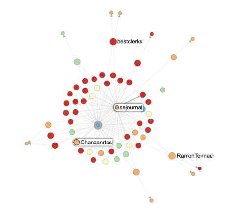 Screenshot by author, January 2022
In this specific instance, I searched the name of a new Search Engine Journal article to see who shared it and influenced others to do the same.
What is really interesting about this is that it actually pulls in all of the Twitter usernames – which could be super useful.
This would be a very interesting way to show your clients how a particular blog post performed on Twitter and who picked it up.
This is especially helpful if you’ve been working with PR people for link building.
Lastly, this could also be great information for identifying potential people for guest posting opportunities.
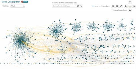
11. Visual Link Explorer
Now, this is a really cool visualization because it comes from a tool specifically created for SEOs!
CognitiveSEO’s Visual Link Explorer can tell you (and your clients) a lot about how their pages are acquiring links in a beautiful way.
 Screenshot from CognitiveSEO, January 2022
Not only can you see which pages have the most links at a glance because of the size of the element, but you can also tell how authoritative those links are but seeing how far out those links reach.
The further out the tether from the center, the more authoritative the link.
Further, this tool is interactive and allows you to color-code the theaters based on the type of domain linking to the page and whether the link is live or lost.
Honestly, this list could go on for days but hopefully, now you have a bit of inspiration!
I challenge you to take a look at the reports you are currently giving to clients and try to make at least one new visual to either replace or complement the data you are already reporting.
I have a good feeling it’ll end with more compelling reports and happier people on the receiving end.
More resources:
- Data Visualization: What It Is, Why It’s Important & How to Use It for SEO
- 8 Tips to Make Your Data Visualization More Engaging & Effective
- Essential SEO Tools for Agencies
Featured Image: Wichy/Shutterstock
