

Instead of telling people about a story/data/information, show them.
Humans are inherently programmed to respond to the visual and our brains process images 60,000 times faster than text.
Images seen for just 13 milliseconds can be identified – hence why advertising is so reliant on logos and imagery.
One simple chart or graphic can provide a near-instant understanding and grasp of complicated data sets.
For this reason, journalism has used charts and infographics for years to supplement stories.
In fact, visualizations are so successful at telling a story that now they are often the mainstream story and not the supporting act.
Just to be clear, real data visualization is a highly-respected field of data journalism and not the spammy infographics that the SEO world started to churn out circa 2012.
SEO infographics are a long-dead tactic (even though there are a few zombies out there – still pitching their infographics).
But a quality visualization of strong data will always be a useful tool for marketing and have value to a journalist.
The following eight tips will help you to make your data visualization more engaging and effective.
1. Make Sure Your Data Is Compelling & Strong Enough
The first rule of visualization:
Everything hangs on the quality and credibility of your data.
If you ain’t got the goods then forget it.
Unique data that you have compiled yourself is the holy grail if you have a big budget, but there are plenty of free credible data sources if you lack resources.
With a bit of digging it is possible to find data sets that others haven’t used, so make sure you regularly scan sources in your niche.
But this is a game of first to publish and winner takes all.
It’s gutting when you press publish and find someone beat you to it by a day or two.
If you’re not agile enough to be the first to publish, you can look at existing data in a new way or combine data sets in a unique way.
I see a lot of content that has been inspired by other campaigns and translated in a new way – usually to great success.
Most great ideas can usually be traced back to another idea.
However, make sure your data has the strength to support a story or campaign.
The worst content I see is a clear copy of a visual technique but without the quality of data.
You can put lipstick on a pig, but it’s still a pig (no offense to pigs intended).
2. Make Sure Your Data Is Right for the Story
The next rule is to make sure that the data you want to use is relevant for your intended application.
Please don’t produce a visualization just because the client’s wife/husband/son/daughter saw one and now your client thinks you should, too.
Yes, this really does happen!
Your data needs to inform the content and not the other way around – don’t try and force-fit a visual technique to a story.
If you get it right, by combining complex data with the right visualization it’s possible to see trends and insights that a bunch of numbers on a page never can.

Any data visualization student will tell you this classic infographic was produced in 1854 by Dr. John Snow.
It’s often cited as one of the first visualizations (technically, it’s not) and as an example of how powerful visual data can be.
In London, with cholera rife, Dr. Snow mapped the cases of death and infection by location using freely available data.
By analyzing this visualization, he noted that a water pump on Broad Street was central to a cluster of deaths and identified it as the potential source. The impact of closing this pump probably saved hundreds of lives.
3. Don’t Overcomplicate the Design for the Sake of It
It’s essential to remember that ultimately, data visualization is a vehicle to convey information.
There is a tendency to get lost in the design and try to make it more complicated than it needs to be just for the sake of it.
Style over substance.
I subscribe to the Bauhaus school of form which follows function and much prefer the minimalist and purist approach to most things.
And when it comes to data visualization function is paramount – it’s so easy to overcomplicate and end up with an overwhelming presentation.
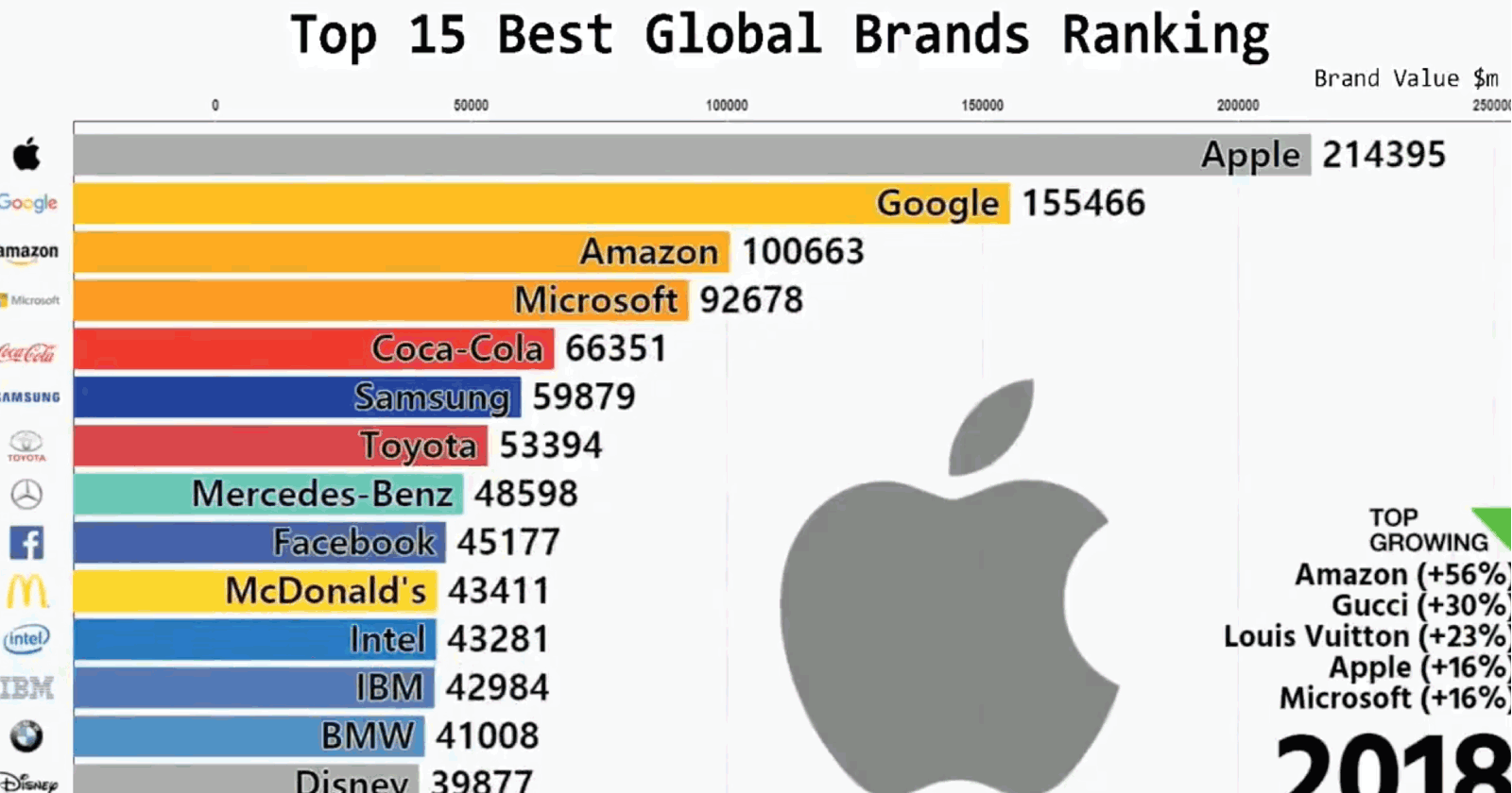
It’s only a year since the animated bar chart came to prominence and what did we do before this?
Animating a visualization adds a new dimension and this can be visually powerful at telling a historic story or presenting a timeline of information.
The first viral bar chart that surfaced was based on the ranking for the top 15 global brands over the last 19 years.
WOAH…!
Top 15 BEST global brands ranking for the last 19 years…
Watch big name tech companies take-over at the end!
h/t @Interbrand pic.twitter.com/oRdO7QH6js
— Matt Navarra (@MattNavarra) February 21, 2019
It’s so simple, but the addition of the basic animation elevates it to a new level.
Mesmerizing.
This is a perfect example of not over-designing your visualization.
You just need to have interesting data that an audience is interested in and an elegant means of presenting it.
Don’t make it complicated.
4. Use the Right Graph Style for Your Data (& Audience)
Just as you would use the right words to describe an event, use the right presentation for your data.
There’s a huge variety of graphs and charts – pie, bar, scatter, bubble, line, flow, radar, frame diagram, funnel, choropleth, waterfall, tree, sunburst, Venn…
But, just because they’re all available doesn’t mean that they’re suitable for your data.
When we’re immersed in a subject we often forget that others don’t have the same level of understanding that we do – the curse of knowledge.
We might think we’re incredibly clever for producing a complex and sophisticated design and our peers might congratulate us. But, if your audience doesn’t understand, then the graph has failed.
For example, 63% of Americans don’t know how to read a scatter plot.
Ask yourself:
Who am I designing for?
Design isn’t about you, it’s about your audience.
It’s about visually conveying information in a format that makes it easy to understand – hold onto that thought.
This resource here is a basic introduction and overview of different types of charts and what they are best used for.
5. Focus on the Point
At the start of every piece of content, I always ask this question:
What’s the point?
Your data should have one key point or statement it’s making – you don’t want to confuse a user by trying to overload them.
And just like any good story, stick to the point.
Avoid visual waffle.
Your visualization will show/prove/highlight an insight or back up a statement.
Make sure this is front and center of the visualization and don’t try to deviate from it by adding any extras.
Keep focused on it.
Keep the data and the story at the forefront of what you produce.
No frills and flowers around the edges.
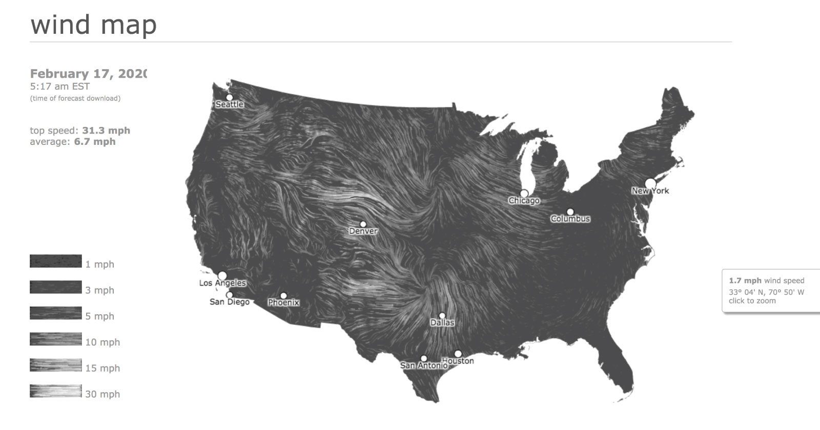
I think it’s a fair assumption to say that the weather is a complex subject.
In the UK, it’s a misery we live with (in the grim north). Brits are obsessed with the subject.
If you had to convey wind direction throughout the U.S., how would you do this?
This wind map is a favorite of mine that many people show as an example of great data visualization.
The map effectively shows, at a glance, the direction of winds and the average speeds.
It’s visually stunning and mesmerizing to watch and at the same time communicates an incredible amount of information.
And information is the aim of any good visualization.
6. Use Color Effectively Within Limitation
Just because you have an unlimited color palette doesn’t mean you should use it all on one page, at the same time!
Color is a difficult subject to teach as it’s subjective and emotive.
There are rules to color theory but every person is going to bring their own experience, preferences, and nuance to it.
The advice I can offer is that limited color palettes are much more effective in a graphic as they avoid any visual overwhelm.
Using tones and shades of one color is much easier for the eye to translate than trying to fight with a rainbow explosion.
Color highlights elements on a page and can draw attention to information.
Pick out your key data in a bold color in contrast to other data shown in muted shades.
Or use opacity to show the scale of data – like a choropleth map.
I spent years after an art school education learning how to pair colors, and now a handy online tool does it for you instantly (hmmm).
Try these tools to help you generate palettes Coolors, Colormind or Mycolor.
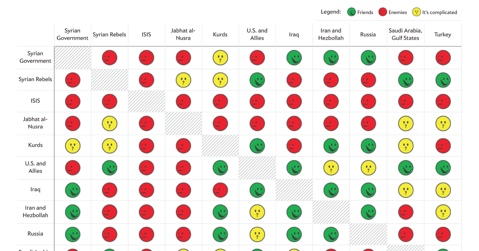
This chart is a perfect example of projected simplicity for a complex amount of information using a recognized color code.
I’m going out on a limb and saying that the majority of people in society understand the concept of red, amber, green and what it represents – bad, medium, good or stop, get ready, go (excluding anyone with visual impairment).
The simple table layout in this graphic tells you at a glance who is friends with who and who doesn’t get along.
If you click on each icon, a pop-up provides more information.
It’s the perfect example of a simple and limited color palette and it looks so simple, yet it’s deceptively powerful.
7. Use Visual Hierarchy on the Page to Highlight Key Elements
When landing on any page for the first time, your eye should immediately be drawn to the key points of the page.
A well-designed page should know its objective and make that the focus of the page.
A visually overwhelming page fails if the eye struggles to find a point of entry.
Size difference is the most obvious way that a visualization can convey the hierarchy of data and information.
Other ways to create hierarchy include the use of color and position on the page.
Negative space that frames elements is a technique that any good designer knows how to do.
Use white space on a page to create balance and put emphasis on elements.
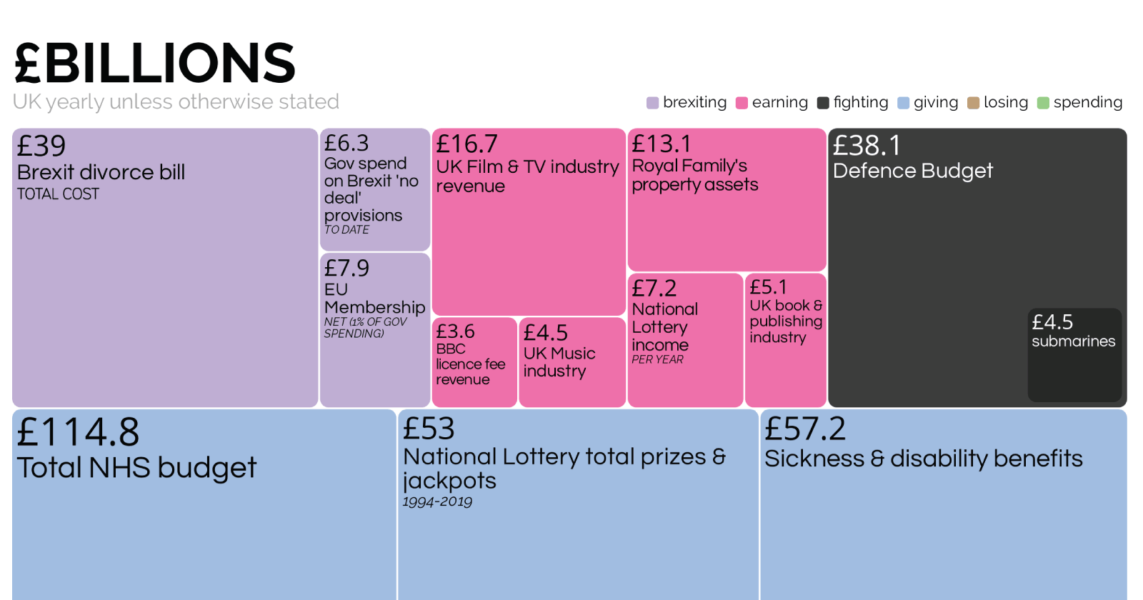
Treehmaps effectively use nested rectangles that represent the weight and scale of the data.
Second to scale ratio, the use of color groups the nests into branches to further increase the relation and understanding of the data.
At first glance of this visualization, it’s easy to grasp the contrasts of the total UK student debt and the NHS budget in comparison to the EU membership and the cost of the entire prison budget.
No frills, no over-engineering, and no unnecessary elements.
I love treemaps for their simplicity and effectiveness and just how powerful a message of numbers can be.
8. Remember Why You’re Using Data Visualization and Stay Focused on Your Objective
As a final point, always stay focused on why you’re creating the visualization and for what reason.
It’s about the story in the data.
And, it’s about what your audience will find interesting.
Conclusion
To produce engaging and effective visualizations:
- Make sure your data is compelling and strong enough to support a visualization.
- Make sure your data is right for the story.
- Don’t overcomplicate the design for the sake of it.
- Use the right graph style for your data (and audience).
- Focus on the point.
- Use color effectively within limitation.
- Use visual hierarchy on the page to highlight key elements.
- Remember why you are using data visualization and stay focused on your objective.
More Resources:
- Data Visualization: What It Is, Why It’s Important & How to Use It for SEO
- How to Uncover Powerful Data Stories with Python
- 12 Essential Data Studio Visualizations for Paid Search Marketers
Image Credits
All screenshots taken by author, February 2020
