
Adding web accessibility best practices testing to your websites and mobile apps offers new opportunities to understand digital product experiences.
We are challenged — as marketers, writers, designers, and developers — to observe people because our work focuses on meeting their needs.
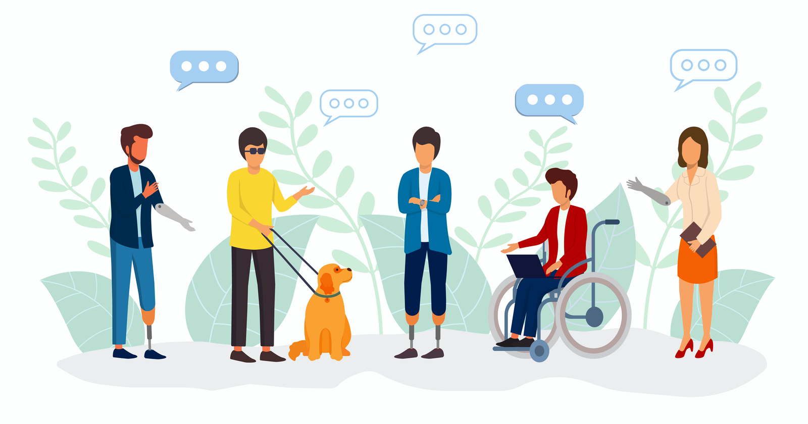
When creating web solutions for persons with disabilities, there are gaps in how we are building digital products because we are not asking the right questions.
I recently learned that in some cases, it is best to not ask anything at all. I’ll explain shortly, and in this column you’ll learn:
- Who is web accessibility for?
- What is the value of accessibility QA testing and audits?
- Do you need to design and build digital experiences for persons with disabilities?
Use Case Assumptions
Let’s imagine I am holding two ice cream cones in my hands.
The cone in my left hand is hand-dipped, locally dairy-made ice cream made with one scoop of mint chocolate chip and a scoop of black raspberry. It has colorful sprinkles on top.
It’s my favorite ice cream. No need to guess what I’ll choose; I know myself.
My cone is stuck upside down into a paper cup, so I don’t drop it.
I know my poor eyesight and tendency to bumble along in surroundings I am unfamiliar with.
In my right hand is an ice cream cone made with chocolate and vanilla swirl soft ice cream poured into a vanilla wafer cone, topped with chocolate sprinkles and I asked for a cherry on top.
I have no idea what you want.
When I hand your cone over to you, you give me that look that says, “Yours is way better. Can I have one like that?”
I should have asked you what you wanted.
I should not have made assumptions about what you like or how you would eat the ice cream cone.
The cherry is my apology.
This is how we build websites.
This is why so many digital properties are not accessible.
We don’t want to know about anything outside of ourselves.
Web Accessibility Short Cuts
Some marketing campaigns are crystal clear about how your business may be destroyed by an ADA lawsuit and the only possible solution is to pay for an AI product promising to prevent them.
If you were talked into buying an accessibility automatic AI product by today’s version of a vacuum cleaner salesperson selling pink colored Kirby’s, you are making assumptions about the needs of persons with disabilities.
The pushback by accessibility advocates and persons who find themselves facing interference by unwanted accessibility tools is intense and justified. The claim that one line of JavaScript inserted into a web page automatically fixes all accessibility issues and prevents an ADA lawsuit has been proven to be false.
Check to be sure the installation of any accessibility overlay or widget script isn’t actually a third-party app violating your privacy.
The National Federation of the Blind, for example, revoked sponsorship of an accessibility tool for a convention, saying in their written statement:
“The Board is deeply concerned that the company treats blind access technology experts shabbily and disrespectfully in private meetings and disparages the blind in the press and their other communications. It seems that accessiBe fails to acknowledge that blind experts and regular screen reader users know what is accessible and what is not.”
Research Updates
The most recent report compiled by UsableNet found that in 2021 there have been 350 lawsuits filed against companies using accessibility widgets or overlays.
The study also documents a 20% increase in ADA lawsuits. The top five industries are:
- Ecommerce.
- Digital Media & Agencies.
- Food Service Industry.
- Fitness & Wellness.
- Banking/Financial.
Nearly every industry has had lawsuits related to mobile apps, and more than 26% of companies that received an app accessibility lawsuit this year were previously sued for their website being inaccessible.
The threat of an ADA lawsuit, while possible, is not a business reason to invest in inclusive design practices.
Incorporating an accessibility program from the ground up is a sound business decision, both now and for the long term.
This may include thinking outside the box to gain a competitive edge.
Digital marketers with complementary UX and accessibility knowledge are one option. Training customer care and sales staff on inclusive web practices is another.
For example, a phone requires the ability to hear unless there is a special setup. Online chat help is intimidating for those who can’t read or type quickly.
Marketing to people we don’t understand can be expensive. Excluding persons with disabilities or impairments from your testing methodologies allows other companies to gain a competitive advantage.
It’s best to get your hands into the inclusive design goo.
Do We Need to Design & Build Digital Experiences for Persons With Disabilities?
Well, who are the people being excluded?
You.
A disability is not automatically considered a disability. It may be an inability. It may be a temporary incapability. It may be a secret.
An impairment can be permanent or temporary. A migraine headache. Hangover after a bachelor party. Carpal tunnel pain in the wrist. Misplaced reading glasses. Learning new mobile phone settings.
There are endless examples of people who need an assist to perform a task with computers.
Many people have no idea they have an impairment that falls into the accessibility category. Colorblindness. Diabetes. ADHD. Low hearing. Low vision. Stutters. Autism. Fear that creates physical reactions like hand tremors and memory loss from shock.
Can you design for everyone, or should you focus on a few? Does your data indicate targeting specific demographics, operating systems, and computer devices?
Going down the select-users-only path sets up barriers to discoveries and blocks opportunities for customer loyalty.
User Interface Design, Accessibility & Conversions Design Are Woven Together
What are some of the challenges?
That Alt Text Experience
Why should an image need alt text?
Web images are empty visuals without alt text to describe them to people depending on audio feedback. Twitter, Medium, MS Word, and WordPress are some examples of how alt text fields are added to help website visitors understand images.
Search engines need to know what the picture is, yes. You may fire up the automatic alt text thinker machine and let it decide how to describe the image.
Or you can stop, take a look, and figure out how you can play with it.
How would you describe an image of a painting of wildflowers to someone who has never seen colors, wildflowers, or a field of them on a summer day? Would you try?
How about a visually impaired person hoping to understand your painting so they can buy it for a friend? How might you describe it for them? What do they need to know?
They may know their friend has a favorite scent like lavender or rose. Maybe they love the sound of thunder and rain. These details may mean little to you but to someone looking for a gift, your extra efforts to describe images help them make good choices.
Conversions are not just for people who can see.
The Anchor Text Experience
You are taking me to the airport for that promised trip of a lifetime to some exotic island and we become separated in a large crowd of people.
I panic easily and speed dial you for directions. “Help! I have no idea where to go!”
You say, “Click here.”
I say, “Click here what!”
You say, “Read more.”
I say, “Read more what? Are these the directions?”
You say, “Price drop 60% if ordered in the next 3 seconds.”
I get really mad at you.
None of your directions were any help to me. The sudden modal ad was totally out of scope for the task at hand.
These common design habits are not helpful on websites when someone has no visuals to assist with figuring out what the link is referring to.
When my son was small, he would wander off in stores and get lost. My husband is not a child, and he also wanders off in stores. The rule I devised works for stores and websites. When you are lost, go back to the front of the building, or “Home” link.
This is why having a navigation link “home” matters. It’s a best practice, not an ADA success criterion, that saves the mental and emotional health of millions of people.
Gotcha Captcha
The Completely Automated Public Turing Test to Tell Computers and Humans Apart (Captcha) way to prove you are human ironically excluded many humans.
Captcha confounded anyone who could not see the images.
Understandably, captchas of images where you check all the ones that show a tree, or you try to figure out what the letters are when English is not your first language and dyslexia makes the letters do the Charleston on your monitor, do not work.
We find ways to convince computers that we are not robots and yet some companies install AI to manage the accessibility for human visitors.
Pain Points Tank Conversions
A pain point is anything that prevents someone from completing a task on the web the way they expect to.
Performance is an accessibility consideration because it is related to user experience. Google’s Web Core Vitals should be included in accessibility QA testing.
Web accessibility requires a shift in how you perceive the world around you. You may stop seeing barriers and start looking for new ways to open doors.
I can walk from my house to the barn to feed the horses and lose the signal on my cell phone. People who live deep in the woods or in areas that do not have 5G do not have access on demand at speeds that allow 50 images to load.
It’s not a disability. It’s design that doesn’t accommodate.
It’s the marketing promotion for 5G in areas where it doesn’t exist.
Videos and podcasts are a pain point for deaf, blind, or deaf/blind persons who need captions and transcripts.
Symbols, fractions in recipes, and abbreviations within the content are pain points because they are not read back accurately unless programmed to do so.
The removal of pain points is ongoing and part of a larger, growing awareness that persons with disabilities are trying to fit into a world that traditionally excludes them, and it should be the other way around.
If you use social media to share images that tell stories, sadly, many people will never know you did.
There’s Lots to Consider in Making the Web Work
You’re not expected to design for everyone. However, if you’re curious and creative, there are endless opportunities for developers to make the web work for people.
User experience and accessibility experiences are human experience design opportunities.
There’s a fascinating research study called Orientation Tactics and Associated Factors in the Digital Library Environment: Comparison Between Blind and Sighted Users that explores the differences between how visual and blind users use digital libraries.
Visual users scan content they see on the page. They use images, headings, links, navigation structures, columns, and familiar layout patterns to quickly understand web page content and orientation.
Blind or low vision users ask for help from their favorite screen reader, which is loaded on their computer or mobile device.
They may request to see all the headings so they can understand where the content is. They may request a list of all the page links.
For someone missing visual clues, relationships and page structure take on more importance.
Does the anchor text move them forward or leave them stuck wondering what the link means?
How long does it take to understand the page topic? How does this differ between blind and visual users?
An audio summary presented at the beginning of the page for screen readers that presents the page topic or recommends where the help or contact page is located for fast access might be helpful.
Don’t Underestimate the TAB Key
Assigning people tasks on webpages and apps quickly provides informative user feedback. It’s common to watch them wait or listen for validation.
Did I make the right choice? Is this the correct button? Was this the right form field to use? Did I enter the phone number accurately?
To get an idea of what visual feedback is like, use your keyboard TAB key to navigate webpages.
You should first be presented with a way to skip over the header section and jump directly to the content. This Skip to Content link is an aid for screen readers and text to voice apps, too.
Imagine being forced to start at the top of the page each time you want to start over or click to a new page.
The TAB key should show you a focus state and be included in the focus order. This means that each link provides a visual change in appearance to signal it is a clickable link. Screen readers announce clickable links.
The focus state success criteria for WCAG 2.2 is available now if you want to implement it rather than depending on the browser default settings.
The TAB key should move forward to each link on the page in an orderly manner, without missing a link. (There can be hidden menu links from the focus order, such as lists of links by category.)
It’s a fast way to see your anchor text and decide if you can adjust the content to increase interest or remove confusion.
Anchor text links work with our impulse to make decisions on the fly.
If you present a brief paragraph about a product and your content motivates desire and interest, present the link to go get that amazing thing at the precise moment it is introduced.
Not later. Not down the page. Not in some long lost sidebar stacked on mobile way down at the south pole of your web page.
“Submit” is not a motivational call to action.
The TAB key is a fun test.
So is removing all the images on the page to see what’s left.
The most common missing text is the brand name when all the images are removed from view.
Every Moment Is Now
Accessibility reaches far beyond the five senses. The brain and heart offer additional clues for negotiating life. A horse can sense your heartbeat from far away.
Sometimes, someone with an impairment or disability will explain that they do not feel limited. It is the rest of us who see differences.
Dementia slowly reduces the brain’s capacity to remember people, places, and things. As horrible as it is to watch a loved one experiencing dementia or Alzheimer’s, I had the opportunity to see a miracle during a visit with my mother.
Since my father passed away in May, she has needed to adjust to life without him in an independent care facility where she is safe.
Every Sunday morning, my husband and I take her out to breakfast. It’s always new to her. She bursts into joy as if she hasn’t seen us in years.
She lives in the now. I’ve been watching how that works. There’s much to learn. Google maps fascinates her.
“What do you think of that voice in your car?” she will ask.
One morning as we were leaving the restaurant, it began to rain. People were standing on the sidewalk trying to get underneath the overhang to avoid getting wet.
Not Peggy.
She looked up at the sky, raised her arms in the air, and went out and danced in the rain.
The people on the sidewalk cheered for the tiny 85-year-old woman with long white hair.
She may have dementia but at that moment, she was limitless. She needed nothing. There was nothing for us to fix.
There was no reason to hide from the rain.
More Resources
