

There are many emotional and powerful stories hidden in gobs of data just waiting to be found.
When these stories get told, they have the power to change careers, businesses, and whole groups of people.
Take Whirlpool, for example. They discovered a socio-economic problem that they could leverage with their brand.
They mined data to find a social cause to align with and discovered that every day 4,000 students drop out of school because they cannot afford to keep their clothes clean.
Whirlpool donated washers and dryers to the schools with the most at-risk children and tracked attendance.
The brand found 90% of these students had improved attendance rates and close to the same amount of children had improved class participation. The campaign was so effective that it won a number of awards, including the Cannes Lions Grand Prix for Creative Data Collection and Research.
While big brands can afford to hire award-winning creative agencies that can produce campaigns like this one, for most small businesses, that is out of the question.
One way to get into the spotlight is to find powerful stories that are yet to be discovered because of the gap that exists between marketers and data scientists.
I introduced a simple framework to do this which is around reframing already popular visualizations. The opportunity to reframe exists because marketers and developers operate in silos.

As a marketer, when you handoff a data project to a developer, the first thing they do is remove the context.
The developer’s job is to generalize. But, when you get their results back, you need to add the context back so you can personalize.
Without the user context, the developer is unable to ask the right questions that can lead to making strong emotional connections.
In this article, I’m going to walk you over one example to show you how you can come up with powerful visualization and data stories by piggybacking on popular ones.
Here is our plan of action.
- We are going to rebuild a popular data visualization from the subreddit Data is Beautiful.
- We will collect data from public web pages (including some of it from moving charts).
- We will reframe the visualization by asking different questions than the original author.
Our Reframed Visualization
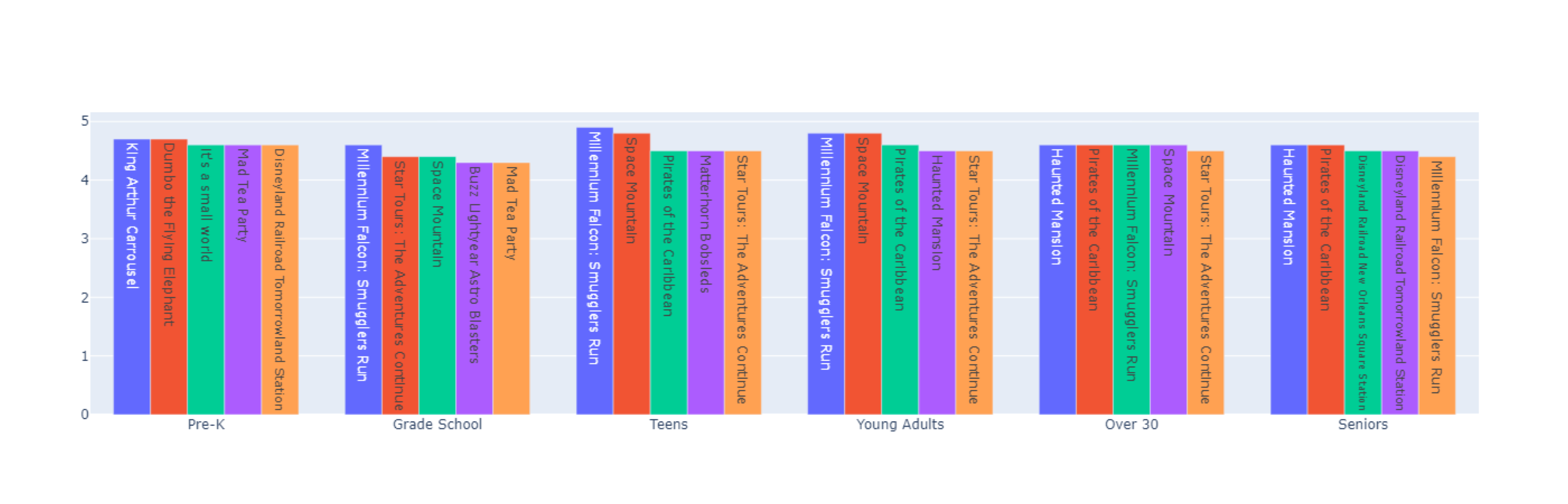
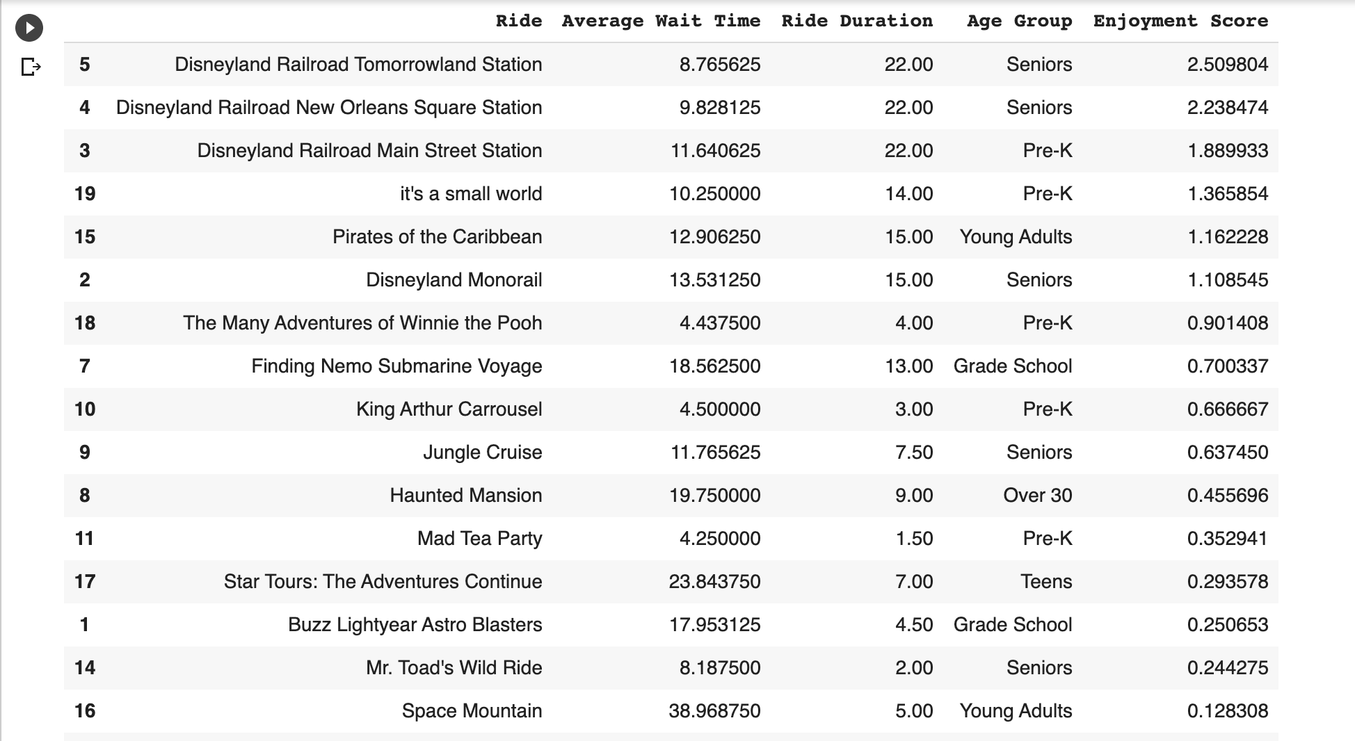
This is what our reframed visualization looks like. It shows the best Disney rides ranked by how much fun they would be for different age groups.
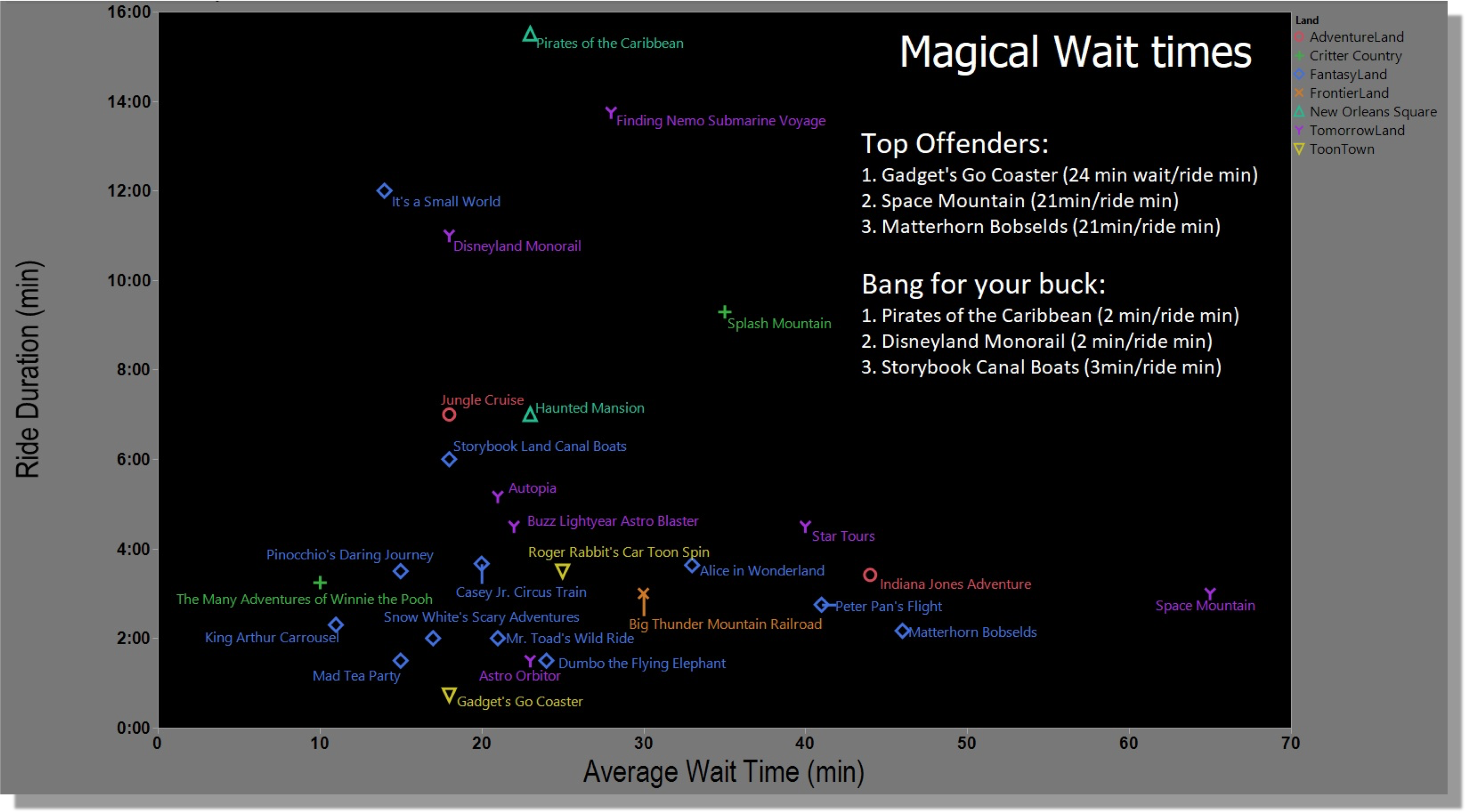
This is the original one shared on Reddit. It shows the best Disney rides compared by how long they last and how long you need to wait in line.
Our Rebuilt Visualization
Our first step is to rebuild the original visualization shared in the subreddit. The data scientist shared the data sources he used, but not the code.
This gives us a great opportunity to learn how to scrape data and visualize it in Python.
I will share some code snippets as usual, but you can find all the code in this Google Colab notebook.
Extracting Our Source Data
The original visualization contains two datasets, one with the duration of the rides and another with their average wait time.
Let’s first collect the ride durations from this page https://touringplans.com/disneyland/attractions/duration.
We are going to complete these steps to extract the ride durations:
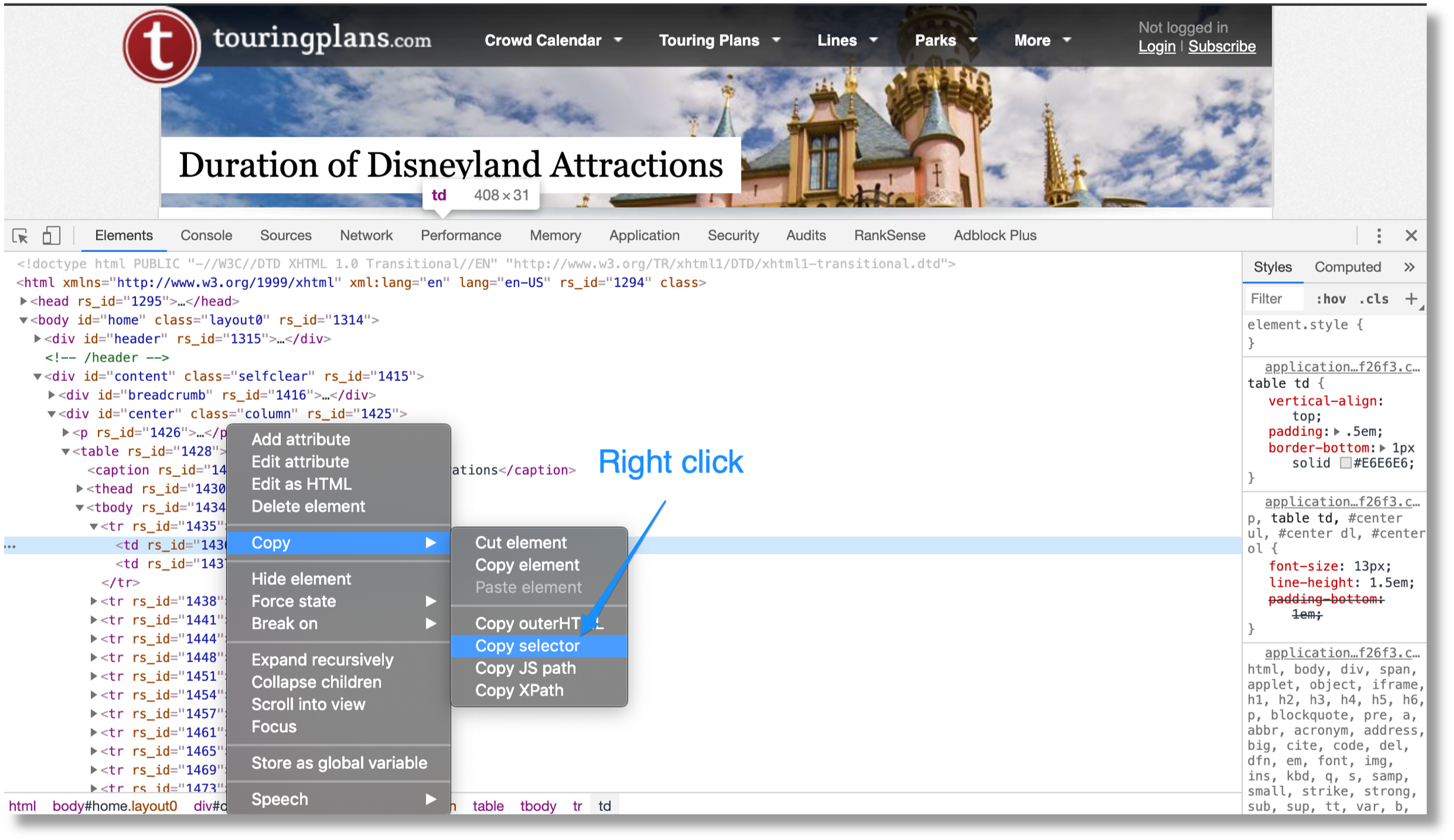
- Use Google Chrome to get an HTML DOM element selector with the ride durations.
- Use requests-html to extract the elements from the source page.
- Use a simple regular expression for duration numbers.
Next, we need to collect the average wait times from this page https://touringplans.com/disneyland/wait-times.
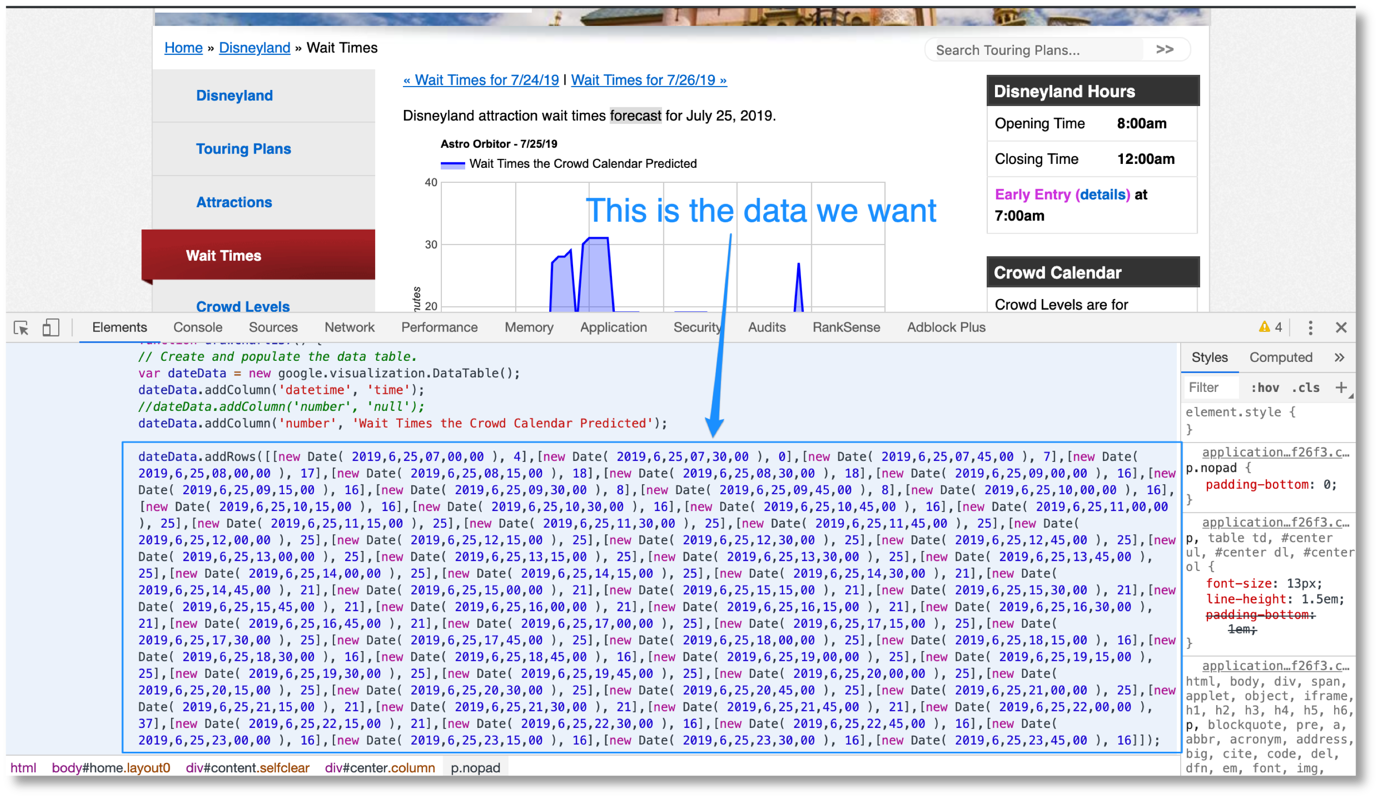
This is a more challenging extraction because the data we want is in the moving charts.
We are going to complete these steps to extract the average wait times:
- Use requests-html to extract the JavaScript snippets from the source page.
- Use regular expressions to extract the data rows from the JavaScript code and also the ride name/title of the chart.
- Use a Jinja2 template to stich together a custom JavaScript function that returns the values we extracted in step 2.
- Use Py_mini_racer to execute the custom JavaScript function and get the data in Python format.
In order to convert the JavaScript data embedded in the charts to Python, we are going to perform a clever trick.
We are going to stitch together JavaScript functions using fragments of the code we are scraping.
We will use delimiters to define which fragments we will extract and use a Jinja2 template to work them together in a JavaScript function that runs correctly. The function will return a dictionary with the duration of our rides.
We will execute such functions using an obscure library called Py_mini_racer. That library runs JavaScript code from Python, returning Python objects that we can use.
I tried to use the PyV8 engine from Google, but couldn’t get it to work. It seems the project has been abandoned.
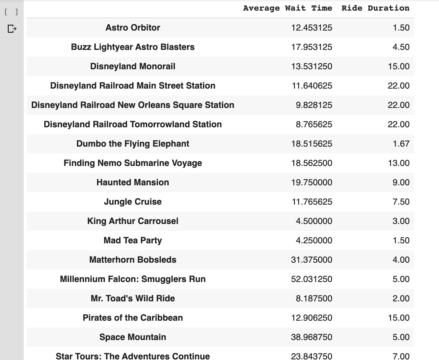
Now, we have the two datasets we need to produce our chart, but there is some processing we need to do first.
Processing Our Source Data
We need to combine the datasets we scraped, clean them up, calculate average, etc.
We are going to complete these steps:
- Split the extracted dataset into two Python dictionaries. One with the timestamps and one with the wait times per ride.
- Filter rides with fewer than 64 data points to keep the same number of data rows per ride.
- Calculate the average number of wait time per ride.
- Combine average wait time per ride and ride duration into one data frame.
- Eliminate rows with empty columns.
Here is what the final data frame looks like.
Visualizing Our Data
We are almost in the finish line. In this step, we get to do the fun part! Visualizing the data frame we created.
We are going to complete these steps:
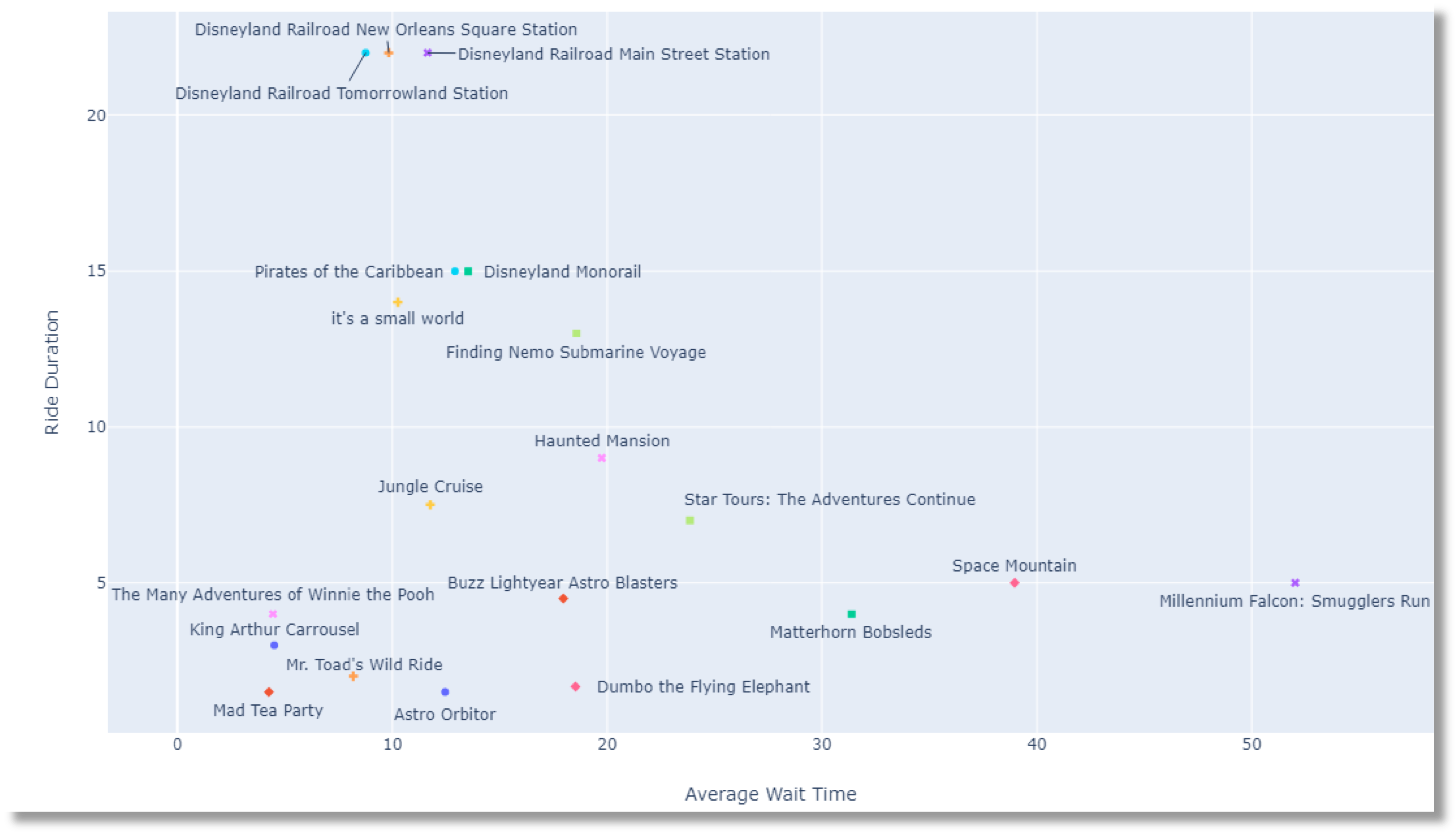
- Convert pandas data frame to a row-oriented dictionary. The X-axis is the Average Wait Time and the Y-axis is Ride Duration. The label is the Ride name.
- Use Plotly to generate a labeled scatter plot.
You need to manually drag the labels around to make them more legible.
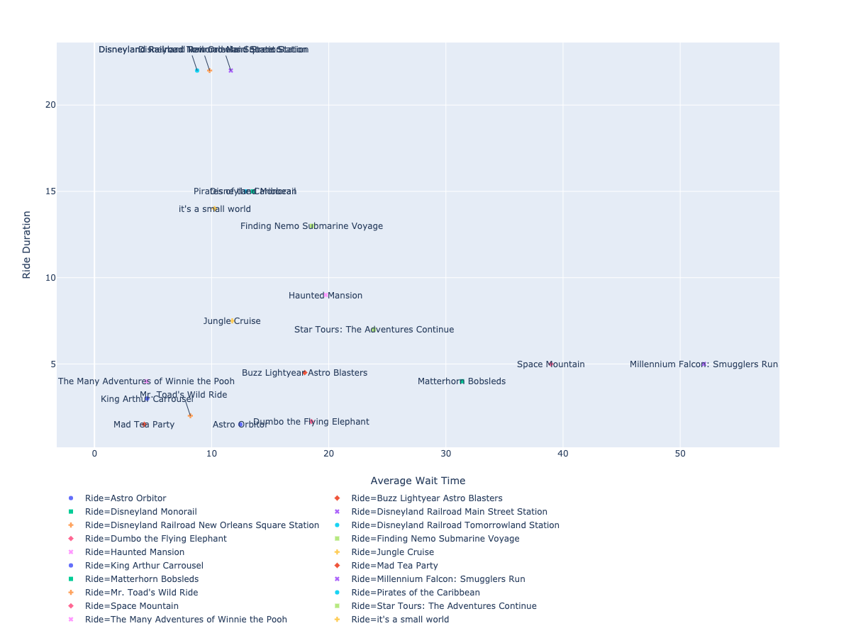
We finally have a visualization that closely resembles the original one we found on Reddit.
In our final step, we will produce an original visualization built from the same data we collected for this one.
Reframing Our Data
Rebuilding the original visualization took serious work and we are not producing anything new. We will address that in this final section.
The original visualization lacked an emotional hook. What if the rides are not fun for me?
We will pull an additional dataset: the ratings per ride by different age groups. This will help us visualize not sure the best rides that will have less wait time, but also which ones would be more fun for a particular age group.
We are going to complete these steps to reframe the original visualization:
- We want to know which age groups will have the most fun per ride.
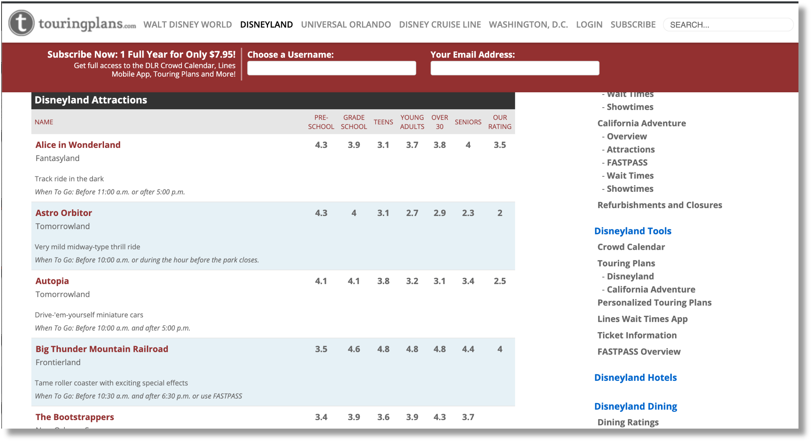
- We will fetch the average ride ratings per age group from https://touringplans.com/disneyland/attractions.
- We will calculate an “Enjoyment Score” per ride and age group, which is the number of minutes per ride divided by average minutes of wait time.
- We will use Plotly to display a bar chart with the results.
This is the page with our extra data.
We scrape it just like we pulled the ride durations.
Let’s summarize the original data frame using a new metric: an Enjoyment Score. 🙂
We define it as the average duration by wait time. The bigger the number, the more fun we should have as we have to wait less in line.
This is what the updated data frame looks like with our new Enjoyment Score metric.
Now, let’s visualize it.
Finally, we get this beautiful and super valuable visualization.

Resources & Community Projects
Last January, I received an email that kickstarted my “Python crusade”. Braintree had rejected RankSense’s application for a merchant account because they saw SEO as a high-risk category.
Right next to fortune tellers, mail-order brides and “get rich quick” schemes!
We had worked on the integration for three weeks. I felt really mad and embarrassed.
I had been enjoying my time in the data science and AI community last year. I was learning a lot of cool stuff and having fun.
I’ve been in the SEO space for probably too long. Sadly, my generation made the big mistake of letting speculation and magic tricks rule the perception of what SEO is about.
As a result of this, too many businesses have fallen prey to charlatans.
I had the choice to leave the SEO community or try to encourage the new generation to drive change so our community could be a fun and proud place to be.
I decided to stay, but I was afraid that trying to drive change by myself with minimal social presence would be impossible.
Fortunately, I watched this powerful video, wrote this sort of manifesto, and put my head down to write practical Python articles every month.
I’m excited to see that in less than six months, Python is everywhere in the SEO community and the momentum keeps growing.
I’m really excited about our community and the brilliant future ahead.
Now, let me continue to bring light to the awesome projects we continue to churn out each month. So, exciting to see more people joining the Python bandwagon. 🐍 🔥
Tyler shared a project to auto-generate meta descriptions using a Text Rank summarizer.
I have a colab notebook for auto-generating meta descriptions with TextRank!
— Tyler Reardon (@TylerReardon) September 20, 2019
Hugo shared his first script that automates exporting SEMrush reports.
My first ever Python script : https://t.co/gyHbhRVtkI
It allows you to automate Semrush organic reports exports. I'm open to any feedbacks and suggestions
— Hugo Akh (@hugodeuxfois) September 21, 2019
Jeffrey is working on an AI tool to break the writer’s block and open-sourced his Python backend.
I've been working on a writing tool that uses AI to help beat writer's block! https://t.co/Y4fItfoLgS (Python backend open sourced at https://t.co/Bk8pG5aHEc)
Thank you! I find marketing pretty awkward/hard for me.
— Jeffrey Shek (@shekkery) September 20, 2019
Charly is working on a URL translator and classifier.
Hey @hamletbatista! I'm working on a URL translator/classifier built with #Python & interacting with @googlesheets. It's not 100% yet, but our chat @brightonseo gave me confidence that I should stop worrying about the code being perfect and start sharing it!😁
— Charly Wargnier 🇪🇺 (@DataChaz) September 20, 2019
More Resources:
- How to Generate Text from Images with Python
- Advanced Duplicate Content Consolidation with Python
- How to Use Python to Analyze SEO Data: A Reference Guide
Image Credits
All screenshots taken by author, October 2019
In-post images: Provided by author
