
It was an honor being called upon to do the redesign and development of Search Engine Journal. I have been apart of this network for a short time but I have quickly learned what an amazing community this site has.
Loren Baker approached me about the redesign a few months ago. I was excited to take on the job and I know what a pleasure it is to work with Loren and the rest of the Search & Social crew.
Blog Design 101
As with any site design or redesign I started by sitting down with the client and discussing their needs. The most important thing to grasp in this meeting isn’t necessarily a list of items the client wants but rather to get a feel of what they want to accomplish. Take this opportunity to figure out their goals and more importantly how they will measure the success of those goals.
With blogs the goals are usually one of two things, either increase traffic and subscribers or increase ad revenue. Search Engine Journal has a strong following and is definitely an authority in the industry. My design would have far less impact on subscribers and traffic at this point because of SEJ’s continued success. My goal at this point was to restructure the site to give the user a better experience while maintaining or increasing ad revenue.
Wire Frames
Especially with blog design I encourage my students and others to start with wire frames. Wire frames do not have to be the traditional hand drawn lines outlining the layout. They can be anything you want them to be. My goal with wire frames is to outline specific site functionality and layout.
At this point it’s good to limit your thoughts on design and focus on how the site will function for a user. Making sure specific elements live above the fold, that subscribe buttons are clear and easy to find and that any other functionality the client requests has a home and is easy to use is the goal.
Take a look at these wire frames used for SEJ. As you can see it formulates the basic existing layout you see today. There of course were some minor changes and tweaks as we went along. However the basic layout and functionality was carefully planned and agreed upon through these wire frames.
The Design
Once the client signs off on the wire frames you are now able to get to work on the design. This is the most fun for me. Here you can really turn your thoughts and ideas in to reality. I love playing with fonts and colors to try and find the right fit for everything. To me, it’s very gratifying when you send off the design for approval.
Below you can see the different phases and changes that were made to the site. You may notice that the design phase did not have a lot of back and forth. I attribute this to planning and management of expectations. Your first meeting with a client all the way up to the completion of the wire frames you’re building a blueprint of what your client will be expecting at the end. These steps will make your work flow smoother and help your client to understand why we do things the way we do.
Design Version 1

Design Version 2
Tips and Tricks For Development
After the design was finished and we were ready to move on to development I did the following to make my life easier and the development process faster.
- With any blog redesign it’s good to install the blogging software (wordpress) onto another server and export the data from the original blog to your new install. This gives you free reign to test and play without worrying about hurting the live site.
- About a year ago I started implementing a css framework or reset to help with the coding my css. I’ve tried out a few but my favorite so far is Yahoo’s YUI. The use of a css reset sheet will greatly reduce the complications with cross browser compatibility and help you to remember to write cleaner more efficient code.
- Don’t be afraid to share your dev link with the client while you’re working. If you have a client who helicopters over the development phase you may get a few emails like asking “why isn’t this working” or “you know the logo is supposed to be on the left not the right” but if you can grin and bear it through those you’ll find it’ll help you in the long run. Your client is going to spend more time on the site (especially during the weeks leading up to its new live date) than you are. They’ll find something wrong before it’s too late too turn back. Too often we can over look the minor details our clients see as very important and if we wait too long sometimes it’s really difficult to go back and undo the mistake.
Fighting the Norm
Take a look at many of the more popular sites out there these days. One thing you’ll find in common for most of them is that the site is not wider than about 950px. This is because a vast majority of people are still using the common 1024×768 screen resolution and we all know that horizontal scrolling can sometimes spell disaster.
However there are a great deal of individuals who are using better screen resolutions. In fact as many as 60% are using at least 1200×1024 (2009 numbers) seen here. Am I recommending that you increase your design width to these resolutions? Umm… no, not yet anyway. Two reasons why, 1 you don’t want to be putting too much on the screen, it’ll over stimulate the user and 2 because we don’t want to hide important elements from users that wouldn’t otherwise see it.
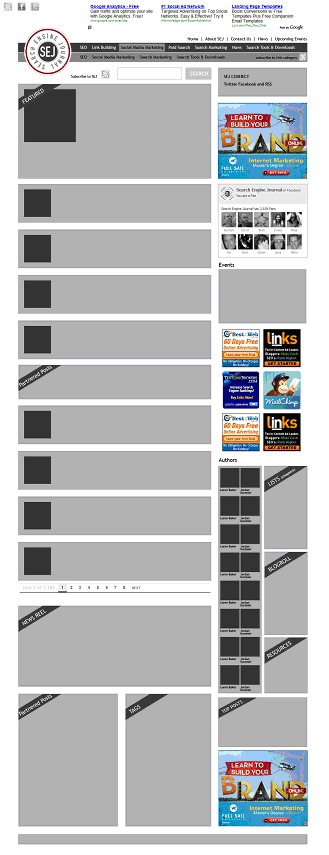
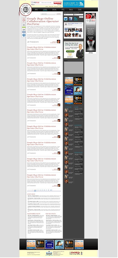
What I am recommending you do is utilize the space where it makes sense. In the case of SEJ I built the site to fit into a 1024 wide screen resolution but if you are in fact someone with a better screen resolution you will see an extra advertisement on the right. Below you’ll see what I mean.
1024 wide

1200 wide
The reason we did this was because it’s no loss to the user if they are using 1024×768. They don’t miss out on important information and they don’t have to scroll for vital elements like subscribing or searching.
I hope you are all enjoying the SEJ redesign. It was a real joy working with Loren, Dave and Jordan and I am truly honored to have created something so many of you use everyday.
Please let me know what you think of the redesign and share your tips and tricks with everyone below.
