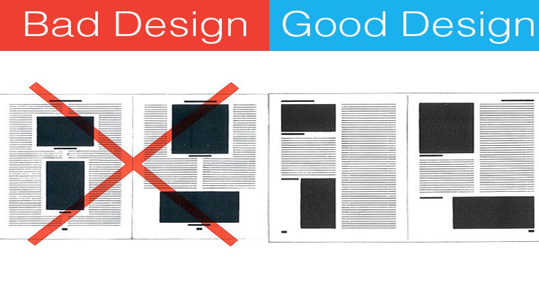
I have a free, conversion-rate-optimizing opportunity for you. That opportunity is typography.
That’s right. When used strategically, typography can make that crucial first impression for your users. By using the right typeface choices and styles, you can enhance the character of your site and set a tone of voice that reinforces what your words say and influences how your words are perceived.
Since you really only have a few web design tools in your toolbox (words, images, colors, and composition), you should be optimizing each one as much as possible to appeal to viewers and drive those leads.
The Impact of Typography
Studies have found users tend to give links to longer pieces of visually appealing, quality content.
That visually appealing part is where typefaces come in.
Keep in mind, this doesn’t mean all of your webpages should be 3,000 words long. In fact, I urge you NOT to always write long-form content, since a study found that people read less than 20% of text online.
But if your site has a blog to provide deeply actionable information, then you should use it as an opportunity to publish that long-form content and earn some links.
And if you’re going to have long-form written content on your site, you better make sure it’s readable and pleasing to the eyes.
Contrast
The best way to make something pleasing to the eyes is to make sure it has great visual contrast.
People are programmed to look first at things that stand out. If something looks different than the things around it (it’s bigger, a different color, aligned differently, etc.) then we assume it must have special significance and we pay more attention to it.

You can use this psychological wiring to your advantage. By strategically incorporating different font faces and styles, you can make specific words really pop, creating visual interest while simultaneously emphasizing your most important points.
Increased Comprehension and Readability
By incorporating typography the right way, you can positively impact your viewers’ reading experience by optimizing readability and increasing comprehension.
There isn’t one perfect typeface for increasing visibility, so don’t even start that search. All you need to do is choose a typeface that lends itself to the web.
Before you drive yourself crazy going through huge lists of fonts, I want you to first realize: there are three legibility factors more important than the specific typeface you choose:
- Age of reader
- Size of type
- Line spacing
These three characteristics can greatly impact a viewer’s ability to consume and comprehend your words.
1. Age of Reader
Our vision deteriorates as a natural part of aging in a process called presbyopia. At 40 years old, only half the light gets through to your retina as it did when you were 20. When you’re 60, it goes down to 20%.
2. Size of Type
Since all eyes aren’t equal, you’re going to want to make sure you can accommodate as many as possible.
Research shows small font sizes and low contrast are the #1 complaint for web users when it comes to reading online. This makes a lot of sense, since 42% of Americans are near-sighted and three out of four need some form of corrective lens.
Keep your font-sizing in mind, and you can increase readability and maximize conversions for all eyes. Remember it doesn’t hurt those who can see well if your text is large; however, it does hurt those who can’t see well if your text is smaller.
3. Line Spacing
Line spacing is important because it affects how easily a person can locate the start of the next line of text. The less effort a person needs to read your words, the better.
All readers (especially those with low vision) experience better reading speeds and improved comprehension when line-spacing was set to 1.5 or 2.
Impact on Judgment
Not only can typography visually attract us and increase our comprehension, but it can also impact our judgment and emotional responses.
New York Times Study
A New York Times study, called “Are you an optimist or a pessimist?” was designed to determine if test subjects would find a statement more believable depending on its typeface.
People were given a statement to read about a catastrophic event and were then asked how confidently they believed the statement.
Different test groups were given statements printed in different typefaces, including:
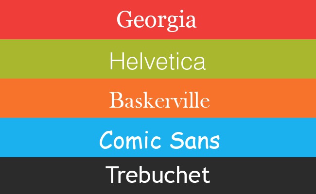
The results: Baskerville, a font designed in the 1700s to balance readability and high contrast, had a 1.5% increase in people agreeing with the statement than the other fonts.
The takeaway: Typefaces that are legible and have a high contrast can potentially influence readers to trust and even agree with your statements.
MIT Study
Another study by MIT psychologist Kevin Larson tested if type choice, layout, and line spacing would affect the reader’s emotional state.
Twenty volunteers were split into two groups and asked to evaluate a version of The New Yorker. One was designed poorly, with unattractive font styling, text wrapping, and alignment. The other was more visually attractive and used better text, spacing and alignment practices.

Larson found viewers who read the poorly designed page were negatively impacted, expressed feeling upset and even physically frowned.
Though it may seem like a stretch, the muscles associated with frowning are related to the amygdala – the part of the brain responsible for forming memories and associating them with emotions.
In other words, the character of your font can help people form memorable associations with your brand. And changing your font is way easier than telling a compelling story or creating a conversion-optimized landing page.
The Current Typography Climate
So font can produce visual appeal, increase comprehension and even form positive memories.
If something as simple as a font choice can have such dramatic results, why wouldn’t you optimize it?
But hold on just a second. You can’t just go changing your fonts randomly and hoping for the best. There are some font faces and styles that are simply better than others at appealing to your readers.
Before we get into some best practices, let’s take a look at the current climate for typography on the Web.
Serif vs. Sans-Serif Fonts
The serifs vs. sans-serifs debate is one of the most discussed and unresolved topics about typesetting.
In typography, a serif is a small line attached to the end of a stroke in a letter. A typeface with serifs is called a serif typeface, and one without serifs is called sans-serif.
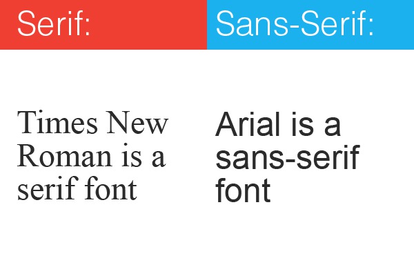
Generally, serif fonts are:
- Considered “old style” or even outdated because of their likeness to calligraphy and typewriting fonts.
- Known for creating line contrast and therefore, excellent readability, especially at larger sizes.
Whereas sans-serif fonts are:
- Viewed as cleaner and more modern.
- Slightly less legible than serif fonts.
You can see why there’s such a debate – you can’t have both a modern appearance and excellent readability. You basically have to choose whether appearance or legibility is more important to you.
Fortunately, you don’t have to make this tough decision on your own. There’s a lot of research into the current trends for choosing body copy and headline fonts.
Serif vs. Sans-Serif for Body Copy
The majority of sites (2/3) use sans-serif fonts for body copy. This is partially because of their clean and modern look, but it’s also because designers like to stick to core Web fonts.
The most popular include Arial (28%), Verdana (20%) and Lucida Grande (10%).
On the other hand, only 34% of websites use serif for body copy.
Serif vs. Sans-Serif for Headlines
Though they’re not popular for body copy, sans-serif fonts are more common for headlines (60%) – mostly Aerial (28%), Helvetica (20%) and Verdana (8%).
Though sans-serif fonts are still the majority for headlines, the industry is slowly changing its views on serif headlines. These have been steadily increasing in popularity the past few years, with the most popular being Georgia (28%) and Baskerville (4%).
Most Frequently Used Fonts
From that research, we can see most designers keep going back to those traditional core Web fonts like Arial, Georgia, and Verdana. In fact, those three fonts alone make up 80% of body copy online. The remaining 20% consists of a lot of Helvetica, Baskerville and a font called Lucida Grande, which is only installed on Macs.
Georgia and Arial are also the two most popular fonts for headings. While Verdana is a common choice for body copy, it’s a much less common practice for headlines because it places a lot of spacing between letters at larger sizes.
I’d like to point out, when sites deviate from the norm with “alternative” fonts, they tend to use them more for headlines than body copy. If you want to experiment with a not-so-classic typeface, I suggest doing the same.
Average Font Size
Research shows there is no clear average font size, but that it really depends on the typeface used. However, as a general rule of thumb, most range from 18-29px, with 18-20px and 24-26px being the most popular choices. Here’s how this breaks down further:
- The average font size for headings is 25.6px.
- There’s been more and more emphasis on larger font sizes for body copy, with a tendency toward sizes 12-14px.
- The most popular font size (38%) is 13px, with 14px slightly more popular than 12px.
Typography Best Practices
So since all of those practices are the trends right now, that means they’re the best practices, right?
Actually, no.
But don’t worry! I have for you a list of some of the best strategies for optimizing your text online.
Contrast
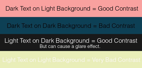
Text should be printed with as much contrast as possible to ensure clarity and enhance comprehension. Generally speaking, the traditional black text on a plain white background produces the best contrast for reading on the web, though any dark text on a light background works.
It’s pretty common knowledge that dark text on a dark background or light text on a light background won’t create great contrast. However, quite a few people are using light text on a dark background (called reverse type) as a fun way to use colors while maintaining visual contrast.
I’m sorry to say, but… it’s not the best idea.
Fortunately, we’ve moved past the days where fuchsia on blue text was considered cool for the Web. However, white on black text is still pretty common on the Internet.
Reversed type is a problem for several reasons. For one, light text on a dark background will undoubtedly reduce the number of people who will bother to read your content.
Not only that, but it can also reduce their ability to comprehend it because it strains the eyes. Staring at reversed text for an extended amount of time tends to create a sort of glare, where the letters start to seem overwhelmingly bright to look at. Again, this is a problem for all readers, but especially for those over 40 who are starting to lose some of their vision.
Type Color
High contrast can be difficult to achieve with color combinations other than black and white. However, most companies want to add color to their sites for branding and engagement purposes, and that’s fine. Just make sure you choose effective combinations, so you don’t lose out on viewers for something as trivial as colors.
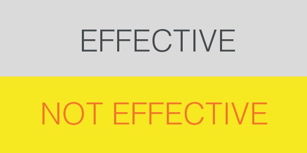
For instance, black text on a light gray background is pretty effective at creating contrast and readability. However, a dark orange text on a light yellow background will not be as effective, because yellow and orange are so close on the color spectrum.
Point Size
Generally speaking, you should have a 16px minimum size for all of your text online. This is for two reasons:
- 16 pixels is the font sizes that browsers were intended to display by default.
- 16 pixels on the average computer screen looks about the same size as 12-point printed text.
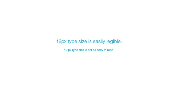
Unfortunately, as we discussed earlier, most sites are using 12-14 pixels for their content. By increasing the size of your text, you can make your content more legible for all ages and stand apart from the crowd.
Research has also found that larger font styles can elicit stronger emotional connections.
Leading
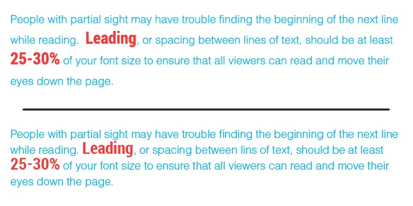
People with partial sight may have difficulty finding the beginning of the next line while reading. Leading, or spacing between lines of text, should be at least 25-30% of your font size to ensure that all viewers can read and move their eyes down the page.
Font Family
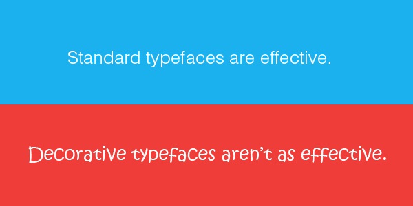
Avoid complicated, decorative or cursive-style fonts. If they must be used, use them sparingly and for emphasis only. Standard serif or sans-serif fonts with easily recognizable characters work best.
Font Pairings that Work Well Together
It’s boring to just use one font throughout a page. You’re going to want to pair different fonts together to make your content look more interesting and cohesive.
Although Georgia and Arial are the most widely used typefaces, there’s been an increasing trend of pairing fonts outside of traditional choices. This is likely because of font delivery services like Typekit and Google Fonts, which allow more font choices to be rendered in browsers.
More font choices mean more opportunity to establish your brand’s unique personality. They allow you to be more expressive and creative online and stand apart from the competition. Typeface is body language, and it creates that emotional connection that is so critical to the sales process.
Last year, Creative Bloq published a list of 20 different font pairings that work well together for computer screens. Basically, you should try to use different fonts within the same overarching typeface family to create contrast, but not conflict.
Using serif for your headlines and sans-serif for body copy can create a visually interesting contrast as well. By pairing the two, you can achieve maximum readability while still developing a strong sense of character for your words.
The I:1 Test
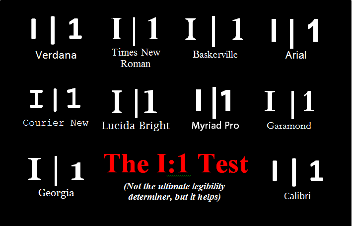
Considering a font that’s not on the list? Check out font designer Jessica Hische’s I:1 test, where you put the letter “I” next to the number “1” and see if you can tell the difference. It’s not the ultimate legibility determiner, but it definitely helps.
Font Style
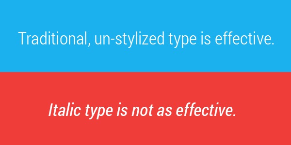
While styles like bold, italics and underline can really emphasize your words, you should definitely avoid using them to style whole blocks of text.
These kinds of styles are intended to stand out to the viewer. If they fill your whole page, your viewer will be distracted by what your words look like and unable to focus on what they actually say.
Conclusion
Typeface is more than just choosing a font. It’s about size, contrast, colors, spacing, and a whole plethora of styling choices that can influence how your words and your company are perceived. Typeface communicates not just the words themselves, but the experience of your brand.
By following these best practices for fonts, you can appeal to readers, increase their comprehension, build their trust, and ultimately earn their business.

