Do you remember those old “Choose Your Own Adventure” books? Yeah, that was before Al Gore created the internet and Wikipedia became the ultimate “choose your own adventure” in useless facts.
But for us kids back in the 80’s, being able to read a book and actually be part of the story was pretty dang cool. Each chapter let you choose between one or more options. Based on your selection, you would skip to the correct page and continue on until a new choice was presented.
This was the ultimate in being able to control the story. You weren’t just a bystander, you were a participant. How the book ended was up to you and the decisions you made. But be careful…sometimes a bad decision resulted in your ultimate demise!
Today, we don’t need choose your own adventure books; we have a choose your own adventure web.
But far too often, websites are built like traditional novels. Instead of giving visitors options, the website tries to force visitors to the sale, without giving them any of the adventures. Ultimately, the result for far too many websites is the demise of the conversion.
Too Many Adventures to Choose From
In a choose your own adventure novel, you reach a point and you have to make a decision. Do you go through the door on the left or the door on the right? Do you give the creature in front of you the blade of your sword or the gift in your pocket? Do you run and hide or do you charge into battle?
Not every decision leads to death. Both may lead to new adventures of their own. But you never have an unlimited set of options to choose from. Imagine if that wasn’t the case: Do you build a bridge or swim across or take the boat or turn around or yell for help or take a nap?, etc. As much as I enjoyed rereading the books and selecting a different option each time, this is not what readers would want. And it’s not what the visitors on your website want either.
But that is often what website visitors get: a massive number of navigational options. And not just top-level options but every secondary option as well.
Yes, your navigation must give visitors options. Whenever someone lands on your site, they need to get a good understanding of what you offer and have options to go down the best path. But too many options is just too many options. You have to let visitors choose a path before you start giving them more choices.
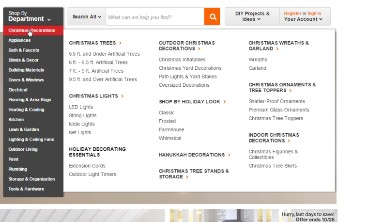
Clearly, I’m not a fan of the mega menu at all. And I’m not alone. From a usability perspective, mega menus fail.
 Home depot employs the popular, but often confusing “mega menu.”
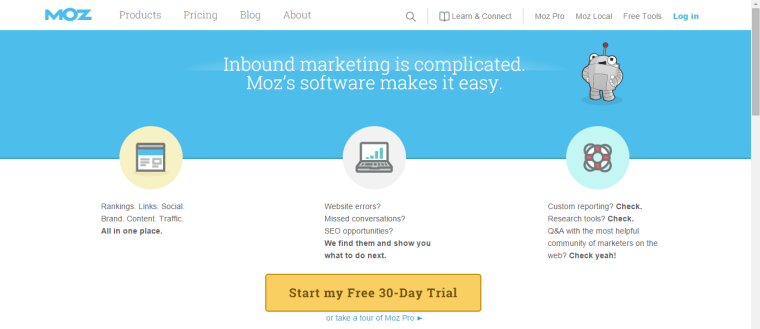
So what’s a good menu? One that gives your visitors your primary service or product category options and little else.
 Moz does a good job of keeping their main menu simple with only a few, clear options
If you have seven core services, fine, list each one, as each is an adventure of its own. But don’t also present every sub-service under each of the main services in one giant drop down. That’s just getting into too much detail before the visitor has even had a chance to make a basic choice to begin with.
When a visitor to your website has too many options, they freeze. While that may not lead to an untimely death as it might in a good novel, that hesitation is generally followed by exasperation. If visitors have to spend too much time thinking about how to get the information rather than being directed toward it, they will just leave.
No Clear Options to Take
Your site navigation is just one aspect of helping your visitors find the information they need. But you should never rely on the navigation to get your visitors to where they want to go. In fact, the visitor should be led through the site by the content.
Every page on your site needs to have a clear purpose. Part of that purpose is to give the visitor the information they need, but there is more to the story, if you’ll forgive the pun. Besides providing great content, you have to determine where the visitor should go next.
Too many websites focus on the content and not the action that content should be driving the visitor toward. Yes, great content is an important part of the process, but content without an action to take is ultimately pointless.
Many businesses think the navigation is what visitors use to get from page to page, but the page itself must present some navigation options for the visitor.
Imagine reading a choose your own adventure novel and having to go to the table of contents to figure out what to do next? That would make no sense and add a layer of complication. Same goes for forcing your visitors to use navigation to figure out where to go next when on your site.
Each visitor should not be forced out of the content to move on to the next page. They should be presented with options right there based on what they are reading. Any time your content presents an opportunity for a visitor to gain more information somewhere else, add a link to that information on your site.
By adding these contextual links, you’re giving your visitors the option to choose their own adventure, taking the path that is most meaningful to them. But also keep your eye on the prize. Again, it’s not about giving them every option but giving them the options that help them move toward the conversion.
Some will be more direct than others, but that’s because each visitor will need different information before being ready to convert.
There are Multiple Adventures to Victory
Every visitor that comes to your website is different. Some will want to know more about you and will need to take a path to company information pages. Some might need assurances, so their adventure will go through your policy pages. Some need to have confidence in your products or services so they’ll travel through testimonials and reviews. Still others just may want to get a sense of your skill and experience.
All of these paths can lead to the all-victorious conversion. But only if you allow for these adventures to be taken within your content. You want to allow your visitors to choose their own adventure through your website, but you also have to provide the options that allow them to actually choose their path.
Whether they become a customer or not is up to them, but you can control the message and the options that are presented to each potential customer while also giving them the freedom to choose the adventure that’s right for them. It’s up to you to use that to lead each visitor to victory.
What is your biggest pet peeve about website navigation?
Image Credits
Featured Image: Image by Stoney deGeyter
All screenshots by Stoney deGeyter. Taken October 2015.


