SEO is a rapidly evolving field, making it important for professionals to continuously expand their knowledge and skills.
We’ve put together a list of essential SEO books suitable for readers at various levels.
Some books on this list provide a foundation in core concepts, while more advanced practitioners can explore topics such as entity optimization.
The list includes specialized resources tailored to specific areas of SEO. For example, some books offer strategies for businesses targeting local audiences, while others serve as comprehensive guides to link building tactics.
For those interested in Google’s perspective, another book provides insights into the company’s philosophies and principles.
Whether you’re a beginner or an experienced professional, this list caters to diverse interests and skill levels, ensuring there’s something for everyone.
Books On Search Engine Optimization
1. SEO For Beginners: An Introduction To SEO Basics
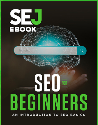
Published by Search Engine Journal, this is a comprehensive guide to SEO. It covers everything from link building and SEO history to busting common myths and offering expert tips.
While it’s for beginners, veterans can also gain new insights. The book breaks down complex ideas into bite-sized pieces, making it a great starting point.
It’s well-structured, with each chapter tackling a different SEO aspect – from search engine mechanics to the latest algorithm updates.
The authors don’t just stick to theory. They provide real-world examples and case studies to show how these concepts work in practice. This mix of theory and application makes the book a valuable resource for anyone looking to improve their SEO.
Key reasons to give it a read:
- Get a solid grasp of SEO basics from industry pros.
- Easy-to-follow explanations of tricky concepts.
- Practical advice you can apply to your SEO strategies.
- Stay in the loop with current SEO trends and Google updates.
- Benefit from the collective wisdom of top SEO experts.
2. Entity SEO: Moving From Strings To Things
By Dixon Jones, CEO of InLinks
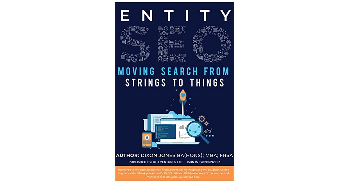
Dixon Jones’ book “Entity SEO: Moving from Strings to Things” explains the shift from old-school keyword SEO to modern entity-based optimization.
It explains how search engines now use the Knowledge Graph to understand relationships between concepts and offers practical advice on adapting your SEO strategy.
Key points:
- Making your brand an “entity” in your niche.
- Using structured data effectively.
- Getting quality links and mentions.
- Creating content rich in entity information.
The book uses real examples to show how these concepts work in practice. It’s meant to help SEO professionals at all levels understand and prepare for where search is heading.
Worth reading if you want to:
- Get a solid grip on entity SEO.
- Learn actionable entity optimization tactics.
- Establish your brand as a recognized entity.
- Master the use of structured data for SEO.
- Future-proof your SEO strategy.
3. The Art Of SEO: Mastering Search Engine Optimization
by Eric Enge of Stone Temple Consulting, Stephan Spencer, and Jessie C. Stricchiola

Covering everything from SEO 101 to advanced tactics, this book starts with the basics of how search engines work and then dives into the meat of SEO: keyword research, on-page optimization, technical SEO, and link building.
The authors break down complex strategies into actionable steps, making implementation a breeze.
What sets this book apart is its holistic approach. It’s not just about ranking; it’s about aligning SEO with your business goals and integrating it into your digital strategy. The book also discusses the role of content marketing and social media in boosting SEO performance.
Reasons to read this book:
- Get a complete SEO education, from basics to advanced strategies.
- Learn to align SEO with your business objectives.
- Access practical, step-by-step guides for implementing SEO tactics.
- Understand how to integrate SEO with content marketing and social media.
- Benefit from the collective wisdom of three renowned SEO experts.
4. The Psychology Of A Website: Mastering Cognitive Biases, Conversion Triggers And Modern SEO To Achieve Massive Results
Matthew Capala’s “The Psychology of a Website” offers a fresh take on website optimization. Instead of focusing on technical aspects, it dives into the psychology behind user behavior and conversions.
Capala, a seasoned digital marketer, shares actionable tips for creating websites that perform well in search results and keep visitors engaged and more likely to convert.
The book kicks off by exploring how our brains work when we browse websites. Capala then gets into the nitty-gritty of optimizing different website elements, from how they look to what they say.
A big focus throughout is user experience (UX). Capala stresses that a great website isn’t just about ranking high on Google – it needs to be easy and enjoyable for people to use.
While UX is key, Capala doesn’t ignore SEO. He offers practical advice on keyword research, on-page optimization, and building links while keeping the focus on creating content that actually connects with users.
By blending psychological insights with practical digital marketing strategies, Capala offers a well-rounded approach to website optimization that can lead to significant improvements.
Reasons to read this book:
- Gain insights into the psychology driving user behavior and conversions.
- Learn to create websites that not only rank well but also engage visitors.
- Get practical strategies for optimizing design, content, and calls-to-action.
- Discover how to enhance user experience and mobile performance.
- Learn to integrate SEO best practices with a focus on user engagement.
- Benefit from real-world examples and expert insights from a seasoned digital marketer.
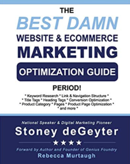
5. The Best Damn Website & Ecommerce Marketing And Optimization Guide, Period
SEO veteran Stoney DeGeyter’s book “The Best Damn Website & Ecommerce Marketing And Optimization Guide, Period” covers SEO basics to advanced tactics for websites and online stores.
It starts with SEO essentials and then dives into advanced topics. The book’s standout feature is its focus on ecommerce, addressing product pages, category optimization, and effective product descriptions.
DeGeyter emphasizes a holistic SEO approach that aligns with business goals and user experience. He also covers analytics for strategy refinement.
This guide suits both small business owners and ecommerce marketers.
Reasons to read:
- Master SEO fundamentals and advanced strategies.
- Learn ecommerce-specific optimization tactics.
- Discover product page and description best practices.
- Understand user-generated content’s SEO impact.
- Align SEO efforts with business objectives.
- Benefit from decades of industry expertise.
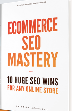
6. Ecommerce SEO Mastery: 10 Huge SEO Wins For Any Online Store
Kristina Azarenko’s “Ecommerce SEO Mastery” offers 10 key strategies for online stores. The book tackles common ecommerce SEO challenges like thin content and complex site structures.
Azarenko breaks down each “SEO win” with practical advice on implementation.
Topics include:
- Ecommerce keyword research.
- Product & category page optimization.
- Leveraging user-generated content.
- Building quality backlinks.
- Site speed and mobile optimization.
- Structured data.
The book provides real-world examples and emphasizes data-driven SEO. It guides readers through using tools like Google Analytics and Search Console to track progress.
Reasons to read:
- Learn 10 powerful ecommerce-specific SEO strategies.
- Gain insights from a renowned SEO expert.
- Discover how to optimize product and category pages.
- Leverage user-generated content for SEO benefits.
- Learn to build high-quality backlinks.
- Apply real-world examples and case studies.
- Adopt a data-driven approach to ecommerce SEO.
7. Product-Led SEO: The Why Behind Building Your Organic Growth Strategy
by Eli Schwartz
Eli Schwartz’s “Product-Led SEO” offers a fresh take on SEO strategy, emphasizing business goals and sustainable organic growth.
Drawing from his work with major brands, Schwartz presents a framework that integrates SEO with overall company strategy.
The book challenges traditional SEO tactics, advocating for a holistic approach that prioritizes user value.
Key topics include:
- User intent optimization.
- Content strategy for the full customer journey.
- Measuring SEO’s business impact.
Schwartz focuses on the strategic “why” behind SEO tactics, encouraging critical thinking and adaptable strategies for long-term success.
Reasons to read this book:
- Gain a strategic perspective on SEO that aligns with business objectives.
- Learn to create sustainable organic growth through user-centric approaches.
- Discover how to optimize for the entire customer journey.
- Understand methods for measuring and communicating SEO’s business impact.
- Access real-world case studies and examples from major brands.
- Benefit from the author’s extensive experience in driving impactful SEO results.
Books On Link Building
8. The Link Building Book
by Paddy Moogan
Paddy Moogan’s “The Link Building Book” is a comprehensive, free online guide.
It covers link building basics, tactics for acquiring high-authority backlinks, content creation, and practical steps for planning and executing campaigns.
The book emphasizes white-hat techniques and quality over quantity, making it valuable for both SEO novices and pros.
Reasons to read:
- Master link building fundamentals and best practices.
- Learn diverse tactics for acquiring high-quality, relevant links.
- Understand how to assess potential linking websites.
- Discover content strategies that naturally attract links.
- Learn to plan and execute effective link building campaigns.
- Benefit from practical advice and real-world examples.
- Access updated, valuable insights at no cost.
Books On Local SEO
9. Local SEO Secrets: 20 Local SEO Strategies You Should Be Using NOW
by Roger Bryan
“Local SEO Secrets” by Roger Bryan is a must-read for businesses targeting local customers. It offers 20 proven strategies to boost local search visibility and drive growth.
Key topics include:
- Local SEO fundamentals and how it differs from traditional SEO.
- Optimizing Google Business Profile listings.
- Building local citations and leveraging structured data.
- Creating local content and managing online reputation.
- Implementing and tracking local SEO strategies.
The book provides actionable advice, real-world examples, and step-by-step instructions. It’s valuable for small business owners, marketers, and SEO consultants working with local clients.
Reasons to read:
- Learn 20 proven strategies for improving local search visibility.
- Understand key local ranking factors like Google Business Profile, reviews, and citations.
- Master GBP optimization for local SEO success.
- Discover how to use structured data and local content effectively.
- Learn reputation management best practices.
- Get practical, easy-to-implement instructions and examples.
- Learn to measure local SEO performance with analytics tools.
Books On Search Engines
10. How Google Works
by Eric Schmidt and Jonathan Rosenberg
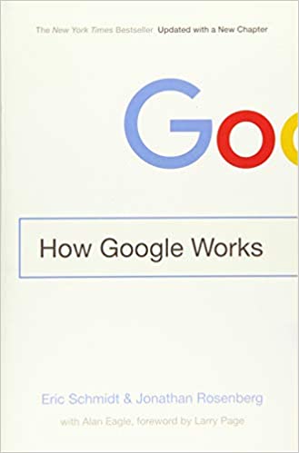
“How Google Works” by ex-Google execs Schmidt and Rosenberg offers an insider’s view of the search giant. While not focused on SEO, it provides valuable insights for digital marketers and business leaders.
The book offers practical advice and real-world examples applicable to businesses of all sizes.
Understanding Google’s philosophy can inform more effective, customer-focused digital marketing strategies.
Reasons to read:
- Get an insider’s view of Google’s success principles.
- Understand how to create a user-centric business strategy.
- Discover ways to foster innovation and experimentation in your organization.
- Gain insights into data-driven decision-making processes.
11. Entity-Oriented Search

“Entity-Oriented Search” by Krisztian Balog is a deep dive into modern search engine tech. It focuses on entities, knowledge graphs, and semantic search and is aimed at readers with a background in information retrieval (IR).
A key strength is its coverage of cutting-edge research, like neural entity representations and knowledge-based language models. While tech-heavy, it touches on applications in QA, recommender systems, and digital assistants and discusses future trends.
It’s essential reading for IR, natural language processing (NLP), and artificial intelligence (AI) pros seeking in-depth knowledge of modern search engines.
Reasons to read:
- Deep dive into entity-oriented and semantic search tech.
- Research on knowledge graphs and semantic understanding.
- A detailed look at entity extraction, linking, and ranking algorithms.
- Insights on neural entity representations and knowledge-based language models.
- Expert knowledge from a renowned IR and search engine specialist.
Conclusion: Choosing Your Next Book
These 11 SEO books have got you covered – whether you’re a beginner or a seasoned pro.
For beginners, “SEO for Beginners” and “The Art of SEO” are solid starter packs that’ll teach you the SEO fundamentals.
As you level up, books like “Entity SEO” and “Product-Led SEO” explore more advanced topics like optimizing for entities and aligning SEO with business goals.
Several books focus on specific areas:
- “Local SEO Secrets” is a must-read if you’re targeting local customers.
- “Ecommerce SEO Mastery” zeroes in on ecommerce SEO.
- “The Link Building Book” is your starting point to master link building.
On the technical side, “Entity-Oriented Search” dives deep into semantic search and cutting-edge search engine tech. “How Google Works” gives you the inside scoop on Google’s mindset.
The key is picking books that match your skill level and areas of interest. Whether you want to learn SEO from scratch, level up your game, or specialize, there’s a book for you.
The Amazon links in this post are not affiliate links, and SEJ does not receive compensation when you click or make a purchase through these links.
More SEO & Marketing Books Worth Your Time:
- Enterprise SEO Guide: Strategies, Tools, & More
- The Complete Guide to On-Page SEO
- What is SEO? An Introduction to SEO Basics
Featured Image: PeopleImages.com – Yuri A/Shutterstock


