

In 2003 it was generally understood by affiliate marketers that ugly sites that looked like they were “built by a 10 year old” tended to convert exceedingly well.
Major sites like Walmart and CVS use exceedingly plain websites. It may seem counterintuitive to purposely create an “ugly” site but the nearly forgotten affiliate marketing strategy of “ugly sites sell” might be useful to revisit.
The ugly site sells paradigm is not well known nowadays. But it was a well-tested marketing strategy used by affiliate marketers in the early days. In fact, major websites today use a variation of the ideas discovered back in 2003, so it may pay to revisit this strategy to understand how it came to be and how it might be adapted today.
It was at Pubcon Boston 2003 that affiliate marketers gathered around beers and snacks discovered they had each independently come to the discovery that making their sites ugly (but usable) led to higher sales.
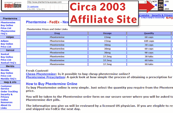
Legendary affiliate marketer Mike Mackin posted a private discussion on WebmasterWorld on June 2003. The post was entitled, Ugly Sites Sell.
That post became one of the most influential discussions from WebmasterWorld whose influence continues to be felt today. That discussion inspired online marketers to A/B test different designs, including ugly website designs that were built for speed, usability and conversions.
Related: 15 Important Conversion Metrics & Business KPIs You Should Track
One publisher in that discussion from 2003 objected to the ugly site paradigm and stated that perhaps nobody is making ugly sites on purpose.
A legendary affiliate marketer replied that he was very much on purpose making sites that were ugly.
The discussion is still online but it’s hidden behind a paywall at WebmasterWorld (link at the end of this article).
The Enormous Buy Button
The subtitle to the Ugly Sites Sell discussion was:
“Monkey see big yellow button.
Monkey press big yellow button.
Monkey get banana.“
An enormous “buy” button was an important part of the ugly sites sell approach.
A/B testing of the ugly sites sell strategy discovered that making the “buy” button large, sometimes to the point of dominating the viewport, increased sales.
They discovered that making the buy button enormous increased conversions.
As ridiculous as that may sound, the strategy still exists in different forms today.
Check out this current web page from Amazon that features an enormous “buy” area that dominates the web page:
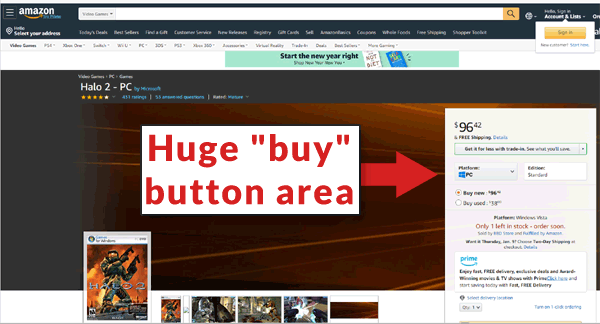
Amazon wouldn’t be using a huge buy call to action if it wasn’t effective.
Related: 101 Tips & Tricks That Will Boost Your Conversion Rates
The idea of making the buy button jump out may have had roots in magazine advertising but the strategy was independently discovered and tested by online affiliate marketers.
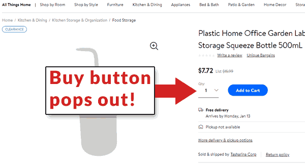
The idea of making a buy button that stands out continues to this day, as this screenshot from a Walmart web page illustrates:
Ugly Site Strategy Continues
One of the legendary affiliate marketers from that time, RC Jordan started a discussion about ugly sites sell on Th3Core.com online marketing forum asking if ugly sites still sell.
Th3Core is so-named because many of the founding members are longtime affiliate marketing professionals. The information passed in that community is in many ways more useful and time-tested than what is found on the average Facebook group.
RC Jordan asks,
“Would ugly sites still sell? Or has the buying public become so accustomed to eye-candy filled bloatware that they’d reject it?”
One member answered that they A/B tested a complex page versus a stripped down web page and found that the stripped down page converted at slightly lower rate than the complex page filled with sliders, carousels, and social media widgets.
He later conceded that his test wasn’t exactly beautiful versus ugly:
“…it was more a light/heavy comparison than a beautiful/ugly comparison.”
Yet another member offered their opinion that a “better looking” site might do best:
“I think a better looking site with more conversion points that specifically targets your market will sell better in most circumstances, therefore it is all relative to your customer and competition.”
Major Companies Use Plain Websites
It may be that users are more sophisticated today than they were at the beginning of the 2000’s. The appearance of a site is just one factor of many to consider.
That said, major organizations like Walmart feature plain looking web pages that some might say are ugly. Surely Walmart wouldn’t use those if they weren’t converting for them .
Screenshot of a Walmart web page:
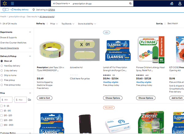
Major drug store chain CVS presents a simple and plain web presence:
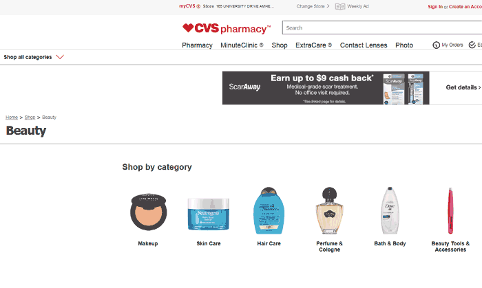
Both of those sites are run by major corporations yet their web presence can be said to be plain at best and ugly at worst. Yet, if those sites weren’t successful, one would imagine they would update the sites to be flashier.
Related: 10 Landing Page Tweaks That Will Increase Conversions
It’s clear that some factors of the ugly site sell movement such as highly visible buy buttons are as relevant today as they were almost 20 years ago. The examples of sites such as CVS and Walmart are evidence that there is a place for plain-looking websites.
So what do you think? Do ugly sites sell?
Original Ugly Sites Sell discussion (behind a WebmasterWorld paywall)
Discussion on Th3Core.com: Would Ugly Sites Still Sell?
