

Whether it’s AMP, JavaScript, or link building, there isn’t much that the SEO community can unanimously agree on.
However, one thing that the vast majority of us can get behind is getting better at informing the people we work with, who are outside of the SEO bubble, to explain its importance and the impact it can have on the businesses you’re aiming to better.
The benefits of promoting a better understanding of SEO issues and implications among the likes of other marketing teams, clients and senior stakeholders can help you:
- Secure more budget.
- Have better client relationships.
- See SEO initiatives, campaigns, and actions prioritized more highly by development teams and by the business as a whole.
Downing Tools
One great way to promote a better understanding of SEO to people less familiar with our space is to take the data out of the tools we use and bring them into customizable dashboards.
This approach is beneficial as it:
- Allows you to remove confusing jargon and present data in layman’s terms.
- Means you can present exactly what you want rather than what a tool’s user interface suggests.
- Might well be presented in a dashboarding solution your intended audience is already familiar with, such as Google Data Studio.
- Enables SEO tool data to be blended together with other sources that your audience might already work with (e.g. Search Console and Google Ads for PPC teams).
Starting with Speed
You’re about to learn one way you can use dashboards to communicate SEO-related data with different teams and stakeholders.
For this example, I’ve chosen to build a Data Studio dashboard which focuses on speed metrics and I’ve done so for the following reasons:
- Load time is something everyone can easily see the benefit of improving.
- Site speed impacts many different business functions (e.g., UX, all acquisition channels, senior stakeholders).
- There is a positive correlation that site speed has with both bounce rate and conversions.
Building Your Speed Dashboard
The speed dashboard I’ve built aims to provide a focal point for monitoring performance metrics and features data from:
The dashboard has been designed to be understandable to people who aren’t all that familiar with speed metrics while still providing useful insights for those who are well-versed in this area.
I’ve made the template available here, but please keep in mind it is a work in progress and should be treated as a starting point on which to build your own dashboards.
Note: I’m aware the dashboard is really zoomed in on laptop screens. It’s something I plan to fix but for now, you’ll need to zoom out to see the dashboard in its entirety.
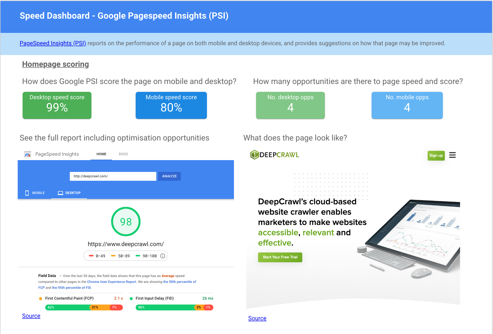
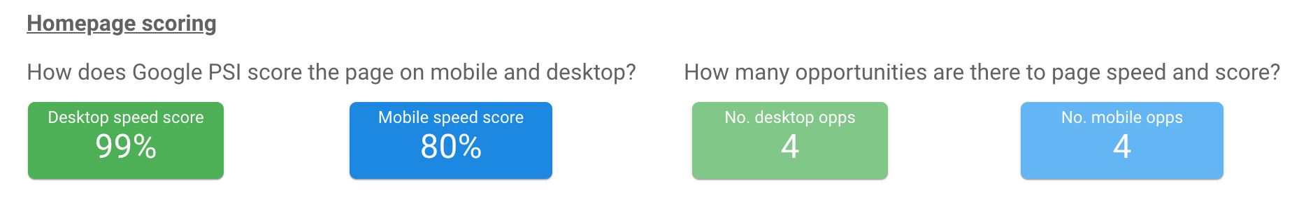
Bringing PageSpeed Insights into Data Studio
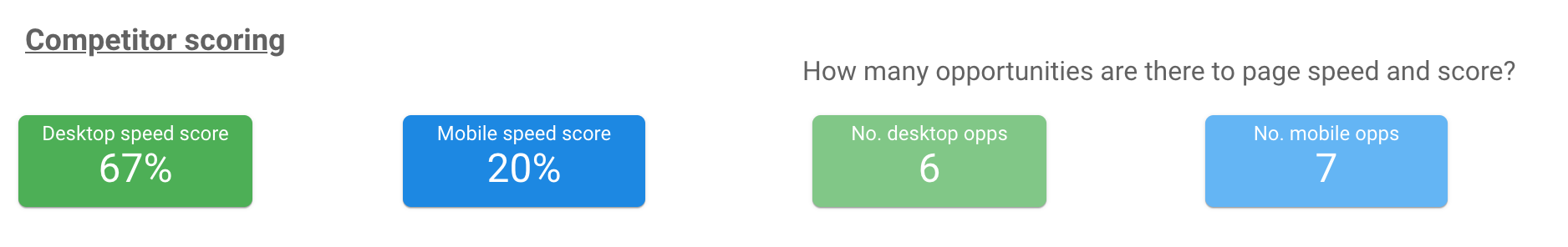
The PageSpeed Insights part of this dashboard displays:
- Google’s mobile and desktop scores for a single URL.
- The number of optimization opportunities.
- Access to the full report.
How Can I Build This?
This data is pulled in via the PageSpeed Insights community connector created by Grant Kemp.
Setting up the connector does involve deploying your own version of the connector via the Apps Script, but Kemp has provided clear step-by-step instructions as part of the documentation making the set up relatively straightforward.
What Does It Show?
Once you’ve set up the connector in Data Studio, you will be able to see the PSI score for both desktop and mobile. The connector also allows you to show the number of opportunities that PSI has found.
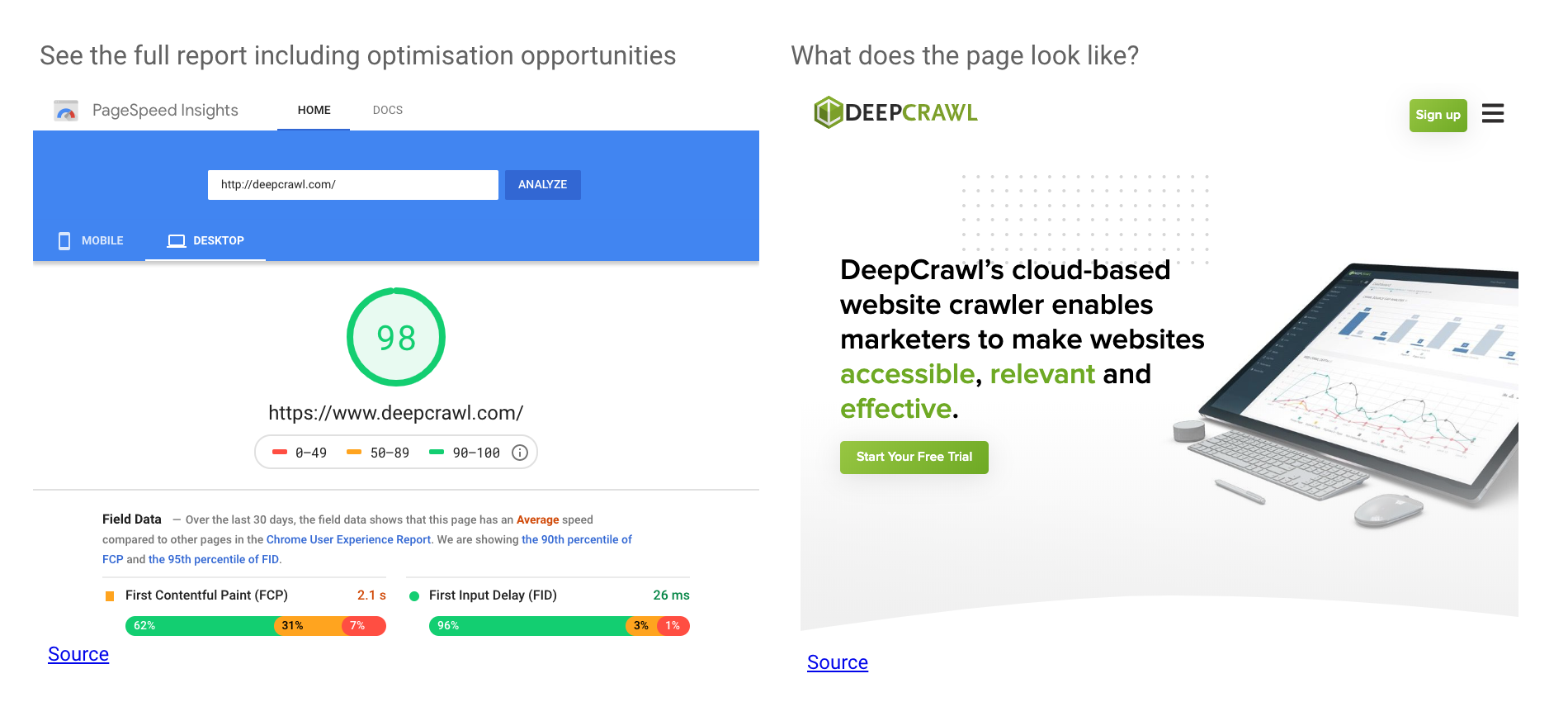
Below the scoring and opportunities scorecards, I’ve embedded the PSI report for that URL so you can see what those optimization opportunities actually are as well as browse the whole report.
I’ve also embedded the webpage itself as a visual reference to reinforce which page this data is referring to.
Separate data sources can be set up using the same connector multiple times to show the PSI scores for different URLs.
I’d recommend setting these up for example pages from different templates (e.g., one for the homepage, category page, product page, and blog post page).
As you can run any URLs through PSI, you might also want to consider creating separate data sources for competitor pages, so you can compare how you stack up to them in terms of performance.
How Does It Help?
While this connector is still in its infancy and has its limitations it still provides valuable insights as to how Google judges PageSpeed and it could help influence others in the following ways:
- Performance scores and opportunity areas are displayed clearly and simply from an authoritative source, acting as an impetus to take action.
- Comparing competitor pages side by side with the domain you’re looking to optimize can be a powerful motivator for change, particularly with more senior stakeholders.
- Comparing page templates across the same site or between owned properties could help a business to understand where they should be focusing on development resource.
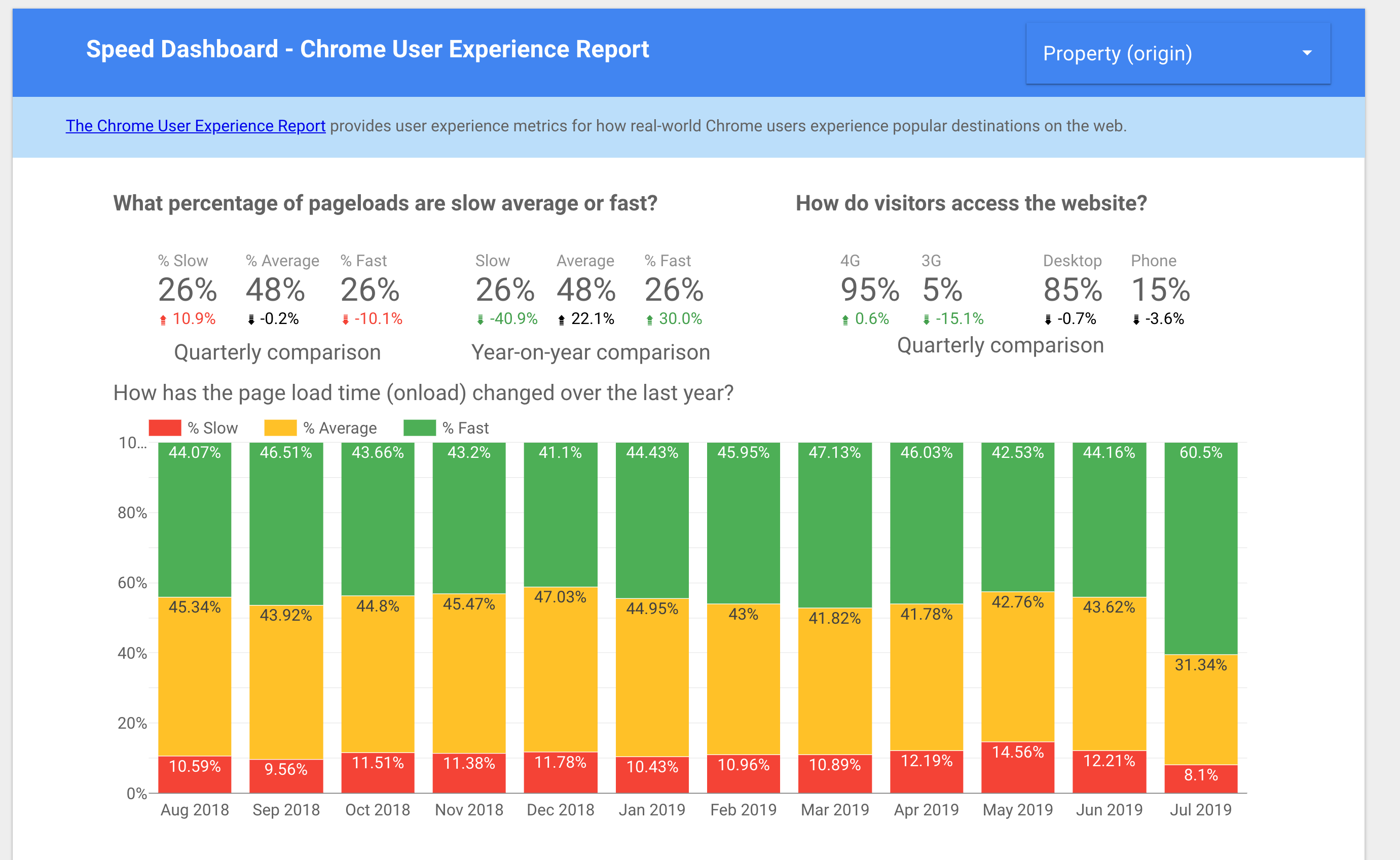
Bringing the Chrome User Experience Report (CrUX) into Data Studio
The Chrome UX Report is a unique dataset as it shows how real users experience pageload at scale as well as on an array of connections and device types.
This can help remove subjective arguments against optimization out of the equation (e.g., “The site seems fast to me.”)
While this database of performance metrics from real users is incredibly useful, it can be a bit off-putting if you don’t know your First Contentful Paint from your DOMInteractive.
In the second part of this dashboard, I’ve aimed to make the CrUX metrics as easy to understand as possible.
Hopefully, a wider range of people will be able to get a feel for what these performance metrics are saying about the sites they’re interested in.
How Can I Build This?
To build this dashboard, head over to g.co/chromeuxdash to configure your Chrome UX Report connector.
After authorization, specifying your domain and checking the metrics and dimensions that have been pulled through, you should be good to start building the dashboards as I have done in my template.
It is worth noting that you can access the raw CrUX data via BigQuery, if you have more time to invest in understanding the dataset and how to query it.
If that’s of interest I’d strongly recommend watching this series of tutorials by Paul Calvano.
What Does It Show?
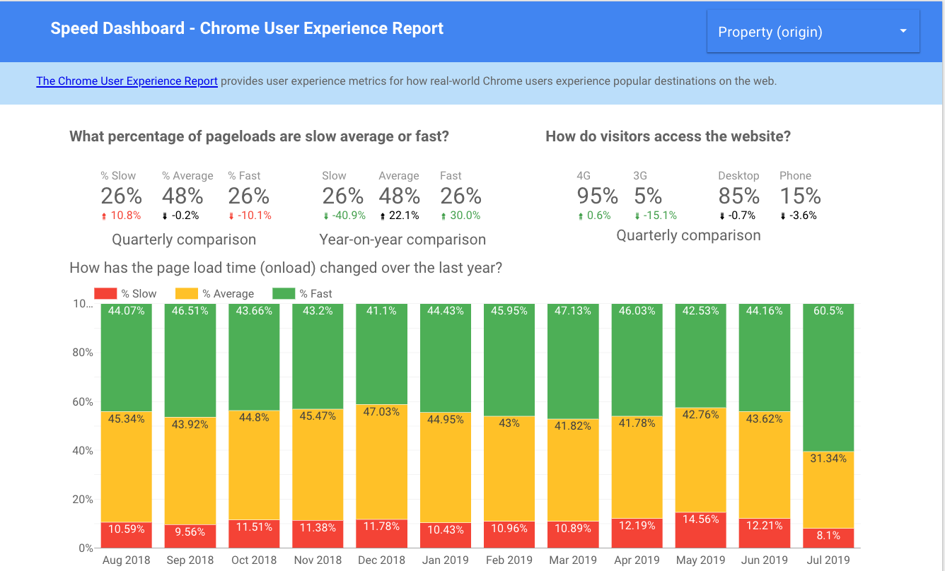
From top to bottom, the Chrome UX Report page in my template shows:
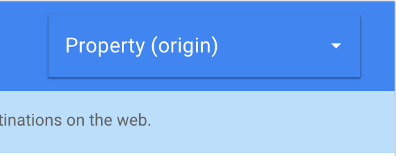
- A filter to switch between different root domains.
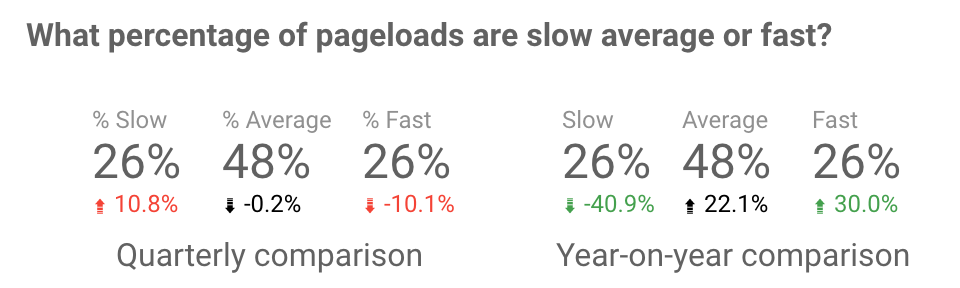
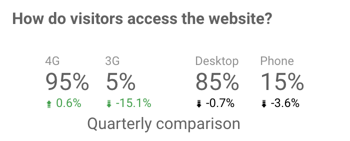
- The proportions of slow, average and fast pageloads over the last quarter with comparisons to the previous quarter and previous year.
- A breakdown of connection and device distributions for the last quarter compared to the previous quarter.
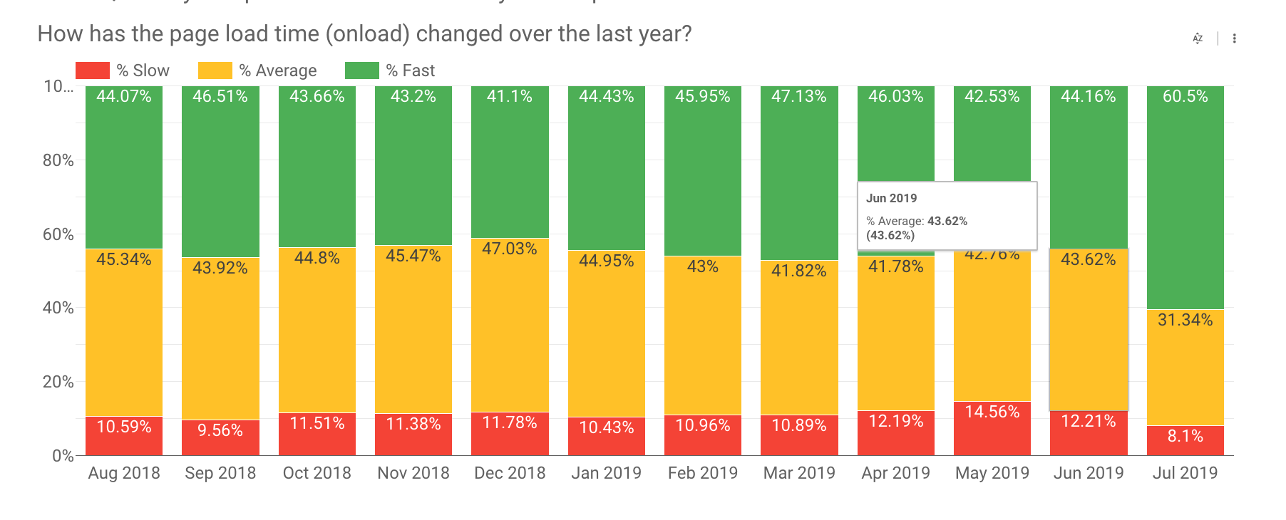
- The proportion of slow, average and fast pageloads trended after the past 12 months.
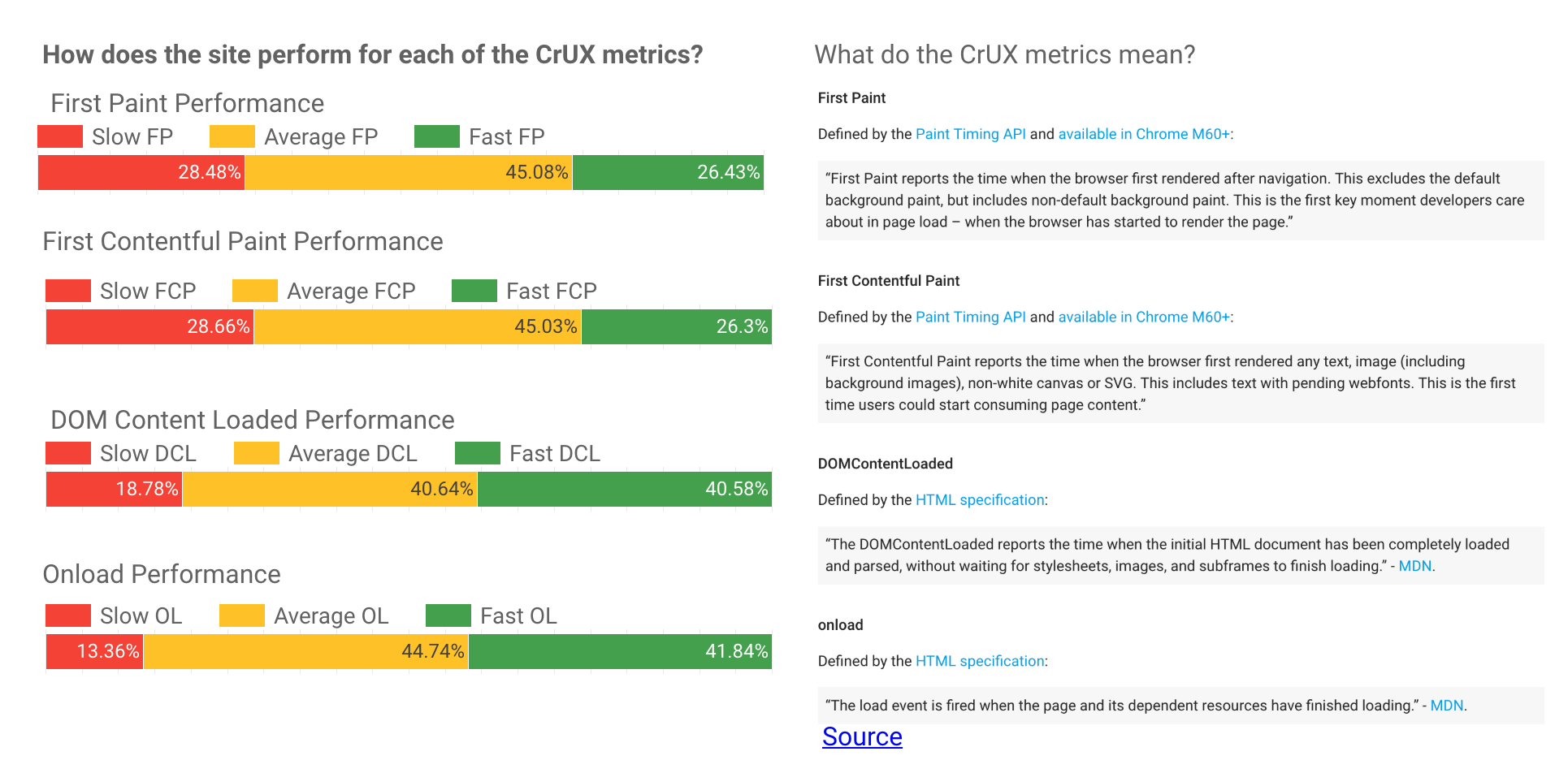
- The proportion of pageloads with slow average and fast performance for each of the individual CrUX metrics (First Paint, First Contentful Paint, DOMInteractive and Onload).
- Accompanying definitions for the metrics mentioned above.
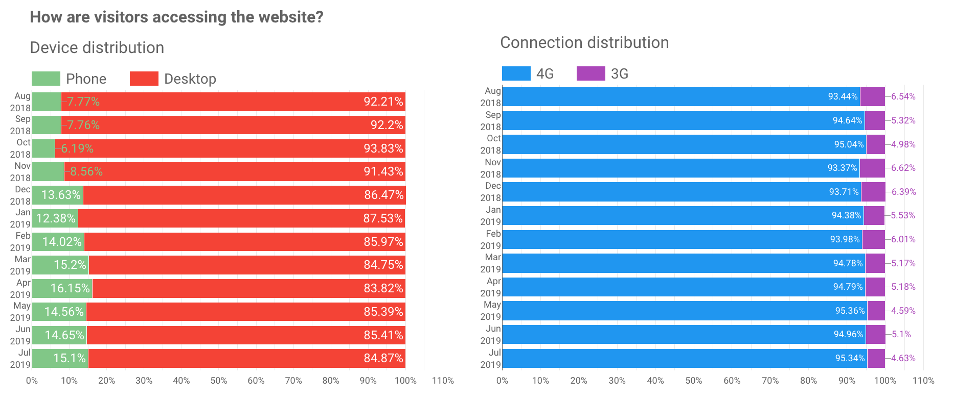
- Connection and device distributions trended over the last 12 months.
How Does It Help?
Building out a dashboard with CrUX metrics like the one in my template could be used to:
- Quickly and easily show how actual visitors from Chrome are experiencing a site. This could be useful to show to clients, management teams, or any stakeholders who need to be convinced of a performance issue on the site.
- Pinpoint specific problems with site speed by looking at individual performance metrics to help inform development teams.
- Communicate ongoing trends and explain fluctuations in performance (e.g., showing how a new site launch has reduced the load time and helped to increase various business metrics).
- Promote testing on the devices and connections that visitors actually use to access the site (e.g., testing site speed over 3G connections because that’s how most mobile users access the site).
Next Steps
Hopefully you find this template a useful starting point in how to communicate site performance.
Hopefully, you can use it as a springboard for a more fundamental change in how you communicate with colleagues and clients.
I’ve found huge value in building dashboards to help clearly explain aspects of my work to aid cross-team collaboration.
This dashboard template isn’t finished. I will continue adding to and refining it with additional data sources in the near future.
I’m keen to hear any thoughts, ideas, questions or opinions you might have on this dashboard.
Looking forward to seeing the wonderful creations you can build with these data sources at your disposal!
More Resources:
- Data Visualization: What It Is, Why It’s Important & How to Use It for SEO
- 3 Changes to Mobile Page Speed & How It Impacts Search
- How to Integrate & Visualize Any Source in Google Data Studio
Image Credits
All screenshots taken by author, August 2019
