

Marketers aren’t always sure how to prove their value and keep their job.
This post will help you figure out what your bosses care about and how you can show the value of PPC on a dashboard.
People often think that what we do in PPC is either the black arts or is as simple as picking some keywords, ad copy, and targeting. We know it’s a lot more complex than that.
We also know it can often be hard to show the value of what you do to everyone in the organization.
One thing that I have learned working on brands like ASOS, WealthBar, and Telstra is that there are only three people you really need to satisfy in an organization:
- Yourself.
- Your boss.
- Your boss’s boss.
Making sure you are happy at work should be important because we spend 30 percent of our life at work.
Making sure your boss and their boss is happy is a lot more tricky, but this post will help you with that.
Here’s how to find your North Star, prove the value of your work, make sure your data is correct, and communicate with everyone in the organization.

What Is Your North Star?
If your boss came around to your desk tomorrow and asked you how the business was doing, what would you tell them? Could you rattle off performance numbers for the last 60 days?
Knowing your performance numbers inside and out shows you care about the business. Every business should have a North Star; that one number each department and business unit looks at to make sure they are making the company more profitable with each choice they make.
To put it another way, it’s the one number that the whole company rallies around to make sure everyone is pushing the company in the same direction.
Mel Gibson’s North Star in “Braveheart” was freedom for his people. Love or hate the movie, his character knew how to rally everyone together.
If you work in ecommerce then you care about average order value (AOV) or return on ad spend (ROAS). In software-as-a-service (SaaS), you look at cost per acquisition (CPA) or lifetime value (LTV).
If you work in another industry then your North Star could be something different. A lot of friends who work for apps care about cost per install (CPI) or average revenue per user (ARPU). The latter is focused on paying users and not anyone who has installed the app.
Once you know what your North Star is, you need to lay it out in your Excel sheet. If we stick with ecommerce as our example, we know that they really focus on return on ad spend (ROAS) for our one metric of success.
Finding All Your Data
Where does your boss and boss’s boss pull their data from?
Making sure you and your manager are looking at the same numbers is key for this being a success. There is nothing worse than you thinking you did 400 sales last month but your boss says it’s only 375 because you had some returns and refunds not taken into account.
I have seen people pull numbers from a Google Ads account, whereas a boss pulls it from Google Analytics or even a data warehouse like Domo.
If you don’t have access to the data warehouse, then you need to ask your boss to get access. Explain that you want to help make sure everyone is talking about the same numbers and we are comparing apples to apples.

Since we want to build a dashboard looking at ROAS, I would pull revenue numbers for the last two calendar years and the current year to date.
Plus, make sure you get all your ad spend from your ad platform. If you can get your revenue number broken down for each ad platform, that would be a great way to get more granular with reporting.
If you are pulling from an ad account or Google Analytics, my agency is a big fan of using Supermetrics as our data reporting tool. We find Supermetrics is great for pulling data from multiple advertising and analytic sources.
Plus Supermetrics can be set up to auto-update data each day or every hour. If you need to pull from Domo or another data warehouse, then you may need to download the data into a CSV. A CSV can be upload into Excel or Google Sheets.
Now that you have all your data, you need to put it together in a dashboard that updates. I would stick with a weekly update. Though around Black Friday or a major sale, you may want to update it daily to keep on top of performance numbers.
Setting Up Your Executive Dashboard
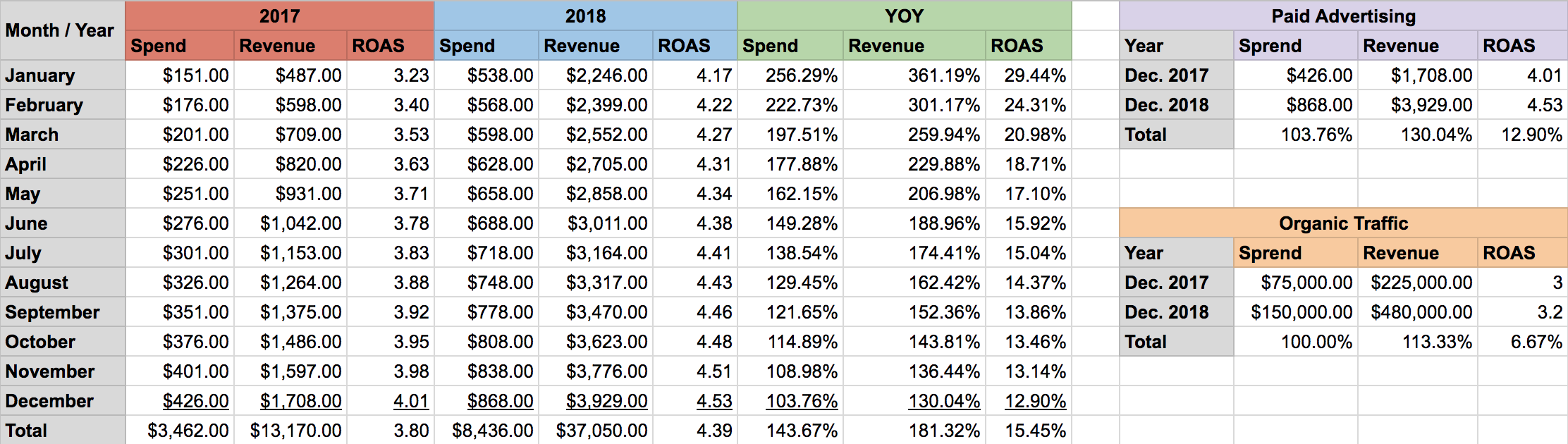
The image above is a good example of how I would lay out my data. There are two areas you want to show off to your manager and their boss:
- How is paid doing on its own (paid advertising channel tab).
- How is paid doing compared to the rest of the business or organic traffic (KPI Dashboard).
Access the spreadsheet here.
Paid and organic tend to be 2 of the top 3 traffic sources for an ecommerce business. They usually make sense to compare to each other. You may need to include why, if you are having a slow month or numbers are down for a month.
Paid Advertising Channel Tab
Layout your months along column A, followed by your spend, and revenue for year one. Since we want to use ROAS as our North Star, figure out what your ROAS would be for the first year for each month. Duplicate the process again for your second year.
The next 3 columns compare year over year (YOY) performance for spend, revenue and ROAS between your first and second year. For instance, how did January 2017 do compared to January 2018?
I always include a totals column at the end to help track yearly performance as well. This lets you look at how paid is doing on its own for the year.
KPI Dashboard Tab
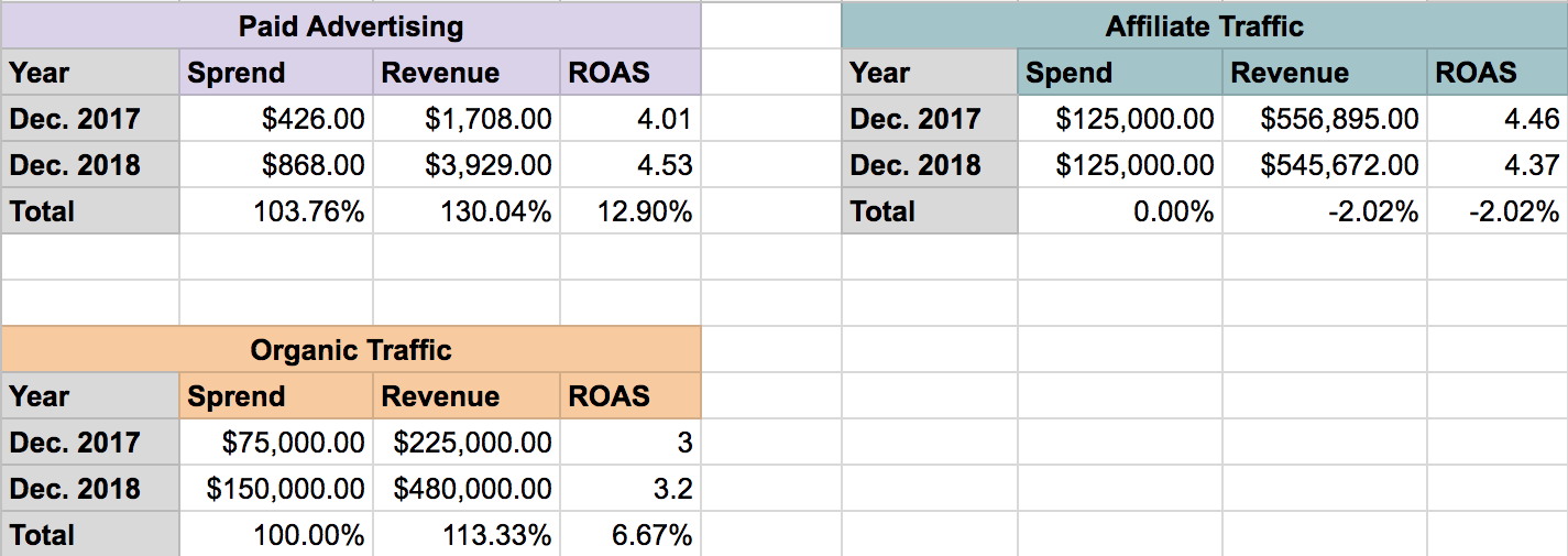
How is paid doing compared to organic? No marketing channel should operate in a silo. It’s good to see how you are doing against the rest of the business.
Plus if there is a wide difference in performance, it’s a good time to check in with the person doing organic and see if there are learning opportunities between the two channels. The spend under organic would come from the SEO person’s salary and benefits.
If you had affiliate data in your dashboard, you might put spend as salary of the person managing your affiliate revenue, plus how much you had to pay out to affiliates. Basically, all the costs of running the affiliate channel.
Since the data in the paid advertising channel could overwhelming, I always make a second tab that just looks at the KPI dashboard. This tab will look at year over year performance for the current month.
This tab quickly lets your bosses see how you are doing year-over-year compared to the whole business. You could add a section underneath that adds why performance is up or down. This comes down to how detailed your bosses like to get.
Conclusion
Figuring out what your company’s North Star is important. What is the one number everyone in your company rallies behind?
Make sure you are looking at the same data as your bosses. Assemble the spreadsheet above and help make sure everyone is on the same page.
One final note, you may want to do a monthly email out to the marketing team. That could explain in more detail what is going on behind the numbers.
You can also say what your plans are for next month. Never be afraid to overshare in your job and have information freely flowing from your department to the company.
More Resources:
- PPC 101: A Complete Guide to Pay-Per-Click Marketing Basics
- 3 Critical PPC Tasks You Should Do Every Day
- 5 Useful & Easy Google Ads Metrics You Should Monitor
Image Credits
All screenshots taken by author, February 2019
