
![How To Write CTAs For B2B: A Call-To-Action Guide For Businesses [With 10 Examples]](https://cdn.searchenginejournal.com/wp-content/uploads/2022/07/ctas-for-b2b-62daa4025a23f-sej.png)
The CTA (call-to-action) is a make-or-break moment in your content strategy and lead generation goals.
Therefore, it is a critical copywriting component and essential in your B2B (business-to-business) marketing content and webpages.
Plenty of information is available if you want to learn about B2C CTAs.
However, B2B CTAs often lack resources for inspiration – and many brands in the industry don’t take the proper care to make them engaging, resorting to endless “learn more” and “book demo” CTAs.
In this guide, you will learn how to write a compelling B2B CTA, with four best practices to infuse into your copywriting and 10 examples from major brands that work to engage prospects and drive clicks.
4 Best Practices For Creating A B2B CTA
General guidelines can help when writing CTAs – whether you’re faced with a blank document, or looking for that last element needed to finalize a project and meet the deadline.
These four best practices will inspire your writing efforts and help you decide what to do when a B2B CTA is required.
Deliver Value To The Buying Committee
In contrast to B2C consumers, a buying committee often decides on B2B purchases. These must not only appease stakeholders when bringing a solution in-house but are also composed of members with differing priorities and concerns.
Thus, strategies that work well with B2C CTAs, such as “Fear Of Missing Out” (FOMO) and urgency, can come across as “clickbaity” or appear desperate in B2B. Value (and trust) must be proven for the investment to be approved.
Therefore, tailor your CTAs to your audience and focus on promoting the unique value of your products, first and foremost.
Utilizing marketing segmentation data and personalizing CTAs for buyer personas works even better to ensure your campaign’s selected values resonate with your target accounts.
Be Conversational, To A Point
In B2B, brands sometimes overdo the jargon and formality.
And while brand consistency and voice are important, it is crucial to be relatable and conversational in your CTAs.
For example, an SDR (sales development representative) that says, “Let’s book a time for coffee and chat,” is more approachable than “click here to book a sales meeting.”
Being to the point, however, is also important. As mentioned previously, you need to demonstrate the unique value of your CTAs.
Prospects are often short on time and won’t click if the value isn’t apparent.
Spark Curiosity By Addressing The Implications
A common copywriting technique is to address the implications of a problem, yet not deliver the solution on a silver platter.
In other words: Mention what can go wrong for the prospect, but reinforce that they need to click on the CTA to discover exactly how they can solve their challenges.
Like “cliffhangers” in literature and TV series, this technique can increase your click-through rate – but you must deliver on your promise.
Nothing disappoints more than a cliffhanger that doesn’t meet expectations.
A/B Test Your Copy And Design
Testing is key to determining which CTAs work for your audience.
You can always guess what will work best, but with A/B tests, you’ll know what is truly driving clicks.
It’s important to test copy, colors, design, and the placements of your CTAs, as well as additional elements such as surrounding imagery and copy leading up to the CTA.
Make sure to test only one element at a time so that you can associate the increase/decrease in clicks with a specific adjustment.
10 Examples Of Inspirational B2B CTAs
With these four best practices in mind, here are 10 examples of B2B CTAs that drive clicks.
They deliver value and stand out from the surrounding copy on their webpages.
1. “See All Plays” By Atlassian
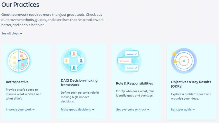
Atlassian, a software tools platform, has this CTA on its homepage to invite visitors to check its team playbooks.
The copy is the following:
- Headline: Our Practices
- Subtitle: Great teamwork requires more than just great tools. Check out our proven methods, guides, and exercises that help make work better, and people happier.
- CTA: See all plays
The CTA is followed by a breakdown of four team playbooks by Atlassian, so the visitor has an overview of what they will see if they click.
This CTA works well because it not only presents enough information for the prospect to understand the value (methods, guides, and exercises to build great teamwork), but teases them with four breakdowns of what they will find in the plays.
Without the breakdown, the word “plays” would be vague and not draw attention.
Therefore, all elements combined spark curiosity and invite the reader to the next page, where they can read the instructions for all 30 playbooks.
2. “Get Started With eSignature” By DocuSign
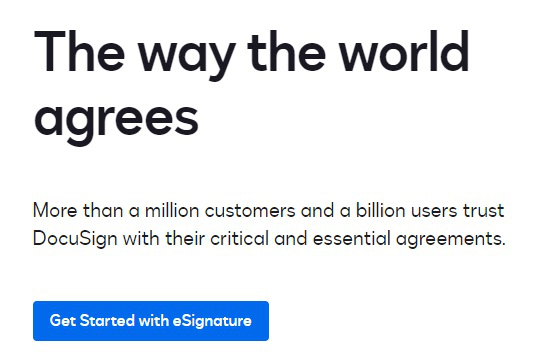
The above example is a CTA that pairs well with its headline and subtitle:
- Headline: The way the world agrees
- Subtitle: More than a million customers and a billion users trust DocuSign with their critical and essential agreements.
- CTA: Get Started with eSignature
Paired with the social proof (“million customers” and “billion users”) and the wordplay headline (which alludes to the act of signing papers with mutual agreement), DocuSign entices the user to click the CTA and see what’s offered.
It leads directly to a landing page for a 30-day free trial that gets right to the point and delivers what DocuSign’s audience desires (to sign documents electronically).
3. “Go Big With Pax8” By Pax8

Cloud marketplace platform Pax8 does a spin on the regular “learn more” CTA with this intriguing line. For full context, it has a header and subheader before it:
- Headline: Where Business Goes Big
- Subtitle: Join the cloud marketplace that unlocks a universe of possibility.
- CTA: Go Big With Pax8
Plastered on a starry background with abstract imagery, the CTA works well to pique interest in what “going big” means. It links to Pax8’s “Why Pax8” page, which briefly explains its services and provides social proof with ROI numbers for its partners—indeed, what most expect when “going big.”
4. “Explore The Process” By project44
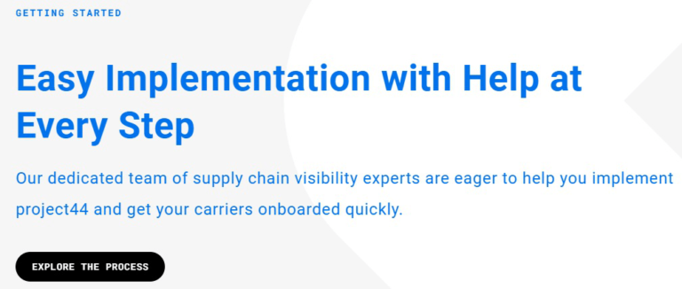
Logistics visibility platform project44 invites the user to discover the inner workings of its product with this CTA:
- Headline: GETTING STARTED Easy Implementation with Help at Every Step
- Subtitle: Our dedicated team of supply chain visibility experts are eager to help you implement project44 and get your carriers onboarded quickly.
- CTA: EXPLORE THE PROCESS
In an industry where time is of the essence, and major supply chain issues can arise from the smallest of delays, project44 appeases objections with onboarding by featuring a step-by-step rundown of what happens when acquiring the product.
There’s also a CTA to a demo so the prospect can see how the platform works and convert to a lead.
5. “See All Success Stories” By BlackLine
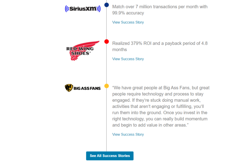
Accounting platform BlackLine showcases four client testimonials for social proof at the end of its Financial Close Management solution page:
- Headline: Proven Results. Real ROI.
- Subtitle: Customer Success Stories
- CTA: See All Success Stories
Using “Success Stories” for the CTA rather than the regular “case studies” adds value to the point BlackLine is making with the four testimonials featured above it: that clients obtain provable, quantifiable ROI by utilizing the platform successfully.
It adds weight to the numbers and entices the user to click to learn about the success of these clients.
6. “See All 11 Reasons” By Apple At Work
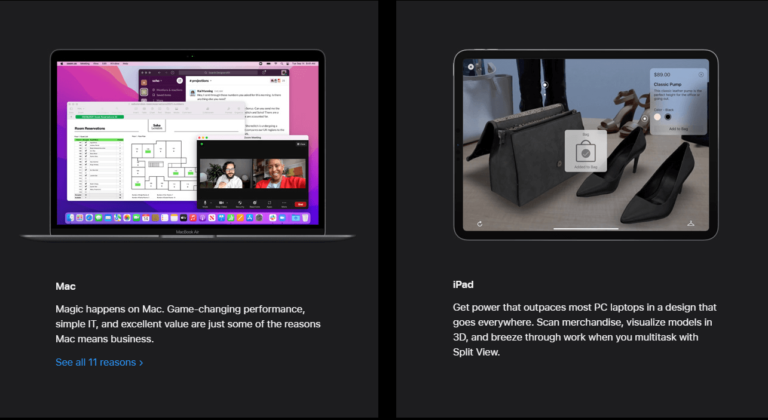
Apple’s dedicated business page has this CTA under its Mac product to invite users to a page with plenty of eye candy and engaging language about why the Mac is better than other laptops in a similar price range.
- Headline: Mac
- Subtitle: Magic happens on Mac. Game-changing performance, simple IT, and excellent value are just some of the reasons Mac means business.
- CTA: See all 11 reasons
The odd number (11 instead of 10) calls attention, along with the fact that it is the only “list CTA” on the page, while most use the traditional “learn more” format.
Also, since Apple designed a unique page with illustrations and fun copywriting for showcasing the 11 reasons, it delivers on the promise of why the user should pick Mac.
7. “Learn More About Our Purpose” By Caterpillar
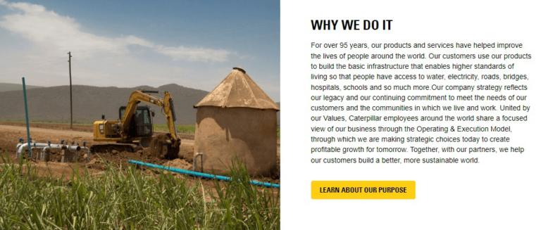
Manufacturer and construction company Caterpillar features this CTA on its Strategy & Purpose page for people to deep dive into the company’s purpose.
The copy is as follows:
- Headline: WHY WE DO IT
- Subtitle: For over 95 years, our products and services have helped improve the lives of people around the world(…)
- CTA: LEARN ABOUT OUR PURPOSE
This CTA works well because it aligns with the page’s name and drives the user to learn more after reading the copy under “Why we do it,” in a way that a simple “Learn more” wouldn’t.
In other words, the keyword “purpose” adds value to the CTA, making it more click-worthy for users who wish to learn more about the brand’s goals.
8. “Find Out How” By Honeywell
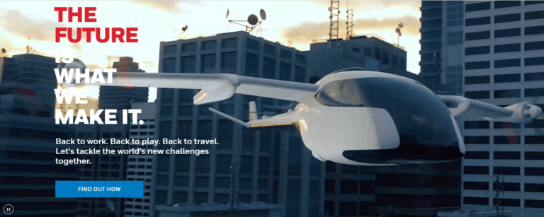
Honeywell – the conglomerate in aerospace, building, and performance materials – has this CTA on its homepage to invite users to its The Future page.
- Headline: The Future Is What We Make It
- Subtitle: Back to work. Back to play. Back to travel. Let’s tackle the world’s new challenges together.
- CTA: FIND OUT HOW
A video accompanies the CTA and copy in the background of flying cars, skyscrapers, factories, and production lines, which draws attention to “the future” Honeywell is envisioning.
These elements and the CTA engage the user to discover what this future is about.
9. “Ride Along” By Cummins
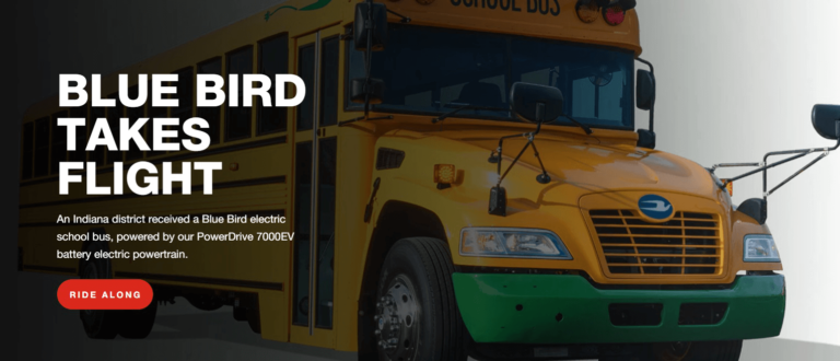
Engine and power corporation Cummins has this CTA on its Bus industry page to read a press release on an electric bus powered by its battery:
- Headline: Blue Bird Takes Flight
- Subtitle: An Indiana district received a Blue Bird electric school bus, powered by our PowerDrive 7000EV battery electric powertrain.
- CTA: RIDE ALONG
The “ride along,” with its storytelling element CTA, is inviting. Its double meaning encourages the reader to connect with the story of riding on the bus to learn about this technology.
True to the description, the press release tells the news of how a school in Indiana, U.S., acquired the bus as an environmentally-friendly solution.
1.0 “Experience Rosa Robotics” By Zimmer Biomet
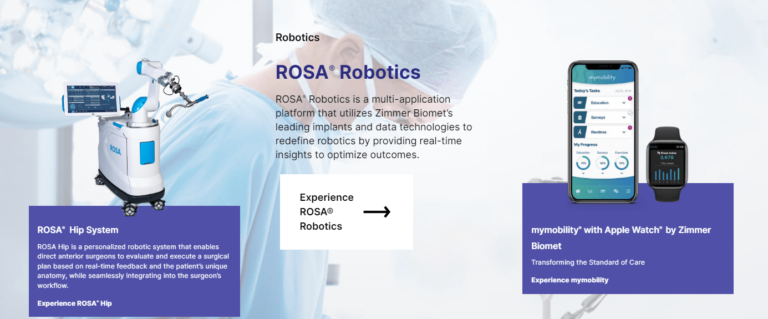
Medical device company Zimmer Biomet has this CTA on its homepage for users to learn more about its Rosa Robotics line:
- Headline: ROSA® Robotics
- Subtitle: ROSA® Robotics is a multi-application platform that utilizes Zimmer Biomet’s leading implants and data technologies to redefine robotics by providing real-time insights to optimize outcomes.
- CTA: Experience ROSA® Robotics
Using the word “experience” – like CTA #9 above – leverages storytelling to connect with the imagination and curiosity of the user, as if they will take a deep dive into the inner workings of these robots.
It leads to a dedicated page with four robots for different uses (knee, partial knee, hip, and neurosurgery).
This CTA is a simple example of how exchanging typical “learn more” language with another action verb (such as experience) can make it more engaging and entice more clicks.
Final Takeaways
Based on the 10 examples of B2B CTAs above, here are my final takeaways on what works to make your copy stand out in this industry.
Infuse Your Unique Value Proposition And Branding In The CTA Copy
Some examples on this list not only state in the CTA the value it offers, but also a keyword associated with the brand and the action encouraged.
That’s the case in the “Go Big with Pax8” example.
It reiterates a theme used elsewhere on the website (going big) and adds the brand name in the CTA to associate both concepts.
You can inspire yourself with this example by adding brand keywords on the CTAs that lead to your product pages.
Replace “Learn More” And Other Generic CTAs With Interesting Action Verbs
While simple often works best, most B2B brands play it safe with their copywriting by utilizing “learn more” for their product CTAs.
This quickly turns stale, and your prospects will ignore the CTAs unless the headline is interesting enough.
However, if you use a different verb or turn of phrase (such as the “ride along” CTA by Cummins, example #9), then you will reel in attention and get more clicks.
Think how many products have something much more interesting to engage prospects rather than a simple “learn more.”
Action verbs help to connect the prospect to the benefits of a product or motivate them to actively take the next step.
Make The CTA An Invitation To A Story/Experience
The goal of any CTA is to muster an action – and inviting the prospect to enjoy a storytelling experience with your brand is engaging since it resonates with emotion during crucial decision-making.
It not only “breaks the ice” but makes your prospect attach positive feelings to your products, especially if they clicked on your CTA and enjoyed their experience.
Therefore, instead of saying “Read X,” why not, “Find Out How,” like Honeywell does in example #8?
More resources:
- Local B2B SEO: The Complete Guide For Local Businesses
- B2B Keyword Research Done Right With Practical Examples
- Winning At Retargeting: Tips to Reconnect & Convert
Featured Image: Motortion Films/Shutterstock
