
Infographics are incredibly popular with link builders right now, and for good reason, because they have worked really well. While there may be plenty of infographics around, too many simply aren’t cutting it and the novelty is wearing off fast. This is causing infographics to be less effective as a link building tactic.
All too often Infographics are poorly executed and audiences are growing tired of seeing them – infographics (and bad ones in particular) have reached the saturation point. I see a lot of infographics and some of the most common flaws in the design of infographics include: being too complicated and long and having really bad design.
This infographic flow chart explaining the iPhone Facebook app v5.0 is a really good example of being too intricate. While it contains valid information, it’s just requires too much attention from the user. And it’s not that great.
Another common pitfall that I see is ugly design. I know we all have budgets, but sometimes you need to use a few month’s spend to create a piece that looks good rather than using the lowest cost infographic designer you can find in order to complete the infographic in a month. If your design is terrible, it doesn’t matter how good your content is. When your infographic looks like it was made in MS paint, you aren’t going to build links or help your brand image.
Link Building with Infographics in a Saturated Market
To effectively build links with infographics now and in the future, we need to consider the blogger’s point of view. Bloggers get tons of requests to publish infographics every week so yours will need to stand apart from the rest if you are to have any chance of getting it featured. To do this, we need to focus on creativity and wanting to give bloggers something that is different than what they’ve seen. Instead of making data or a story fit into an infographic, we need to consider what is the best way to present the data or story. What medium does the content best lend itself to?
To make this shift in finding better ways to present content, we need to change our mindset and our language. When we talk about infographics, we should categorically refer to them as creative pieces to help being confined to a predetermined content format. These formats can include videos, quizzes and other interactive elements that will make the infographic stand apart from the masses.
Below are some strategies and examples of infographics that are on the right path and take an approach that is different than most of the infographics on the web.
Tailored Content
The internet is becoming smaller and smaller for users – the content they see in SERPs is targeted based on their search history, G+ can influence users results, the news people see is frequently from the Facebook Newsfeed or from RSS subscriptions. Though the internet is growing, what people see is becoming more focused.
We can take the same approach with our creative pieces; we can show them data or a story that is hyper relevant to them. Rasmussen has done a good job of this with one of their recent pieces which looks at salary and employment data. Instead of creating an infographic that shows data for industries a user doesn’t care about, the user can select which industry is relevant to them. This does two things: it shows them only relevant info and removes clutter from the visualization.

Resourceful Content
Resourceful infographics are useful even if they don’t ‘go viral’ or hit a homerun. People can link to them later because they offer genuinely useful references and aren’t just trendy visuals. This means you have to go beyond adding interesting facts and stats in order to create a resource that people will refer back to for help later.
Below is an example from Blue Nile – this “infographic” doesn’t just tell a bridesmaid what their responsibilities are and when they need to do them, but it links out to pieces of content to help them do each of the responsibilities well.

Quizzes
Though quizzes have been around for a while in different forms, their visibility has waned some and their saturation pales in comparison to infographics. If you are trying to show users that they need to change something, such as their behavior or beliefs, quizzes are often a better way to present the story than data in an infographic. A couple good examples of quizzes are SimpliSafe’s digital security guide and Slavery Foot Print’s survey.

Scrolling/Parallax Experiences
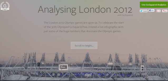
While users can do a lot of scrolling if an infographic is really, long, this isn’t what I’m talking about. Parallax or scrolling experiences change the elements on the page to update the experience as a user goes through it. I really like this approach for sharing a story or topic with a user. Below is an example from Go Squared which is about the 2012 London Olympics. Other great examples include Dangers of Fracking and Google’s How Search Works
Video
Video is obviously a good medium for sharing a story but it can be great for sharing data as well. Plus videos tend to be more engaging and users will usually spend more time watching a video than reading an infographic. This video from the New York International Auto Show is a really good example (though it should have been hosted on their own site). The video contains a lot of data and could in its own right be an infographic, but presenting the data in video format is much more compelling.
