
I ignored the opportunity to link build with infographics for far too long. As an engineer turned search engine professional, the idea of creating art scared me. I prefer complicated puzzles and problems over design, but after seeing so many others succeed I decided to go all in.
So, a few months back, we created a Beer in Colorado graphic. I’m by no means an infographic expert, which you’ll see as you read on, but some of the work we did will hopefully be useful for your next (or first) infographic project.
Promotion Strategy
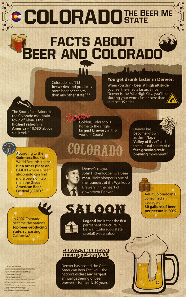
We chose Colorado beer as our topic, because we wanted to piggyback onto Colorado’s annual Great American Beer Festival (GABF). In the beer blogging world GABF is akin to the “Superbowl of beer.” The number of beer bloggers that cover this event is astonishing, which is what got me salivating at the link prospects. However, the toughest part would be reaching those bloggers. We chose to focus on four different promotion strategies.
1 – Contacting Beer Bloggers and Beer Associations Directly
We launched the graphic a few weeks before the event by contacting individual beer bloggers and beer-related sites to ask them for feedback on our graphic. Every email was personalized, and we reminded them of the upcoming beer festival with the hope that they would post our graphic on a page or post dedicated to the GABF.
2 – Contacting Infographic Bloggers
Here is a list of a few of the infographic sites that we submitted our graphic to and/or picked our graphic up spontaneously. If you’re like me, you’ll bookmark these for your next infographic promotion:
- http://www.coolinfographics.com/
- http://www.submitinfographics.com/
- http://www.vizworld.com/
- http://www.infographicsshowcase.com/
- http://visualoop.tumblr.com/
3 – Press Release
We used Google Trends to look at the most popular GABF press coverage from 2009 in order to determine the best timing for our press release and press contact. The most significant stories about the event occurred the Saturday before and then the day of, so we timed our 2010 press outreach and release accordingly.
4 – Social Media
We ran an ad on Facebook targeting beer fans in Colorado with an ad headline designed to challenge viewers. It read: “Think you know beer? Check out this Colorado beer trivia.” We had limited success, but it did help our page get some spontaneous “likes.”
We used Twitter to shout out to every blogger that included our graphic on their site, as well as SponsoredTweets to get the word out to bloggers early in the process. Finally, we promoted the infographic on our own blog and on our Facebook page the week of the GABF.
Lesson: Infographics Should Contain Hearty Data
The most stinging criticism from the infographic bloggers we contacted had to be that our infographic was light on data. Unlike some of the most successful infographics we bench-marked, we didn’t include a data-intensive graph or diagram. The reason? I didn’t think any of the numerical data I found was very interesting.
Of course, after the fact, I received half-dozen suggestions on data possibilities, and I struck the palm of my hand against my head with every piece of advice I received. Why didn’t I think of that?
Lesson: An infographic needs some strong numerical data to meet the standards of infographic critics, as well as to have some value as a reference material.
Lesson: Get Community Buy-In Before You Begin
I did not bring beer experts into the project early; my second regret. We contacted a knowledgeable beer blogger as well as a local brewing advocacy group for feedback after our graphic was done, and in both cases I learned of a missed opportunity.
The blogger would have helped us promote the graphic had we done something specific to her state (which would have been easy to create side-by-side with our Colorado graphic), and the brewing advocacy group would have been on-board had we not included the beer fact “you get drunk faster in Colorado.” They said they would have been happy to help us if we hadn’t sullied the image of beer drinking with drunkenness (my words, not theirs).
The point: Had I contacted these people earlier and gauged their interest in participating, we might have had a much more successful product.
Lesson: Design For The Web
When we conceived our plan, I wanted to be sure that the final graphic would be available in both web and print resolutions. As a result, our designer started his design with print resolution in mind and then scaled things down to web resolution, which caused a problem: the text from the print version was too small to be legible in our web version when scaled down. As a result, we had to create two distinct graphics – one designed for web, and one designed for print. I would have saved some time and money had we planned for this originally.
In terms of the best size, I found that our 600px wide graphic had the best embed rate. The 500px wide graph, despite being fairly legible, wasn’t quite big enough for most bloggers that used our graphic.
Results
Our graphic garnered dozens of good quality links from beer bloggers, exposed Spork Marketing to local breweries, and helped me develop a process for our next infographic. Our cost-per-link was incredibly low when compared to some other projects we’ve done—low enough, in fact, to be cost-effective for some of our small business clients.
