

Mobile traffic has already surpassed desktop traffic online. More than half of all traffic is from smartphones and tablets now.
Plus, 79 percent of global internet traffic will be mobile by the end of 2018.
And it’s no secret that Google places a big importance on mobile.
Mobile is critical in today’s world. But just having a mobile site doesn’t mean you are free from potential issues.
Nowadays, having a mobile site can’t be an afterthought. It shouldn’t be just another addition to appeal to Google.
Mobile sites are becoming the cornerstone of content consumption and buying. Mobile searches lead to purchase decisions and increased buying intent.
Is your site ready for Google’s mobile-first indexing? If not, you’re risking both sales and traffic.
Here’s how to find out and ensure you avoid potential ranking problems.
Google’s Mobile-First Index Explained (What Is it, Really?)
When most people first heard about mobile-first indexing, it seemed like the apocalypse was upon us.
Websites were burnt to the ground. Riots started forming in online forums. Letters were sent to local congress branches.
OK, maybe that’s a slight exaggeration. But amongst all that noise, the true meaning of mobile-first was easily lost or even misconstrued in an online game of telephone.
But still, Google’s mobile-first indexing announcement is big. It will fundamentally change the way that we optimize and create content in the coming years.
So, what exactly is it?
Here’s a brief, digestible version:
Instead of indexing desktop versions of a given site to evaluate and rank pages based on relevance, they’ll do it for your mobile site first.
Why?
Well, according to Google (and countless other studies), mobile traffic has surpassed desktop traffic on Google.
Google’s entire business and foundation is built on a simple principle: give the user information as fast possible that’s as accurate as possible.
For example, when you search for “what animals live in West Africa,” you expect an entire list curated at your fingertips in a perfect format.
That means perfectly optimized images, a fast page speed, and text that you can read without straining your eyes.
Google wants to deliver content fast and effectively. To meet this demand, Google can’t simply sit back and index desktop sites first when the majority of their traffic is on mobile.
That opens the door for tons of poor user experiences with their search engine that could prompt users to try competitors instead.
In Google’s own words:
“Although our search index will continue to be a single index of websites and apps, our algorithms will eventually primarily use the mobile version of a site’s content to rank pages from that site, to understand structured data, and to show snippets from those pages in our results.”
With constant developments on their SERPs, Google is using this stepping stone as a way to develop the ease of use and overall UX of their platform.
But why isn’t this change simply called “mobile indexing” instead? Because Google isn’t switching over to only mobile indexing. It’s simply “mobile-first” indexing. Meaning you shouldn’t be considering scrapping or slacking on your desktop version of your site.
The mobile-first indexing change means one fundamental change for most businesses out there:
You can’t put your mobile site on the backburner anymore. It must become a huge focus of your optimization strategy if you want to continue to drive organic visits.
Thankfully, not everyone has to do tons of work to account for this change. In fact, you might be perfectly fine right now without a single tweak to your existing setup.
But depending on your current site architecture, it’s also possible that you’re far behind.
Here’s how to know if your site is ready for mobile-first and how to prepare yourself if you aren’t.
Is Your Site Ready for Mobile-First? Here’s How to Find Out
You know how important mobile is now, especially with the roll-out of mobile-first.
But how do you know if your site is “in the clear” or ready to go?
It depends heavily on the current setup of your desktop and mobile sites.
Let me break down a few common scenarios that you might fall under to see if your site is ready for Google’s mobile-first index:
Mobile-Responsive vs. Mobile-Friendly
Two of the most common solutions people use for mobile websites are mobile-responsive and mobile-friendly sites.
While they are generally similar, they have major differences that can negatively impact your SEO in the mobile-first index.
Mobile-responsive sites (or dynamic servings sites) have their primary content, including text, images, video, and any page elements, syncing dynamically between the desktop and mobile site.
Google prefers responsive web design, as it allows the server to always send the same HTML code to all devices.
Responsive sites virtually eliminate the most common mobile user experience issues:
Pinching, zooming, squinting, and all other annoying functions that you likely have come across hundreds if not thousands of times when using mobile.
You know, the image that you can’t even see when turning your phone into landscape mode? That’s a sign that a website isn’t mobile responsive.
On the other hand, mobile-friendly sites are where you commonly see issues related to the user experience.
Mobile-friendly sites allow your content to dynamically change when seen on a mobile browser. But that doesn’t mean your content is responsive. It simply means you won’t see a desktop version of the site on mobile. Instead, you’ll see a functional mobile site, but page elements will still likely be impacted.
The problem? It doesn’t work in today’s world of competing smartphones and tablets. Devices come in different sizes with different aspect ratios.
The iPad Mini and the iPad Pro are fundamentally different tablets with vastly different aspect ratios. Compare that to an iPhone X or Galaxy, and you start to see the problem.
Mobile-friendly isn’t going to cut it.
According to Google, if your site is mobile-responsive, you are in the clear. Congrats!
You don’t have to do any extra work (besides maintaining a great site), as your content dynamically updates perfectly on mobile.
But if you’re still using a mobile-friendly design, you will need to update content accordingly to score high with mobile-first indexing.
Separate Mobile Sites
Another somewhat common method of displaying mobile content is separating desktop and mobile sites into two separate entities.
While it seems like a good idea, it won’t be easy to manage when mobile-first rolls around.
Why? You’ll have to monitor multiple websites as separate, individual sites.
Instead of writing a new blog post or updating an old one for your desktop site and being able to view it perfectly on mobile, you’ll have to reformat content, images, and page elements on your mobile site.
Not only does content get impacted, but structured data and metadata also need updating without impinging on duplicate content rules.
And the complications go beyond your content. Structured data and metadata also need updating without impinging on duplicate content rules.
That means more work for less reward.
If you currently have a separate mobile site and don’t plan on making the jump to a mobile-responsive site, ensure that you’ve added the mobile version of your site to Google Search Console.

Consider making the switch to a mobile-responsive site to prepare yourself for Google’s mobile-first index.
Make Your Mobile Site Stronger Than Ever
The key takeaway from Google’s mobile-first announcements is that mobile sites are a necessity and should begin to receive better care from website owners.
They can’t be an afterthought anymore. It’s just not an option for companies that rely on inbound traffic for leads and sales.
If your business doesn’t care about organic search or inbound leads and you only rely on direct referrals, you can ignore this. But that’s probably less than 0.01 percent of you.
Making your mobile site stronger than ever before is key to getting ahead of the game.
According to a 2017 report on mobile benchmarks from Google, the majority of sites in every industry are 3x slower than the best practice of three seconds.
This is likely because the average mobile page in a given industry is multiple megabytes. The best practice is 500KB.
With each added second on your mobile page speed, you can expect big increases in bounce rates. From one second to ten seconds results in a 123 percent increase in the probability of a user bouncing.
Speed can directly impact your bounce rate. And one of the biggest culprits slowing down your mobile sites is likely big, uncompressed images.
According to another mobile page speed report, fewer images on a mobile page result in more conversions. While you shouldn’t eliminate all images, it’s worth noting that the more images you place, the heavier your site will become and the slower it will run.
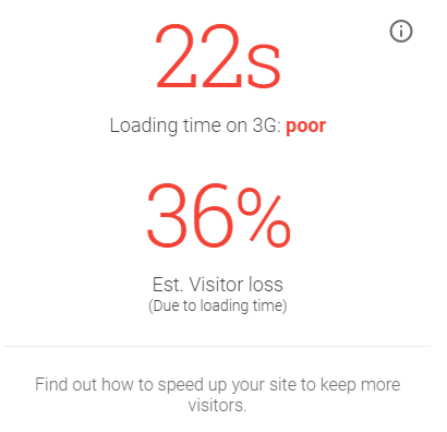
Try using Google’s Test My Site tool to see which specific areas of your mobile site need work:

It will test based on a 3G network, which will remain the most common network for worldwide mobile browsing through 2020 (according to the tool). Test My Site scans hundreds of different factors including:
- Compression, HTML / CSS, and JavaScript
- Mobile usability: configuring viewport, sizing objects, and text readability
- Comparing your site against industry benchmarks
Once the report is generated, you can instantly see how you stack up against competitors and what potential customers you’re leaving on the table:
With a curated content library, Google will list your “top fixes” in order of importance, giving you detailed steps on how to improve your site speed, content delivery, and any lagging factors impacting the user experience.
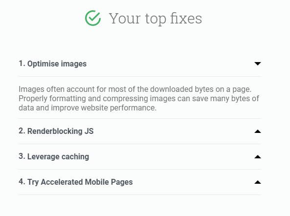
While it’s not the end-all, be-all of mobile tests, it gives you a clear picture of how to improve your current score to capitalize on mobile-first indexing.
Conclusion
Mobile traffic isn’t the wave of the future. It’s already here, and it’s here to stay.
Google’s slow rollout of mobile-first indexing means that Google will index mobile sites first instead of desktop sites.
While this simple change might not seem grand, it is.
If your mobile site isn’t responsive, fast, and ready to roll, your rankings will suffer greatly.
Get your mobile site up to date with your desktop content and ensure that you always update your mobile site accordingly. Utilize the Test My Site tool to consistently improve on lagging features from content and text readability to page speed.
While you may not see effects for a while, it’s always better to be ahead of the curve than struggling to catch up.
More Mobile Search Resources:
- Google’s Mobile-First Index: What It Is & How You Can Prepare
- What Does Mobile First Index Actually Mean?
- Google to Move Many More Sites to Mobile-First Index Very Soon
- Google: Here are 6 Ways You Can Get Ready for the Mobile-First Index
- Google Introduces Breadcrumb SERPs
Image Credits
Screenshots taken by Brad Smith, February 2018
