

Over the years, search engines have encouraged businesses to improve mobile experience on their websites. More than 60% of web traffic comes from mobile, and in some cases based on the industry, mobile traffic can reach up to 90%.
Since Google has completed its switch to mobile-first indexing, the question is no longer “if” your website should be optimized for mobile, but how well it is adapted to meet these criteria. A new challenge has emerged for SEO professionals with the introduction of Interaction to Next Paint (INP), which replaced First Input Delay (FID) starting March, 12 2024.
Thus, understanding mobile SEO’s latest advancements, especially with the shift to INP, is crucial. This guide offers practical steps to optimize your site effectively for today’s mobile-focused SEO requirements.
What Is Mobile SEO And Why Is It Important?
The goal of mobile SEO is to optimize your website to attain better visibility in search engine results specifically tailored for mobile devices.
This form of SEO not only aims to boost search engine rankings, but also prioritizes enhancing mobile user experience through both content and technology.
While, in many ways, mobile SEO and traditional SEO share similar practices, additional steps related to site rendering and content are required to meet the needs of mobile users and the speed requirements of mobile devices.
Does this need to be a priority for your website? How urgent is it?
Consider this: 58% of the world’s web traffic comes from mobile devices.
If you aren’t focused on mobile users, there is a good chance you’re missing out on a tremendous amount of traffic.
Mobile-First Indexing
Additionally, as of 2023, Google has switched its crawlers to a mobile-first indexing priority.
This means that the mobile experience of your site is critical to maintaining efficient indexing, which is the step before ranking algorithms come into play.
Read more: Where We Are Today With Google’s Mobile-First Index
How Much Of Your Traffic Is From Mobile?
How much traffic potential you have with mobile users can depend on various factors, including your industry (B2B sites might attract primarily desktop users, for example) and the search intent your content addresses (users might prefer desktop for larger purchases, for example).
Regardless of where your industry and the search intent of your users might be, the future will demand that you optimize your site experience for mobile devices.
How can you assess your current mix of mobile vs. desktop users?
An easy way to see what percentage of your users is on mobile is to go into Google Analytics 4.
- Click Reports in the left column.
- Click on the Insights icon on the right side of the screen.
- Scroll down to Suggested Questions and click on it.
- Click on Technology.
- Click on Top Device model by Users.
- Then click on Top Device category by Users under Related Results.
- The breakdown of Top Device category will match the date range selected at the top of GA4.
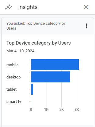 Screenshot from GA4, March 2024
You can also set up a report in Looker Studio.
- Add your site to the Data source.
- Add Device category to the Dimension field.
- Add 30-day active users to the Metric field.
- Click on Chart to select the view that works best for you.
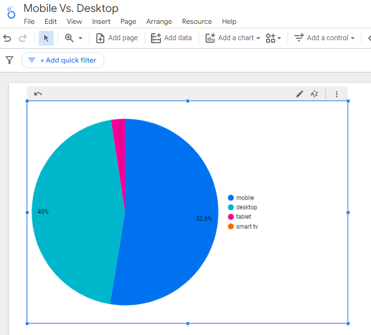 Screenshot from Looker Studio, March 2024
You can add more Dimensions to really dig into the data to see which pages attract which type of users, what the mobile-to-desktop mix is by country, which search engines send the most mobile users, and so much more.
Read more: Why Mobile And Desktop Rankings Are Different
How To Check If Your Site Is Mobile-Friendly
Now that you know how to build a report on mobile and desktop usage, you need to figure out if your site is optimized for mobile traffic.
While Google removed the mobile-friendly testing tool from Google Search Console in December 2023, there are still a number of useful tools for evaluating your site for mobile users.
Bing still has a mobile-friendly testing tool that will tell you the following:
- Viewport is configured correctly.
- Page content fits device width.
- Text on the page is readable.
- Links and tap targets are sufficiently large and touch-friendly.
- Any other issues detected.
Google’s Lighthouse Chrome extension provides you with an evaluation of your site’s performance across several factors, including load times, accessibility, and SEO.
To use, install the Lighthouse Chrome extension.
- Go to your website in your browser.
- Click on the orange lighthouse icon in your browser’s address bar.
- Click Generate Report.
- A new tab will open and display your scores once the evaluation is complete.
 Screenshot from Lighthouse, March 2024
You can also use the Lighthouse report in Developer Tools in Chrome.
- Simply click on the three dots next to the address bar.
- Select “More Tools.”
- Select Developer Tools.
- Click on the Lighthouse tab.
- Choose “Mobile” and click the “Analyze page load” button.
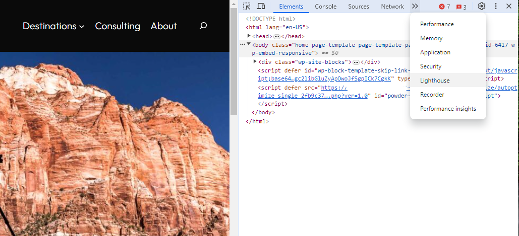 Screenshot from Lighthouse, March 2024
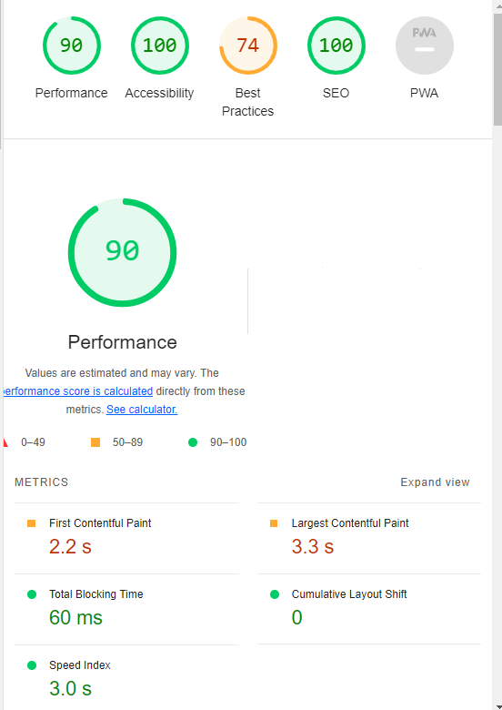
Another option that Google offers is the PageSpeed Insights (PSI) tool. Simply add your URL into the field and click Analyze.
PSI will integrate any Core Web Vitals scores into the resulting view so you can see what your users are experiencing when they come to your site.
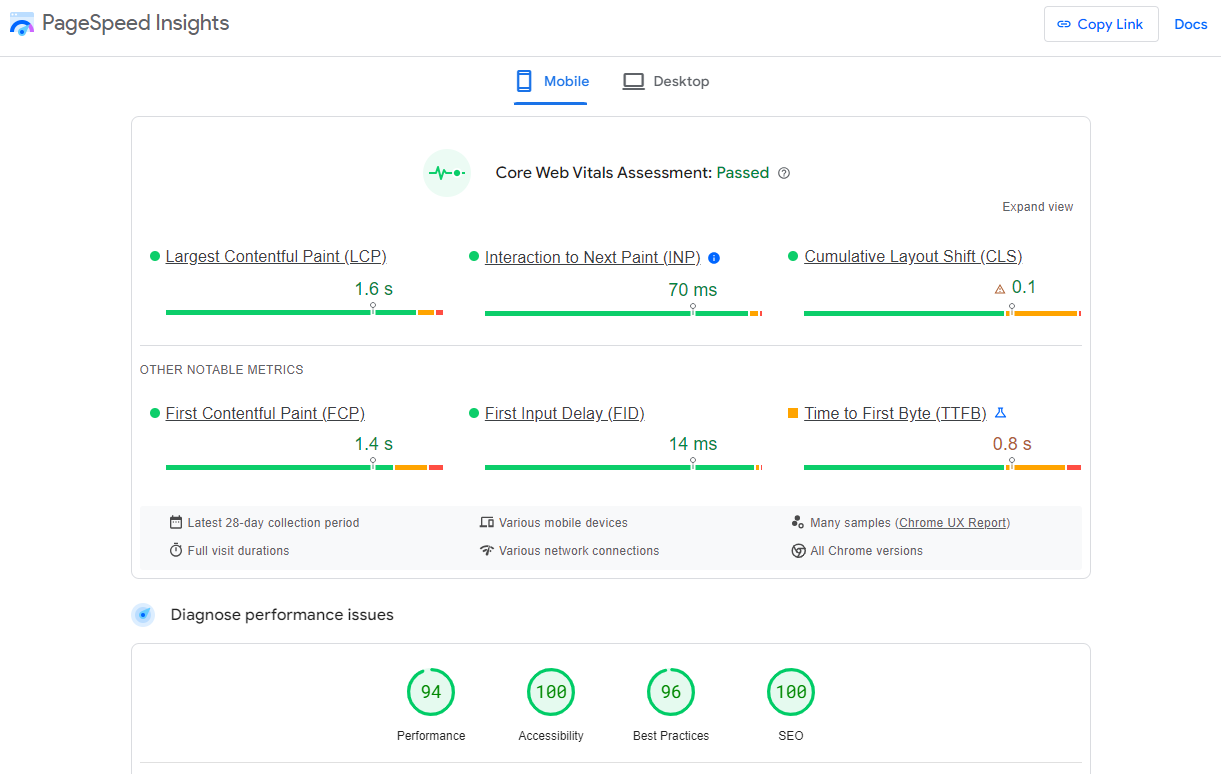 Screenshot from PageSpeed Insights, March 2024
Other tools, like WebPageTest.org, will graphically display the processes and load times for everything it takes to display your webpages.
With this information, you can see which processes block the loading of your pages, which ones take the longest to load, and how this affects your overall page load times.
You can also emulate the mobile experience by using Developer Tools in Chrome, which allows you to switch back and forth between a desktop and mobile experience.
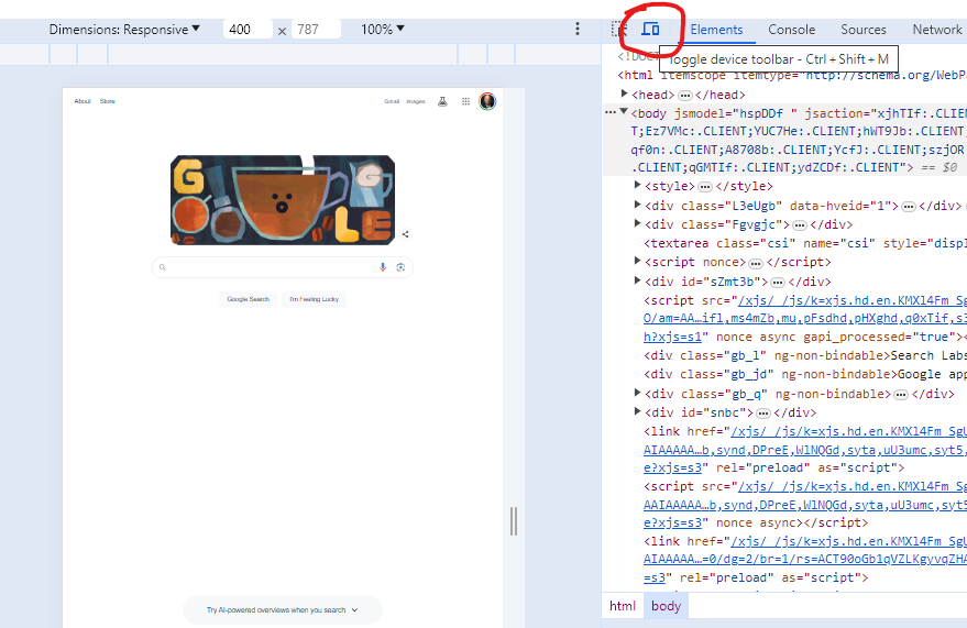 Screenshot from Google Chrome Developer Tools, March 2024
Lastly, use your own mobile device to load and navigate your website:
- Does it take forever to load?
- Are you able to navigate your site to find the most important information?
- Is it easy to add something to cart?
- Can you read the text?
Read more: Google PageSpeed Insights Reports: A Technical Guide
How To Optimize Your Site Mobile-First
With all these tools, keep an eye on the Performance and Accessibility scores, as these directly affect mobile users.
Expand each section within the PageSpeed Insights report to see what elements are affecting your score.
These sections can give your developers their marching orders for optimizing the mobile experience.
While mobile speeds for cellular networks have steadily improved around the world (the average speed in the U.S. has jumped to 27.06 Mbps from 11.14 Mbps in just eight years), speed and usability for mobile users are at a premium.
Read more: Top 7 SEO Benefits Of Responsive Web Design
Best Practices For Mobile Optimization
Unlike traditional SEO, which can focus heavily on ensuring that you are using the language of your users as it relates to the intersection of your products/services and their needs, optimizing for mobile SEO can seem very technical SEO-heavy.
While you still need to be focused on matching your content with the needs of the user, mobile search optimization will require the aid of your developers and designers to be fully effective.
Below are several key factors in mobile SEO to keep in mind as you’re optimizing your site.
Site Rendering
How your site responds to different devices is one of the most important elements in mobile SEO.
The two most common approaches to this are responsive design and dynamic serving.
Responsive design is the most common of the two options.
Using your site’s cascading style sheets (CSS) and flexible layouts, as well as responsive content delivery networks (CDN) and modern image file types, responsive design allows your site to adjust to a variety of screen sizes, orientations, and resolutions.
With the responsive design, elements on the page adjust in size and location based on the size of the screen.
You can simply resize the window of your desktop browser and see how this works.
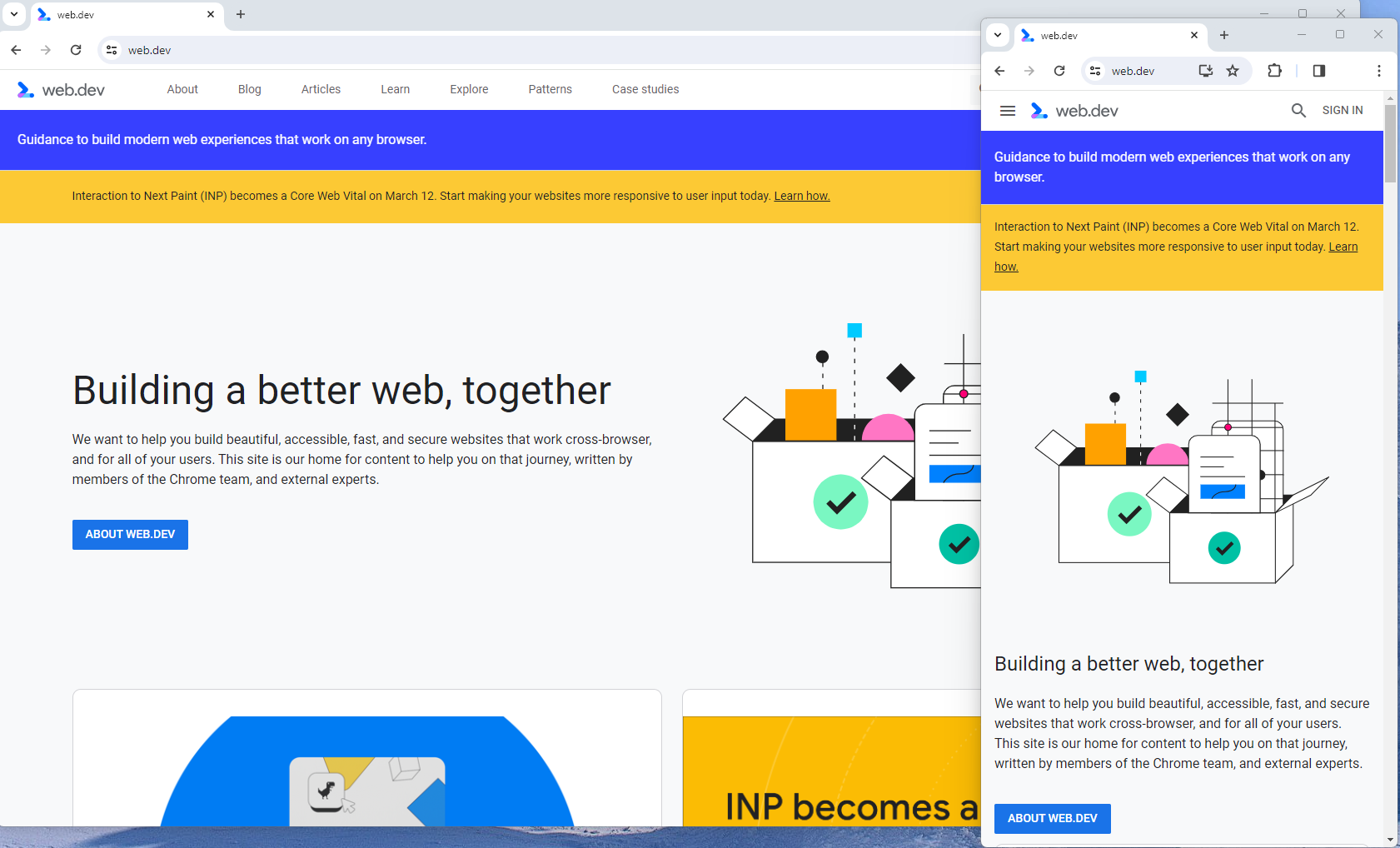 Screenshot from web.dev, March 2024
This is the approach that Google recommends.
Adaptive design, also known as dynamic serving, consists of multiple fixed layouts that are dynamically served to the user based on their device.
Sites can have a separate layout for desktop, smartphone, and tablet users. Each design can be modified to remove functionality that may not make sense for certain device types.
This is a less efficient approach, but it does give sites more control over what each device sees.
While these will not be covered here, two other options:
- Progressive Web Apps (PWA), which can seamlessly integrate into a mobile app.
- Separate mobile site/URL (which is no longer recommended).
Read more: An Introduction To Rendering For SEO
Interaction to Next Paint (INP)
Google has introduced Interaction to Next Paint (INP) as a more comprehensive measure of user experience, succeeding First Input Delay. While FID measures the time from when a user first interacts with your page (e.g., clicking a link, tapping a button) to the time when the browser is actually able to begin processing event handlers in response to that interaction. INP, on the other hand, broadens the scope by measuring the responsiveness of a website throughout the entire lifespan of a page, not just first interaction.
Note that actions such as hovering and scrolling do not influence INP, however, keyboard-driven scrolling or navigational actions are considered keystrokes that may activate events measured by INP but not scrolling which is happeing due to interaction.
Scrolling may indirectly affect INP, for example in scenarios where users scroll through content, and additional content is lazy-loaded from the API. While the act of scrolling itself isn’t included in the INP calculation, the processing, necessary for loading additional content, can create contention on the main thread, thereby increasing interaction latency and adversely affecting the INP score.
What qualifies as an optimal INP score?
- An INP under 200ms indicates good responsiveness.
- Between 200ms and 500ms needs improvement.
- Over 500ms means page has poor responsiveness.
and these are common issues causing poor INP scores:
- Long JavaScript Tasks: Heavy JavaScript execution can block the main thread, delaying the browser’s ability to respond to user interactions. Thus break long JS tasks into smaller chunks by using scheduler API.
- Large DOM (HTML) Size: A large DOM ( starting from 1500 elements) can severely impact a website’s interactive performance. Every additional DOM element increases the work required to render pages and respond to user interactions.
- Inefficient Event Callbacks: Event handlers that execute lengthy or complex operations can significantly affect INP scores. Poorly optimized callbacks attached to user interactions, like clicks, keypress or taps, can block the main thread, delaying the browser’s ability to render visual feedback promptly. For example when handlers perform heavy computations or initiate synchronous network requests such on clicks.
and you can troubleshoot INP issues using free and paid tools.
As a good starting point I would recommend to check your INP scores by geos via treo.sh which will give you a great high level insights where you struggle with most.
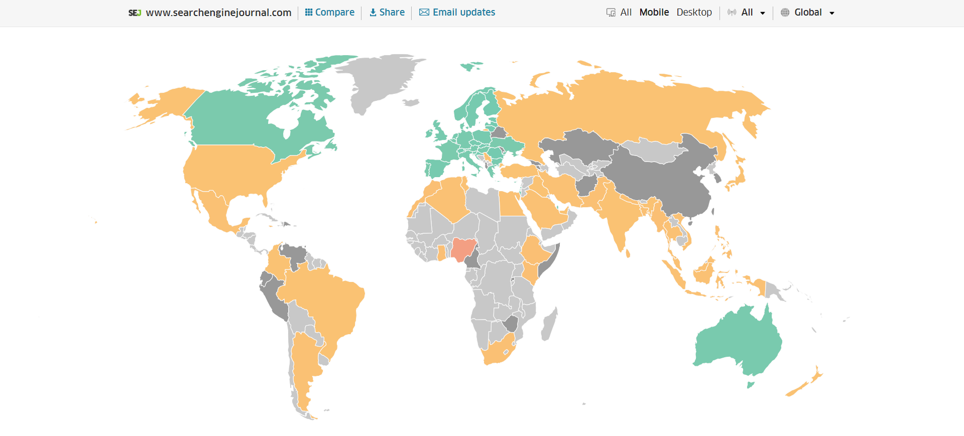 INP scores by Geos
Read more: How To Improve Interaction To Next Paint (INP)
Image Optimization
Images add a lot of value to the content on your site and can greatly affect the user experience.
From page speeds to image quality, you could adversely affect the user experience if you haven’t optimized your images.
This is especially true for the mobile experience. Images need to adjust to smaller screens, varying resolutions, and screen orientation.
- Use responsive images
- Implement lazy loading
- Compress your images (use WebP)
- Add your images into sitemap
Optimizing images is an entire science, and I advise you to read our comprehensive guide on image SEO how to implement the mentioned recommendations.
Avoid Intrusive Interstitials
Google rarely uses concrete language to state that something is a ranking factor or will result in a penalty, so you know it means business about intrusive interstitials in the mobile experience.
Intrusive interstitials are basically pop-ups on a page that prevent the user from seeing content on the page.
John Mueller, Google’s Senior Search Analyst, stated that they are specifically interested in the first interaction a user has after clicking on a search result.

Not all pop-ups are considered bad. Interstitial types that are considered “intrusive” by Google include:
- Pop-ups that cover most or all of the page content.
- Non-responsive interstitials or pop-ups that are impossible for mobile users to close.
- Pop-ups that are not triggered by a user action, such as a scroll or a click.
Read more: 7 Tips To Keep Pop-Ups From Harming Your SEO
Structured Data
Most of the tips provided in this guide so far are focused on usability and speed and have an additive effect, but there are changes that can directly influence how your site appears in mobile search results.
Search engine results pages (SERPs) haven’t been the “10 blue links” in a very long time.
They now reflect the diversity of search intent, showing a variety of different sections to meet the needs of users. Local Pack, shopping listing ads, video content, and more dominate the mobile search experience.
As a result, it’s more important than ever to provide structured data markup to the search engines, so they can display rich results for users.
In this example, you can see that both Zojirushi and Amazon have included structured data for their rice cookers, and Google is displaying rich results for both.
 Screenshot from search for [Japanese rice cookers], Google, March 2024
Using JSON-LD, you can mark up the business, product, and services data on your pages in Schema markup.
If you use WordPress as the content management system for your site, there are several plugins available that will automatically mark up your content with structured data.
Read more: What Structured Data To Use And Where To Use It?
Content Style
When you think about your mobile users and the screens on their devices, this can greatly influence how you write your content.
Rather than long, detailed paragraphs, mobile users prefer concise writing styles for mobile reading.
Each key point in your content should be a single line of text that easily fits on a mobile screen.
Your font sizes should adjust to the screen’s resolution to avoid eye strain for your users.
If possible, allow for a dark or dim mode for your site to further reduce eye strain.
Headers should be concise and address the searcher’s intent. Rather than lengthy section headers, keep it simple.
Finally, make sure that your text renders in a font size that’s readable.
Read more: 10 Tips For Creating Mobile-Friendly Content
Tap Targets
As important as text size, the tap targets on your pages should be sized and laid out appropriately.
Tap targets include navigation elements, links, form fields, and buttons like “Add to Cart” buttons.
Targets smaller than 48 pixels by 48 pixels and targets that overlap or are overlapped by other page elements will be called out in the Lighthouse report.
Tap targets are essential to the mobile user experience, especially for ecommerce websites, so optimizing them is vital to the health of your online business.
Read more: Google’s Lighthouse SEO Audit Tool Now Measures Tap Target Spacing
Prioritizing These Tips
If you have delayed making your site mobile-friendly until now, this guide may feel overwhelming. As a result, you may not know what to prioritize first.
As with so many other optimizations in SEO, it’s important to understand which changes will have the greatest impact, and this is just as true for mobile SEO.
Think of SEO as a framework in which your site’s technical aspects are the foundation of your content. Without a solid foundation, even the best content may struggle to rank.
- Responsive or Dynamic Rendering: If your site requires the user to zoom and scroll right or left to read the content on your pages, no number of other optimizations can help you. This should be first on your list.
- Content Style: Rethink how your users will consume your content online. Avoid very long paragraphs. “Brevity is the soul of wit,” to quote Shakespeare.
- Image Optimization: Begin migrating your images to next-gen image formats and optimize your content display network for speed and responsiveness.
- Tap Targets: A site that prevents users from navigating or converting into sales won’t be in business long. Make navigation, links, and buttons usable for them.
- Structured Data: While this element ranks last in priority on this list, rich results can improve your chances of receiving traffic from a search engine, so add this to your to-do list once you’ve completed the other optimizations.
Summary
From How Search Works, “Google’s mission is to organize the world’s information and make it universally accessible and useful.”
If Google’s primary mission is focused on making all the world’s information accessible and useful, then you know they will prefer surfacing sites that align with that vision.
Since a growing percentage of users are on mobile devices, you may want to infer the word “everywhere” added to the end of the mission statement.
Are you missing out on traffic from mobile devices because of a poor mobile experience?
If you hope to remain relevant, make mobile SEO a priority now.
Featured Image: Paulo Bobita/Search Engine Journal
