

If you keep updated on the latest in SEO, you may be aware of Google’s mobile-first initiatives.
Dubbed “mobilegeddon” when it first became known in 2015, transitioning client sites to full mobile experiences has become a priority for SEOs everywhere.
Optimizing for mobile is more than just design. It’s an entire discipline designed to create websites that display across a wide array of devices and screen resolutions.
And, don’t forget, there are SEO factors involved, too!
As Google’s focus changes to mobile with its mobile-first index, it is now critical to make sure that your site is fully optimized for the mobile platform.
If you don’t, you are likely to lose out on important traffic from Google’s mobile-first index.
In March 2018, Google announced that it began rolling out the mobile-first index as the default for all new domains. This means that the Google index is now primarily mobile.
In industries that rely on separate mobile sites on m-dot (m.) sub-domains, you must take certain leaps forward if you hope to compete in the Google SERPs. This is a critical decision and one that shouldn’t be taken lightly.
You may be asking:
- What elements do I need to consider for this undertaking?
- How do I design for the mobile user?
- What do I need to do to ensure that my site is compatible for these updates?
Well, you’re in luck because we have the information you may find useful in achieving a successful mobile-first implementation.
Mobile Design Factors You Must Consider
Make no mistake, design and UX (user experience) are critical factors if you hope to achieve a successful mobile SEO implementation.
From mobile menus to recognizable design patterns, these elements are critical for fostering successful conversions.
By ensuring that your site is designed in this way, you can move forward in your search campaign with confidence in your mobile site.
A Top-Down Approach to Mobile Design Is Preferable
Developing on mobile requires a mobile-first mindset. One approach that works well with this mobile-first mindset is a top-down approach.
This approach means that extensive planning is involved in the creation of the final version. Every detail is carefully calculated and measured so your mobile site does not look like a tacked-on artifact.
A bottom-up approach is exactly the opposite. Development occurs on a module-by-module basis, with not much planning or thought involved in the process along the way.
As you can imagine, creating a mobile site with the bottom-up approach is a recipe for disaster.
For the most optimal results, use a top-down approach that considers everything in your design from the smallest to the largest.
Mobile Menus
Mobile menus should be user-friendly, keeping in mind the smaller device, and should not be 100% the same as the navigation on desktop.
While the structure won’t change, the visual elements will change, and their appearance will depend on your device.
Creating recognizable design patterns for your navigation is essential for achieving a true UX-centered design. This doesn’t mean copy all design patterns that you have done previously.
Instead, you must create recognizable icons and elements as determined by your audience.
Don’t forget to “design for the fat finger,” or the largest finger of your audience.
Ensuring your elements are designed according to these factors will result in an experience that caters to your users and their need for UX that fosters better conversions and an easier-to-use website.
Seamless Design Is Imperative
Creating seamless design means that you are creating design elements across all devices, regardless of platform.
This is a different concept to responsive design, which we will cover below. Even though they do overlap a little.
If responsive design is created to combine desktop and mobile, then seamless design refers to mobile design elements.
When you have seamless design elements, they do not appear different on other screen sizes. A red button on desktop won’t appear as a blue button on mobile, for example.
Or a call-to-action form does not appear differently on the mobile device compared to the desktop device.
Different elements only serve to confuse users, and if they’re moving between devices in certain situations, this will only confuse them.
Consider Larger Tasks & Their Flow
When was the last time you visited a mobile app, only to find that its process for completing an action was nightmarish compared to the website itself?
This happens when mobile web development oversight gets away from those in charge of the site, with scope creep and bad judgment clouding engineering successful paths to completion for the app.
If your checkout process on your mobile site is nightmarish for your users, you can kiss those conversions goodbye.
Don’t include minor actions on the mobile screen. Instead, you must make sure that your primary action is visible and clearly easy to do.
If your user has to hunt around for credit card payment, or they have to work hard to find something else, they will abandon their cart.
Make sure they can at least save where they’re at as well. Mobile devices are primarily used on the go, and users must be able to save their progress in some way.
Creating a mobile experience without a choice to save your spot only serves to irritate and annoy, and not much more.
Avoid Forced Registrations
Login walls that force registration should be avoided. These walls appear when your app shows a login wall immediately upon entering the app itself. You don’t gain goodwill among users when you force their registration.
Forcing a user to register can lead to annoyance on their part, and will cause them to dislike your mobile experience.
Just doing this also leads to a loss in credibility and your standing as a service people will want to use.
When was the first time that you got frustrated with the login wall of an app and just chose not to use it because of that?
Make It Simple to Go Back to the Home Page
A simple icon leading back to home is a great way to create an easy link back to the home page of your site.
If you don’t make it easy for users to get back to the home page, they will likely abandon your site for another one that does.
Mobile users are not all smart SEOs like us.
They need help figuring out where things are on your mobile site until they become more familiar with it.
Creating ambiguity just leads to bad UI, and fewer conversions as a result, because your users cannot understand where things are.
Just because you know your industry, doesn’t mean your client knows it in the same way.
Use the Correct Layout
Creating a layout for the mobile device has its own challenges, but can be done once you know a few things.
First of all, you must know what the targets on the touch screen device are going to do, and how they are going to function.
Designing for the right finger size is important because this means that your users will be able to use your mobile site design.
Adobe recommends that you design mobile touch targets with this size in mind: 7-10mm. Their argument is that this size “allows a finger to aim and touch the target without too much frustration.”
The entire goal here is to make mobile accessibility much easier than it otherwise would be, and your site easier to use for the user.
Don’t Forget About Text Size!
One more design consideration is text size.
Not only must the text size of navigation elements be considered, but the size of regular text content on the page is also important.
Without quality text at a legible size, you could lose readers. And, you won’t be able to communicate effectively.
By including the right text size as is appropriate for the application of your mobile site, it will help you retain readers by keeping them on your site.
Don’t let a simple thing like text size prevent you from capturing your audience and engaging with them.
The color contrast ratio of your text is something you need to be thinking about.
This is an accessibility point because the worse your contrast ratio is, the more you exclude certain types of readers (especially those who are color blind).
Use the website color contrast checker tool here to determine whether or not your chosen colors meet the minimum threshold of accessibility as defined by the level you want to reach.
Adobe recommends a 4.5:1 contrast ratio.
Read more about the W3C Color Accessibility Guidelines for more about color contrast ratios.
Google Mobile SEO Considerations
In addition to design, there are SEO considerations for Google’s mobile-first index, especially if you are transferring over to mobile-first.
Considerations include things like:
- Page speed.
- Cross-platform.
- Cross-display compatibility.
- Not including pop-ups or interstitials.
- Mobile content.
- Proper image optimization.
Google’s Mobile-First Index Contains Only Mobile Results
Once upon a time before Google’s Mobile-First Index, you had a mix of both desktop and mobile results.
If someone performed a search from desktop, they would get filtered results for desktop.
If someone did a search on a mobile device, they would show results catered to mobile.
This is no longer the case. Since Google’s mobile-first update, all search results are determined by using the mobile version of the indexed page.
The consideration here is critical because it will affect how you create content and design for your mobile device.
What Google Considers a Mobile Device
To pursue the correct strategy in tackling the mobile SEO world, we must first identify what Google considers to be a mobile device. Do they consider all portable devices mobile devices?
No, they do not.
In Google’s Web Developer Guidelines for Mobile Devices, they mention the following:
“Mobile: In this document, “mobile” or mobile devices refers to smartphones, such as devices running Android, iPhone, or Windows Phone. Mobile browsers are similar to desktop browsers in that they can render a broad set of the HTML5 specification, although their screen size is smaller and in almost all cases their default orientation is vertical.
Tablets: We consider tablets as devices in their own class. When we refer to mobile devices, we generally aren’t referring to tablets. Tablets tend to have larger screens, which means that, unless you offer tablet-optimized content, you can assume that users expect to see your site as it would look on a desktop browser rather than on a smartphone browser.”
As you can see, pursuing a responsive design approach is preferable because it targets all mobile devices, and fulfills Google’s requirements for being mobile-friendly.
This is why a top-down approach is so important. It takes into account all potential devices rather than simply one or two.
Make Sure Your Content Is the Same
Your content must be the same on both desktop and mobile.
You might be wondering if longer content is more suitable for either.
You may be surprised to learn that people actually will read long content on mobile devices according to this case study:
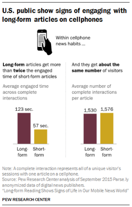
This case study also shows the following:
“The data also reveal that while shorter news content is far more prevalent than long-form and thus draws more total traffic, long-form articles are accessed at nearly the same rate. Fully 76% of the articles studied were fewer than 1,000 words in length. But, article for article, long-form stories attract visitors at nearly the same rate as short-form: 1,530 complete interactions per long-form article and 1,576 per short-form.”
If you don’t have the same content on desktop as you do on mobile, you may fall victim to claims of cloaking or other manipulative SEO tactics.
When in doubt, always use the same content on both platforms.
Make Sure Google Is Able to Crawl Everything
For certain sites, you may have many blocked resources in your robots.txt file.
These resources include things like JavaScript, CSS, and other types of files that you may not want to have indexed.
Without proper developmental oversight, you could quickly lose sight of these types of files.
Perform an analysis of your robots.txt file and make sure it is not blocking too many critical resources.
These resources all affect rendering, crawling, and indexing.
To get the most of your mobile site, you must ensure that your site is fully crawlable and accessible by Google mobile.
Like Google’s Gary Illyes says: “Make that damn site crawlable!”
Address Annoying Interstitials Before You’re Penalized
Are you aware of interstitials?
You may not know what they are, especially if you have encountered them in passing.
You know, the ads that appear blocking the page on mobile devices?
Advertisements that just don’t seem to want to stop, or otherwise allow you to click away from their annoyance?
These are known as interstitials, or modular pop-up ads that show up unannounced in your phone’s window.
They block your viewing experience, sometimes forcing you to click on the ads.
Google has rolled out an interstitials penalty, all the way back in 2017.
To make sure that you don’t run afoul of Google’s guidelines in this regard, you must make sure that your:
- Site isn’t hiding content with ads.
- Pop-ups serve a purpose.
- Plugins (if you use WordPress) comply with Google’s guidelines for interstitials.
Test Your Mobile Design & Adjust as Needed
Once your design is complete, it’s a great idea to test it using a testing program like Browser Stack.
This program will allow you to view your mobile site on as many different platforms as possible, providing direct feedback you would not get through traditional analysis.
Building a testing methodology will allow you to increase efficiency and spot design issues before they become issues for your customers.
You can also use the Web Developer Toolbar extension for Chrome and Firefox to test your mobile design directly in your browser.
Page Speed Is Critical
Faster websites on mobile should be your ultimate goal.
Now, more than ever, optimizing for page speed must be a staple of your optimization strategy.
There are many ways to achieve the lowest page speeds possible on your website.
Adobe Photoshop’s lossless image compression for the web is a great function you can use to physically resize and crunch your graphics.
What’s the difference between physically resizing and crunching?
When you physically resize your images, you only resize the width and height dimensions. Your pixel density stays the same.
So you will end up with a smaller image, but your page size will still be 300 MB because of that one 300 MB image.
Crunching your image refers to reducing the physical pixel density of the image. Adobe Photoshop’s lossless image compression targets both, and you must choose the proper settings to do so.
If you have a WordPress site, using a plugin called SMUSH can do both for you, resulting in a final image that loads fast enough for mobile.
Test Your Site for Page Speed
Assessing your site’s page speed and making adjustments as necessary is another critical point in your optimization process.
Using the tool here, you can test just your page speed, and make needed changes to satisfy their recommendations.
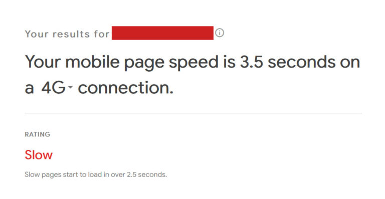
Testing your site regularly can keep you updated on any recent changes your web developer made, or any other member of your team. And, it will help you keep your page speed bottlenecks in check.
When in doubt, always test!
Getting Your Site on Mobile-First Takes Time
Make no mistake, ensuring your site is fully mobile-first compatible is a timely and costly endeavor.
By using the principles above and working on integrating a full mobile-first philosophy, it is possible to get your site on mobile.
Hiring a competent developer is the first step. This is followed with a top-down approach, ensuring that all pieces of your site’s mobile SEO puzzle fit together properly.
Making sure that bottlenecks are plugged up and present no further issues is critical, along with implementing credible designs of mobile elements that will delight your consumers.
Despite the challenge, getting your site onto a mobile-first platform is crucial in this day and age of Google’s mobile-first index.
You must keep yourself updated by reading as many resources as possible on the topic before you leap into the project management parts.
Just a surface-level overview is enough, provided you hire the right developer who can code your site.
Regardless of whether you’re an SEO or someone just getting acquainted with all of the moving parts, you must ensure that all of your mobile-optimization tasks are completed properly.
Your SERP performance will thank you many times over.
More Resources:
- Google’s Mobile-First Indexing: Everything We Know (So Far)
- 7 Ways a Mobile-First Index Impacts SEO
- Google Updates Mobile-First Indexing Best Practices Documentation
Image Credits
Featured Image: Created by author, February 2020
