

The world craves minimalism.
So much so, that whichever aspect of our lives you look at – whether it is the lifestyles we lead, homes we live in, or the products we consume – minimalism is present in every facet.
Even the smartphones in our pocket prove that minimalist design has more than caught on.
Why Minimalism?
Often confused with simplicity, the concept of minimalism entails reducing all elements to only include those that are essential.
This means that while minimalism is simple, simplicity, or using simple forms, does not necessarily translate to minimalism.
In the world of design, minimalism is used to directly convey the message without the unnecessary noise and obstruction of focus due to other distracting elements.
Seeing the benefits of using minimalism to swiftly and effectively convey the message, the minimalist approach has taken root in many branches of design.
From painting and sculptures to digital product design and web design, minimalism has managed to root itself and understandably so.
Designed with minimalism in mind, digital products and web designs are no less impressive.
Apple’s brand is one of the best examples of having a minimalist approach in mind when designing products.

The design itself is clean and sleek, and it puts an accent on every aspect of customer experience – from the first moment you hold an iPhone packaging in your hand, peeling off the foil of your screen, to finally using the smartphone.
Minimalist designs are visually appealing and user-friendly, so it’s really not surprising that so many businesses prefer to have a minimalist web design, as it helps them boost their company’s bottom line.
Taking Minimalist Approach to Web Design
Your company’s website is the best business card you have.
It tells your customers all they need to know about your business – from where to find you to what the business is all about.
Websites that are not functional, take a long time to load, have too many distracting elements or are not user-friendly will make your potential customers bounce in a heartbeat.
In essence, a business’ website tells customers all they need to know about the company, but if your visitors don’t stick around long enough to know who you are or what you do, they won’t actually get to know you or understand what you have to offer.
In minimalist design, gestalt takes precedence over all else.
This means that the elements that are connected must remain close to one another, whereas elements that lack connection should be further apart.
Every element on your website that is crucial in guiding the user should be bigger, bolded, or feature strong colors.
From these simple principles, you draw all other rules of minimalist approach in web design, whether typography, negative space, visual elements or overcrowding are in question.
Instead of overcrowding your website with elements that are not necessary, feature only the most essential ones.
This way, the most important information will quickly grab users’ attention, allowing them to easily solve their problems.
Choosing a minimalist approach for your company’s web design means making conscious decisions about the layout of the website.
This means that you ought to question every design decision, putting the user first.
Ask yourself:
- Will the chosen typography be too off-putting for users?
- Is the typography easily readable?
- Does the chosen element distract the user from their path?
- Are there too many images on the page?
- Is the color scheme appropriate?
- Are too many colors used?
Minimalist Web Design & SEO
SEO-friendly websites receive more traffic.
This means that when designing a website, you need to keep both the users and search engines in mind.
Questions of how to create the best user experience should keep you up at night.
Google said that when designing a website, you should aim to serve your users’ needs… but users aren’t limited to consumers – you have to consider search engines, too.
We all know that competition is fierce, and we need to do our best to keep users on their track when they visit the website.
We all want our websites to load quickly, and minimalist design entails lesser features, which means that there will be lesser features to load.
However, even if you have a single image on your webpage, it is still important to optimize it.
Great and memorable user experience is the basis of a minimalist approach.
It does not only aim to be visually appealing, but to keep the most important for the user in order to gain valuable information without unnecessary chaos surrounding it.
So, rather than losing your customers over a badly designed website, try a minimalist approach and create an experience on your site that is simple, but not one that they will be quick to forget.
Minimalist Web Design in Action
When it comes to creating a plan for a minimalist web design, here are three focus areas you should consider leveraging.
1. Visual Elements
Every detail must be significant.
It should be functional and serve the purpose.
So when designing take each element into account, stop and ask yourself: Does this detail serve a function or is it just visual?
If it is only visual, then you must step back and decide if it belongs on your webpage or it clutters it.
Graphic Elements
All graphic elements need to be usable.
Think of the purpose the added element serves.
- Does it have the role of shape divider?
- Does it lead the eye, meaning it will help the user navigate easily?
- Or, does it highlight the information that should be immediately noticeable to the user?
If it doesn’t serve a purpose, avoid using it.
Yes, illustrative detail might appear to be appealing to the eye.
However, every element must be added with a purpose in mind.
This applies to all types of visual elements, images, illustrations, and shapes.
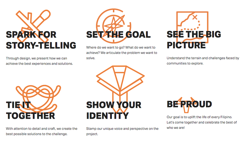
A great example of how to incorporate graphic elements with minimalism can be found on plus63’s site:
Images & Videos
Having a single image featured on a homepage may seem monotonous, but think of it as highlighting a point.
Here’s an example by Measponte, a website that sells shoes, that features one simple image of a shoe with overlaid copy:

Instead of an image, you can always use a video or animation for the first impression.
Your website can still look clean and have minimal copy, but also be interactive and inform the user what they need to know.
Although sometimes perceived to be on the “heavy” side, videos – like images – can be optimized to ensure they do no hurt your page loading time.
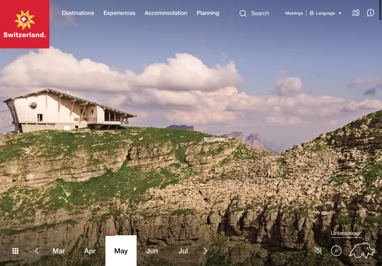
Take a look at the website from My Switzerland, they’ve done a great job:
The most prominent type of minimalist web design focuses on having a hero image and hero text in focus, all the other elements, whether visual or written are featured on other pages.
Images vs. Words
A key element to keep in mind is the amount of copy your webpage uses.
Words are the quickest and most reliable way to get your message across.
However, they can be our biggest enemy.
If a user lands on a homepage with a ton of the copy, they are unlikely to stop and read.
What’s more likely to happen is that consumers will bounce off your site and search for information elsewhere.
So, as a rule of thumb, don’t let words overtake the webpage; use as little as possible and only include essential information.
Allow navigation pages on your site to be dedicated to describing a product, service, or mission, featuring more copy than your homepage.
Background Image
Choosing the right background image is important.
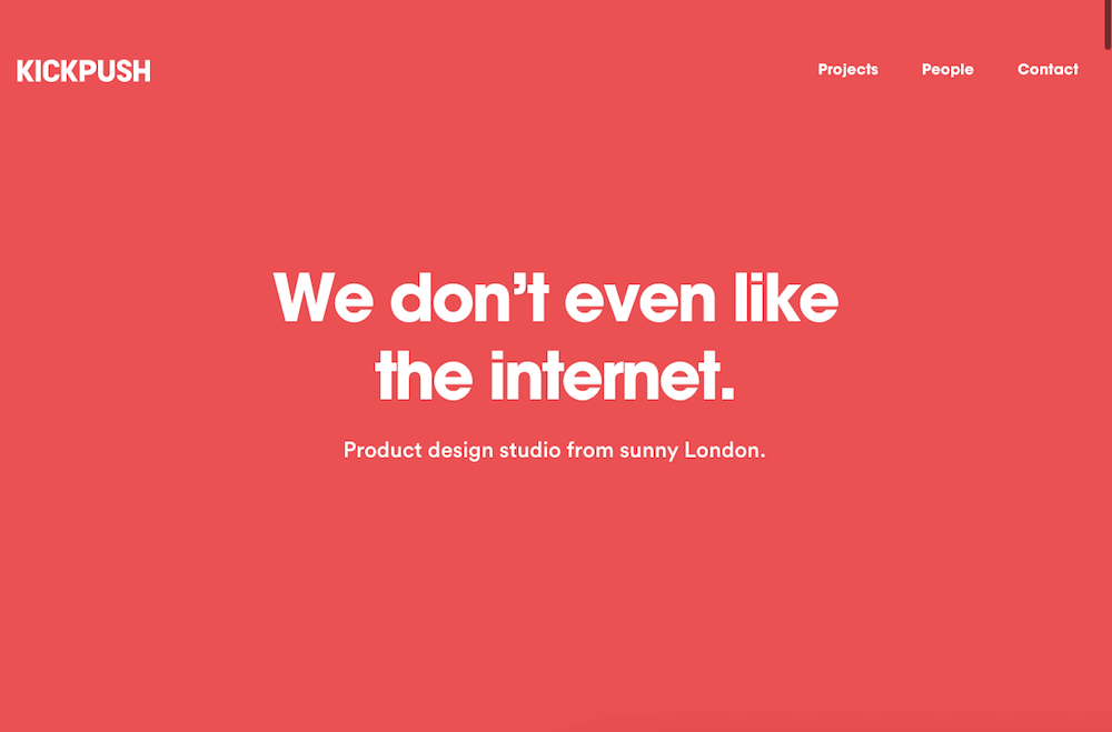
At times, the background image may be the only visual element on the page, over which you’ll have hero text displayed, similar to what KickPush did:
Just like other elements of minimalism, flat design and textures are featured in the background image.
By using flat design, you can employ a stripping concept, so that what’s left on the page seems deemphasized, allowing users to pay attention to the most important information on the webpage.
2. Colors & Contrasts
In minimalist design, colors must be used wisely.
Colors should create visual interest while also capturing and directing the users’ attention in a way that does not require additional elements or graphics.
The usage of colors should be limited – which is why on successful websites, you’ll see monochromatic colors or the use of two to three key colors on a website.
The commonly used monochromatic color palette (which uses several shades of a single color) tends to soothe the eye and not overshadow the important details.
However, contrasts still have value in minimalist web design, and many web designers make the use of white color, as it tends to contrast well with other elements on the page.
Remember that color has many purposes.
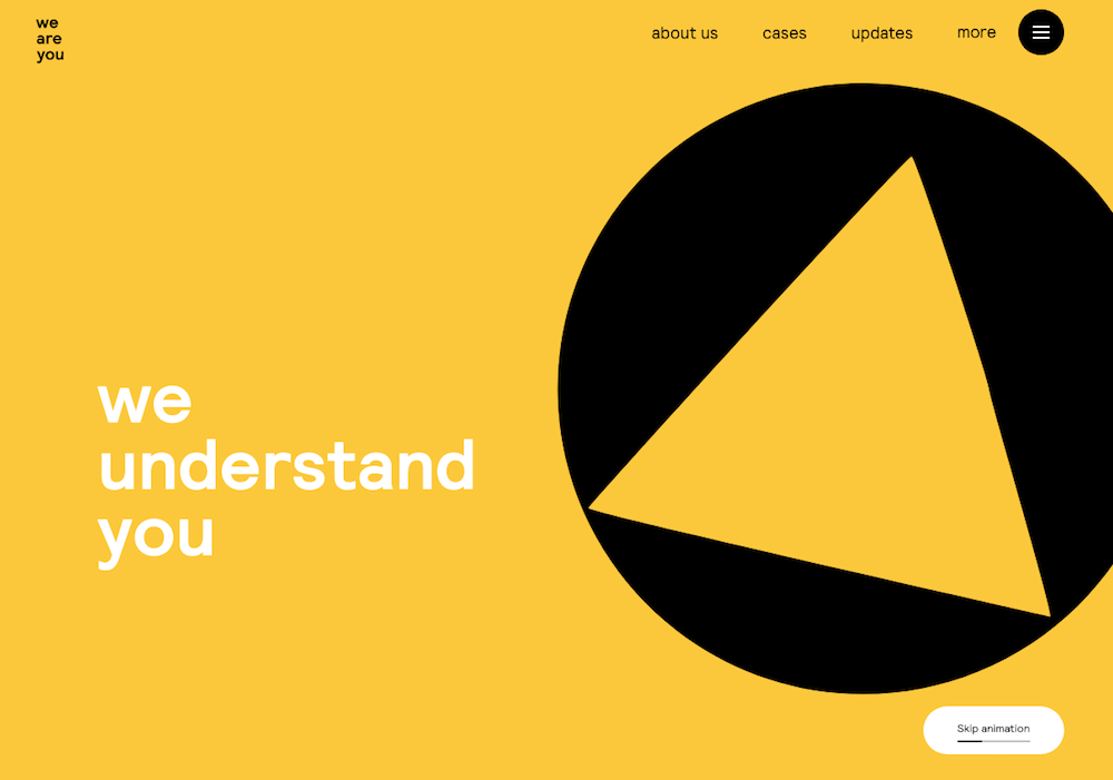
It can serve as a background of the webpage, similar to the design that We Are You has embraced.
But, it can also accentuate the important features on your webpage, serving as the functional element.
If you wish to highlight your product, this might be done best with a color that contrasts the rest of the palette.
It is wise to keep the psychological aspects that colors can tap into in mind.
Consider the purpose of your website and the message you want to convey to your visitors.
What would be the best color to use in order to set up the mood that aligns with your business?
For example, consider Huntington’s color choice.
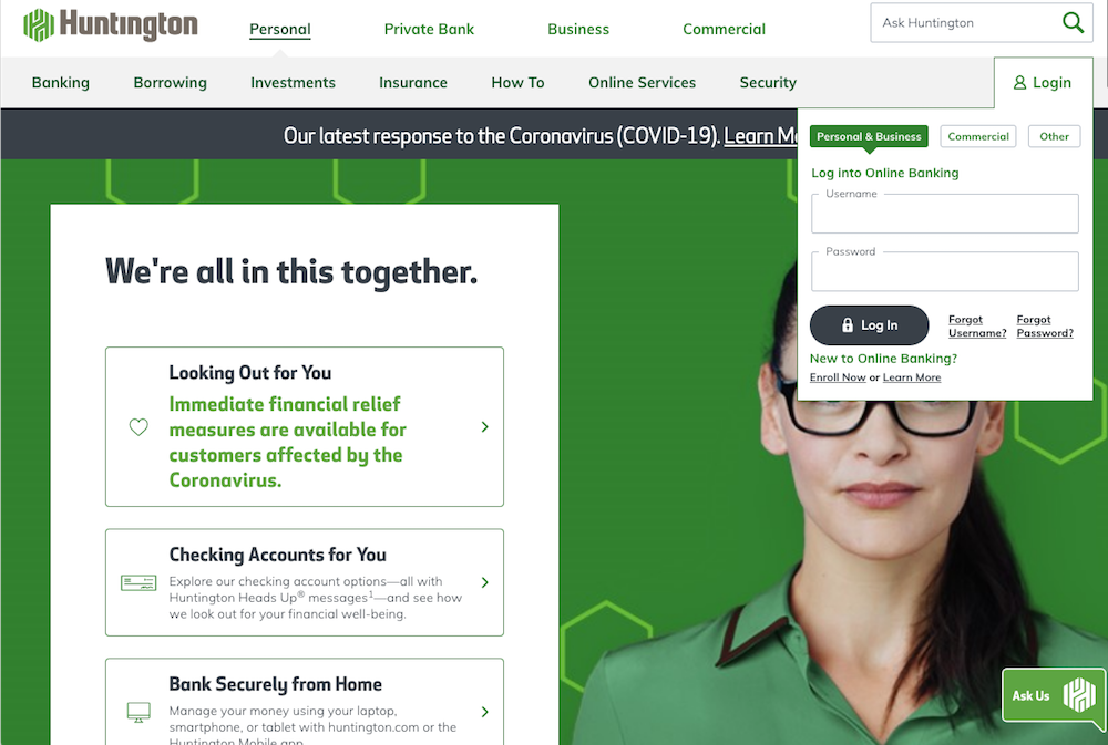
They’re a financial company, therefore they leverage various colors of green, which psychologically signifies money.
Blue and purple hues can be calming, while yellows, oranges, and reds can be warm or exciting – all things to consider when making a color choice on your site.
3. White Space
Commonly referred to as negative space, this feature can be the most powerful trick up a web designer’s sleeve.
The white or negative space tends to open up the “room” and let it breathe, and it is quite contrary to the visual clutter that exists on many websites.
The white space can be used to your advantage to guide the user’s attention.
By increasing the negative space around the information you want the user to focus on, you can make particular content elements more noticeable.
White space has the power to naturally guide the eyes of the user toward key content.
If you opt for using the white space, make sure you steer away from having multiple focal points on one screen.
Keep in mind that users have vulnerable focus, and their attention can easily drift from one thing to another.
When faced with too many options, users may find it hard to figure out what to focus on.
Summing Up
Minimalist web design creates a win-win situation for both businesses and customers.
Clean, non-obstructive design with clear focus points allows the users to quickly find the information they need, while also allowing businesses to keep customers happy by quickly providing answers to key customer questions of who their business is and what they do.
The “less is more” approach appears simple to achieve, but there are many elements that need to be considered in the creative process.
We’ve all faced tough moments when all information feels too precious to let go of and cut out.
From choosing what colors and visual elements to use to deciding on the quantity of text you should display on each page and each screen, it’s important to keep one key item in mind:
What’s the purpose of the piece of information?
If you can’t answer that, then it shouldn’t be included in a minimalist web design.
More Resources:
