
Google announced via their Webmaster Central blog today that they have recently updated PageSpeed Insights with mobile-specific recommendations to help site owners make their page more mobile-friendly.
The announcement states:
Poor usability can diminish the benefits of a fast page load. We know the average mobile page takes more than 7 seconds to load, and by using the PageSpeed Insights tool and following its speed recommendations, you can make your page load much faster.
Google suggests that if mobile users have to spend additional time after your site loads to pinch-zoom and scroll through the screen in order to read the text, then your fast-loading site isn’t really all that fast after all. Google’s new PageSpeed Insights’ user experience rules can help site owners identify and correct issues that could be impeding the overall usability of the site.
Google’s new recommendations currently cover the following areas:
- Configure the viewport: Modern mobile browsers will assume your page is not mobile-friendly if it doesn’t have a meta-viewport tag, which will cause it to fall back to a desktop viewport and possibly apply font-boosting, interfering with your intended page layout. Configuring the viewport to width=device-width should be your first step in mobilizing your site.
- Size content to the viewport: Users expect sites to scroll vertically, not horizontally. Google recommends that once you’ve configured your viewport, make sure your page content fits the width of that viewport, keeping in mind that not all mobile devices are the same width.
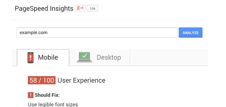
- Use legible font sizes: Google says that your site isn’t truly mobile-friendly if users have to zoom in just to be able read your article text on their smartphone screen. PageSpeed Insights checks that your site’s text is large enough for most users to read comfortably.
- Size tap targets appropriately: Trying to tap a button or link on a touchscreen, and accidentally hitting the wrong one because the site is designed to be used with a desktop cursor, is very frustrating. Google recommends to make sure that your mobile site’s touchscreen tap targets are large enough to press easily.
- Avoid plugins: Most smartphones don’t support Flash or other browser plugins, so Google recommends to make sure your mobile site doesn’t rely on plugins.
For more information about these rules, please visit Google’s help pages. To see how mobile-friendly Google considers your site to be, you can test your pages and the improvements you make using the PageSpeed Insights tool.
