
From the solopreneurs to the Fortune 500 companies, everyone wants better conversion rates.
Unfortunately, conversion rates, like many other things in life, do not improve via wishful thinking.
It takes work. Hard work.
The question now is: what type of work do you need to put in to improve your conversion rate?
What if I told you you could increase your conversion rate by 5x?
Interested?
Then read on to learn four way I’ve done it with my own sites.
1. Enhance Your Website’s Personalization
According to a Forrester report, 68 percent of businesses have made personalizing experiences a top business priority.
Research from Epsilon marketing indicates that 80 percent of customers are likely to do business with a company that offers personalized experiences.
And Evergage’s Trends in Personalization Survey (PDF) shows that an average of 54 percent of marketers say they see increases of at least 10 percent in their main KPIs (which includes conversion rate, lead generation, and revenue) when they use personalization on their sites.
So what exactly can you personalize on your site?
A whole lot.
Have you ever visited a site and you keep getting pop-ups encouraging you to sign up for their product?
I have, too. It’s frustrating, to say the least.
When someone opts into your list or signs up for your product, often, especially in this post-GDPR era, they’re giving you permission to write a cookie that doesn’t expire. Do it.
You can enhance your site’s personalization and, by extension, your conversion rate, by showing relevant testimonials. This helps to clear objections about your product or service.
For example, if I’m a solopreneur and I’m interested in your product or service but all I keep seeing on your site are testimonials or case studies about big software or Fortune 500 companies, the chances I’ll sign up for your product/service is low.
You can also personalize your opt-in forms by making them relevant to what a visitor is doing on your site at the moment.
Geotargeting, or serving people content based on their location is another option. This may mean:
- Changing your site’s language to theirs where available.
- Changing your site’s offerings (you shouldn’t offer visitors from a tropical country winter coats on your ecommerce store).
- Recommending products to customers based on the content of their shopping cart.
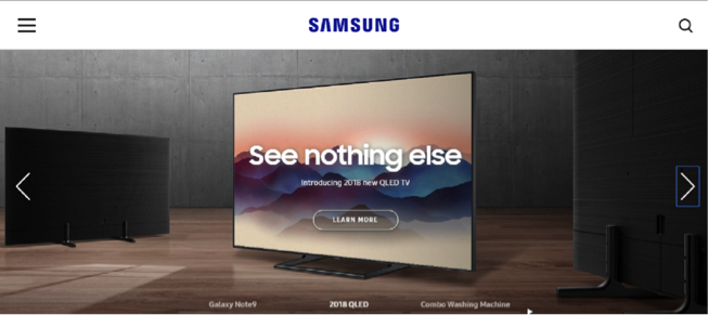
Here’s an example from Samsung. This is Samsung Africa:
And this is Samsung India:
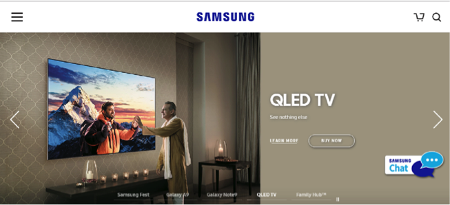
See the man dressed in an Indian attire? It’s much easier for people in India to identify with the messaging when it’s tailored to the local culture.
Beyond the geographic locations of your audience members, there are plenty more signals that you can tap into for creating dynamic messaging and CTAs that are optimized to resonate.
Based on the number of times someone has visited your site, the device they’re using, or the campaign URLs that referred the first-time visitor, you can learn a lot about their intent.
Even the time of day of their visit can help you to dynamically personalize the experience, as illustrated in this example:
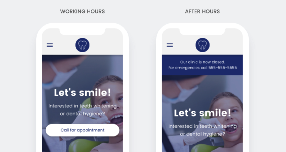
You wouldn’t want to display a click-to-call button when your business is closed.
But depending on what kind of service you provide, if it’s during business hours, this might be your best option for a primary CTA.
2. Perform A/B Tests
Running experiments allows you to reduce risks that come with making guesses about your site.
Performing A/B tests is a technique you can use to turn more visitors into leads and customers.
For example, you may have two possible layouts and/or navigation for your landing page and you’re unable to decide which one you should use. An A/B test will help you determine which one works better.
All you need to do is create two versions of the landing page, then an A/B testing software directs half your visitors to either page. You’ll check how many people converted or took the desired action on either page. The page with the higher conversion rate wins.
If you’ve been reading marketing or CRO sites for a while now, you likely already know that some webpage features work better than others. And while there are some generally widely accepted best practices, it’s still wise to test to know what works better for your site instead of blindly copying other marketers.
That being said, here are some elements of your site that you can test today to improve your conversion:
- Pricing: The price of your product/service may be too high or too low for your target market.
- Your headline: Your current headline may not be convincing enough for visitors. Test to see if you can nail one that works better.
- Your offer: Do potential customers prefer you talk about your product or service in a certain way? Or do they prefer purchasing your products in a bundle with other products albeit at a higher price. Test.
- Page layout/navigation: See above.
- Media formats/style: Does adding or removing a video or picture to your landing page increase conversions or not? A test will convince you.
- Miscellaneous: You can perform a large number of related tests at the same time. Debatable I know, but worth trying too.
Tools like Google Optimize, Optimizely, or VWO can help you with your tests. And remember, never run out of things to test – keep testing.
3. Clear Objections via Your Website Copy
Good copy sells. That’s true even though good copy works in tandem with other factors.
Addressing objections potential customers may have about your offer via your copy removes mental obstacles to purchasing from you in their head.
Some objections they may have about your offer includes but are not limited to:
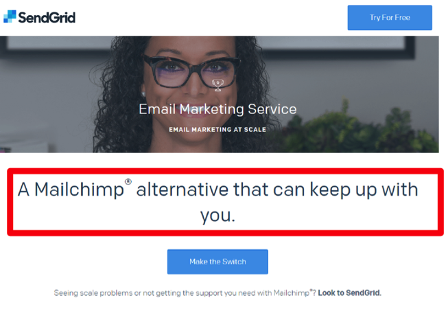
- I shouldn’t spend money on this because it’s too expensive: You can compare the price, including features and benefits of your product with what competitors offer at a similar price and prove why yours is more valuable. Here’s a sample landing page from SendGrid that rides off a competitor MailChimp.
- It won’t work for me: Remember the testimonial example I mentioned earlier? Yup, show off testimonials in all kinds of niches your product serves.
- I don’t believe you: Quotes from testimonials and case studies, reeling off your credentials and/or awards, and places your product has been featured in can help.
- My problem is complicated: Describe your product, explain its process for solving customers’ problems and carefully outline all problems your product can solve.
- I don’t think your product’s style/format/X or Y feature is suitable: These are objections about your product’s packaging (for physical products), your course delivery methods, or software features. Again, your copy should explain why those features of your product are the best they can be, plus what you’ve done to remove or reduce any bottlenecks experienced in the past.
These are just ideas you can start with. There’s more in-depth information about writing copy that sells here, here, and here.
4. Eliminate Interference
I use interference in this context to broadly describe anything that can stop visitors to your site or potential customers from converting. And it can be a lot of things, some of which are:
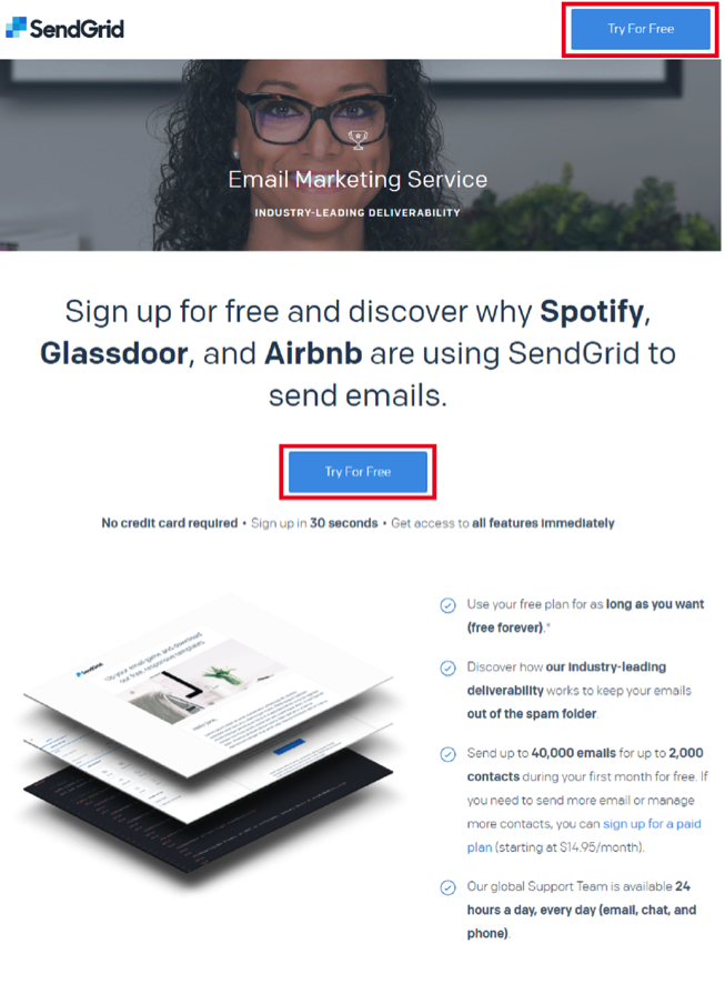
- Remove or reduce navigation on landing pages: The only option a visitor should find is the next step you want them to take after reading your landing page copy. Anything else is unnecessary. Here’s another excellent example from this landing page by SendGrid. No navigation. Just the next step they want you to take.
- Collect only user data that’s absolutely necessary in forms: Reduce the number of fields in your forms to encourage more people to fill it out.
- Avoid giving too many options: Recommended and People who liked X also bought… features are fine on ecommerce stores, though you’ll still need to tread with caution. But adding several products to the same landing page in some niches like digital marketing will only cause analysis paralysis and tank conversions.
- Write clearly: Don’t make people want to reach for their dictionaries with every sentence on your landing page copy. Daniel Oppenheimer, professor of psychology at the UCLA school of management said it better:
“You should use use instead of utilizing utilize.”
Think also of adding incentives to encourage action, giving iron-clad guarantees, and also allowing users to buy from you without signing up.
Nevertheless, you’re in a better position to think of and remove other obstacles stopping visitors from converting on your site.
Conclusion
Great things take time, as people say. But you don’t need months or years to improve your conversion rate.
You can start seeing little wins here and there with these tips right now. Apply them.
More Resources:
- Using 6 Principles of Persuasion to Increase Conversions
- 10 Landing Page Tweaks That Will Increase Conversions
- 15 Important Conversion Metrics & Business KPIs You Should Track
Image Credits
Screenshots taken by author, January 2019
