
Google’s Web.dev published a group of layouts that depend on a single line of CSS to make them work. These layouts are mobile friendly, fast loading and ready to be incorporated into a web project.
Proof of Concept
These layouts are meant to show what can be accomplished with just a single line of CSS.
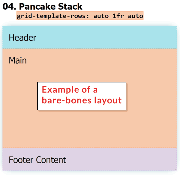
For example, the following is the CSS for a bare bones layout consisting of a header, a main content area and a footer area:
.ex4 .parent {
display: grid;
grid-template-rows: auto 1fr auto;
}
Screenshot of a Bare Bones Layout
Holy Grail Layout
This is an example of a classic layout. It features a header, sidebars on either site of a main content area and a footer.
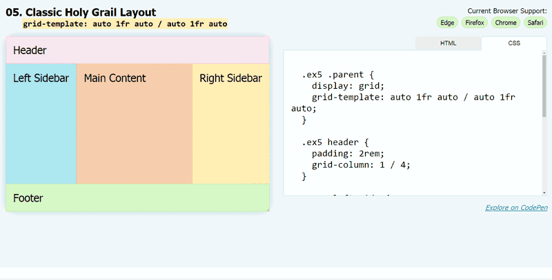 This animation shows how the layout automatically adjusts to the screen size without the use of media queries.
The CSS for the above layout is below:
.ex5 .parent {
display: grid;
grid-template: auto 1fr auto / auto 1fr auto;
}.ex5 header {
padding: 2rem;
grid-column: 1 / 4;
}.ex5 .left-side {
grid-column: 1 / 2;
}.ex5 main {
grid-column: 2 / 3;
}.ex5 .right-side {
grid-column: 3 / 4;
}.ex5 footer {
grid-column: 1 / 4;
}
No Media Queries
Most mobile responsive web designs rely on what’s called Media Queries. Media queries are CSS rules that are used to select a different style sheet depending on the device being used to view the website.
When a device is a tablet, a set of CSS styles optimized for a tablet screen size is used, resizing images, fonts and layouts for that screen.
What’s interesting about these 1-Line Layouts is that they do not use media queries in order to be mobile friendly. That helps get rid of a lot of CSS code and makes these layouts mobile and desktop friendly without additional JavaScript or CSS.
Layouts Not Templates
These are layouts. That means they are the bare bones of a web page.
It’s what a person can start with to create a screaming fast layout.
These layouts are not WordPress templates, either. They still need to be completed with logos, background colors, widgets and so on.
Yet, once that look and feel is completed, an HTML template can be converted into a WordPress template.
Examples of What Can Be Done
These are examples of what can be done on a bare-bones layout. However, the examples can be incorporated into parts of a site.
Watching the video helps because the host explains the CSS and how it works.
Watch the video here:
Check out the website here:
