
SpongeBob may be not willing to disclose the secrets of cooking Krabby Patties, but he can talk for hours about user experience and hospitality. Man, he’s turned Krusty Krabs into the most visited place under the sea! Still think his expertise is not applicable to websites? Just take a look at this actionable UI guide for beginners!
1. Never leave a customer in an awkward situation—create custom 404s!

Though some things can be temporarily missing on the menu, SpongeBob will always offer you something good to fill your stomach with. Why? Because you are more likely to come back! When your site visitors click on the outdated link, and get redirected to a 404 (“Not found”) page, they’ll run away using the Back button, or just close the irritating page. Let’s see what you can do with this page not to lose your traffic:
1. Place a clear explanation what this page means and why the user appeared here.
2. Don’t go overly creative – the design of a 404 page should be close to your main site’s theme.
3. Put links to your best content or place the search form.
4. You can even place some random products with the order or contact form – who said that a 404 doesn’t bring conversions?
5. Inspire the visitors to get into some activity – share the content, participate in the contest, download a tool, etc.
And here are some fresh examples of 404 pages I like:
WebMeUp offers users to take part in… the monster’s naming contest!
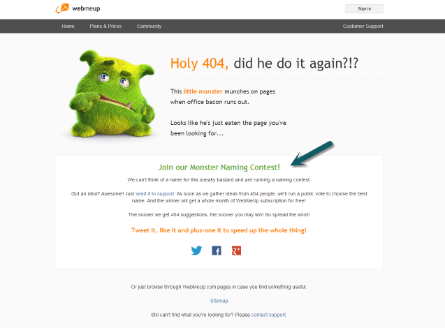
(http://webmeup.com/404)
Heinz lists popular products and recommends visitors to use the search form:
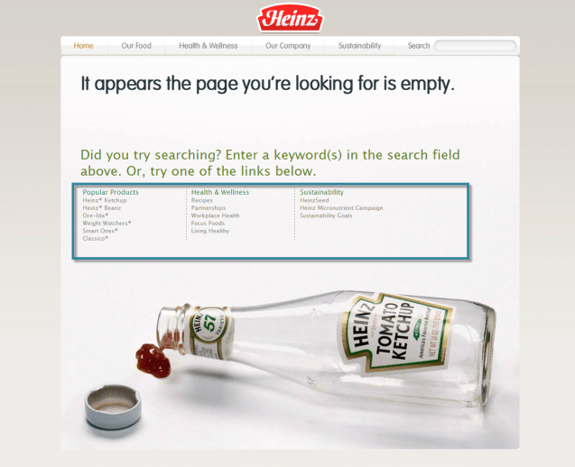
(http://www.heinz.com/error.aspx)
Kochatelier, the company offering various cooking courses, uses the 404 page to get more leads:
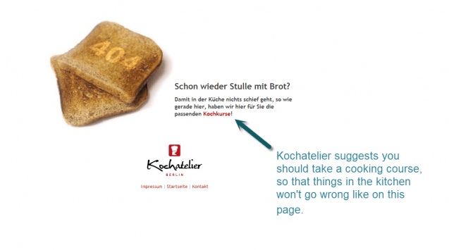
(http://www.kochatelier-berlin.de/404-fehler/)
Keep your 404 informative and simple – don’t let users run away!
2. Watch your visitors to make their stay even more comfortable

SpongeBob knows that even some dusty dishes can irritate visitors and make them leave. Do you know what makes your visitors leave? There’s a simply way to tell:
In your Google Analytics account take a look at pages that have most exits and the highest bounce rate. It’s okay for your “after-conversion” page to have lots of exits, since the user already got what he wanted. But if your landing pages get to this list – that’s a clear warning that something is wrong.
The problem can be hidden anywhere – it can be a large contact form with lots of fields, flash content that didn’t work because the user doesn’t have an Adobe Flash Player installed, a pop-up window that you cannot close at once, or maybe excessive advertising.
Ask someone who hasn’t seen your website before to look through the pages and say what makes their way to the order page complicated and what they’d love to change. Or use some powerful user tracking tool, such as ClickTale to watch the videos of what visitors do on the pages: how long they scroll down, where they pause, where they try to click thinking there’s a link, etc.
3. Provide delicious stuff so that visitors would love to come back for more

Fresh crispy salad, hot buns with sesame, spicy meat – oh Mr. SquarePants knows what delicious is – no surprise the Krusty Krab’s visitors are all hooked on his cooking. Do you offer visitors the content users can get addicted to? Here are some things that can spice up your content “menu”:
- Freebies – the free stuff is always delicious and gets a lot of attention
- Unique content (how-to articles, photos, reviews, interviews, case studies, infographics)
- Videos (tutorials, presentations, reviews, congratulations)
- Expertise (if you are a lawyer, you can start a Q&A section to share your experience with users)
- Handy quick-use tools (take Ian Lurie’s title generator as an example!)
Whatever it is that you offer, make sure you create unique stuff and share it with others on social media networks, using the BufferApp (Yay, Mr. SquarePants knows Buffer too!).
4. Be professional

“If you are not professional – better get out of the service,” says SpongeBob and I can’t but agree more. But what do we actually mean by “professionalism”? – A clear and consistent design of your site
– Content that gets proof-read
– If you are a business, I don’t want to see ads on your site
– If you are a blogger, don’t forget to place links on the used resources
– Respect the privacy policy and don’t spam your subscribers
– Be active in social media – share relevant information and communicate with customers (always in a polite way)
And have a sense of humor – hints the king of the underwater fast food!
5. Keep up with the trends

Do you really think Krabby Patties have always been the same? No way! SpongeBob’s constantly working to modify the secret formula and uses new technologies to improve the taste.
“It’s not new for the sake of new,” he says, “but it’s new for the sake of better.” Okay!
Is there anything new you can do for your users? Here are some ideas:
- It’s never late to start (or restart!) a blog
- Make your site design mobile-friendly
- Change your monthly newsletter contents
- Optimize your site for super-fast performance
- Be personal – share some private bits to make your resource more human
- Write your first e-book!
- Create a comics series:

(http://theoatmeal.com/story/octopus)
(And make up a viral title for it!)
Start with easier things and keep on improving your site.
SpongeBob guarantees: if you follow his instructions, users will fall in love with your site and will return for more!
