

Ken Olson, Chairman and founder of DEC once famously said,
“There is no reason anyone would want a computer in their home.”
I bet he felt at least a little silly about that statement by the time he died in 2011.
That is the trouble with always going along with ‘the way things are’. Every once in a while, there will be an upstart who will come along and change the rules of the game so startlingly it leaves everyone else completely obsolete in the process.
The e-commerce business is no stranger to the ‘this is how it must be done’ affliction. Conventionally accepted e-commerce wisdom has a set of closely held beliefs that every e-commerce business owner strives to replicate.
While playing by the rules helps keep you from getting left behind, it also prevents you from innovating something completely out of the box, something that can take your business to the next level.
Whether by design or by default, there are a ton of successful e-commerce brands out there that buck these sacred rules and yet stay ahead of the pack. Here’s a look at some of these path breakers and how they’ve turned weaknesses into strengths.
Killing It With Clutter
Clutter is the biggest enemy of every web designer. The first rule that designers learn about websites is to keep them clear and simple and clutter free. White space is important, heck, necessary even to prevent users from bouncing away in fright. Website owners go to great lengths to prevent a sensory overload on their homepages, to ease users into the second, third, and even fourth page during their visit.
The starkest example of an e-commerce brand that has bucked this cardinal rule for as long as memory serves, is the Big Daddy of e-commerce – Amazon.
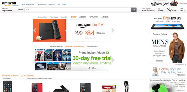
The top fold alone on Amazon’s home page displays 7 different product categories, with personalized items based on past shopping behavior continuing the sensory assault. Any other e-commerce site with that array of products would be slammed for sloppy design, being unfocused, and confusing the customer.
Not Amazon. No sir. The biggest reason Amazon gets away with their homepage clutter is a surprisingly simple one – habit. As the first big e-commerce site on the web, most online shoppers have bought at least one item from Amazon and know their way around the site by now. Besides first mover advantage, you can’t miss Amazon’s large search bar that dominates the top of the screen to ensure that ‘lost’ customers are taken care of. Apart from the chaos on the homepage, the search results page, categories pages and individual product pages are exemplary for their minimalism.
The Final Verdict: I’m going to vote with the conformists on this one. A cluttered homepage is a bold move for an unestablished site to make. Think twice before modelling your home page after Amazon.
Expensive (but Human) Customer Care
E-commerce stores prefer customers to write to them via email or offer an IVR based service to keep these costs to the minimum, putting the customer through maddening hold times and byzantine processes to fix a problem.
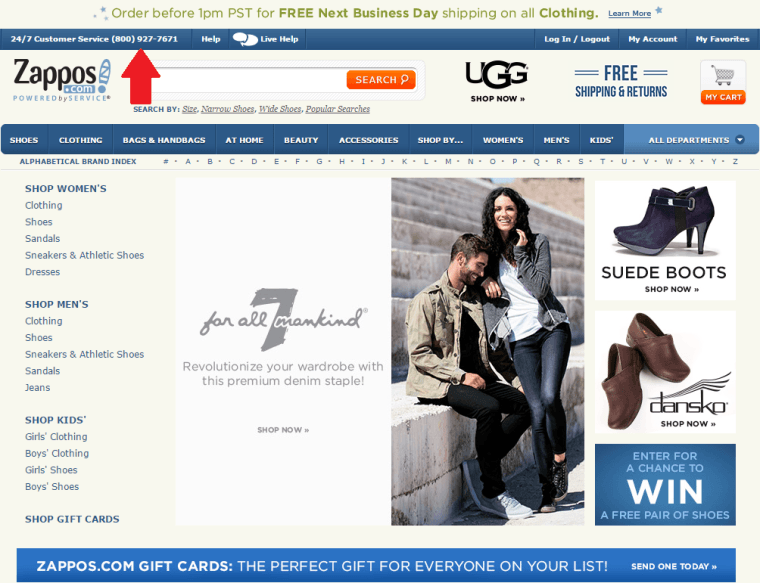
Zappos is a huge exception to the rule. Not only does every customer call get handled by a live customer support team member, unlike other brands, Zappos encourages team members to stay on the line as long as necessary to solve a customer’s problem. Customer care representatives have a lot more decision-making powers than the average representative who can’t stray from a tight script.
The best part? They make the wait time fun for the caller by offering a ‘Zappos Joke of the Day’ to keep the customer entertained while they wait for the next free representative. The result? Over 75% of Zappos customers are repeat buyers, a statistic that every e-commerce brand in the business would want to replicate.
The Final Verdict: This one is a no-brainer. You might save a few pennies by going the automated route, but there is no replacing good old human contact; well-trained, cheerful and helpful human contact at that. If you have just one thing that you can change about your e-commerce operation, then pick customer service for the overhaul. The results will be well worth your time and effort, I promise.
Sliding Hero Banner on Home Page
Another web design taboo is the home page sliding banner. Experts and usability gurus have thrashed this element to pulp stating reasons as varied as banner blindness to lack of messaging focus in an effort to dissuade e-commerce sites from going down the sliding or rotating banner path. Some attributed click-through rates of a measly 1% to sliding banners, while others hate them because they apparently affect SEO rankings.
If all this was not enough warning, they claim that sliders don’t work well on mobile devices.
However, when have dire consequences threatened the brave of heart? The best vindication for whether sliding banners work or not is that the top 5 e-commerce sites in the world ALL use sliding banners on their home pages. 100% of them. In fact, Amazon – which occupies two of the top five slots, uses TWO sliding banner carousels in the top fold of the home page, in place of the standard single carousel!
A fine example of the right way to handle sliding home page banners on retail sites is the men’s made to order fashion website OwnOnly.

Here’s what it gets just right:
- The slider takes over the entire home page with hero images, thus removing distractions and improving CTRs.
- The slider is automated not manual, thus ensuring users don’t miss out on offers showcased on deeper slides.
- The copy is crisp, self-explanatory, and action oriented, helping the messages register better.
- The sliding banner helps the site showcase multiple messages in the most important location on the homepage – above the fold.
The Final Verdict: If the homepage slider works for the giants in the e-commerce business or customized brands, it should work for yours, too. Use the pointers mentioned above and test the performance of your sliding banners before you decide to unquestioningly follow convention. We all know what happened to the mice that blindly followed the Pied Piper of Hamelin!
Wrapping Up
As the saying goes, “Only dead fish go with the flow.” Following the rules may seem like a safe bet in the short-term, but in the long run it works out to be a false security blanket.
As an e-commerce business with unlimited guidance at your fingertips, stop being the dead fish and be the salmon that swims upstream to spawn a new generation – the new ideas that will take your business to the next level.
Image Credits
Featured image: John Mosbaugh, Flickr
All screenshots taken October 2014
