

Some people are visual learners, some kinesthetic, and others auditory. But I’d argue the majority of us are impatient learners.
We demand websites to load in an instant and our questions to be answered directly. This is why search engines prioritize websites with faster page speeds, especially over mobile devices.
In many cases, images are the number one issue affecting website load times.
We all understand that high-quality images contribute to positive user experience, but I wonder have we drank too much of our own Kool-Aid?
A 2016 Google and SOASTA study confirmed that complex webpages with more images had lower conversion rates than webpages with fewer images.
While some websites may benefit being “image-heavy”, we should really look at page speed as a scarce resource. The more we dedicate this resource to loading large, bulky resources, the less effective it will be.
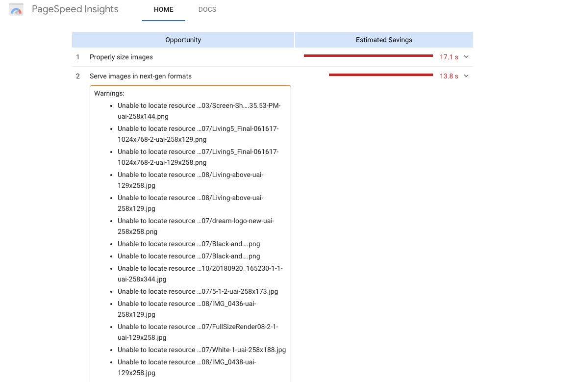
With Google’s redesigned PageSpeed Insights, a lot of people are confused about what it means to serve images in “next-gen formats” and what browser support exists to satisfy Google’s concerns.
Additionally, many people are still relying on old technologies to compress and serve images on their website.
Read on for some pragmatic tips to help you optimize images for faster page speeds while preserving your UX.
1. Use Images Responsibly
Minimalistic design often lends itself to good user experience because it provides greater performance. But you need to ask yourself whether an image is absolutely critical to your design.
For more dynamic webpages, it can be tempting to make images interactive and even a focal point of your design.
Unless you’re a photographer, you can leverage alternative resources instead of images to improve your UX, such as:
- CSS3 for interactive elements.
- Scalable vector graphics for simple logos and designs.
- Embedded videos instead of bulky GIFs.
In fact, vector images tend to maintain greater resolution when being loaded on higher resolution devices.
Furthermore, instead of encoding text within images, which search engines can’t read, you could instead turn to web fonts which improve UX.
Within the PageSpeed Insights tool, you’ll often find that Google recommends deferring images offscreen to improve load outs. This essentially means moving images below the fold so at least the initial loadout for users is faster.
To accomplish this, you’ll need to optimize your critical path rendering.
There are a few methods to take to optimize your critical path rendering, such as minifying, caching, and compressing all on page resources (CSS, JavaScript, HTML).
Inline CSS delivery for header and main document module can also provide users with an instant loadout while all unused CSS and resources are loaded in the backend.
Additionally, you could prevent JavaScript blocking to prevent resources you wanted to be loaded from being loaded in the first load out.
While this is fairly complicated, there are tools to assist in WordPress.
W3 Total Cache caches and minifies virtually every resource in your CDN from HTML all the way to WordPress elements.
In addition, W3 Total cache can be used to optimize critical path rendering, such as using JavaScript unblocking with “async” and “defer” and other features that can help improve page loadouts without having to entirely get rid of images.
This tool also offers HTTP/2 capabilities to further improve loadouts.
2. Automate Image Compression
Probably the two best ways to optimize images for speed are by reducing their size and compressing their files. Image compression is incredibly easy with the right tools at your disposal.
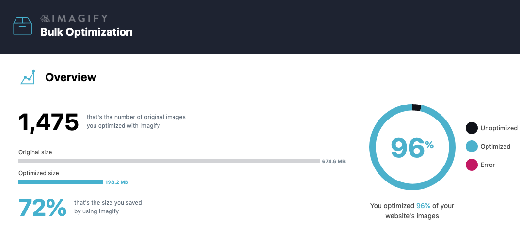
If you’re working with WordPress, you can install Imagify and compress all of your images in bulk in one click. All further images that are added to your library will be compressed using this tool.
This plugin even offers an aggressive setting to compress JPGs and PNGs for massive speed boosts.
If you’re worried about plugins slowing down your site or are working with a more open-source CMS, you can use Image Optim to compress all of your images in a particular folder. It’s drag-and-drop features make it incredibly easy to compress images and then add them to your site.
Additionally, if you’re worried compressing images in your CMS and leaving large file sizes, you can also experiment with compression in the Adobe Suite or Affinity Photo.
In terms of resizing images for different devices, WordPress’s responsive design can do that for you using the ‘srcset’ attribute.
One important thing to keep in mind is that lossy compression may come with the potential to sacrifice the quality of your image.
At larger scale compression, lossy compression will eliminate greater bit depth and provide noticeably reduced file resolution.
3. Serve Images in Next-Gen Formats
Depending on your file format, you will have to use lossy or lossless compression.
Traditionally, we’ve relied on two image formats JPEG (lossy) and PNG (lossless compression).
But tools have begun recommending new image formats, especially for creating fast load speeds and maintaining smooth aspect ratios over mobile devices.
You can choose between a number of new formats, including JPEG 2000, JPEG XR, and WebP.
JPEG 2000 is much like traditional JPEG, but with lossless compression. This means that compressed JPEG 2000 files retain their metadata without much of a loss of quality.
JPEG XR supports both lossless and lossy compression at higher compression ratios.
Unfortunately, both of these formats are unsupported by most major browsers, including Google Chrome and Firefox. This means that you’ll need to have the JPEG or PNG format as a fallback regardless.
The only image format that’s supported by Google Chrome, as well as Firefox is WebP. WebP offers lossless and lossy compression, as well as support for animation.
There are a variety of WebP plugins to experiment with and you can convert a JPEG or PNG file to WebP using an online converter or Photoshop.
Of course, it’s ideal to provide a backup to a WebP file. To accomplish this, you’ll need to leverage the <picture> element in your HTML to provide backups.
Plugins like WebP Express for WordPress automatically do this in the HTML and can be used for bulk conversion in your library.
Ultimately, the option to serve images in next-gen formats is not too appealing considering limited browser support.
But leveraging formats like WebP to give your site images greater compression ratios and smaller file sizes over mobile devices will make a noticeable difference in page speed.
Additional Thoughts
Page speed over mobile is hard to maintain, especially on image heavy sites.
Responsive web design and other speed plugins can’t really account for large bulky file sizes and resources are trying to fetch on your site.
Fortunately, by automating compression, resizing files, and images more strategically you can drastically improve your page load speeds.
More Resources:
- How to Boost Your Visibility on Google Images
- 7 Ways Images Can Boost Rankings
- How to Take Your Website Beyond Fast
Image Credits
Featured Image: Pexels
All screenshots taken by author, April 2019
