
Internet users in the United States may have already noticed a slightly changed layout in Google.com search results. While the change will go unnoticed by tablet users who are familiar with the layout (since last year), desktop users getting the new layout now may well miss it altogether what the change really is.
In an attempt to create a consistent search experience across the wide variety of devices and screen sizes used today, Google changed the design of its main search results page, making it cleaner, simpler, and with a bit more breathing room. At least, this is how lead designer Jon Wiley explains the new layout.
The real change is a small thing with big potential: Google added a new horizontal navigation bar and completely removed the left side navigation. More on the potential later.
The move was officially announced on Tuesday via Inside Search, then Google asked for feedback on its Google+ page. As expected, some people like it, some hate it, and some couldn’t care less.
But in essence, many feel that the new design makes navigation almost redundant with the black Google bar at the top, as some search options are already there (images, news, video, etc), then once again repeated on the new horizontal navigation bar, and some even once more with the drop down “Search tools” function.
Desktop users with wide screens have already complained about the waste of vertical space. The place once occupied by the left side navigation is now completely blank, and Google hasn’t expressed any intention to use it in the future.
So, what’s the potential? Google simply introduced the bar as a “design change,” but there’s more to this move than meets the eye. The black Google bar is a static entity, while the new bar reveals relevant content based on your query. This helps Google serve up curated content, targeted ads, and related Google products.
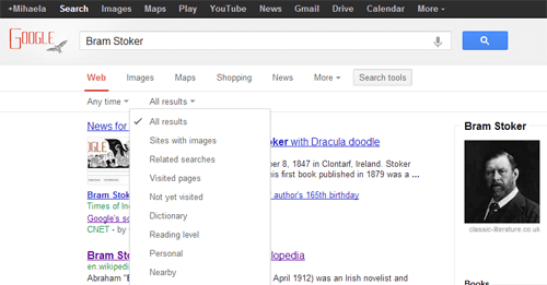
Let’s say you searched for Bram Stoker today, inspired by Google’s doodle. The new bar brings Google shopping to your fingertips. Now, you are one click away from purchasing Bram Stoker books directly from Google. This example alone speaks volumes about the true potential (and purpose) of the design change.
While the new design may appear cleaner and more elegant, and the bar curates content, usability suffers a big hit. Some search options are now hidden in advanced search mode, and you’ll spend a bit more time to discover them (more clicks to filter by date, by language or by other criteria).
In image search, you lose the option to search by specific size (Exactly…), and you are left with any size, large, medium, and icon instead.
These and other issues go deeper, but while some will probably be addressed (if that serves Google’s purpose), in the meantime, you will have to get used to navigating Google in a different manner or switch to a different search engine.
