

Images are one of the most critical elements of effective ecommerce.
On Amazon, customers have a lot of options right at their fingertips, and before they even click on a product, they will look at the images.
Want to beat your competition?
Then having high-quality images is necessary.
When you see a product in person, you answer a million questions by simply walking by a rack of clothes and running your fingers across the fabric.
- Is this going to be itchy?
- Does it look cheap?
- Is it going to be see-through?
On Amazon, our images are our salesforce.
Images help the customer decide if this product is the right product for them.
The quality of your images can be the difference between your product ranking on page 1 or page 6 of an Amazon search query.
Here are 11 tips for optimizing your images on Amazon.
1. Make Your Main Image Shine
Amazon has specific rules about your main image.
It is essential to review the seller support page regularly as the guidelines can change.
However, the fundamentals haven’t been altered in the 10 years we have been listing products on Amazon:
Only Show the Product
Your main image cannot have any text, props, borders, or items that show the scale of the product.
It needs to be a photo of just the product you are selling.
Pure White
Amazon wants a particular type of white on the main images (RGB 255, 255, 255).
This is with the intention that products look like they are floating in the interface.
Some services will edit your photos to this color for a small fee.
Close Up
The product in the main image needs to take up 85% of the image.
Images that are cropped loosely make your product appear small in the thumbnail shown in search and your ads.
This can decrease your click-through rate (CTR) for your ads as well as reduce the amount of organic traffic your listing receives.
 Your main image on Amazon needs to be zoomable, closely cropped, on pure white, and only show the product for sale.
2. Fill Every Spot
While this seems basic, you would be surprised by the number of listings that only have 2 or 3 images.
Amazon gives most categories seven or more image slots.
So make sure to add as many images as you can since this is how customers get informed before they buy.
Important: In many categories, you are allowed more than seven images, but you will only see seven slots on the main product detail page.
Additional images will only show if a customer clicks them to get more details.
Make sure your most critical images are in the first 6-7 slots of your listing so they can be seen from the product detail page.
If you add a video, it will use the 7th slot on your listing.
One of the reasons people leave those slots open is that they forget that you can show more than just the product.
Yes, we need a picture of the front, the back, and the packaging.
However, customers also need photos that show scale, use types, and functionality.
Lifestyle images can also go a long way to help conversion.
A lifestyle image shows your product being used.
This could be as simple as a happy woman drinking her morning coffee to someone cooking in their kitchen with the new handy garlic press.
Infographic images in which you add callout text can be a powerful tool for conversion on Amazon.
3. Size Matters
The size of your image plays a significant role in the way that it is viewed on Amazon.
Images that are too small can appear pixelated and will also disable the zoom feature for desktop.
Amazon recommends that your images are at least 1,000 pixels on the shortest side so that your images will be zoomable.
Proportion also plays an important role in images.
The recommended aspect ratio for images on the product detail page is 1:1, or square.
Amazon allows rectangular images to be uploaded, but inconsistent image sizes make your products look less professional and can hurt your conversion rate.
Proportions are even more important on your main image.
Amazon will adjust your image for the thumbnails that appear in search results and your ads.
Sometimes simply removing the reflective shadow on a bottle can increase the size of the image in the thumbnail and have a positive impact on conversion.
Having scaled items next to your product to show scale can be an important tool in reducing returns and increasing the number of positive reviews your product receives.
One of the easiest ways to make sure your customers are happy is to make sure there is not going to be a miscommunication on the size of your item.
One of our clients was selling long-sleeved children’s T-shirts.
The main image showed one arm of the shirt extended and the other one folded.
Because of this, their image was cropped to a rectangular shape making their thumbnail images much smaller than their competitors.
It also made it hard to see the graphic on the T-shirt from the thumbnail.
By changing the images to be the proper proportion, we were able to increase CTR for their ads in over 10%, and their unit session % increased by more than 25%.
4. Mirror Your Bullets
Titles and bullets play an essential role in indexing and ranking, and Amazon puts a lot of emphasis on them.
Your images have less to do with bringing in traffic to your listing.
They have more to do with converting the traffic that your listing is getting.
People often ask how they can optimize their Amazon listings for mobile.
The best way you can do that is to make sure you have beautiful and informative images.
On mobile, the only content that appears above the fold is the product title and images.
Many customers will never scroll down to where the bullets are located.
Highlighting the main benefits in your images can increase conversion.
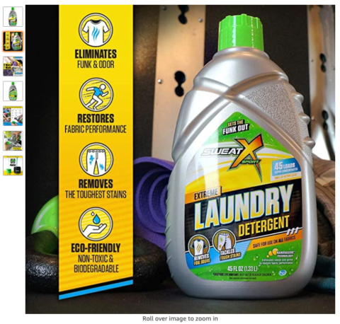 Infographics allow you to combine images of your product or lifestyle images with callouts that highlight your product’s benefits and features.
Mobile and desktop experiences on Amazon are very different.
Many shoppers view their products on mobile browsers and their mobile App.
It is important to view your product detail page on desktop, Mobile, and the Amazon App.
Review your bullets for ideas for images, also look at customer questions and reviews.
If you listen, your customers often will tell you exactly what information they needed to make a purchase.
5. Let Your Customers See Themselves
Psychographic research for your customers is just as important when creating your images as it is when you are writing your copy.
Knowing your customers’ income, beliefs, and use cases will help your images be more compelling.
For example, if you are selling coffee to people making over $100,000 a year, you would want to use an upper-class kitchen in the background.
If you are selling to those making $40,000 a year, then a middle-class kitchen would be more appropriate.
You want your customers to be able to see that this product fits their needs and their lifestyles.
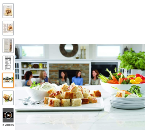 This is a lifestyle image of a Beer Bread mix that is known for being great to bring to parties. Here the image highlights the internal need of the customer to impress their guests.
6. No Novels
Including text on images through the inclusion of infographics can be a powerful tool for conversion.
However, the more text, the less effective those images become.
Think about if your customer is going to need to zoom or pinch to read this graphic even more so if you have an older demographic that finds reading small text frustrating.
Sometimes using a larger call to action or benefit statement mixed with a limited amount of smaller text for those customers that need more information works well.
 Here is an example of a product that has used one of the images of their products with additional text to help highlight one of the benefits of their products.
It is OK to use phrases, but don’t mirror the bullets word for word.
The images should be highlights, not the play by play.
7. Avoid Photoshop Fails
There is nothing wrong with Photoshopping your product into a lifestyle image.
However, there are common pitfalls you want to avoid:
Shadows
Make sure that your shadows fall where they are supposed to be.
Customers might not know what is wrong, but they will know something is wrong.
Watch for Scale
This is especially true if you are photoshopping in props.
Make sure your images are to scale.
Scale issues can cause returns and restricted ASINs.
 The shadow of the blocks should be going in the same direction as the shadow in the little girl’s foot. Also, if these are one-inch blocks a customer is not going to be happy when their item arrives. This is an example of how poor images could lead to potential returns.
8. Spell Check
It is easy to have a misspelling or grammatical error slip into your images.
Run the copy on images through a program like Grammarly and have at least 2-3 people check the image before uploading.
9. Follow Category Requirements
In addition to having specific rules for images, Amazon has even more specific rules that vary per category.
This can include whether you are allowed to use a mannequin, the placement of shoes, and requirements like nutritional labels.
You should make it a policy to re-check the style guidelines each quarter as sometimes Amazon will make changes without notification to sellers.
10. A+ Content
Outside of the image slots at the top of the product detail page, there is also the opportunity to use images in the A+ content modules.
One mistake that I see quite often is that sellers will simply repeat the images from the image slots in the A+ content.
Use A+ content and images to highlight:
- Potential Use Case
- Unique Selling Propositions
- Brand Story, Longevity, or Values
- Additional Lifestyle Images
- Instructions for Use
- Comparison Charts
11. Test, Test, Test
When you first create your listing, you are assuming that you have identified what is important to your users.
After you have been running ads for a few weeks, you see questions coming into your listing, or you have reviews that tell you what the customer loved and hated, now you can reassess to see if your assumptions were correct.
There are tools out there like Splitly and Sellerly that allow you to split test listing changes.
You can also run the split test manually by comparing the data in the Detail Sales and Traffic Report.
Use this data to test new copy and images.
Make sure to look at hard data and avoid running split tests on images when there is unusual buying activity, such as changes in seasonality.
It is also important to only test one variable at a time.
Overall
You want your images to answer all the questions that someone intuitively knows by picking up your product in the store.
Showing close-ups of fabric detail, showing how the product is used, how it will look in their house – all of these components can help to have a buyer pick your product over your competitors.
There are times when it can be appropriate to forgo some of these tips.
Companies with large product mixes can’t always afford the cost of filling all of the image slots.
Sometimes the risk of text being too small is outweighed by the benefit of having all of the information.
However, we have found that following these guidelines helps us to make sure that we are maximizing the potential sales of our clients.
More Resources:
- An Advanced SEO Guide to Top Rankings on Amazon
- A Guide to Amazon Indexing & How to Check Your Keyword Indexing
- How to Find & Understand the Conversion Rate of Your Products on Amazon
Image Credits
All screenshots taken by author, August 2020
In-Post Image: Marketplace Blueprint
