


When you’ve been doing web marketing for any length of time, you find there are some things you enjoy doing more than others. I’m sure that’s typical of any industry. I mean, who likes the filling out paperwork part of their jobs, right?
I can say there are a number of things in web marketing that just aren’t for me. My solution for that is to hire people smarter than me! It’s always a good day when you get to do those jobs you enjoy most.
I just had one of those days when I got to rework a client’s navigation architecture with a couple of the Pit Crew members. I’m honestly not sure why I enjoy this particular task so much. Perhaps it’s my penchant for organization and turning chaos into something orderly. But since I have so much fun with it, I thought I should share the process in an easy to understand format. Maybe you will enjoy it as much as I do!
Here is what you’re going to need:
- Web browser
- Spreadsheet
- Post-it pad
- Sharpie
- Table or plenty of wall space
Step 1: Keyword Research
The first place to start is to collect user data. And a great place to start with that is keyword research. Grab a browser and a spreadsheet and let’s get to work!
The research process you are doing here is to find all the relevant topics of the site. If it helps, you can think of each independent web page (not counting actual product pages) as a “topic”.
For a site that sells clothing, the topics might be pants, tops, and dresses. But as you do keyword research, you also might find topics based on seasons or events such as summer clothes, winter clothes, and evening wear. Each of these topics is represented by a keyword phrase that should be jotted down into your spreadsheet.
Try not to get too granular right now. We want to keep it at a high level. But you also want to look at sub-topic opportunities. So you might have winter clothes as the main topic and women’s winter clothes as a sub-topic, and then even go one further with women’s winter jackets. But you want to avoid descriptors that narrow too far such as pink women’s jackets or bedazzled women’s winter jackets.
Don’t just go with the obvious. You’re looking for all potential ways that searchers look for your products or services on the topical level. If the official name of your product is electrical circuit toggle, make sure you also account that some searchers are looking for a light switch.
Step 2: Find the Top Level Pages
I like to go all old school in this step, breaking out the pen and post-it pads. As we determine relevant navigational pages, you want to be able to write them on post-its and stick them to a whiteboard (or table). This allows you to easily move “pages” and sections around the board, rearranging as new data is discovered.
There are two classifications of top-level pages for navigation. There are the customer-focused pages–what they came for, and the company-focused pages–info they might need. It’s important to keep these two sections distinct, at least mentally when putting together your navigation.
Company-Focused Navigation
Most sites tilt their navigation heavier on the company-focused pages. Here is a perfect example:
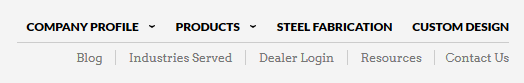
The navigation itself doesn’t look half bad. It’s neat and clean, which is what good navigation should be. But you’ll notice that there is only one customer-focused navigation option (products).
By looking at this, you’d think that the steel fabrication page is one of the most important pages on the site. It isn’t. Do they do steel fabrication? Absolutely. But it’s not really what they sell.
In this case, the site sells steel fabricated products, and very specific ones at that. Which means that the things customers want most are hidden behind a drop-down menu of options. In my mind, this is completely opposite of what a navigation should be.
That’s not to say the company focused pages are not important. They are. Just not as important as a site’s products or services. As such, we want to keep these as part of the main navigation but less prominent than the customer-focused navigation.
For the most part, every site has–and needs–standard company-focused pages; home, about us, contact us, blog, etc. You don’t need keyword research to tell you that these are important pages. Depending on your industry, you may need additional company-focused pages in the navigation for anything about you or your company that you believe is important information for your visitors to have easy access to.
Customer-Focused Navigation
The most visible navigation should be your top product or service categories. If you’re a small company, it might be a link for each of your products. However, if you have more than half a dozen products, there is a good chance they can be segmented into categories.
Take a look at the navigation structure used on our site at the time of this writing. As you can see, the customer-focused pages are the most prominent navigation options, and the company-focused pages are secondary:
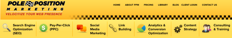
This ensures that every visitor, at a very quick glance–and regardless of what page they land on–knows what you do, offer, or provide. They don’t have to click, search or even hunt for what they want. They can see it right there in the main navigation.
Using your keyword research, you’ll want to find the best search phrases that represent each category of your products or services. Remember, you want your visitors to see a representation of what you offer.
If you sell clothes for kids, creating navigation groups for Boys and Girls clothing may sound like a good idea, but it doesn’t provide much detail for your visitors. Instead, try focusing on your products. Pants, Shoes, Jackets, etc. Then, each of those categories can have a division of boys and girls, age groups, or whatever. Not only does that allow you to have more focused landing pages, it doesn’t leave the visitor guessing as to what kind of kids clothing products you sell.
Your keyword research will tell you what people search for. The most frequently searched core terms are often going to be the best top-level pages. Not always, but it’s a good place to start.
Step 3: Find Secondary Level Pages
In the navigation image shown above, the categories provide the broad overview of what we do. However, it doesn’t represent our specific services within each category. Going back to our clothing store example, shoes makes for a good heading, but it says nothing of the types of shoes you offer, which might break down into outdoor, business, formal, slippers, etc.
This is really where your usage of the keyword research really kicks in. You should have a plethora of phrases that are typically used by searchers looking for what you offer. The goal is to look at each phrase to determine if it warrants its own page (or sub-section) on the website.
Not every phrase will. For example, if you sell gas cans, you may find that both eco-friendly gas cans and earth-friendly gas cans are frequently searched. But because those two terms pretty much mean the same thing, it doesn’t make sense to create two navigation pages for those phrases. The best tactic is to pick the most frequently searched phrase for your navigation title and let the content of the page reflect the different ways searchers refer to the product.
It’s not uncommon to move pages around from one group to another as you assimilate the keyword research information. For example, if you offer customization of your products, you might initially think to have a “custom” sub-category under the each of the appropriate category groupings. However, if customization is highly searched and fits your business model, it might make more sense to create a top-level custom category with sub-categories for each product that can be customized.
I’m not saying that’s the right way to go for you, but it’s an option to consider. Sometimes things like this come down to a judgment call. Do what you think is best. In the end though, it is the customer who is right, which leads us to the fourth step.
Step 4: Real-World Testing
No matter what, your new navigation should be subject to your visitor’s needs. You may think you have the best navigation possible, but that determination is really up to potential customers who come to your site and use it. So roll out your updated navigation and then gather new visitor data to see how it works. Then modify as needed to improve.
Analytics
Analytics can show you exactly how visitors are using your new navigation to find what they are looking for. It will also give you an idea of what pages assist with the conversion process. The downside is it takes time to accumulate enough data and you have to make a guess as to why visitors do one thing over another.
If no one is clicking on a link you think is important, it could be because it’s in the wrong location, mis-named, or something else. Analytics tells you what, but not always the why. Many times you can determine the why, but it’s an educated guess.
Still, Analytics is an important part of understanding your new navigation and should not be discounted by any means.
User Tests
Performing actual user testing is a great way to get real-time feedback on what visitors are thinking as they navigate your site. These tests allow you to set up specific goals and then document what the testers do, while allowing them to explain why they are making the decisions they are making. This provides great feedback into the mind of your visitor.
This information can help you write better navigation titles, find better placement for specific navigation links, and a whole host of other user-centric improvements.
A/B & Multi-Variate Testing
With your user and analytics data in hand, you can now set up some multi-variate testing. This pits option A with a new option B. Maybe you change your navigation background color, the order of your links or link titles. Once the test has run, you can see which version performs better. The winning version is awarded (semi)permanent placement on the site. I say “semi” because nothing is permanent on the web. You can just as easily run a new A/B test against your winning navigation and improve the user experience even more.
Step-by-Step
I honestly can’t decide which step is my favorite. But I do know this–they are all important. Many businesses spend a great deal of time working on their website without properly considering the navigational needs of the visitor. Taking the time to work through these mind-blowingly simple steps will not only improve your visitors’ on-site experience, it’s an easy way to improve customer interaction and conversions.
What’s your process for optimizing navigation?
 Image Credits
Featured Image: Image by Stoney deGeyter
All screenshots by Stoney deGeyter. Taken April 2016.
