Carsten Cumbrowski

New Stumbleupon Interface

August 19th, 2007 by CarstenCumbrowski | 12 Comments

Stumbleupon.com launched a new beta interface tonight. I just noticed the change when I stumbled a few pages.

I was playing around with the new interface and I have to say that I like it. It is IMO much more intuitive to use. It also looks much more organized and overallĀ better and more visually appealing. For people who prefer the old look and feel exists the option to switch back to the old interface and back. I doubt that many people will actually do that.

I did it once to be able to take some screen shots that show the same page with the old and the new interface. Once I was done with them, didĀ I return it to the new look and leave it like that.

Good job.

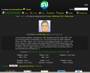
My new Stumbleupon home page (left) versus my old home page (right)

stumble_new_about.pngstumble_old_about.png

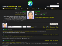
My new “About” page (left) versus my old one (right)

stumble_new.pngstumble_old.png

Stubleupon is a good and often underestimated source of traffic to your site. I also use it myself to discover new content on the internet. Virtually everything Stumbleupon selects and redirects me to is content I like. Professionally relevant content as well as personal stuff I just like. Less than a handful of pages from hundreds of stumbled pages did I not like. I use Stumbleupon as much to promote my own content and content I think is good as I do to discover new content, I would probably not come across without it.

The new and improved interface is another good reason to check it out.

Cheers!
Carsten Cumbrowski

Tools, services, articles, podcasts, videos and other resources for marketers at your fingertips for free at the internet marketing resources portal at Cumbrowski.com.

Vote for this post : 0 Vote down Vote up or Buzz it at Yahoo :


Comments

12 responses so far ↓

  • nonya on Aug 19, 2007 at 4:43 pm

    New Interface? The SU beta went up 8 weeks ago…in terms of the Internet and the average SU user, not so new.

  • Glen Allsopp on Aug 19, 2007 at 4:44 pm

    Its a lot better now in my opinion. Easier to navigate

  • CarstenCumbrowski on Aug 19, 2007 at 5:09 pm

    Nonya: Really? It looked different yesterday for my account than it looked today. Maybe it was in a closed beta and was now rolled out to the general public. That would explain things.

    I was not part of a beta and only a casual SU user. I also did not have the options before to change the interface.

  • testi on Aug 20, 2007 at 12:11 am

    StumbleUpon is the best way to discover great websites, videos, photos, blogs and more. Channel surf the internet and get personalized recommendations

  • Wayne Smallman on Aug 20, 2007 at 7:40 am

    I made a few comments about the general layout of StumbleUpon on a forum over there some weeks ago and got stonewalled.

    Fast forward a week and guess what? The ideas I put forward have in part been implemented.

    I’m not saying I was taken seriously, because their work must have been well underway at that point.

    But I just find it odd the attitude some have with regards to suggestions that mirror their plans.

    Not every idea needs to be intrinsically new to be good…

  • CarstenCumbrowski on Aug 20, 2007 at 8:15 am

    Wayne:

    Tell me about it. some companies don’t appreciate the fact that somebody takes the time to provide a feedback and makes suggestions…. FREE.

    If the suggestion is already in the making, just say it… I would be happy to hear that, because I make the suggestion for a reason.. I would like to have that option/feature etc.

    It’s unbelievable sometime. Fortunately are there still good examples to be found. Usually the smaller and less known services, the start-ups… when they grow big and fat, they often grow ugly along with it and forget their roots from time to time.

    Thanks for the comment btw. :)

  • Wayne Smallman on Aug 20, 2007 at 10:10 am

    I had been using the Beta of the StumbleUpon UI for quite a while, and I really like it.

    This post of yours is quite a coincidence, because I’ve got a couple of StumbleUpon articles in the pipeline, so I may make reference here.

    Oh BTW, there’s no need to thank me for commenting! It’s a pleasure…

  • luke on Aug 20, 2007 at 11:35 am

    It seems too cluttered to me. Thats the only thing wrong with it. I still like the old interface better.

  • ALLIE on Aug 21, 2007 at 8:10 am

    I RELLY LIKE NEW SETUP..ALSO THAT I CAN REVERT TO THE OLD NE IF I NEED.. AS I’M PARTIALLY SIGHTED,I APPRECIATETHE BRIGHT DEFINITION OF PAGES..ENJOYING STUMBLES..ALL AGES…WORLDWIDE…BRILLIANT…!! THANKS ! CUPPA :)

  • Matt Keegan on Aug 21, 2007 at 9:59 am

    I believe this BETA has been available for some time as I have been using a new StumbleUpon interface for weeks now. Perhaps they made it universally available to users?

    I like the interface too, but I can see where someone might want to access the old one, given its familiar look.

  • CarstenCumbrowski on Aug 21, 2007 at 9:58 pm

    Matt: It seems like it, because it changed for my account in the night between the 19th and 20th. I was not part of the closed beta and also did not sign up for any closed or public beta.

    I actually had problems with the old interface and it was harder to get to certain stuff, even if you knew that it existed. I noticed in the new interface right away that a number of these problems were addressed and a number of sections are now much easier accessible than they were before.

    I did not had the oposite case yet, where I can’t find it easily in the new interace, but were able to access it without problems from the old one. Did you or anybody else noticed cases like this? If you do, let me know. Thanks.

  • The Sign Guy on Dec 25, 2007 at 2:42 pm

    Stumbleupon.com is great, I am addicted

Leave a Comment