

Nothing is more boring and unmotivating to a user than seeing a big “Click Here” or “Learn More” link.
As a user, they’re already researching a product or a service they want to purchase. Of course, they’re going to click links to learn more.
Going Beyond “Click Here” Or “Learn More”
So, how do we get users motivated to take the action that we want them to?
It begins by:
- Understanding user goals and user behavior.
- Establishing trust.
- Creating accessible, clearly labeled directions that inspire interest.
It sounds so easy in theory, but in truth, why are our webpages only converting at an average of 2.8% in the US?
Obviously, something is missing from our webpages. If 97.2% of us don’t convert on a webpage, we’re likely confusing our users on what we want them to do to some degree.
Let’s dive into how we can accomplish this.
While You’re Here, Go There Now
The trick to optimizing calls to action is to present the action at the precise moment when your website visitor is most interested in taking the next step.
If a user is met with a call to action before any information, do you think they are going to click on it?
There has to be compelling content preceding the link, as well as an accurate description of the landing page.
If the landing page isn’t what a user expected, every time you present another opportunity to leave the page, your user may not trust that you can help them solve their problem.
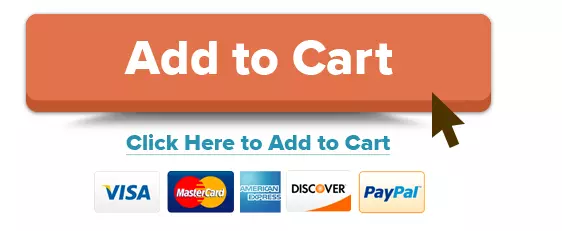
The call to action is clearly labeled in the example below.
Even better, it is obvious designers understand their customers’ fears over money, ease of use, customer confidence, and the use of color.
First Date Links
When your webpage visitor is ready to take action, they must feel confident that the link invitation is worthwhile, credible, and constructive.
When you present a new product offering, nothing should prevent your visitor from immediately seeing what it is.
We may begin by being sly, especially if we want something. I call these “First Date Links.”
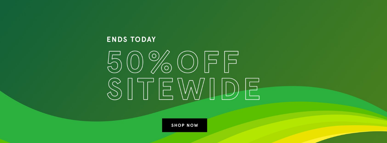
The screenshot above is taken from an ecommerce website. What you see here is the entire top half of the homepage.
There is no text. There are no product images.
First-time visitors would need to know in advance what the company is selling.
With this website, first-time visitors are required to scroll down, wait for the gigantic images to load, and scan minimal text to gain a better understanding of the brand and its products.
The fun part of this “First Date Links” example is knowing that this particular brand runs this special or something similar to it every single day.
There is no incentive to “shop now” for regular customers and first-time visitors have no idea where that “shop now” button is taking them.
They’ve been presented with this link that will likely overwhelm them with choice and decision paralysis – and most likely leave the site.
Try adding specific promotions for your loyal customers, or even first-time customers, into your marketing strategy.
By creating specific promotions segmented by customer type, you’re showing that you understand what they’re searching for.
Trust, credibility, and being forthcoming with your story add spice to calls to action on websites and real-life too.
Scarecrow Links
If you have watched the original film, “The Wizard of Oz,” you will understand why I refer to these calls to action as “Scarecrow Links.”
These are calls to action that provide many choices, usually with vague labels and often to the same destination.
In the film, when Dorothy is traveling the Yellow Brick Road to find Oz, she comes upon the Scarecrow and asks for directions.
Dorothy: Now which way do we go?
Scarecrow: Pardon me. That way is a very nice way… [pointing]
Dorothy: Who said that?
[Toto barks at the Scarecrow]
Dorothy: Don’t be silly, Toto. Scarecrows don’t talk!
Scarecrow: It’s pleasant down that way too! [pointing in another direction]
Dorothy: That’s funny. Wasn’t he pointing the other way?
Scarecrow: Of course, people do go both ways [pointing in both directions]. That’s the trouble. I can’t make up my mind. I haven’t got a brain. Only straw.
Sometimes, calls to action are placed within webpage content at a moment when we really don’t want choices. We just want to be directed to that cool thing you just showed us.
In the example below, the top CTA is the best option because the destination is clearly defined and is the desired user task.
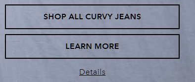
If the company wants customers to learn more about curvy jeans, they can provide this information on the landing page that presents sorting options when they click to shop all the curvy jeans.
The smaller link to details would make more sense if it explained what the details are about.
Is it a size chart? Pricing?
What does that link do for us that “Learn more” doesn’t offer?
What does the user really want to do here after they have been shown images of curvy jeans?
Link Optimization Is More Than A Label
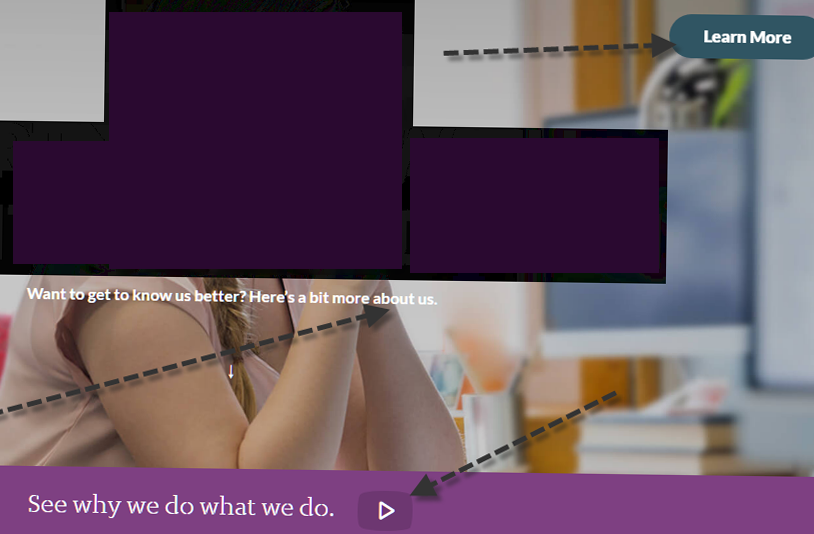
This next example is a mixture of a button, text sentence, and text sentence with a clickable icon overlaying a large header image.
If you were to watch someone using your website during a live session, you would most likely watch them mouse over the button, the text, and the text with the icon to see which one is going to go somewhere they want to go.
For this example, the “Learn more” button label provides no information about what we are going to learn.
It is the most visible CTA and the eyes of the person in the image are facing the button, which is a designer trick because studies show we look to see what the face is looking at.
How can we optimize the CTA for this page?
First, remove the “Learn More” button. We are going to give it an upgrade.
The text below the image, in tiny font size, is not linked. It asks a question, but the user must look for where to get the answer.
It also asks a question that may not be as important or interesting as the one following it. I would remove the entire “Want to get to know us better” sentence.
The more compelling story is why.
The button can be larger and placed in line with the model’s eye gaze. The button label is the invitation to “See why we do what we do” and link that to their story.
Not only does this narrow the choice to one link for one lead task, but it is easier for screen reader software to announce the link and direct visitors listening to the page.
Links with labels such as “Learn more,” “Read more,” “Shop now,” “Submit,” “Click here,” “Download,” and “Continue” are common.
However, these links are probably less likely to be clicked on than a more specific, inviting link.
Don’t be afraid to experiment to optimize calls to action by inviting the action. Don’t be afraid to tell the user what you want them to do by clicking that link.
If anything, you’re guiding them on their purchase decision journey.
Now, sometimes we may get a little too enthusiastic with our link text.
Every Call To Action Is A Risk
Remember that when providing a call to action, it must be placed at the moment when you inspired your reader to leave their train of thought.
Every call to action is a risk. At the minimum, your link should:
- Have a clear label with the exact destination.
- Be easy to see and read.
- Be compelling to the person.
- Present itself at the exact moment when it is most useful.
- Not have competition (other links) nearby.
- Navigate to the desired task that will provide a benefit to your user.
As humans, our attention span is already short.
Each time a call to action takes them forward, they may have forgotten where they just were.
It is important to support tasks with well-organized information architecture and navigation that provides signals for a sense of place.
Calls to action are sometimes annoying interruptions.
What additional incredibly fascinating information is hiding behind “Learn more” that is so compelling that you have interrupted their thought process?
It better be worth it.
Conclusion
We have a small window of time to catch a user’s attention.
Using generic language like “Click Here” or “Learn More” won’t cut it anymore. When creating call-to-actions for a user, try to reiterate what exactly you want them to do.
Don’t insert CTA links for the sake of having them or taking up space.
Rethink your link strategy by viewing it from a user’s point of view: Is there more than one link option? Are they both needed? Are they clear enough for a user to take action?
Furthermore, your content leading to that call-to-action should be enticing enough for them to want to take action.
More Resources:
- Unusual Call To Action Examples That Actually Work
- How To Create A High-Converting Call-To-Action Button: 4 Best Practices
- Perfectly Optimized Content From Start To Finish
Featured Image: Motortion Films/Shutterstock
In-post image #4 created by author, June 2022
