

Your landing page is basically like your Tinder profile.
You’ve only got a few seconds to keep someone from swiping left and close the deal as quickly as possible. And if you want to play the long game, you better pack a persuasive pitch.
Except, instead of asking for someone’s digits, you’re asking for their email address or trying to get them to purchase something out of the gate.
It isn’t the place to write a soliloquy. That’s what your homepage is for.
You need to be smooth. Like, Purple Rain levels of smooth.
And above all else, you need these five elements.
1. Concise (but Not Generic) Copy
Who’s the first person you look for when you’re creating a new webpage?
It’s probably a designer. Graphic, user experience, interaction, genetic. Whatever your variety.
Except that, when you strip down all the fancy graphics, and you’re looking at the bones of your page, it isn’t the designer that’s plating it with calcium to grow up big and strong.
It’s the writer. The copy. And it’s an art unto itself because it needs to be concise without losing readability.
The best of landing page copy goes even further than that. It aligns itself to the user and gets personal.
Shopify understands this better than most. Check out their Facebook landing page.
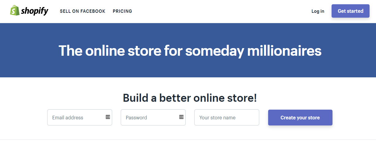
They make a clear value proposition and a promise in just 11 words while tapping into their intended audience’s aspirations.
Maybe it’s not enough to get you to sign up. But it’s probably enough to make you scroll down.
And that’s magical because landing pages have the highest bounce rate of any page on your website at 70 to 90 percent. That bounce rate isn’t necessarily a bad thing, but it’s a time crunch.
One which gets even tighter when you’re working with the younger generation, by the way.
Eye-tracking research indicates Generation Y (a.k.a. those cursed millennials who are destroying every industry) prefer hero banners and minimal copy.
So the pressure for concision isn’t going to relent anytime soon.
That’s not even digging into your microcopy. You know, the copy that’s not part of your content, like the stuff you see on buttons.
That has the added challenge of needing to concise without being generic. “Buy now” is on every website out there. Do you really want to be like every website?
Microcopy still has to tell your story. Still needs to feel personalized.
Something like what you see Too Faced doing on their homepage.
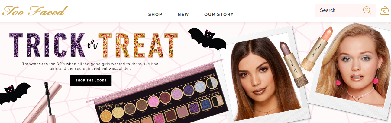
Three words on their CTA. It’s concise, personalized to the product and people involved, and still directs a clear action for users to take.
That makes it genius microcopy.
Basically:
Keep the copy tight on your landing page. But make it yours, whether it’s your microcopy or your body copy. Your visitors can read generic headlines and CTA everywhere.
Don’t make your landing page one of those places.
2. Someone Else Vouching For You
You’re a standup girl or guy.
But how do users know that when they arrive on the landing page?
To them, you’re one step away from the creature from the Black Lagoon. They don’t know you, so they don’t trust you.
Like personal relationships, that’s a major barrier to taking things to the next level. If you want to get past second base, you need to build trust. Quickly.
And nothing says trust me like someone else saying it for you. In other words, social proof.
When you land on “Content Marketing for Ecommerce: 5 Essential Tips,” what’s one of the first things you see?
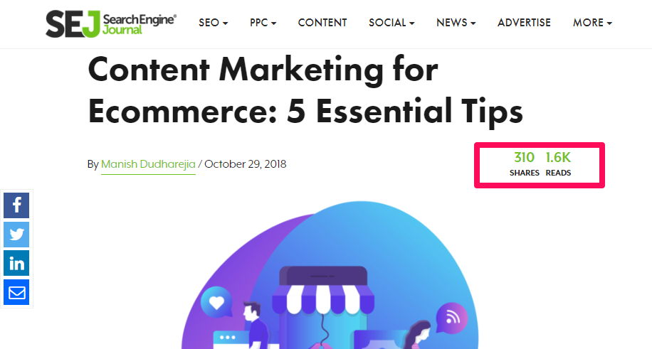
It’s been shared over 300 times. Read at least 1600 times.
So maybe there’s something in that article worth checking out.
The same concept applies to your landing page.
Look no further than Brian Dean’s social squeeze page – converting at 21.7 percent – for proof.
But share widgets aren’t the only way to incorporate social proof and trust signals.
Testimonials and reviews can work, too.
Or just showing who your other customers are, like BigCommerce does.
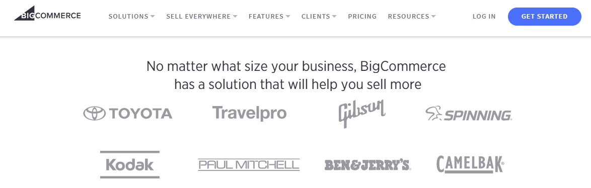
If Toyota and the glorious makers of Cherry Garcia trust them, shouldn’t you?
Bottom line:
People won’t take you at face value. You need someone else to put in a good word for you before they convert into leads.
3. Room to Breathe (a.k.a., Negative Space)
Let’s take the opposite approach for a second.
Do you know what your landing page doesn’t need?
Clutter.
Landing page elements, like people, need space to breathe. Empty space between elements and on your page isn’t wasted space.
It’s calming, it makes your elements – and their hierarchical relationships – clearer.
And on a landing page, adding more negative space, even just a tiny strip of it, can make a big difference in performance.
In fact, skipping the navigation menu on a landing page can uplift conversions by a full 100 percent.
Adobe does negative space really beautifully on their Gartner report landing page.
It’s intriguing, it has the concise copy that’s tailored to the audience, and it’s easy on the eyes. You aren’t being bombarded by a million competing elements.
You’re being invited to learn more without claustrophobic margins.
Yes, it makes the landing page a lot longer. But that’s not always a bad thing, either. If users need to know more about your product before coming onboard, longer is better.
And assuming you aren’t Adobe, someone on your landing page probably does need to know more about you before they take the plunge.
So give them room to grow with you and space to make their decision.
4. Images with Line of Sight
Humans are social, nosy creatures by nature.
We want to know what everyone else is looking at.
You can use that to your advantage on your landing page.
Someone can ignore a picture of a cup of coffee, but ignoring a human face is nigh impossible.
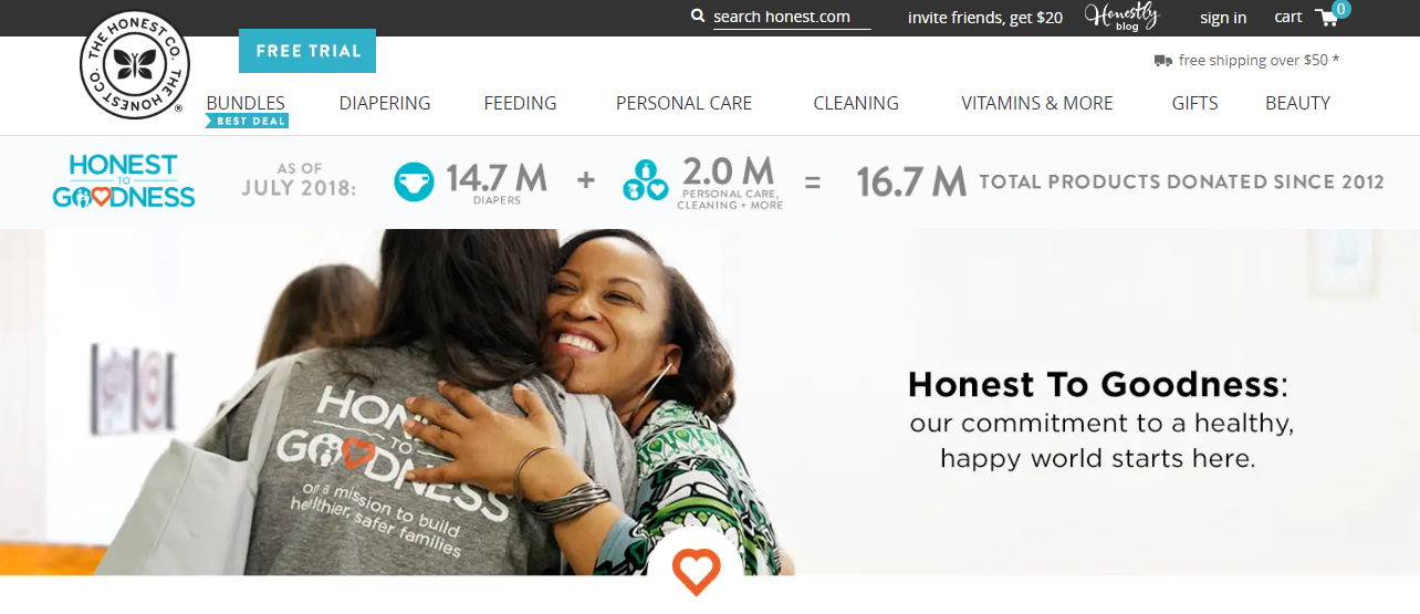
The Honest Company has this down pat. You basically can’t shake a stick on their website without finding a face.
But to really make your landing page pop? Pair it with a human face that’s got a clear line of sight to follow.
It turns out that neither eye gazes nor arrows can be ignored.
(But you should probably stick to one of the two, see our last tip about avoiding clutter.)
This is a simple element, but a powerful one.
If you’re going to use imagery on your landing page, make it human. And encourage our natural propensity for nosiness.
Or, better yet, use the last element on this list.
5. Motion Graphics & Video
Have you ever told yourself this lie?
“I’ll just pop on ‘The Office’ and get some work done.”
If you did, let me guess what happened: you accomplished next to nothing.
Ignoring that it’s one of the greatest shows to binge, this is another human nature thing.
We’re primed to track motion — we needed to when we were trying to avoid becoming a sabertooth’s next teatime snack. That evolutionary trait still characterizes our peripheral vision.
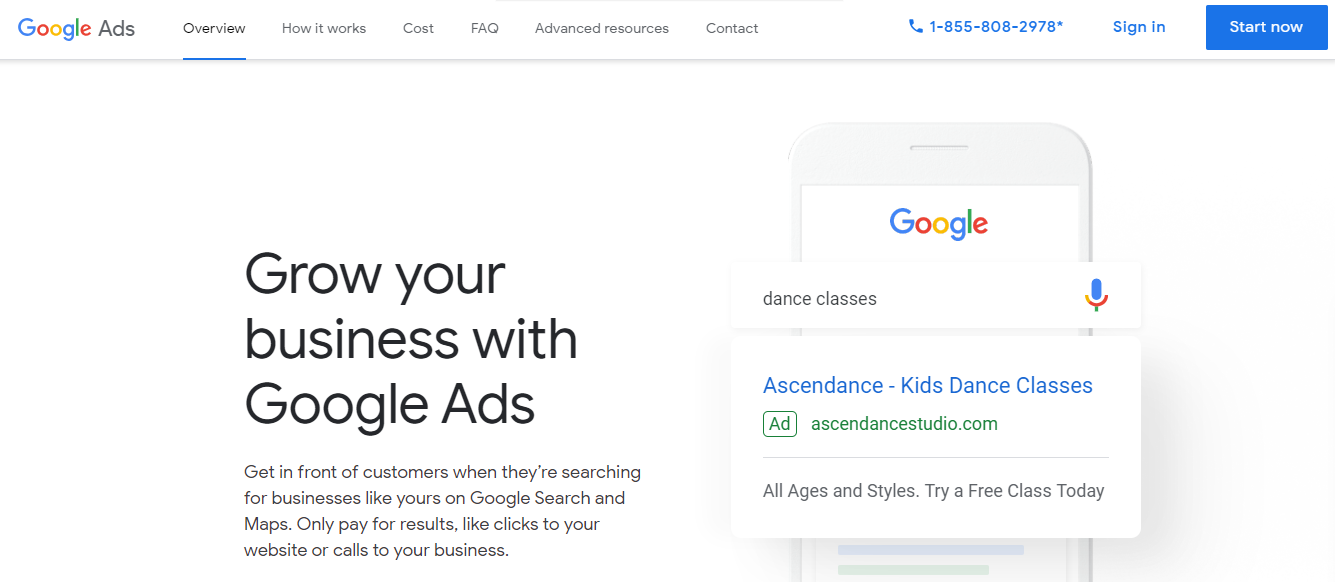
So even though there’s nothing (physically) threatening about the Google Ads landing page, you’re incapable of not watching the animation.
And that makes it a great element for a landing page.
It’s also probably why adding videos to a landing page can increase conversions by 86 percent.
Interestingly, this can be especially impactful if your demographic skews male. Men pick up on motion faster than women do, science says.
But ultimately, it doesn’t matter who your demographic is. If they’re human (and, presumably, they are), adding motion to your landing page will get their attention.
And what’s what you want, right?
Conclusion
Landing pages have one purpose: to make visitors convert.
Making those conversions actually happen is hard work.
Your landing page copy needs to stands apart from the generic sea of offers.
Your page will be even better if it includes a good word from someone else.
Don’t crowd users, though. They – and the elements on your landing page – need room to breathe.
A little help for where to look doesn’t hurt, either. Use images with a clear line of sight to direct user’s attention to the most important elements (probably your CTA) on your landing page.
Finally, add movement. Humans can’t help but notice when something is moving around them, whether that’s from a motion graphic or a video.
It’s just nature.
And you can use that to get to the (lead) nurture.
More Resources:
- How to Make the Right Landing Page Rank: A Complete SEO Checklist
- 10 Best Ways to Optimize Mobile Landing Pages
- 5 Best Examples of Killer Mobile Landing Pages
Image Credits
Featured Image: Pixabay
All screenshots taken by author, November 2018
