
They say that content is king, and that’s true. Quality, keyword-rich content will go a long way for your SEO and conversion rates.
But people are visual in nature, and long blocks of text don’t do your site any justice.
That’s why you need to strategically incorporate high-quality, emotionally charged, appropriate imagery throughout your site. Images help attract your viewers’ attention and keep them focused on your message.
Visuals deliver context for communicating messages in the three ways: by providing information, eliciting emotional responses, and causing persuasion.
Here are some tips and examples of different ways to use visuals for persuading conversions.
Informational
One of your website’s primary purposes is to provide potential customers with all the information they need to make a purchasing decision. Sometimes, that information can be lengthy or complex, and might be more easily digestible if represented visually. Other times, you may be selling a physical product (like a piece of clothing or a device) that people will want to see and examine before making the big commitment.
In any case, images can help deliver information, provide context and tell your brand story.
Deliver Information
Let’s pretend we’re shopping online for a new iPhone. We go to the Apple comparison site and land on a page that provides excellent information on the three latest iPhones in terms of specs, capacity, price and color. When removing the images, like I did in the screenshot below, you have to really compare all three descriptions to identify the differences between them, especially visual differences like size and color.
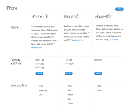 Screenshot Taken 6/12/2014 from apple.com
Now if we look at the original presentation, we see that the images instantly convey an order, with the largest and therefore most advanced on the left and the smallest on the right. A quick scan of the prices supports this assumption. We can also see not only the different color swatches at the bottom, but images of the phones in all of these colors as well.
Now all that viewers have to do is check the differences between the iPhone 5S and the 5C. That’s it. The visuals provide an instant idea of what the three models look like and what their main differences are, so visitors can easily make a decision.
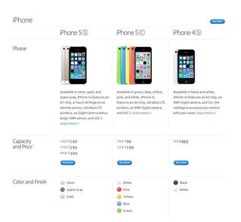 Screenshot taken 6/12/2014 from apple.com
Provide Context
When explaining a complicated concept or idea, it can be tricky to accurately convey your message without going on and on to make your point. On the web, you want to be as precise as possible tso visitors can understand your idea within seconds.
This is where visuals like graphs, charts and infographics are handy. These elements help you communicate a message without necessarily having to spell it out.
One such example could be instructions for tying different knots, a task which would be almost impossible to explain without some sort of visual representation. “Tie strand side A around strand side B twice before tucking strand side B through the left-side loop” is complicated and hard to visualize, especially for first-timers.
Knot 2 Shabby is an infographic (pictured below) that effectively provides instructions for tying different knots in a purely visual format. With step-by-step graphics to detail every step of the way, this infographic takes a fairly complicated subject and makes it as easy to follow as possible.
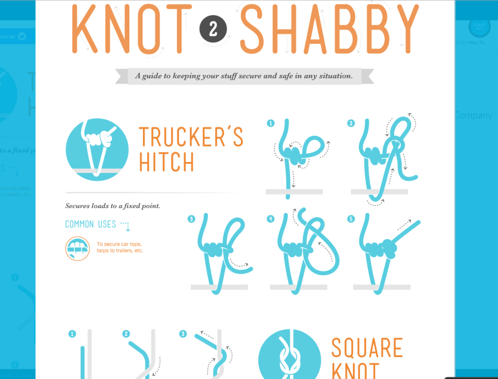 Screenshot Taken 6/12/2014 from visual.ly
Sure, visuals are great. But you might be wondering how the heck can draw in any revenue via this method. Using context is one of the strongest methods to inducing sales from potential consumers. The infographic, Pick a Mood for the Room, is quite honestly the greatest “context” piece I’ve come across. By attracting readers interested in remodeling their room, this infographic captures the attention of shoppers and shows the context for which their choices would affect their remodel. Conveniently, the producer of the content, Gate to Garage, sells those goods.
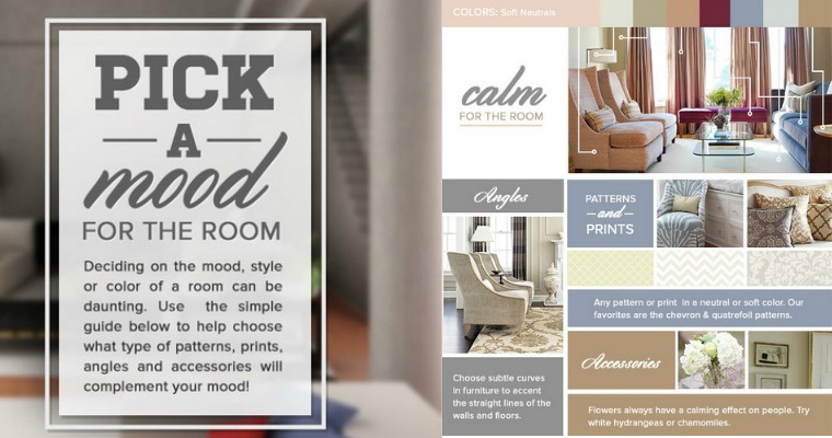 Screenshot taken 6/12/2014 from Gatetogarage.com
Tell a Story
Visuals can also put content into perspective, adding value to your content in many ways. A selection of words that stand alone won’t be nearly as effective as they could be with images.
An example is Future of Car Sharing, an organization devoted to spreading awareness about the benefits of car sharing. Its website is a fun, interactive experience where users “drive” through different sections of horizontally scrolling content.
One of the sections describes the positive impact of car sharing on carbon dioxide emissions. It features the statistic:
“In 2009, car sharing diminished global carbon dioxide emissions by 482,170 tons. (That’s half the weight of the Golden Gate Bridge!)”
By itself, that statistic is a really interesting and informative fact. But with the imagery of the bridge over the ocean and the “emissions” in the background (combined with the experience of driving across the site), that content goes from describing a statistic to telling a story.
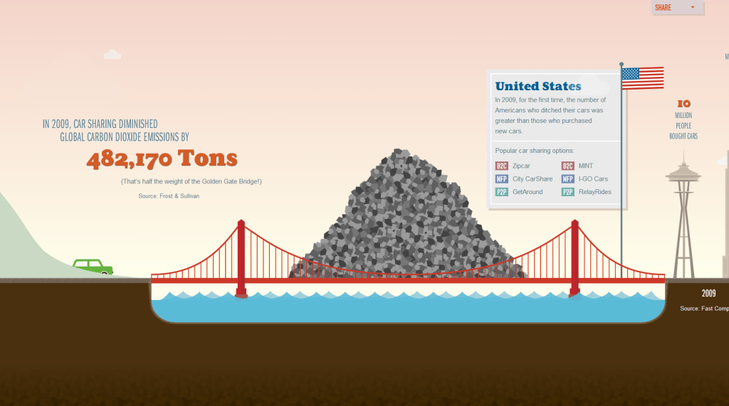 Screenshot taken 6/12/2014 from futureofcarsharing.com
And stories are more powerful, more inspirational, and more likely to motivate action.
A similar interactive infographic was created to celebrate the work and accomplishments of Carroll Shelby, creator of the Ford Mustang, after his passing. This Tribute to Carroll Shelby recaps the history of the Ford Mustang and allows everyone to pay their respects.
Emotional
Visual context is not just visual, but also emotional. Different shapes, colors, and fonts can cause different emotional responses in people.
Red is passionate. Rounded edges feel more inclusive. Images of people can make a site feel more human, and therefore more relatable.
By understanding these reactions, you can create visuals that elicit the emotions you want your customers to associate with your brand. This will help you trigger user actions, offer attractive experiences, and show your customers that you care.
Trigger Actions
A unique, attractive visual is a great way to attract attention and motivate your visitors to take action on your site.
Signing up for an account or a newsletter is generally a boring task. Why not incorporate some creative visuals that make the process a little more fun?
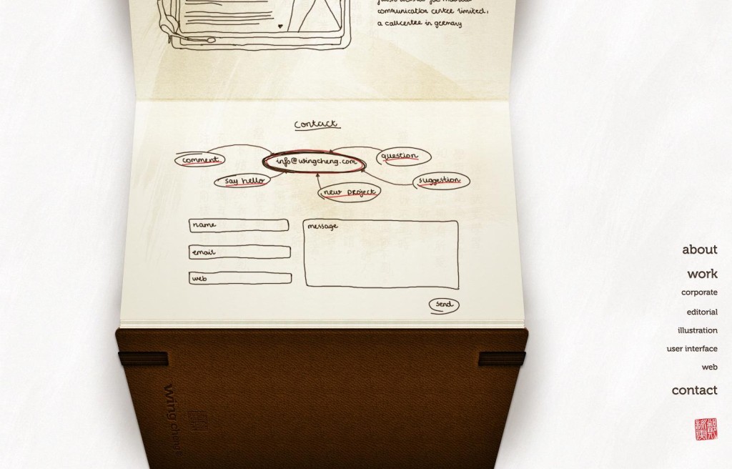
The motif of Wing Cheng’s website is an open sketchbook, with all of the sections designed as thumbnail sketches. The site’s contact form maintains this personality by following the same formatting. The form is simple and consistent with the rest of the site, and it’s easy to type your information in to the appropriate fields. The web at the top adds visual interest while displaying important contact information. All in all, this form brings out the quirkiness of the site while remaining fully functional for visitors.
 Screenshot taken 6/12/2014 from http://www.wingcheng.com/
Forms with fun, well-designed visuals like this make an otherwise-boring task more entertaining, which increases the chance users will follow through.
Offer Experiences
Visual context can offer your visitors more than just a block of text and a plain CTA.
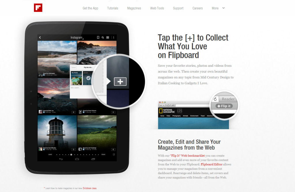
Flipboard provides a unique experience by showcasing its app in a strategically visual way. It shows the app on an image of a tablet, Flipboard’s targeted device. This way, you already have an idea of what the app looks like in action. The visual also includes a high quality call out of the app’s [+] feature, giving a vivid demonstration of the app’s main feature.
 Screenshot taken 6/12/2014 from flipboard.com
By using this visual to showcase its app, the site gives you more than just information about the Flipboard app; it gives you a snapshot of the app experience.
Show That You Care
You can also use visuals to take something frustrating and turn it into an opportunity to impress.
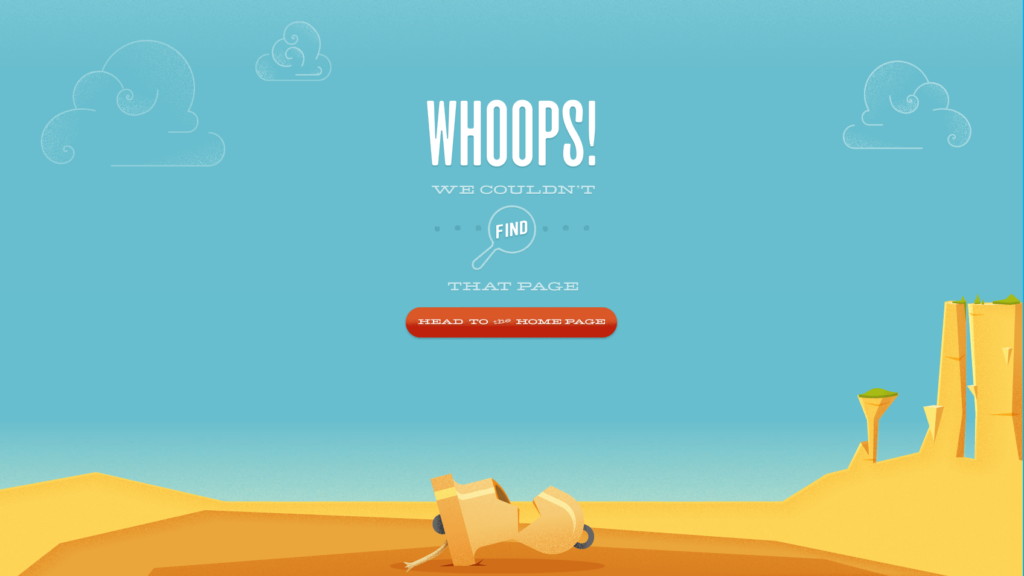
Take your 404 error page, for instance. If a visitor comes across your 404 page, it means that some page they were looking for on your site isn’t there.
By incorporating fun, unique visuals on your 404 page, you can show visitors that you put time and effort into the page and that you care about the mistake.
Take Bellstrike’s 404 page, for instance. This beautiful illustration is exceptionally consistent with the overall look and feel of the web site. The 404 page is both visually stunning and practical, because it lets you know that you’ve stumbled upon the wrong page, but you’re still on the right site, which is extremely important for retaining visitors.
 Screenshot taken 6/12/2014 from bellstrike.com
Of course, you don’t want errors on your site at all, but they can be unavoidable if external links to your site are incorrect. In case your visitors do get a 404 error, do your best to apologize and turn the incident into a positive experience.
Persuasive
Visuals have a unique power to convince. When used correctly, visual imagery can easily evoke memories and trigger emotions. By incorporating strategic visuals, you can help focus your visitors’ memories and emotions on your message and guide them to take the action you want.
Persuasive visuals can help you showcase your trustworthiness, display confidence, and create a feel-good atmosphere.
Showcase Your Trustworthiness
Expertise and authority help build trust. Trust is crucial for persuasion, since obviously we won’t listen to someone who we don’t trust.
How do you build this expertise and authority to gain that trust? You display confidence.
Study: The Influence of Confident Advice on Decision-Making
Don Moore of Carnegie Mellon University demonstrated this concept. In his experiment, Don asked volunteers to guess the weight of people in photographs and paid them for correct answers.
Before each guess, each volunteer was asked to choose one of four advice-givers (also volunteers) from whom to buy advice. The advice-givers submitted their weight guesses in percentage form, with some spreading their advice over multiple ranges. For example, one advisor might have said that there was a 60% chance that the person’s weight was 160-169 pounds, a 20% chance that it was 150-159 and a 20% chance that it was 170-179. A more confident advisor, however, might have said that there was a 100% chance that the weight was within the 170-179 pound range.
Before volunteers chose their advisor, they were able to see each advisor’s percentage spread, but not the associated weight ranges (i.e. advisor A feels 60% confident in one range, 20% confident in a different range, and 20% confident in another one).
Don found that volunteers were more likely to buy advice from confident advisors (such as the 100% advisor from above) than those who spread out their percentages, even if the confident advisors were inaccurate.
To translate this finding for the web, that means that people are more likely to trust you and convert with you if you display confidence.
Using Visuals to Display Confidence
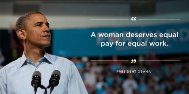 Screenshot taken 6/12/2014 from facebook.com/barakobama
How can you use this in relation to visuals? You take strong, expert content and pair it with powerful imagery to create an air of confidence.
For example, let’s look at an image from President Obama’s Facebook page. The quote, “A woman deserves equal pay for equal work,” is powerful by itself. The image of Obama is also powerful by itself. But put them together, and they bring each other to life. The picture makes the quote more convincing, because it comes from an actual person of authority. The quote turns the picture into a powerful political statement.
By pairing visual context with content this way, you can display your expertise in a real and appealing way.
Create a Feel-Good Atmosphere
Generally, people tend to purchase products or services that make them feel good. Luckily, visuals are a great way to both brand yourself and give your customers those happy emotions.
Welcome to Rainbow Nursery. That slogan doesn’t really cause any warm, fuzzy feelings on its own. However, pair it with a cute, interactive graphic (as Rainbow Nursery did) and you create a colorful, personal, and inviting site. This, in turn, creates a caring and trustworthy atmosphere.
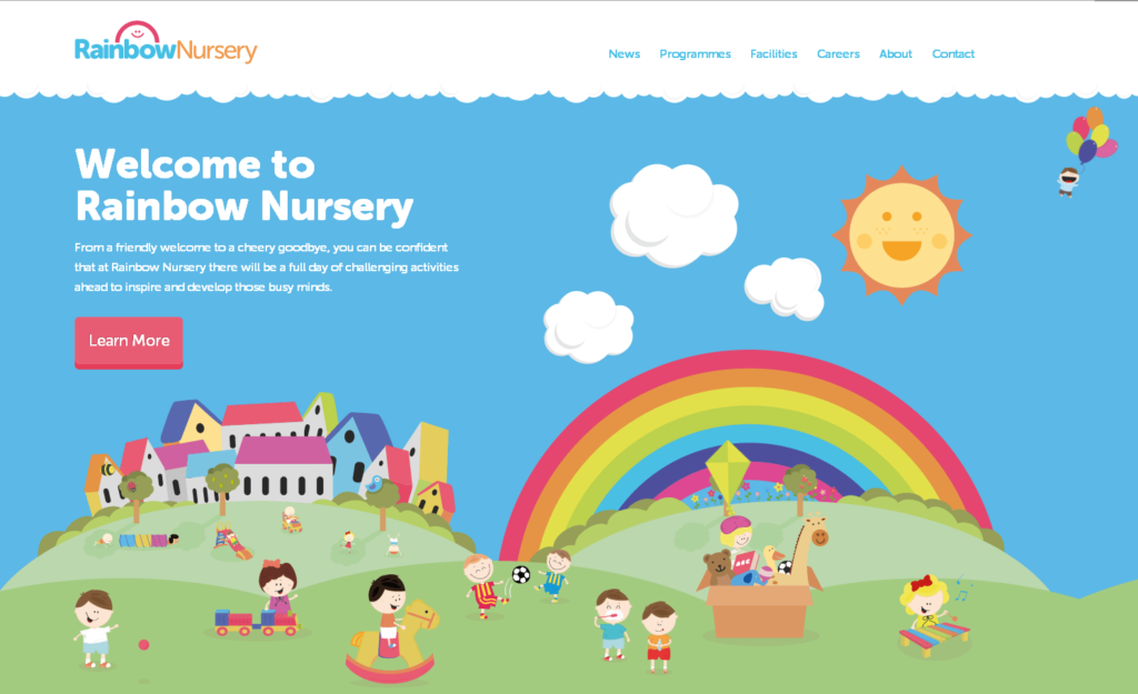 Screenshot taken 6/12/2014 from myrainbownursery.co.uk
Conclusion
Visuals truly are your route to persuading visitors to convert. When you’re tackling your next blog post, content page, or other web design project, keep the power of imagery in mind.
Remember that visuals are appealing and attract our attention. They help us present info, explain complex concepts, and tell our brand stories. By pairing your content with well-designed visuals, you can make life easier for your visitors and create positive experiences.
When visitors have positive experiences, they’re more likely to convert – and that’s a positive experience for you as well.
