
I’m about to give you a hard reality check.
There are millions of websites on the Internet, and all of their designers have the goal to increase traffic and maximize conversions.
What could you possibly do to make yours stand apart?
The answer: appeal to visitors’ subconscious minds. Subconscious behaviors are often the most powerful (and dependable) because:
- We’re all hardwired pretty much the same way, so subconscious behaviors tend to be universal.
- People aren’t aware of their subconscious tendencies and therefore can’t control them.
If you can appeal to the subconscious, you can influence the conscious mind and drive those coveted conversions.
The unfortunate thing about subconscious behaviors is that we have no idea that we’re doing them, so they’re really hard to analyze.
Correction: they WERE really hard to analyze, before we had heatmaps.
Heatmaps are a really great tool for analyzing subconscious conduct. Because they track vision behaviors (which are often subconscious), heatmaps can lead to visitor insights you simply can’t find using other methods. Gathering this psychological information can help you make strategic layout decisions to increase your conversion rate.
Here are some of the lessons that heatmaps have taught us, and how you can apply them to web design and SEO best practices.
Lessons on Web Design
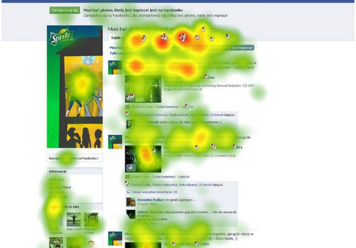
1. Put the content that your visitors care about at the top
Users will scroll down your page, but this study found that users spend 80% of their time looking at information above the fold and only 20% below it.
This is because of a limited attention span. Users want quick, direct information without having to do any extra work (like scroll or read more words). The further down the page they go, the less attention they have in the content. That’s why the content above the fold is the most valuable for attracting and maintaining your viewer’s attention.
However, viewing time increases significantly again at the very bottom of your page.
This is basic psychology at work. The serial position effect states that we’re most likely to pay attention and remember the beginning and end of sequential information.
This breaks down into two sub-effects: the primacy effect and the recency effect. The primacy effect suggests that people remember beginning information because it goes into their long-term memory, while the recency effect states that information at the end is stored in short-term memory.
Also, a separate study revealed that people spend more time on the left half of a webpage than the right – about 69 percent total.
So what does this mean for your webpage? Place the content your visitors care about above the fold and to the left so they don’t have to scroll or search to find it. If you can’t fit everything at the top, make sure your design layout is intuitive for scrolling. Also, consider putting a CTA or restating relevant content at the end to appeal to the recency effect and drive conversions.
2. Appeal to the F-pattern
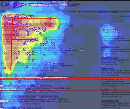 F – Patterns – Image Credit: Amit Agarwal Flickr CC
This study found that users often consume web pages in an F-pattern, which consists of the following three components:
- Users start reading horizontally across the top of the content area, forming the top bar of the “F.”
- Next, users move down the page a bit and then read across again horizontally, though usually covering less content than the first movement. This forms the second bar of the “F.”
- Finally, users scan down the left-hand side of the content, forming the stem of the “F.”
The F-pattern finding has several implications for web designers and marketers. Remember that users will almost never read your text word-for-word, especially if they’re searching for a specific piece of information, so you need to be strategic about how and where you make your points.
Make sure your most important information is located in the first two paragraphs, where readers scan across horizontally. There’s some hope that users will actually read this content, though they’ll likely read less of the second paragraph than the first. Also, start your headings, paragraphs and lists with two powerful keywords to keep users’ attention as they scan vertically (they’ll read the third word on a line a lot less often than the first two).
3. Provide visuals for men and information for women
The saying goes that men are from Mars and women are from Venus, and it seems to be true in the case of consuming web content.
In this eye-tracking study, men and women were asked to view profiles of people on a dating site. The results suggest that men are more visual and focus more on the images, while women tend to spend more time reading the information provided. In fact, women spent nearly 50 percent more time evaluating the profile, while men spend the majority of their time on the images.
How can you use this information to optimize your site? Make sure you appeal to both genders. Include some high-quality, interesting images as a visual element, and make sure you have specific information as well.
4. Avoid placing your content in typical ad locations
Advertising has gone a little crazy over the past 60 years. People see over 5,000 ads a day now, and they’ve developed a self-defense mechanism to combat the clutter. Much to a marketer’s dismay, visitors have learned to subconsciously tune out web elements that look like ads – specifically, parts of a web page where ads are conventionally located. These include the “banner” across the top of the page and the block content on the right-hand side.
You can find these areas on a number of websites. We can use the homepage for WebMD.com as an example.
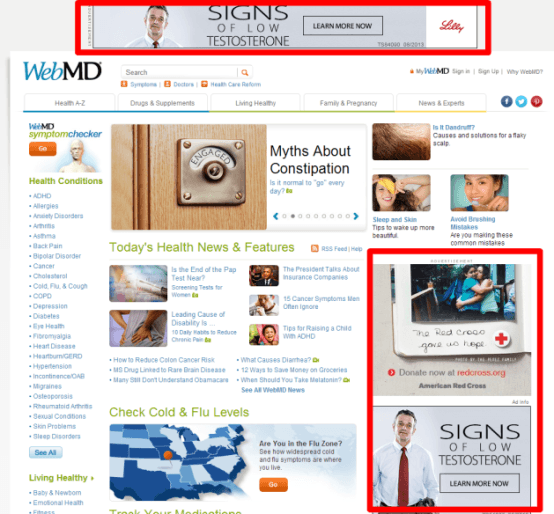 Screenshot taken 4/2/2014 from WebMD.com
Another study shows what this “banner blindness” looks on a heatmap.
The two ad areas received literally no attention from the viewer.
It’s easy to conclude that it’s not a great idea to put important content in these places. Avoid putting your information (especially CTAs or other conversion-necessary information) anywhere near them.
5. Consider using your models’ eyes to direct your viewer’s attention
Humans are kind of obsessed with other humans. From birth, we’re programmed to pick out human faces from other animals or inanimate objects. Therefore, it makes a lot of sense to use people in your design to attract attention. Everyone pretty much knows this already.
But did you know that people tend to look wherever a model’s eyes are looking?
That’s right. If your model is looking to the left, people will follow her line of vision and view the content to her left as well.
You can use this to direct your viewers to the information you want them to read.
Take this product page for a Vanity Fair Outlet for example.
The model’s eyes are looking in the direction of the product information beside her, which encourages viewers to look in the same direction and read more about the dress. By getting people to look at the product information this way, you’re increasing the chances that they’ll make the purchase.
6. Abandon animated headers
Animated headers are all over the Internet right now. We’ve all seen the banner at the top of a homepage that constantly scrolls through different high-quality images and products.
It seems common sense that, if everyone’s doing it, it’s a good practice, but you’d actually be wrong.
According to this study, automated headers annoy users and reduce conversions. In a usability study, a user was asked if Siemens (a company that sells appliances) had any special deals on washing machines.
The answer to this question can be located in the animated header on the Siemens homepage.
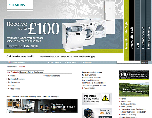 Screenshot Taken 4/1/2014 from Siemens-home.co.uk
Considering the fact that the offer to “receive up to $100” is the biggest item on the screen, both in terms of space and font, you’d think it would be easy to find. Yet the user failed to do so.
Why? For one, it goes back to that banner blindness we talked about earlier. The header has fancy formatting and looks somewhat like a banner, so that’s a strike. Also, the header cycles through photos every five seconds, which Nielsen Norman describes as “deadly.” This is a conversion killer because:
- Moving elements reduce accessibility for users who can’t consume content in such a short period of time.
- The probability that users will spot the information they want is drastically reduced when it’s only displayed a fraction of the time.
- Users simply get annoyed when web elements move on their own accord.
- Users assume that a moving element might be an ad, which makes them more likely to ignore it.
The takeaway from this is to avoid animated headers whenever possible. If you’re going to have a header, it should either show a new slide only when users ask for it or stand completely still.
7. Keep your e-mails readable in less than a minute
Sending your customers an e-newsletter can be a great tactic to maintain relationships and generate conversions. However, heatmaps show that people spend an incredibly short period of time reading an incredibly small amount of your content.
This study found that 67 percent of users found no focal points within newsletters – they tend to just skip the first paragraphs in newsletters and briefly scan the rest of the content. On average, people will spend 51 seconds on your newsletter, and only 19 percent of newsletters are read beginning to end.
Keep your newsletters short and direct, and include a clear CTA.
8. Emphasize elements so people will pick them in a hurry
A recent Caltech study discovered that, when distracted or in a hurry, people will choose the product that has the most visual impact. This is because we subconsciously decide items that stand out are more significant.
You might ask yourself: how often will my visitors be distracted or in a hurry? And the answer is: more often than you think. With the advent of smart phones and tablets, people are increasingly shopping last-minute and “on the go.” They need to make quick decisions and easy purchases.
Shopping is becoming increasingly hectic, but you can actually use this to your advantage. Take whichever products you want to sell and make them visually stand out from the rest through the contrast design principle. Make them bigger, brighter, and bolder so that they appeal quickly to the eye (and to the wallet).
Pretend you’re in the market for a new blender. Which product on the Macy’s website stands out to you the most?
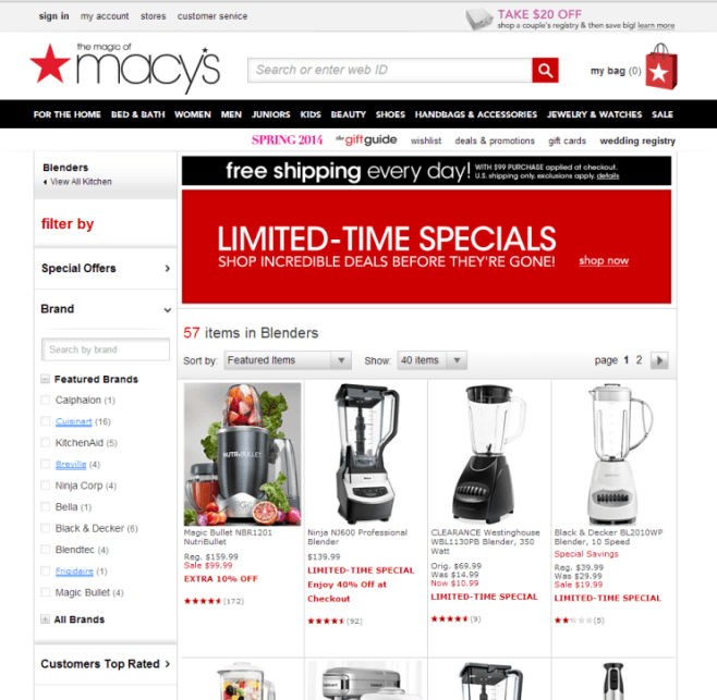 Screenshot Taken 4/1/2014 from Macys.com
For most people, the NutriBullet will catch their eye first. Why? Because it looks different from the rest. While the other product images show empty blenders against plain white backgrounds, the NutriBullet shows the blender filled with and surrounded by fruits against a gray background.
This works for two reasons. The first is the color scheme. The grays, greens, oranges and pinks are starkly different from the other blenders, so it draws your eye immediately.
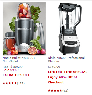 Screenshot taken 4/1/2014 from Macys.com
The second are the fruits themselves, which actually work to create an emotional response. It’s hard to associate any kind of feeling with the static, black and white Ninja NJ600, for example, but when you look at the NutriBullet, you see the fresh strawberries and can immediately smell and taste them. You might associate them with your mom’s strawberry shortcake, or with serving your kids a healthier dessert. Your senses and feelings are stimulated, and you begin to feel more attached to that product.
By emphasizing the NutriBullet this way, Macy’s has increased the likelihood that people will choose it, especially if they’re in a hurry.
Lessons on SEO
A research project conducted by Cornell University revealed several significant findings on how people consume search engine results pages. Subjects were given ten questions in various topics and were asked to use Google to find the answers. Eye-tracking technology was used to determine some interesting trends, including the following:
1. Users select a site in less than 5 seconds.
Here’s a basic breakdown of how users decide on a link:
- Snippet – 43% important
- Title – 30% important
- URL – 21% important
2. Users click the first promising link they see.
And they don’t look past it. If your competitor ranks above you, the majority of users will never even see your link.
3. Users review results from top to bottom.
This is why being the number one search result is so important.
4. The top two results are the most likely to be viewed.
Again, why ranking at the top matters.
5. Users would rather conduct another search than scroll down.
People dislike scrolling so much that they’d rather refine their search if the first five results aren’t what they’re looking for. That means that you need to make sure your link is in the top 5 and has a relevant snippet, title, and URL to qualify as a promising link.
Conclusion
Heatmaps have provided us invaluable insight into the subconscious mind of the web user. They’ve taught us the best places to place important content, including:
- Above the fold
- On the left-hand side
- In the first two paragraphs
- In the area where your models’ eyes are looking
They’ve also taught us where NOT to place important content:
- In typical ad locations (like the top banner and the right margin)
- In animated header format
Heatmaps have taught us what our web content should look like:
- Short and sweet if in e-mail format
- Emphasized, so people will pick it in a hurry
- Visual for men and informational for women
And also what our SEO should look like:
- Best case scenario: number one search result
- Second best case scenario: in the top two search results
- Absolutely necessary scenario: in the top five search results
- Relevant snippet, title and URL
In short, heatmaps have already done a lot of the work for you. Now all you have to do is take their results and use them to optimize your website. Make these psychological behaviors as easy as possible for your viewers, and I guarantee you’ll see an increase in conversion rate.
