
What’s the mark of great design?
Is it the ability to stand next to it with a glass of wine, reference a few pretentious French words, and crown yourself the smartest person in the room?
Nah.
That’s the mark of great art. The mark of great design, whether it’s for a website, an app, or a product, is the exact opposite.
Everyone should be able to walk up to it, understand what it’s about, and use it precisely as intended. No interpreters needed.
Because design is construction, and construction that people can’t use – or just don’t want to – is pointless. (It also doesn’t rank very well.) Design must be usable.
But that doesn’t mean it can’t be beautiful. It’s not a zero-sum game between beauty and usability.
It’s more like a Nash equilibrium. Everything works together for the maximum benefit and minimum losses.
Here’s how to make it happen on your website.
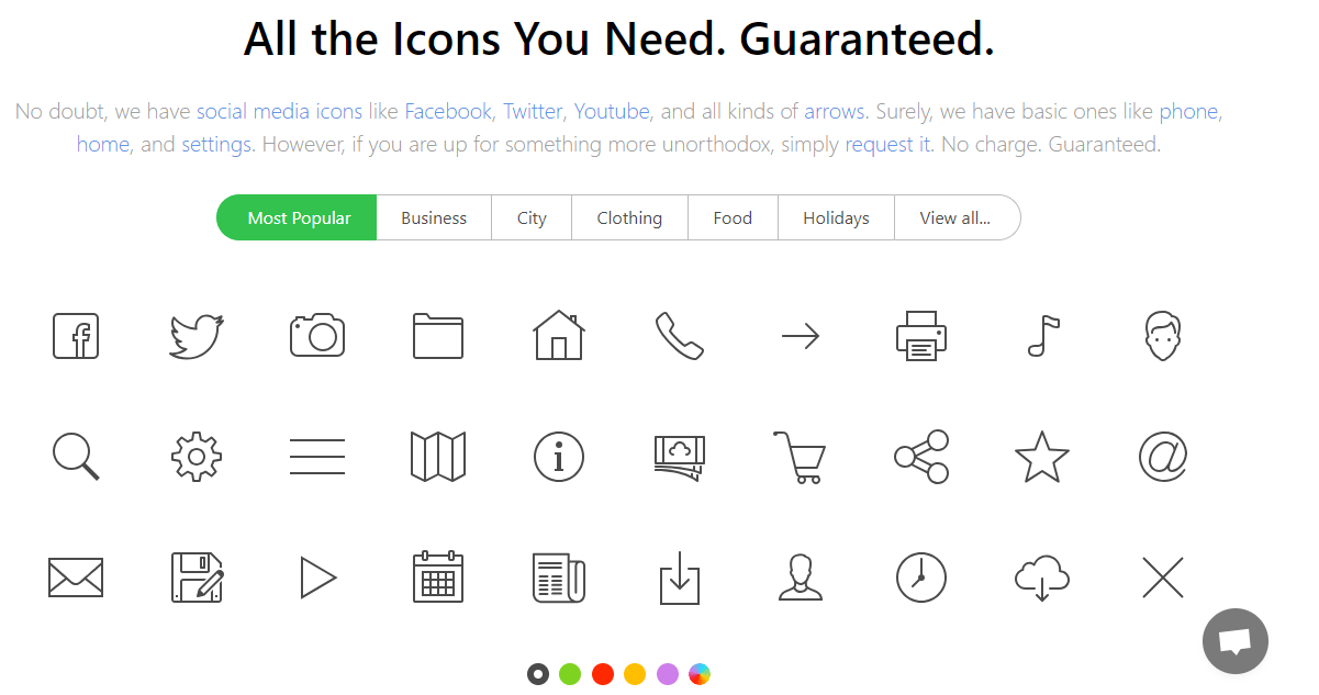
1. Label All Your Iconography
Kids who crawled out of AOL chat rooms in the early 2000s emerged from the primordial ooze of the web with a love of emojis.
Which turned into a love for pictures. And then icons, like the stuff you see on Icon8.*
(*My history might be a little flawed. Don’t fact check me.)
Unfortunately, iconography in web design is about as usable as an Ed Hardy shirt. You can make it work. Pair it with the right elements, and it might even elevate your site.
But more often than not, they’re the equivalent of that bedazzled flaming skull tumbler you can’t put through the dishwasher.
They’re hard for people to remember, cause confusion, and slow users down.
In other words, they create friction. And friction is a problem.
But I know I can’t pry iconography out of your hands entirely. So if you’re going to use them, just keep this in mind:
They need more than one layer of information. State change indicators like color can help, but nothing trumps a text label.
Check out this example from Bing:
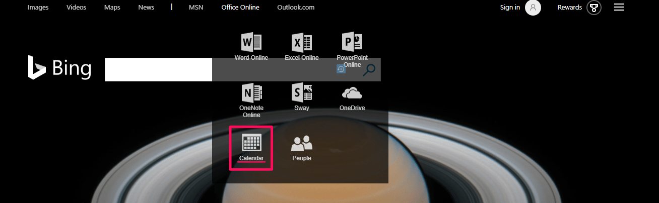
So why do text labels with icons perform so much better than icons without them?
It’s probably because of the nature of symbolism. It requires users to meet a set of cultural conditions via previous experiences to understand the function being conveyed.
When you have a double-label like an icon paired with text, you have a better chance of triggering cues from users’ semantic memory.
Plain icons, on the other hand, may require users to leverage their notoriously volatile working memory, especially if the icon and function aren’t a popular combination. (e.g., if they’re more esoteric than the magnifying glass and search.)
So if you’re going to wear Ed Hardy – I mean, use icons – as part of your site design to enhance your aesthetics, break out your label maker and give them a name.
It can be something simple like InVision does.
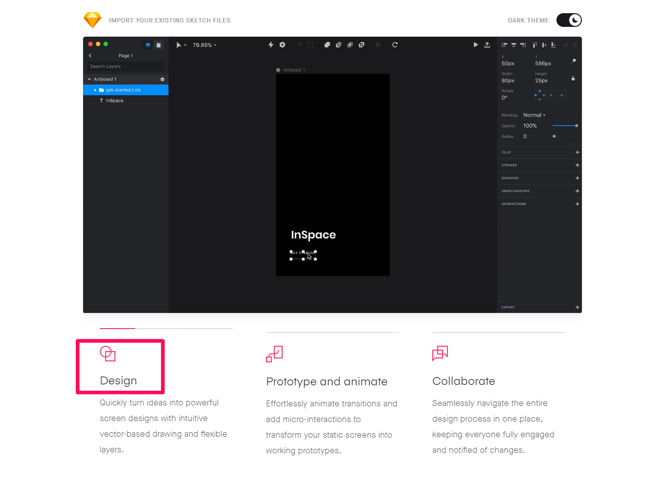
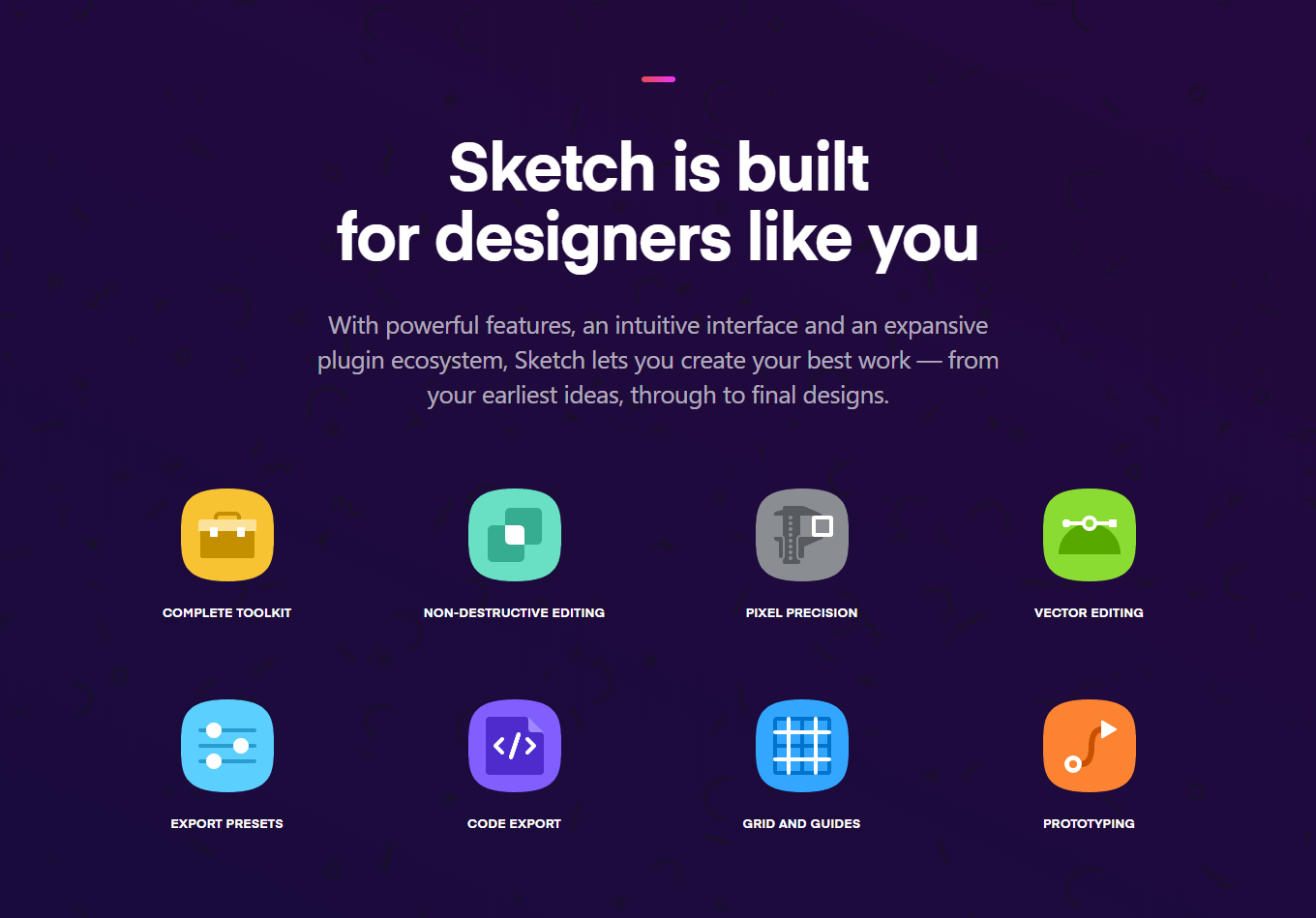
Or something more robust like Sketch.
Either way, a picture isn’t always worth 1,000 words in web design. Remember that so your users won’t have to.
2. Treat Visual Cues Consistently
Hot people and sleek site designs have something in common:
People are a lot more willing to forgive issues in both if they like the look of it. Known as the aesthetic-usability effect, users will let you get away with minor usability problems if the aesthetic makes up for it.
But the effect is even more pronounced when usability and aesthetics are working in concert.
So how do you make them work in unison? Keep your visual cues consistent.
Remember, style is a function. It’s a language.
When you color your links blue, you’re conveying something to the user: this is clickable and opens another page.
And when you use a drop shadow to elevate a button above the page, you’re communicating that it’s an important area and interactive.
This is the guiding precept behind their use in material design, by the way.
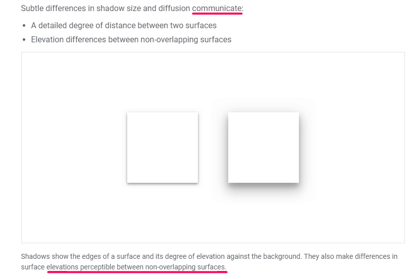
But if you take that same drop shadow effect and apply it to your images in the middle of an article (that don’t, presumably, link out to anything)?
The inconsistency invalidates what it’s communicating on both ends. It makes users learn more relationships than they should have to in order to use your website.
And on the beautification side, design consistency within and across brands yields the greatest rewards with the minimal amount of risks (i.e., a minimax strategy, or a Nash equilibrium).
Medium is one of my favorite examples of design cohesion.
Headlines are always the same size. Subtitles – same. Font – same. The icons – same.
No matter where you land or where you go, you’ve got a consistent Medium experience.
The only variation you encounter is color, and even that’s kept to a minimum.
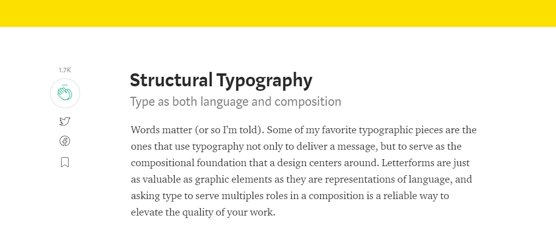
As an example, consider this article on structural typography by Medium’s own Head of Design.
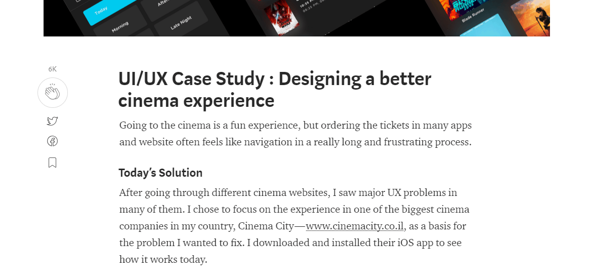
Now, look at another article on a completely different publication.
There’s no guesswork involved. You know which elements are what and how to interpret each because they’re the same across the site.
And that makes it beautifully usable.
Bottom line:
Make a design choice and stick with it. Visuals aren’t just a function of attraction: they’re part of the language of your website. Standardization benefits everyone.
3. Squint at Your Design (Seriously)
Squint your eyes real fast.
Done?
What are the most critical parts of this page?
The headers and navigation menu, right?
Let’s use Josh McCoy’s excellent article about UX pet peeves as an example. When you’re squinting, these are the elements that should stand out:

Why do they stand out? Because they’re styled in a clear visual hierarchy. You know what’s important based on its size and the spatial relationships on the page.
And, believe it or not, you’ve just run a bonafide usability test known as the squint test. It’s a great (cheap) method for identifying problems with your information architecture.
It’s also a quick and dirty way to determine if you have too many ‘important’ elements competing for attention. (Shout out especially for you, marketing friends.)
If it takes you (or a user) longer than a few seconds of squinting to identify the relationships between page elements, your website design is running too much like the government.
Cluttered with elements that think they’re more important than they actually are, and if they really need a podium, should probably go to a different forum to make their case.
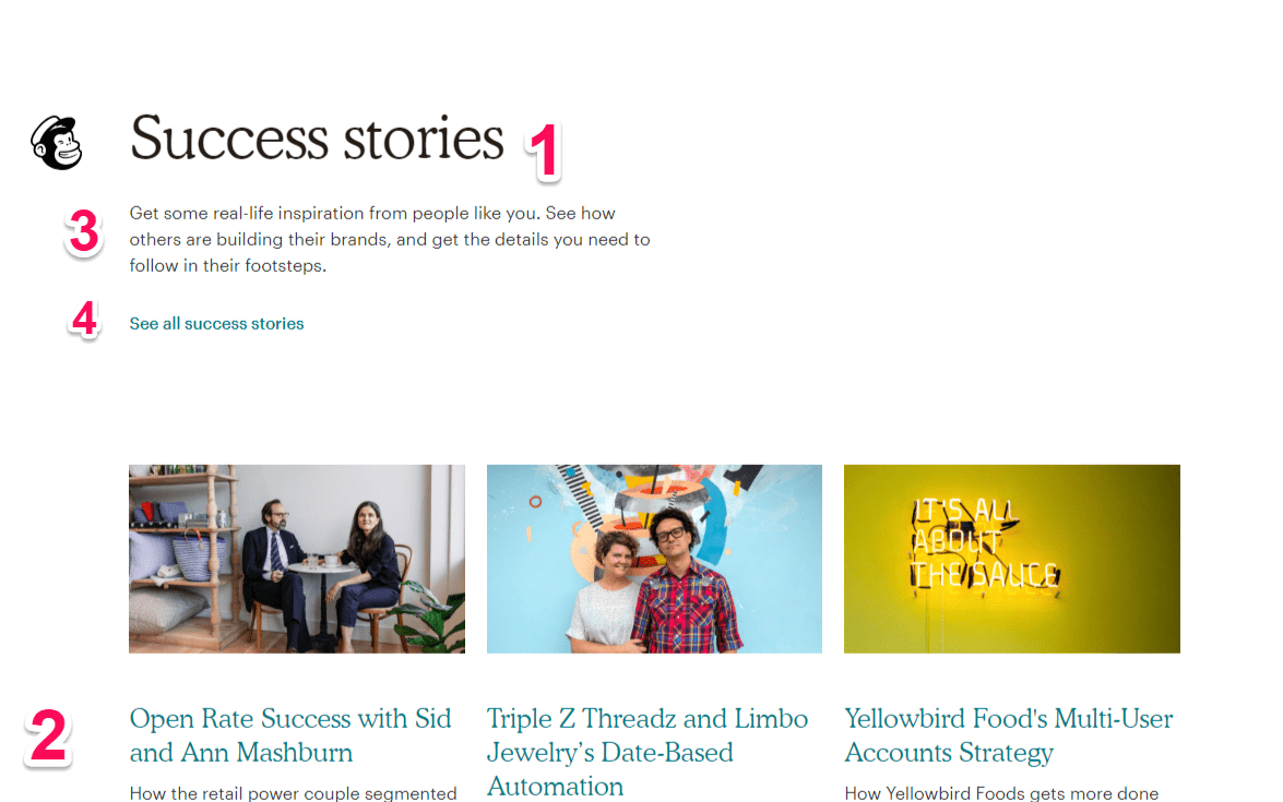
Here’s a different example.
Let’s run this same test on MailChimp.
Eyes wide open:

And now, at a squint: did you identify the elements of importance in the same order?
But, a word of caution about this tactic.
While this test is easy to run and you should be using it for every new page on your website, you need outside influences for this.
In other words, you can’t dogfood it. Not completely.
The people on your team already know what to look for in the hierarchy.
They’re cognitively primed to pass this test the way you want them to.
Remember, the mark of great design isn’t if someone with an advanced degree can interpret it.
It’s if someone can walk in off the street and use it without any (or minimal) assistance.
So squint at your design. Identify which elements are the most important and compare them against which should be the most important.
Then ask someone else to do the same thing.
If the results are different, you’ve got a usability issue on your hands. And probably a crowding problem, too.
So squint, edit, and squint again.
Conclusion
Form without function is art.
Function without form is an abstraction.
Neither is right for your website design.
Not if you want anyone to be able to use it.
If you’re going to use iconography on your website, give it a label. A rose by any other name isn’t actually just as sweet.
Visual cues aren’t just window dressing, either. They’re part of the dialogue shared between your website and your user. Make them consistent. Otherwise, you’ve got word soup.
Channel your inner Clint Eastwood and squint at every page on your website. Every time you change something, squint at it again. Then ask someone else to do the same.
The more harmony your website has between aesthetics and usability, the more people will use it.
And that’s the point, isn’t it?
More Web Development Resources:
- 50 Questions You Must Ask to Evaluate the Quality of Your Website
- 3 Ways Content Improves Your Website Usability
- How to Avoid 6 Common Web Design Mistakes That Hurt SEO
Image Credits
Featured Image: Pixabay.com
Screenshot taken by author, October 2018
