

Google launched the new resource Masterful Mobile Web which assesses the mobile experiences of most visited sites on the web.
New from the @GoogleAds team: Masterful Mobile Web: a new way for you to discover how some of the world’s top brands create smooth, fast and highly-engaging mobile experiences – and start doing the same. Head over to https://t.co/eoz6P9Hbmm #mobileUX #mobileSpeed #Measure pic.twitter.com/qFzovfMzp8
— Google Analytics (@googleanalytics) April 2, 2019
Over 1,000 of the most visited sites across retail, finance, and travel were assessed in more than 60 different usability areas.
Google’s new Masterful Mobile Web resource shows how many sites in each category passed different usability tests.
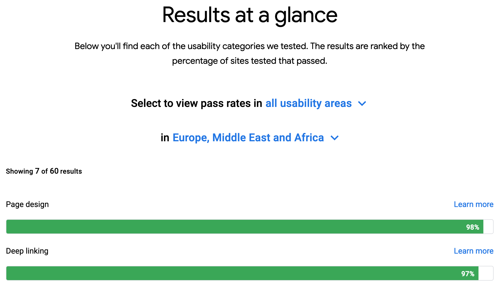
For example, you can see that 98% of retail sites passed in the area of page design, but only 24% passed when it comes to saving customer searches.
Toward the bottom of the page is a carousel which highlights examples of great mobile usability.
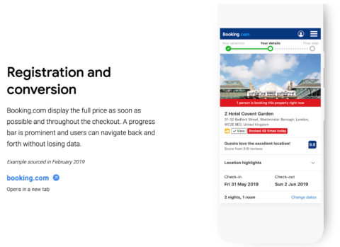
When viewing the travel category you can see that Booking.com provides the best registration and conversion experience.
The following areas were assessed by user experience specialists when collecting this data:
- Findability: How quickly can a customer find what they’re looking for.
- Product pages: Consistent presentation of the main product or service pages with visible CTAs.
- Registration and conversion: Does the site offer a clear, simple, and safe transaction process?
- Mobile design: Are the pages mobile-friendly and laid out appropriately for a smaller screen?
- Speed: Do pages load fast enough to not disrupt the overall experience?
As mentioned, sites were tested in over 60 mobile usability areas. Each one even has its own page where you can look up further data.
If you want to get really granular and see which retail site is implementing the best recommendation engine, you can do that.
This is another resource for marketers on optimizing pages for the mobile web.
What’s unique about Masterful Mobile Web is that it’s not focused primarily on speed. It goes deeper into assessing how well people can navigate a site and complete tasks on a mobile device.
