


Let’s take a familiar journey.
You make a quick Google search and read through a bunch of results. Then, you spot a few websites that have the answer you’re looking for.
But the first, and the most promising, website you select from the SERP doesn’t work correctly on your favorite mobile device.
So, you close it and see if the next site has what you need – no big deal, right?
Well, what if that high-ranking site you just closed had been yours?
Have you ever wondered how often this happened with your website on the receiving end?
How many people have closed your website and contributed to your bounce rate?
How many users dismissed your site because it didn’t work for them?
Content is king, but as we can see here, it’s not the only decisive factor. The device that displays the content also shapes the user experience.
But because most websites are made on a PC, their owners often forget to optimize them for other devices.
Are you making the same mistake?
Check if your website is mobile-friendly >>>
Today, almost everybody has a smartphone, and they use it to search online. You can’t focus on the desktop users alone and hope to wing it. Make your site mobile-friendly if you want to ensure fewer people leave.
The mobile device that displays your website shapes the user experience, too.
1. Give Your Site A Responsive Layout & Mobile-Friendly Design
Your website looks cool and works like a charm on PC; that’s fantastic.
Have you tried opening it on a smartphone?
Does it look like this?

If yes, then you have a big problem. That website is practically unusable on mobile.
Unfortunately, being PC-friendly doesn’t automatically make a website mobile-friendly as well.
And because of Google’s mobile-first index, if your site is not mobile-friendly, it may never see the light of page 1 of the search engine results pages (SERPs).
So what do you do?
The first major step in making your site mobile-friendly is working on a responsive design.
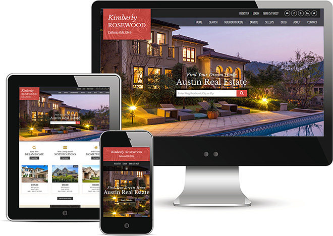
When a site is responsive, it displays properly on screens of all sizes, like this:
How To Give Your Website A Mobile-First Design
There are two ways to upgrade your website into a mobile-friendly experience. Each solution has its own tradeoffs.
- The fastest way: install a dedicated mobile-first plugin like WPtouch to give your website a responsive design in minutes. It’s the easiest method, but not without its risks; plugins are prone to breaking and (in the most extreme cases) even being hacked.
- The most reliable and secure way: modify your website’s code to include responsive solutions.
How To Hand-Code A Responsive Website
If you want to take the matters into your own hands and transform your desktop site into a responsive, mobile-friendly website, you’ll need to incorporate:
- A viewport.
- Responsive images.
- A fluid layout.
- Media queries.
We’ll teach you all the code you need to make your website responsive. But first, be sure you back up your website before making changes to your code.
How To Set A Viewport On A Website
Viewports help each browser know how to adapt your webpage’s dimensions to its screen.
If you add a viewport to your website’s HTML, your webpages will automatically adapt to fit onto any mobile device.
Add This:
To set the viewport on a page, add this line of HTML code inside its <head> tag:
<meta name="viewport" content="width=device-width, initial-scale=1">How To Make Images Responsive
When it comes to mobile-friendliness, it’s important that your visitor does not have to scroll left and right to see the content of your website.
This is true for all images as well, especially infographics.
Responsive images should automatically shrink and grow to fit the width of each visitor’s screen perfectly.
So, you want to use the max-width property.
How To Add The Max-Width To Make Your Images Responsive
- Open your site’s stylesheet (the CSS file).
- Add “max-width: 100%” for the <img> tag, like this:
img {
 max-width: 100%;
}
Now, if your images are wider than the viewport you added in the above step, they will automatically shrink to fit the available space.
How To Install A Fluid Layout
When you have a responsive layout on your website, it’s page elements fit themselves to any screen on their own. For example, if you have a fluid table, the table will resize along with the screen. That way, you can see all the columns without ever having to scroll left or right – even on a small mobile screen.
There are a few different fluid layout methods that you can try, depending on your individual site:
- Flexbox.
- Multicol.
- Grid.
Use them when appropriate.
When To Use Flexbox
Use this method when you have a number of differently-sized items and want to fit them in a row. Add the “display: flex” property to their HTML tag, like in this example:
.items {
  display: flex;
}
When To Use Multicol
This method splits your content into columns. It uses the column-count property, like this:
.container {
 column-count: 3;
}
In this example, you get three columns.
When To Use Grid
As the name suggests, this method creates a grid to fit your elements inside. Here’s an example:
.container {
     display: grid;
     grid-template-columns: 1fr 1fr 1fr;
}
The grid-template-columns property sets the number of column tracks (three in this example) and their sizes (1 fr).
Still not sure which to use? Plugins can automatically detect and implement the best fluid layout.
How To Add Media Queries To Your Website
Media queries are another way to adapt your content to any screen size. But they have another, much more notable advantage: they adapt your site to specific features native to different devices.
For example, a computer mouse’s cursor can hover over page elements, and smartphones have touchscreens. Account for these features, and you can tailor the user experience to any type of device.
There’s a lot to absorb when dealing with media queries, but MDN Web Docs have very detailed instructions.
Once you’ve done everything, check how well it works by viewing your site on many different devices.
2. Make Your Full Website Look Good On Mobile
Step one covered the technical framework that makes your website fit well on mobile devices.
Good news – that was the hardest part. Just a few more steps to go.
With a responsive design, your site is almost fully mobile-friendly. What else do you need to finish the job?
Next, it’s time to:
- Make use of large, easily readable text. Headlines and subheadings should be especially eye-catching.
- Make your interactive elements (such as buttons and checkboxes) large enough to be show-stopping.
- Avoid using long paragraphs. Short ones are always better.
- Use negative space generously. It will prevent your site from looking cramped.
- Leave some room around links and other interactive elements. That way, users won’t accidentally press what they don’t want to press.
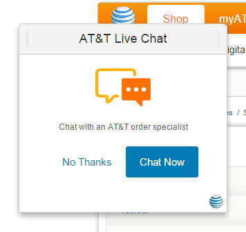
3. Don’t Block Your Content With Popups
Popups make it harder for your visitor to get the information they came for, and they result in high bounce rates, a.k.a. people leaving your site as soon as they enter it.
Now, certain kinds of popups are pretty important. Most websites need to use cookies, and yours is probably no exception. And the GDPR made it mandatory to ask for the users’ permission to use their data, so you can’t avoid using a popup for that.
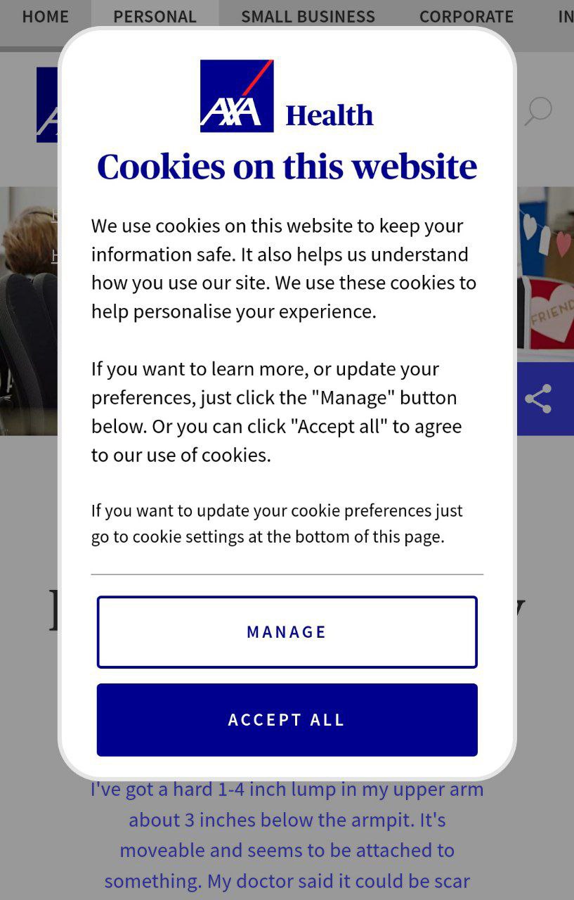
However, your users don’t visit your site to look at popups. When the entire page is blocked by a request to accept the use of cookies, the visitors might not be so eager to put themselves in your shoes. On the contrary, it’s guaranteed to annoy them, and they may even leave without browsing your site at all.
What To Do Instead
Users are more tolerant of popups when they cover just a small portion of the screen. And if they are easy to close and dismiss, even better.
4. Fix The Technical Errors On Your Website
Even the most minor hiccup will be easy to spot on a small screen, including the dreaded 404 errors.
While a 404 page with a funny design can serve you well, an error is still an error; it will disrupt the user experience. It’s better to remove them as a factor completely.

How To Discover Your Website’s Technical Errors
What other errors can ruin a mobile user’s day? To name a few:
- Broken links.
- Broken images.
- Unwanted page redirects.
- Faulty CSS and Javascript.
- Server issues (e.g. gateway timeout).
All of them will send the user running if you don’t do something.
To get started, find all technical errors on your site. Scan it with WebCEO’s Technical Audit tool to generate a report.
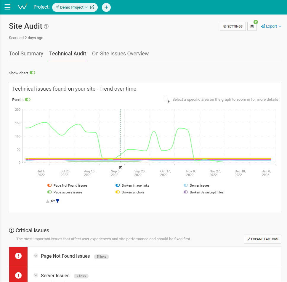
Fix all the website errors you find as quickly as you can.
Don’t let codes like “Status: 503” confuse you – here are some expert tips for dealing with them.
After that, make it a habit to scan your site regularly (once a week is fine), and tend to errors in a timely manner.
5. Make Your Site Load Quickly
You visit your site, and it’s taking too long to load. Oh no!
Is the Internet down? No? Unfortunately, now your user may decide that your website never works and never return.
So, it’s important to do everything in your power to make sure your site loads quickly at all times.
How To Make Your Website Load Faster
Follow these six tips to make your website load faster:
- Optimize your images. Minimize their file size by tweaking their height and width, save them in the right format, and compress them.
- Enable compression (if it isn’t enabled yet). GZIP compression is among the most popular methods.
- Use browser caching. Find your domain’s .htaccess file and set the expiration times for your page elements.
- Use lazy loading. Like compression, it’s often already active. If you don’t have it, you can insert the loading=”lazy” attribute into the HTML tags of the elements you want to lazy load. Or just use a plugin like Smush.
- Optimize your pages’ code. If you have sufficient knowledge of HTML, Javascript, and other languages forming your site, you can try and trim the code. Be careful not to break anything.
- Merge elements where appropriate. For example, if you have two images right next to each other, merging them into a single image will help the page load faster.
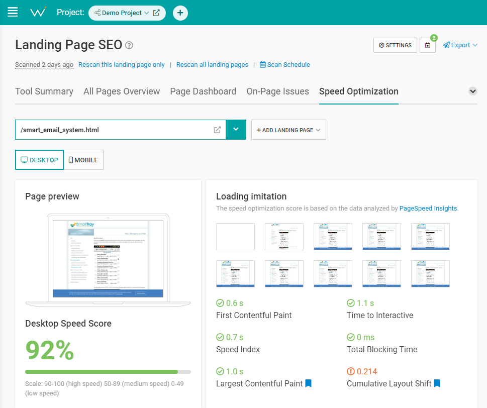
Check your current loading speed with WebCEO’s Speed Optimization tool. It will point out the speed-related problems that are plaguing you right now.
6. Optimize Your Website For Local & Voice Search
Smartphones are easy to carry around, which makes them a perfect tool for online browsing on the streets.
Does the user need to find something nearby? Their goal is merely one question away.
And since the question will likely contain the word “where,” your website needs to be ready for it. That’s done through optimization for local search – and, combined with mobile SEO, it becomes surprisingly effective for voice search at the same time!
Just do these things:
- Use location-based keywords and phrases in your content. They usually contain words like where, nearest, closest, near me, or in “name of your location”. For example: car wash near me.
- Have an FAQ page on your site. Make your answers concise and straight to the point.
- Put your business’ name, address, and phone number on your website’s home page. Better yet, put them in the footer.
- Create a listing on Google Business Profile, and fill it out with as much information as you can. This is necessary if you want to appear in Google Maps.
- Collect positive customer reviews – the more the better.
7. Make Your First Scroll Efficient
Ideally, you should be able to captivate the visitor as soon as they see your website. But there is only so much they can see on a small screen. So, what do you do?
Make your site’s “above the fold” (what users see in the first scroll) is a total knockout.
What are the must-haves you must put in there?
- Descriptive, eye-catching title.
- Navigation menu.
- Search bar.
- Call-to-action.
But those are just the basics.
Here are a couple of expert-level ideas:
- An interactive element (like a panoramic photo, a 3D model, or a simple game). Even an ordinary video works.
- A floating CTA that always stays on the screen no matter how far down you scroll.
8. Make Your Search Results Attractive
As the saying goes, the best place to hide secrets is on page 2 of Google.
However, that’s true only for the desktop version.
Mobile Google comes with infinite scrolling, which presents the top 40 results instead of 10 before you find the “See More” button.
However, top 10 or not, your search results will never get any clicks if they don’t stand out.
And, just like with anything else, you need to stand out well. How do you apply this principle to your search results?
How To Make Your Search Results Stand Out
There are three great ways to make your search results more exciting for your future visitor:
- Use the best keywords. Not just in terms of search volume – use the keywords which capture users’ search intent better than others. To figure out which keywords those are, you need to put yourself in the users’ shoes. Or just ask the users you know about their search preferences.
- Use eye-catching titles and descriptions. Keywords are one main ingredient; the other ingredient is power words that stir the users’ emotions. Do you know which emotions are appropriate for your content?
- Add structured data. Mark up your page elements to create oh-so-clickable rich snippets.

Years ago, Google saw the potential in mobile devices – and, as it turns out, they were completely right.
The search giant invested greatly in mobile friendliness, and there’s no doubt: the Internet is so much better for it. Online content has become much easier on the eyes and simpler to use.
But does your site match the gold standard? Do your users get the same great experience across all of their devices?
If you have even a shadow of doubt, it’s time to employ every tool at your disposal to make sure your site meets the mark. Sign up now and let WebCEO help you sort things out.
Start boosting your search rankings and user engagement with a responsive website today!
The opinions expressed in this article are the sponsor's own.