


If you run an e-commerce store, you probably aren’t satisfied with the conversions and revenue you’re getting. More is always better.
And even if you are satisfied with your conversion rates, there’s always an opportunity to improve. Don’t assume there’s a ceiling where you just can’t go any higher.
If you’re happy with 7%, you’d probably be happier with 10%. Don’t settle into the mindset of “my conversion rates are better than the industry average of X%.”
The conversion rate you should be striving for is any rate that’s better than what you have right now. In short – you should always be working to improve.
Here is where you can start making changes to improve the user experience and boost your conversion rates, and you don’t need a ton of CRO knowledge to make it happen.
Add Better Product Images
When people walk into a store, they’re able to physically handle the products. The can turn it over, inspect it, and experience the product in person. That’s not possible in an online environment.
Images can help the customer imagine how the product fits into their life and how it will solve their problem.
Brookstone, for example, includes a variety of images for each of their products showcasing how they’re used.
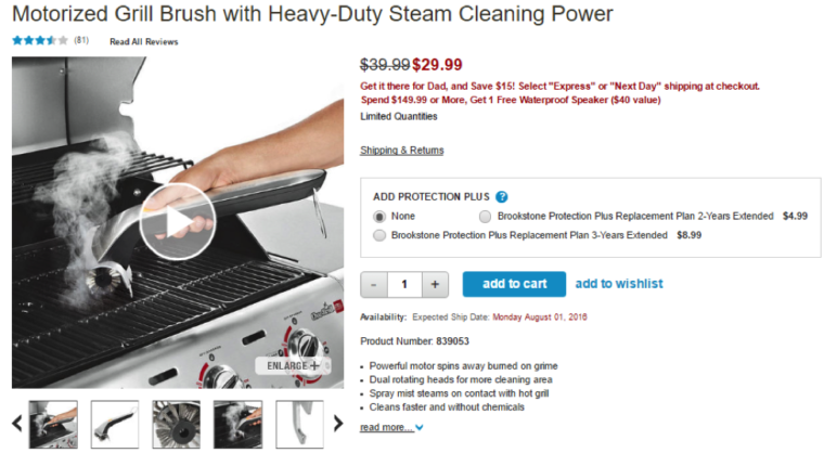
High-quality images are a great investment, and the more you have the better. Take pictures from multiple angles and include images of the product being used by someone who fits the target audience.
Don’t just rely on basic product photos with a plain background. Find ways to tell a story and make an emotional connection using those images.
Use Trust Signals
A first-time visitor has absolutely no reason to trust you. You’re not a well-known brand. Unless they came to you based on the trusted recommendation of others, it can be a hard sell getting them to turn over their credit card information.
Incorporating trust signals into your site helps. They can ease the tension and make visitors more likely to convert. Trust symbols include:
- Brand or manufacturer logos
- Security logos (VeriSign, secure payment)
- Accreditation (Better Business Bureau, Industry associations)
- Consumer reviews
Surprisingly, in a study from UXMatters, analysts found that “icons such as PayPal, VeriSign, and Visa” were among the highest-rated trust elements on a site for first time visitors.
All it takes is a few minutes to add these logos (assuming you qualify) to your pages.
Improve Your Product Descriptions
Don’t be tempted to rely on basic manufacturer descriptions for your products, and avoid copying descriptions from competitor sites at all costs. Apart from the ethical issue of plagiarism, putting duplicate content on your site can impact your search visibility.
Write compelling, unique and informative descriptions that support the photos you use. Your copy should be centered on the value proposition, with clear benefit statements that tell the reader why they should buy your product.
If you’re wondering how long the copy should be the answer is simple: long enough to answer every question the customer could possibly have about the product.
They don’t have to read the entire description. They only need to read long enough to convince them that this is the solution they were looking for.
Most e-commerce platforms will either give you two sections for descriptions (a long and a short description), or they’ll pull a short description from the longer copy.
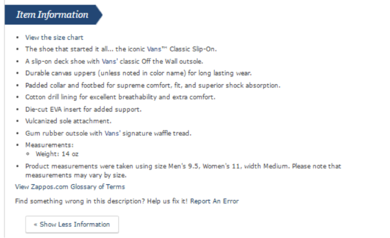
Zappos gets it right. The content isn’t overwhelming and instead combines product specs with benefit statements for the most impact.
Tackle Shipping Costs
Shipping costs are the top reason for cart abandonment in e-commerce. Not only will customers bounce if they need to go clear through the checkout process to get shipping rates, but they’re likely to comparison shop to see if they can get a better shipping rate.
More than 50% of e-commerce merchants offer either completely free shipping or free shipping based on the value of the customer’s cart.
According to a study from E-tailing, free shipping is the #1 deciding factor for consumers shopping online, and 73% consider it a critical factor in whether or not they’ll buy a product. As many as 93% of shoppers say they would purchase more products if free shipping was available.
If you can, eliminate your shipping rates by absorbing its cost into your products.
Address Shopping Cart Abandonment
Sometimes conversions happen outside of your store. On average, 68% of shopping carts are abandoned. It can happen for a variety of reasons, and you’ll always have some measure of cart abandonment.
Go after those lost sales with cart abandonment emails. Most e-commerce platforms like Shopify and BigCommerce have built-in auto-responders you can configure to trigger when a cart is abandoned. Customize the emails, provide an offer to get back to the store, and reclaim those lost conversions.
Make It Easy to Get Support
Some of your potential customers will have concerns about how well a product will work, and what they need to do if there’s a problem.
Eliminate their concerns by making your support options readily visible and available to all. A good start is putting contact information front and center in the header and/or footer of your site. Then, add other contact and support elements including:
- A contact form
- Ticketing system for support
- Home office address
- Dedicated support email
- Live chat interface
Listing any of your social accounts also lets your customers know they can reach you through those channels as well.
Use Videos on Product Pages
Shoppers who view video are almost 2x as likely to purchase a product than non-viewers. If static images are effective at helping a customer understand and settle on a product, then video is an even better option for letting them really experience the product.
Use videos that showcase the product, including its use in real-world situations. ASOS uses videos for all of their products, with the models showing the fit of clothing from a variety of angles.

Make Your Calls to Action Stand Out
Part of a clean user experience is making it easy for customers to navigate and add items to their cart. You don’t want to force customers to hunt for any button needed to move them forward in the checkout process.
Make sure your buttons for adding products to the cart or wishlist, the checkout, or other primary calls to action are colored in contrast to the rest of your site. Make them sizable enough to be seen. Never rely on standalone text links for cart additions or checkout.
Don’t Forget the Upsell
No matter what industry you’re in, I highly recommend working upsells into your sales process. If you’re already going to win the conversion, why not increase the average order value?
Just be mindful not to dump your upsells into the checkout process. It can be frustrating when a customer wants to finish their order but they keep encountering “limited offers” or add-on products.
I had this problem with Apple the last time I ordered an iPhone – I had to wade through a handful of unwanted add-ons just to get to the cart.
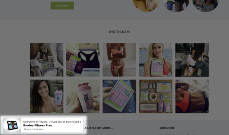
Leverage Social Proof
Thanks to expanded API integration and a host of startups offering specialized products, you can add a lot more conversion potential to your product pages. Apps like Notify trigger when someone makes a purchase from your store, showing a notification to other visitors with general product details.
That kind of social proof coupled with user reviews and testimonials can increase the comfort factor of a potential customer and drive them to make their purchase.
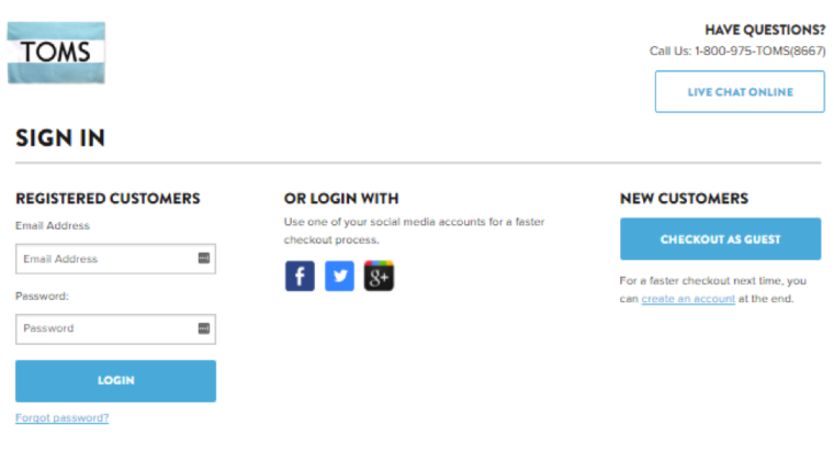
Minimize the Required Info
If you’re requiring customers to register an account before they can make a purchase – stop. This is killing your conversions. Give them the option to check out as a guest, with an opt-in along the way that asks them if they would like to save their account info for later.
It’s a clean way to streamline the checkout process that won’t feel invasive or interruptive to your customer.
I also recommend cutting the size of your checkout forms down and limiting it to a single page.
Accordion style checkouts make for a streamlined experience and reduce page load fatigue that can trigger cart abandonment. If you must have a multi-page checkout, be sure to include a progress indicator so the customer can see how many steps remain to completion.
Test Every Change You Make
No matter what change you make, big or small, conversion optimization is about measuring progress. I never make a change in any of my digital assets or copy without running an A/B test. Without testing, there’s no way to know if the changes you made helped or hurt your conversions.
You can’t go by raw analytics alone, because there are too many variables that impact conversions. A/B testing will let you do side by side comparisons on how even the smallest changed alter conversions vs the original piece.
What are some of the changes you’ve made to your e-commerce store that have had the biggest impact on your conversions? Share your wins with me in the comments below:
Image Sources:
Featured Image: ThreeDigitIQ/YouTube
All screenshots taken by Andrew Raso June 2016
