


Google has made it clear that web content should be created for the user and not for the sole purpose of ranking in SERP’s. Why not take it one step further than most and design a website that even the blind can utilize? In the United States, approximately 20 percent experience some form of disability and 10 percent of cases are considered severe. This equates to three out of every 10 families being affected by disability.
You might be asking yourself why take the time to make your website accessible to the blind? The reasons are simple:
- If you’re a business, you’ll expand your customer base.
- It’s the right thing to do. The visually impaired will appreciate it and their friends and family will certainly take notice of your efforts. It might even generate positive publicity for your company.
You spend time on website design and SEO to drive traffic with the goal of converting, but are you reaching everyone on the internet? People with vision impairment and other disabilities are in the workforce and earning money, so you want them to be able to use your site, too.
According to a study conducted by the President’s Committee on Employment of People with Disabilities, just the discretionary income alone of those with disabilities is $175 billion. With the baby boomer generation getting older, the number of people with discretionary income who also have vision impairment is on the rise.
The United States Cancer Institute’s Communication Technologies Branch conducted a usability study with blind and low-vision users and found that participants went to www.firstgov.gov and www.google.com search engines first. Since June 2001, all U.S. federal websites have to be accessible to people with disabilities. While private websites legally do not have to comply with these standards, it is strongly advised to comply with the standards outlined by the World Wide Web Consortium’s Web Accessibility Initiative (WAI).
The fact that people with vision impairments are using Google is surprising considering the low percentage of websites built with them in mind. The visually impaired continue to use Google as a main search engine and this is why you should seriously think about making your website more user-friendly for them.
How Can You Make Your Website Usable for the Blind?
Now that we understand the importance of not neglecting this significant portion of the population, let’s discuss how you can make your website accessible to those with vision impairment. Creating a website that is user friendly for the vision impaired is not as difficult as you may think, and in fact reinforces many recommended best practices in web design and usability.
Typically those with vision impairment use screen reading software to navigate the web. Job Access With Speech (JAWS) is one such program and it’s the most commonly used internet reading software in the U.S. JAWS reads out loud what is on the computer screen while the keyboard is used to navigate (most visually impaired people do not use a mouse). It is compatible with Windows operating systems and many other programs, such as Microsoft Office, Firefox and Adobe Acrobat. The second most popular program for the blind is Window-Eyes.
Empty Alt-Text
Just like sighted users are not going to read every word of your website and will only scan to find the information they need, vision impaired users will “scan” your website using screen readers. Those who are accustomed to using the program can navigate through a website remarkably fast. However, since screen readers read the code and not just the text, sometimes there are factors preventing vision impaired users from getting to the information they want quickly. For example, a list of links using decorative bullets looks like this to a sighted user:
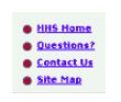
(image via redish.net)
It will be read by JAWS as: “Decorative bullet image: home. Decorative bullet image: Questions. Decorative bullet image: Contact us.”
Yikes, that’s rather annoying isn’t it? The participants in the study certainly thought so. For elements that aren’t relevant for a vision-impaired user, such as a decorative bullet, use empty alt-text. Screen reading software knows not to read this code and will skip over it. The same applies to images next to a link. One example is an envelope image next to an “email this” link. The envelope helps sighted users quickly see what that link is for, but is completely irrelevant for the vision impaired. It could be argued that another lesson learned from this is to ask yourself if these decorative elements are necessary before adding them to your site. Even for sighted users, it could be creating clutter that doesn’t need to be there.
If It’s Important, It Needs to Be At the Top
Inversely: if it’s at the top, then it needs to be important. The most important information should be at the top of your webpage or at the beginning of a paragraph. This is better for everyone: sighted users, visually impaired users, and the website owner. It also helps Google decipher whether the content is relevant to the page title.
All users want to find the information they’re looking for as quickly and easily as possible, so put it where it’s easiest for them to find it. Even screen reader users can quickly scan through paragraphs and links, listening to only the first few words before deciding if it’s relevant to them.
This also applies to forms on a website. Many websites consider a form submission a conversion, so these should be easy to find. In the study, participants were asked to find and fill out a form that was located on a webpage that had a large amount of content above it. It took the participants a long time to find the form and some even gave up before finding it.
Another important feature to keep in mind when creating forms that are accessible is the tabindex attribute. Because the vision impaired typically navigate with the keyboard, it is likely they will use the Tab button to advance to the next field on your form. The tabindex attribute allows the developer to indicate which field in the form is first, second, third, etc. This will ensure your user advances to the field in the correct order, and doesn’t get confused when trying to complete the form.
A form element assigned tabindex=”0” will be visited after all other form elements assigned that same tabindex. This can be used to bring the user to the desired submit button or other action you may want them to take upon completing the form.
Limit the Links per Page
Limiting the number of links on a page should be a priority even if your website is not built with the visually impaired in mind. When users open a page using JAWS, the first thing they hear is the number of links on the page. When participants heard that there were more than 100 links on a page, they expressed feelings of disappointment and were overwhelmed.
Likewise, sighted users will quickly scan the page to see how much information is on it to determine how long it’s going to take them to find what they need. Both of these users are likely to look elsewhere instead of trying to navigate through 100 links or more. Another great reason to limit the amount of links on a page is that the more links you have, the less link juice they carry to internal pages of your website.
Use Anchor Text and Headings
Relevant anchor text and headings are something every content developer should implement and this point is reinforced through screen reading software users. Screen reading software provides the option of hearing just a list of links on the page as a way to speed up navigation. If your links read “click here” or “more information”, then this is not helpful to a person with visual impairments. They will have to exit out of the “Links List” mode (as it is called in JAWS) and listen to the content that comes before the link in order to know whether it is the link they want. Anchor text such as “More information on product X” is better.
Similarly, screen reading software knows to look for the header tags and provides the option of scrolling through these. Separating the sections on the page with relevant H2 headings makes your site easier for everyone to navigate.
Keywords Should Be Text on the Page
The use of keywords on a page isn’t just important to Google, it’s important to the visually impaired as well. Screen reading software has a search function that allows users to navigate directly to the content they’re searching for. It’s important to note that a text image will not be read by the search function. The keywords that people are searching for need to be actual text.
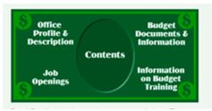
The “Find” function would not pick up this content. (image via redish.net)
You May Not Need A Separate Version
Some websites have a separate screen-reader friendly version that is entirely text in an attempt to provide a better experience for the visually impaired; however, the participants in the study said they hardly used these sites when they found them, because they felt as though they weren’t updated often and contained inaccurate information.
The visually impaired would rather have the graphic version of the website be made accessible with a few changes. This is actually good news for web developers who wish to make their sites accessible to the visually impaired. Instead of creating a separate all-text website, all you need to do is take some of these considerations into account to make your preexisting site accessible.
Only if you are using JavaScript, Flash, or other interactive multimedia elements is it necessary to create a separate version. Sites using JavaScript should still be able to function at a basic level without JavaScript, since some may have it disabled. Flash, Java, and DHTML should also have the ability to be accessed with a keyboard, and plain text navigation links should be available in the footer of the page.
Adobe’s programs are typically made to be compatible with screen reading software. If you use Flash, then check the Adobe website which is updated with information on the latest version of Flash and its accessibility. If it is still not possible to create an accessible website using these guidelines, then it may be best to create a separate, plain text version, but be sure to update this version as often as your multimedia site.
Better for the Blind, Better for Everyone
The findings from the study proved to reinforce practices already recommended for web and content developers. The study also found several improvements that could be made to screen reading software. As the population ages and web-savvy users age, the visually impaired will become a larger portion of consumers on the internet. This is why creating a website with the visually impaired in mind isn’t just the right thing to do, it’s the smart thing to do.
Featured Image: stokkete via Depositphotos
