


Let’s face it. When developing a new website, the design of the Contact Us page, probably isn’t top of mind. In many cases, it isn’t given much thought at all.
And that’s a mistake.
Think about it – the contact us page is the gateway to new business.
Shouldn’t it be given the same consideration as any other important landing page? Yes, it should!
It needs to be visually appealing and written well, just like the rest of your website.
Selecting the Best Contact Us Pages
For this post, in order to determine which Contact Us pages are the best, I chose to query Google directly. My browser of choice for this exercise was Firefox, in private mode, set to 100 search results.
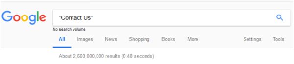
The Top 10 search results follow:
A valid argument could be made these pages rank well because they live on megabrand websites with loads of external and internal links. That’s fair, but there are hundreds of “megabrands” (Sprint, for example, ranked #403 in this search).
The pages featured here are the ones that managed to rise to the top of the SERPs, despite intense competition.
You can learn a lot by studying the top search results in your niche. By virtue of being at the top, these pages are employing practices Google’s algorithm is rewarding. This can be a good way to mitigate your competitors’ advantage.
Keep in mind the best Contact Us pages featured in this post may not be right for your site. A huge menu-driven Contact Us Page is probably overkill for a small site selling medical scrubs. But… you can still use the same methodology to check it out:
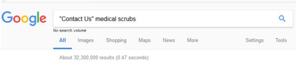
Which will yield results like this:
- https://www.scrubsandbeyond.com/help-contact/
- https://medicalscrubscollection.com/contactus
- https://www.uniformadvantage.com/pages/misc/secure/customer-service.asp
- And more….
Google Top 10 Search Results for ‘Contact Us’
1. Target
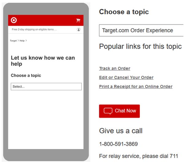
If satisfying user intent is the key to top results, this page delivers. It’s clean, intuitive, and requires no data entry. It’s entirely menu-driven, answering questions via FAQ.
Alternatively, chat and phone options are clearly presented. This is a plus for both the technologically challenged and those not comfortable (or interested) in chasing down answers on their own.
2. AT&T
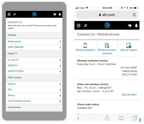
Like Target, AT&T relies heavily on a menu-driven interface with minimal requests for data entry. They also shrink their header to pull useful info above the fold.
As one would expect from a phone carrier, the preferred contact option is to call a dedicated number associated with a series of categories.
3. PayPal
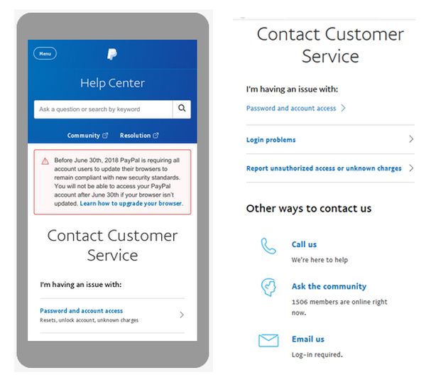
If user experience was a ranking factor, this page just might have some difficulty.
It uses three-quarters of the page to display the header, warning, and headline. This is before ever providing the user with any contact options.
That said, PayPal does give users the option to call, email, or ask the community.
4. Ikea
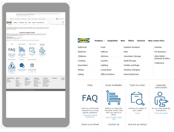
Good news here for procrastinators: non-mobile friendly sites can still rank well (as of publication date). The image to the right is the desktop rendering.
Once again, the contact options are heavily menu-driven. In addition to FAQs, they offer telephone support (you need to click through to find the number) and email support.
Worth noting, at the time of this screenshot: “Email is currently down as we are making improvements to better serve you.”
5. Verizon
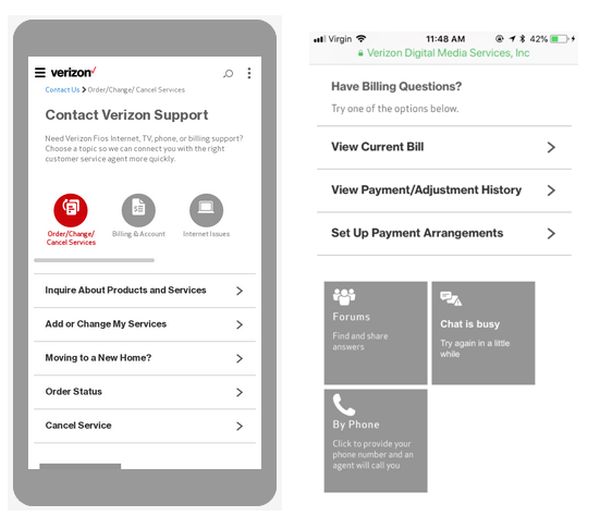
Verizon uses a combination of graphics and menus to deliver their contact info.
Unlike AT&T, they don’t rely primarily on phone contact, but promote forums and chat as alternative ways to contact them.
Is that a plus or a minus? You, as a consumer, can decide.
6. Dropbox
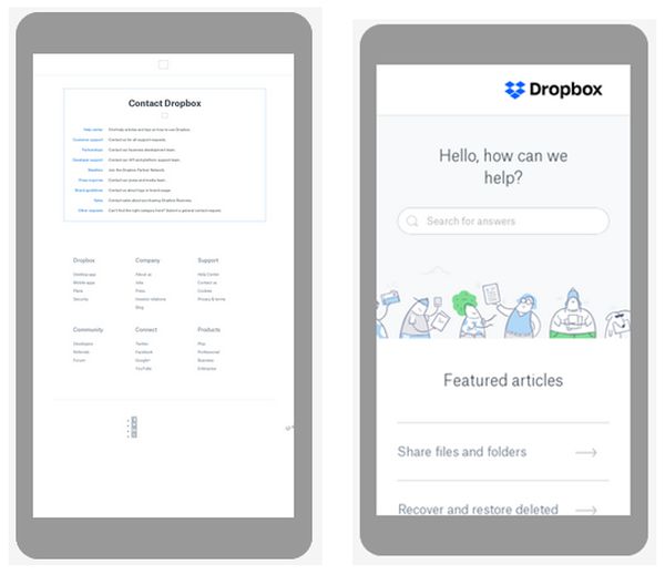
Here’s another page not mobile friendly, yet ranking well.
It links to a series of internal pages which are responsive and like other top ranking sites is fueled by a pretty robust FAQ.
If you’re unable to find an answer in the FAQ, you are given the options to “ask the community” or hit them up on Twitter or via email.
7. Box
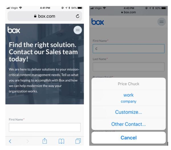
Box uses a classic approach, starting with a call to action, followed by a contact form.
To their credit, the form is enabled for auto fill.
They also provide a phone number, but you need to click the hamburger menu to find it.
8. StubHub
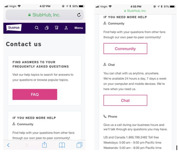
Here’s another super clear and clean layout.
Using a series of big buttons, StubHub leads with a FAQ, followed by community, chat, and phone options, below the fold.
Undoubtedly, the sequence is laid out in the order they would prefer you interact with them.
9. Uline
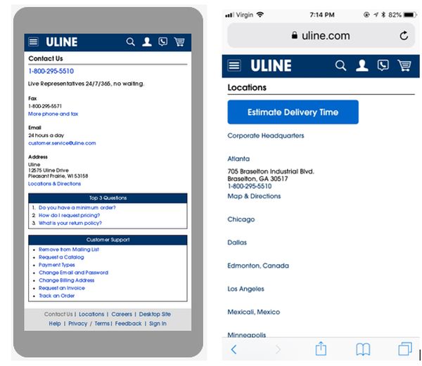
Nothing fancy here – just a no-nonsense page that gets right to the point.
This company leads with a bold phone listing, followed by fax, email and physical address. That’s followed by a series of FAQs linked to answers. All on a single mobile page!
Like many of the other top-ranking pages – there is no data entry.
10. Active Network
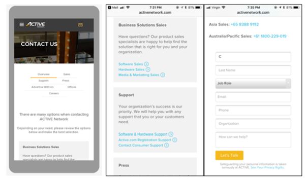
Active Network uses up a lot of space pitching the fact they offer a number of contact options. Too bad none appear above the fold.
Once you scroll down the page you are presented with a series of links to various contact types. Those links ultimately lead to contact pages with phone numbers and a contact form. The form is not autofill enabled.
Summary
The best Contact Us pages should:
- Clearly provide contact details: Names, addresses, phone number(s), and email contacts. In addition to providing the best user experience, having this info on the website establishes trust with buyers and potentially Google, as well.
- Provide a good mobile experience. You know the drill – over 50 percent of search traffic is now mobile. Don’t make it difficult for users to read. Optimize your text. Make certain that forms are user-friendly. Minimize data entry and use menus whenever possible. Enable auto everything (autofill, auto caps, auto spell, etc.)
- Work properly. It should go without saying, but you need to test every form and every clickable element, from phone numbers to navigational links. Nothing undermines your first business contact more than a broken contact page.
The Takeaway
The purpose of this exercise was to compare and contrast those pages that Google is rewarding with top rankings and to look for patterns. Good, bad, and ugly patterns.
Ideally, you will now be able to leverage that knowledge for your own purposes.
More Resources:
- Building Loyalty: 7 Web Design Strategies to Earn Your Audience’s Trust
- 25 of the Best Examples of Beautifully Designed 404 Pages
- Top 5 Ways Responsive Web Design Benefits Your SEO
Image Credits
Screenshots taken by author, May 2018
