


It’s silly how competitive an email inbox is. Brands of all kinds are fighting for a precious few seconds of their subscribers’ attention. And they’re not just battling other brands: They’re competing with moms, bosses and the babysitter who flaked out at the last-minute. Those that are successful stand out from the rest with a mix of compelling subject lines and captivating content…plus, their emails look really, really good.
A great email design evokes a particular feeling – excitement, humor, urgency – that’s memorable and drives an audience to act. Here are five tips and examples for designing emails that do just that.
1. Create a Seamless Brand Experience
Gap and Instagram both faced intense scrutiny when they changed their logos. Why? Because consumers had come to know and expect a specific visual representation of the brand. The same idea applies to the inbox. Your audience expects your emails to have the same look and feel as what they see on your website and in the outside world.
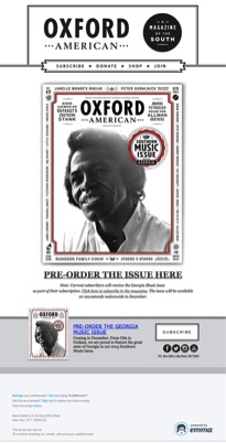
Take this example, from publisher Oxford American. Their email beautifully matches the design of their quarterly print magazine, giving their subscribers a seamless brand experience.
 2. Keep It Nice and Clean. Formatting and organization are key to creating reader-friendly emails, especially when more than 50 percent of all email is viewed on a mobile device. If your email is full of content, stick with a single-column layout and make sure to include clearly defined sections with big, bold headlines and call-to-action (CTA) buttons. To increase click rates, put your most compelling content above the fold (visitors spend almost 80 percent of their time there). Finally, be sure your font size is at least 16 px and build in plenty of white space – it will keep everything easy on the eyes.
3. Tell Your Story with Images. The human brain can process images 60,000 times faster than it can process words. So, it’s not a surprise that 65 percent of recipients would rather receive emails that contain more images than text (HubSpot). Choose beautiful imagery that reflects your brand, customers or product and go light on the copy to tell your story.
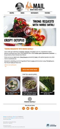
Celebrity chef Mario Batali is known for his amazing culinary creations. That’s what his subscribers want, and that’s what he delivers with every email. Who wouldn’t feel inspired (and hungry) after viewing this delectable dish?
Remember, not all images need to be static. Animated GIFs can increase conversion rates by 103 percent and revenue by 109 percent (MarketingSherpa). So consider using a fun animated GIF to draw attention to your product or promotion.
Pro Tip: Some email clients, like Outlook, aren’t optimized for animated GIFs. Be sure the first frame of your GIF looks good as a static image to avoid any rendering problems.
4. Use Copy Wisely. Although consumers are drawn to images and video, it doesn’t mean you can take your copy for granted. The most obvious examples are the subject line and CTA, which go a long way toward determining your open and click rates. Your copy also provides context to the beautiful design you’ve created. Just avoid using too much cramped copy if you can. Instead, give a quick, compelling reason to click-through to a landing page where you have more time and space to complete your story.
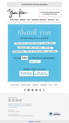
This email from upscale women’s retailer Yumi Kim is a great example of a clean, fun design and smart use of copy that draws you toward the CTA.
5. Play with Color. Did you know that 85 percent of people say color is the main reason they buy a product? Every color you use in your email causes a reaction in the reader. For instance, red inspires a sense of urgency, so use that color for a sale, time-sensitive event or promotion. On the other hand, green promotes growth and relaxation. From orange (immediacy), to yellow (attention), to fan favorite blue (trust and security), color choice is key to conveying the right feeling to your subscribers.
An attractive email does much more than just look good. If an email is designed well, it can attract your reader’s interest, create excitement and encourage action. Keep these five tips in mind and you’ll not only represent your brand beautifully, you’ll have better email performance and the results to show for it.
Images via Emma blog, used with permission.
