

Look out, Ahrefs! You aren’t the only tool provider that plans to launch a new search engine to challenge Google.
Search Engine Journal Founder Loren Baker took the stage today at the annual SEJWWSEOC event to make a huge announcement: SEJ is launching its own search engine.
Yes, exactly one year after launching the most successful free SEO tool in the history of SEO, the Link Juice Tool – the ultimate Link Juice calculator – SEJ is looking to expand into the world of web search with a new search engine.
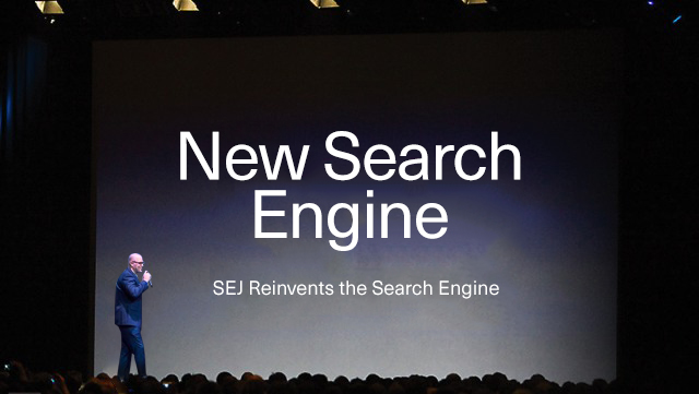
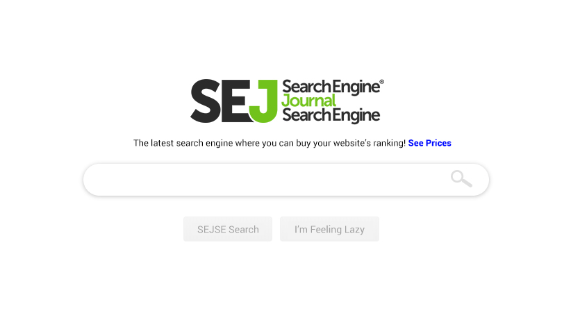
Meet the Search Engine Journal Search Engine
Imagine a search engine with no algorithm updates.
“Our core algorithm is strong, not weak!” Baker said to uproarious cheering. “To ensure our core continues to be strong, we’ve put our algorithm on [dramatic pause] an exercise ball!”
After a five-minute standing ovation, Baker continued sharing more details.
“The core ranking algo is based off the LinkJuice.me parameters, which was launched exactly one year ago today – and hasn’t been updated since. Speaking of which, whenever referring to link equity, you will refer to it by its proper name – link JUICE!”
As for the main algorithm? It was based 100 percent on the crazy things SEO tool creators, and their spokespeople, think are in the algorithm.
It will also feature a real-team algorithm that monitors SEO correlation studies and automatically updates the algorithm based on those findings.
A Search Engine Rep You Can Trust
SEJ’s founder also introduced the world to the new head of the SEJSE Kung-Fu Spam Fighting Team, Illustrious Engineer Fred!
Fred is happy to spend his entire working day on Twitter and forums answering all your toughest SEO questions, without any vaguery or sarcasm, at all!
“Because, after all, our search engine is so good, all we need to do is talk about it, right?” said Fred. “No improvements are needed, so what else I’m I gonna do? Also SEO people are so nice and understanding, I can’t imagine a better way to spend all my time.”
How to Do SEJSEO?
This is probably the biggest question you have. How do you optimize for the new SEJSE?
Well, Fred literally opened his kimono he was wearing (photo not safe for publication) to let us know all of the secrets.
Rel=”DoFollow”
The first ranking factor Fred talked about was rel=“dofollow”.
If you can get a dofollow link, it will have 10x the ranking value over normal links (without this attribute).
“So always make sure, in your outreach, to ask for DoFollow links,” Fred advised. “Be clear you don’t just want a wimpy old school link. Tell them you need the juice!”
LinkTrust: The Algorithm That Puts PageRank to Shame
At the core of the core algorithm is an amazingly innovative link analysis algorithm that only counts links that get clicked.
“You get a trust point for every click earned,” Fred explained. “No more link spamming, only valuable links count!”
Super Long Content Is King
We all know that word count matters. But on Search Engine Journal Search Engine, word count matters a lot more!
You’ve probably heard of the Skyscraper Technique. Well, get ready for the Bifrost Technique.
In fact, a future Backlinko analysis of our organic search results will reveal that if you want any hope of ranking in Page 1, Position 1, your content will have to be at least 20,000 words.
“Superior content length has 25X’s the ranking value over ‘normal’ and ‘competitive’ content,” Fred explained. “Corollary: multiplier increases 10x by every 1,000 words.”
What About Social Signals?
The search engine will also have its own ranking loyalty program of sorts that rewards you for generating social engagement.
Here’s how it works:
You get 1 point for every 5 social shares of your content. Once you get to 100 points, you can then cash them in to increase your organic position by 1 spot for any one page on your site.
Fred also mentioned they are working on something called the Big Payola, where you can risk your points to possibly 2x, 3x, or even 10x your points – or lose them all.
Subdomains vs. Subfolders
Subdomains give you a 3x boost, but subfolders only give you a 2x boost.
So here ends the long debate. Subdomains are better for SEO – at least on the Search Engine Journal Search Engine.
Header Tags
Another key SEJSEO tip: all H tags will be ranking factors – as long as they are in alphabetical and numerical order.
The Return of the Meta Keywords Tag
Relevancy is also king. As such, the Search Engine Journal Search Engine will heavily rely on the keyword meta tag for relevancy signals.
“If you use it, we won’t ignore it!” Baker said.
Dancing Banana Markup
Want to climb 10+ positions? Forget schema markup.
Make sure you add Dancing Banana markup to every page.
“Dancing Bananas just make everything better,” Fred said, before heading offstage to “It’s Peanut Butter Jelly Time.”
Psychic Intelligence
Moving on from ranking factors, Baker returned to stage to talk about some of the “under the hood” goodies we can expect from Search Engine Journal Search Engine.
While artificial intelligence is all the rage these days, Baker has recruited self-proclaimed psychic The Great Boris Who See the Future to power our search engine with predictive search unlike anything you’ve ever seen before.
“You really can’t optimize for Boris,” Baker said. “His special connection with the spirits on the other side will give you the search results you really want.”
That’s right, when you’re about to conduct a search, The Great Boris will know. In fact, The Great Boris will even suggest searches before you ever say or type your query.
“Our predictive and personalized search results are truly (dramatic pause) from beyond!” Baker said.
After another 5-minute standing ovation, it was time to move on.
More Hot New Search Features
Baker also briefly talked about some features we can look forward to:
- Image Search will have a “Sort By Attractiveness” option.
- An Unsafe Search feature, which randomly inserts results from multiple adult sites into the most innocent of searches like it’s still 1999 (e.g., do a search for [Marge Simpson] – you’ll probably be shocked at the results)
- Want privacy? How’s that whole thing working out for DuckDuckGo? Google just had more searches in the last minute than DuckDuckGo will have all year. Obviously, people don’t care about privacy, so why should we? Also: nobody in Europe is allowed on our search engine.
- You can register your political affiliation or leanings so as to avoid any results that don’t conform to your own echo chamber.
- Membership only! Oh yes, get access to a 100 percent ad free search engine for just a few bucks every month. A better deal can’t be found – click here to get your $4.04 deal!
SEJ Reports ‘n’ Things
Like any good search engine, it will come with tools for webmasters, Baker announced.
Called SEJ Reports ’n’ Things, this powerful set of tools and features will give you important data and SEJSEO advice to make your site rank better.
“One report I’m really excited about is our Confusing IPs Report,” Baker said. “Using our state of the art tracking technology, it will ensure your client comes up first in search every single time they search!”
After the next 10 minutes of applause and cheering, we learned that all webmasters need to do is specify any IP address in Reports ’n’ Things. Anytime heading forward, your client will always be number one – even on the most irrelevant and absurd search terms they can think up that they should be found for.
You’re Always on Page 1
Baker saved the best news for last:
The Search Engine Journal Search Engine will have infinite scroll.
“That means every website will always be on Page 1 of our search results!” Baker announced to a near riot worthy of a “Game of Thrones” episode.
Don’t Be Fooled by Imitators!
Or by this post.
Happy April Fool’s!
🙂
Also thanks to the following SEJ contributors and team members for their help beta testing our “search engine”: Loren Baker, Andy Betts, Catfish Comstock, Stoney DeGeyter, Danny Goodwin, Brian Harnish, Jason Hennessey, Sam Hollingsworth, Motoko Hunt, Ryan Jones, Kim Krause Berg, Jesse McDonald, Maddy Osman, Chuck Price, Arsen Rabinovich, Eli Schwartz, and Tony Wright.
