


Running a website is a big endeavor: you have to worry about design, updates, blog management, marketing, and conversion rates. Perhaps you set everything up just right, offering visitors amazing design, engaging content, and everything else they might want – and yet conversion rates are still not where you want them to be. With every positive change you make, conversion rates don’t budge, or only move slightly. What does it take to convince users to complete an action?
As website owners, we take numerous measures to ensure that Google fully understands our website’s purpose: we make changes to the code and improvements to our content, invest in building an effective internal-link system and improving user-friendliness, use CTA to decrease bounce-rate and increase conversions, and employ countless other tactics to adapt our website to search engine algorithms. The primary factor, of course, is that we aim to please is the user. However, how much do we really know about our visitors’ wants, needs and motivations for purchase? In order to achieve a high conversion rate, and before mapping out a plan for necessary solutions to implement in our website, we first need to understand the way our users think.
The Psychology of it All
Before I touch upon some examples, it’s important to clarify that conversion is an end, not a means. In order to achieve conversion, i.e. purchase or registration, a user must first undergo a sub-conscious decision-making process through which he assesses the trustworthiness of a website and the incentives for completing the action.
It is human nature to search for signs of trust. For this reason, it is crucial to have trust signs prominently displayed on your website and on payment pages. In their paper Signs of Trust: a Semiotic Study of Trust Formation in the Web, Kristiina Karvonen and Jarmo Parkkinen claim that e-commerce is at a low because people are finding it harder and harder to trust online companies: “…if e-commerce is to thrive, creating consumer trust is a necessity – or else there will be no transactions. Not only money, but also private information about an individual customer”. In other words, in this day and age, it is more important than ever to gain the trust of users, and it can be key for boosting conversion rates.
As a general rule, people have an extremely hard time taking a risk without first seeking a sign of trustworthiness. According to Carolyn McLeod in her paper entitled Trust, “Trust can have enormous instrumental value and may also have some intrinsic value. In discussing its instrumental value, I will refer to the “goods of trust”, which include opportunities for cooperative activity, knowledge, autonomy, self-respect, and overall moral maturity. Because these goods may benefit the trustor, the trustee, or society in general, they are therefore social as well as individual goods…”.To put it simply, trust is an intrinsic part of selling anything – whether it is a product, a service, knowledge, or an entire brand.
Some ways to invoke a sense of trust among visitors is by including features such as money-back guarantee, secure payment pages, and an easily accessible FAQ section. These components go a long way towards gaining the trust of consumers who will be more likely to complete a purchase, yielding a higher conversion rate. However, trustworthiness isn’t sufficiently established by displaying trust signs on product pages and the homepage alone; they should appear prominently on registration forms and checkout pages as well. In addition to these trust signs, it is important to incorporate symbols of professional organizations your business is a member of, customer testimonials, and press published in significant publications.
Another important catalyst in the user’s decision making process has to do with removing doubts pertaining to the actual product or service being offered. This can be achieved by prominently displaying relevant FAQs. Today, it is most likely to complete a purchase after their third or fourth visit to a website, partly due to the mental process I’ve outlined above. Therefore, if we can establish trustworthiness and remove doubts quicker among users, it stands to reason that we can speed up conversion.
Putting Theory into Practice: How to Optimize Trust Signs
Once we understand the mental process that our customers undergo before coming to a decision, it’s time to put our conclusions into practice. Below is a guide to improving your website’s trustworthiness as perceived by your visitors by using FAQs, Testimonials, Security Symbols, Client Logos, and offering a Free Trial period.
FAQ
By answering a set of relevant questions that are frequently raised by users, we can help dissolve doubt and move them closer to making a purchase. If we fail to do this, the customer may feel information about our product or service is lacking and, naturally, turns to Google to retrieve more information. From this point, there are a number of possible scenarios:
1) Once the user has left our site, he may not return
2) The user may become distracted and forget the goal of his original search
3) The user may backtrack on his decision to purchase and/or deliberate between a number of options without coming to a decision
4) The user may purchase the product or service from another source
5) The user will find the information he was after and decide to purchase from our website, ultimately finalizing payment
As evident from the list above, all but the last scenario work against our interests. Therefore, it is crucial to provide the information they need to finalize a purchase right there in our website.
Where should you start? One way to compile a FAQ list is to turn to services that conduct surveys for companies interested in getting familiarized with their clients, such as qualaroo.com – one of my favorites. This service enables us to easily conduct a survey among our visitors and displays results in a set of friendly reports.
To gain insight as to the issues that hinder your customers’ experience, you can ask the survey takers to perform a number of actions in the cart, the payment page and any other page – then include the answers to their questions in the relevant FAQ page. It’s important to pay attention to the following parameters when writing the survey:
1) Be clear! Don’t leave room for doubts. If you want to know what the user thinks of your website, instead of asking “What is your general impression with our site?”, ask questions such as “How simple/difficult did you find the navigation throughout our website?”, “Were you able to find what you were looking for easily?” and “Was the purchase process easy-to-understand or did you experience problems?”.
2) Be focused! Avoid asking questions that are too general or that could be understood differently by different people. If you’re interested in finding out how easy it is to leave details, don’t ask “Would you be interested in leaving your details in this website?”, but rather “How simple is it to fill out the form in the website?”
3) Be thorough! Ask many questions and break down processes into components to make the survey easy to understand, and to receive detailed answers.
Another way to become familiarized with the issues and questions that users raise regarding your website is to consult Google Analytics. By defining a simple segment, you can extract the common search phrases pertaining to FAQs. Though many people shy away from defining regex formulas, there’s no reason to panic – simply copy the code below onto the search window and everything will work out easily. What this code does is effectively define which segment to pull search phrases from, for instance: pulling only queries that contain words like ‘what’, ‘how’, ‘why’ etc.
In order to define this segment, simply press the little arrow on the top left hand corner (see image):
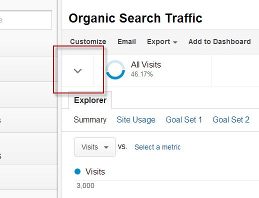 Screenshot taken 10/25/2013
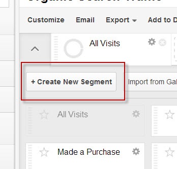
Then, click Create New Segment.
In the window that opens, simply input the data as it appears on the screen, including the following formula line:
\b(adding|does|do|who|what|where|when|why|how|will|can|\?|am|is|are|was|were|be|being|been|versus|vs|vs\.|best)\b
 Screenshot taken 10/25/2013
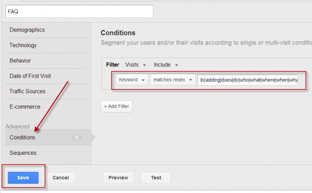 Screenshot taken 10/25/2013
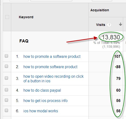
After saving the segment, access Analytics and select “Organic visits” while the segment is active. Soon, you’ll see dozens of questions before you. Now, all that’s left to do is sort the questions according to the number of visits – which should yield priceless insight as to what your customers are truly interested in knowing.
 Screenshot taken 10/25/2013
Note: This method might not work properly nowadays because of the “NOT PROVIDED” issue. You can still use it on other search engines or with Google , but on older months.
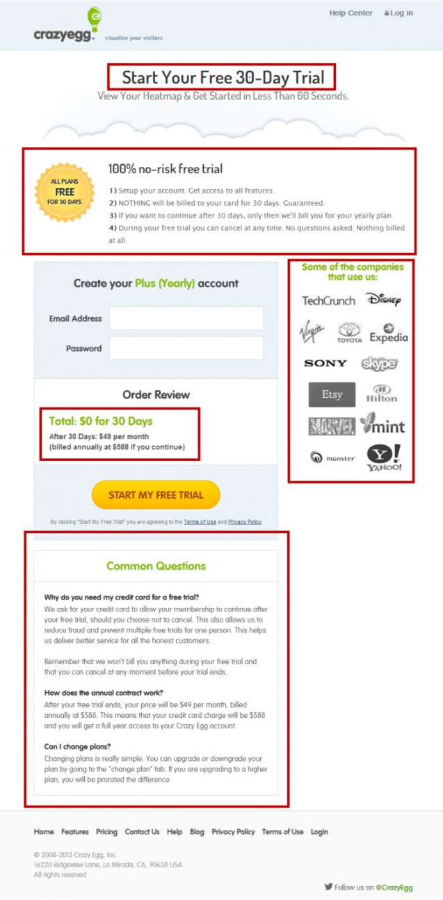
After conducting the survey, all that’s left to do is gather the data and analyze it, in order to extract 4-6 main questions that were raised by the majority of survey respondents. I personally recommend that the breakdown consist of 1-2 general questions that are relevant to every product (e.g. refund policy, shipping policy, etc) and 3-4 FAQs pertaining to the product itself (e.g. size, fit). On the payment page itself, I recommend including questions regarding the security of the website, the payment details, warranty and a return/refund policy. Below is a great example – Crazy Egg’s registration page.
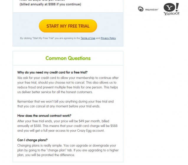 Screenshot taken 10/25/2013
Testimonials
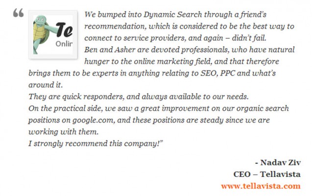
Another important parameter that could potentially boost your conversion is prominently displaying user testimonials. The main purpose of this is to strengthen a new user’s confidence by using an independent previous user to confirm the usefulness, quality, etc. of your product. This kind of ‘organic’ review, i.e. not from a marketing point of view, from other users of the product or service can be key in his decision-making process.
There are a number of ways to write and optimize a testimonials page:
- Include the image, position and full name of each reviewer – this is often overlooked by website that only include the first name of a user. Assuming the reviewing user is not a celebrity who is instantly recognizable by his or her first name (like Madonna or Bono!), only listing a first name can hinder the reader’s confidence in the process. By displaying the full name, picture and position/title of the reviewer, you’ll be sub-consciously harboring trust and empathy among users. Does anyone know who Bob, Randy, Mike or Carole are? I think you got the idea.
 Screenshot taken 11/6/2013 – junior-landscape.com
 - Be clear – most testimonials have to do with the quality of the product or service, which is certainly helpful. To maximize the effect, however, include testimonials that explain in detail how the product has helped them achieve certain goals or how the service solved a particular problem. This extra step goes a long way in building trust and encouraging identification among readers, seeing that other users with similar desires, problems, or issues found your product or service helpful.
 Screenshot taken 10/25/2013 – webs.com
 - Location – where you place the testimonials is important. While there isn’t a set place for testimonials on the website, I recommend conducting A/B testing to determine the optimal location.
 Screenshot taken 10/25/2013
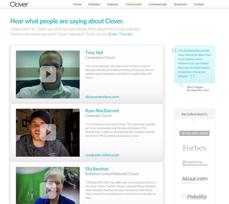
 - Video testimonials – this is the most trustworthy type of testimonial and one of the best options to include in your website. However, it is also one of the hardest to obtain since very few people are interested in cooperating. Users perceive video testimonials as trustworthy since they are harder to fake (unlike a name and a quote).
 Screenshot taken 10/25/2013
Website Security
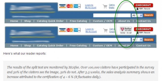
If you offer any type of checkout process on your website, it is extremely important to get your payment page verified by a leading verification company such as MacAfee or VeriSign. This single action will go a long way to gaining the trust of your consumers, as people are far more likely to trust you if they know that their personal information will be kept safe.
Obtaining these verifications is very simple: just apply and as long as you meet the criteria, all you will have to do is pay a small fee. Numerous websites report a sharp increase in conversion after adding a security icon. See below the results of an experiment conducted with McAfee, which resulted in a 4%-6% increase in conversion:
 Screenshot taken 10/25/2013 – getelastic.com
Press Mentions
Part of acquiring customers’ trust has to do with proudly presenting the company’s reputation and experience. A good way to do so is to have a section on your site dedicated to press mentions – particularly mainstream media. By showcasing the publicity you’ve received, you’re effectively telling a customer you are noteworthy, interesting, and accountable because you maintain a relationship with journalists. Some websites choose to display only the names of the publications which have written about their organization, and some also include a scan or a quote from said article. Though both methods are recommended, the latter can stir even more trust among users.
 Screenshot taken 11/6/2013 – nomoredebts.org
 Screenshot taken 11/6/2013 – mint.com
Client Logos
Many websites take pride in their clients, displaying their logos prominently to signal potential clients of their experience and business relations. The subliminal message is clearly about showing new customers that previous service or product-seekers like them have already deemed you worthy. The more high-profile companies included in a client list, the more this will help you.
Don’t have an impressive client list yet? Don’t fret – you can still place your existing clients’ logos on your website and add new ones periodically. If your business is local, it stands to reason that your clients will be familiar with the logos displayed. See a few examples below:
 Screenshot taken 11/6/2013 – desk.com
An excellent example of using client logos can be seen on Neil Patel’s blog. He uses past and current clients to leverage future success with case studies that prominently display company logos. After reading one of his famous success stories, it’s hard not to want to be included in his impressive client list:
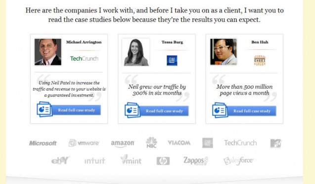 Screenshot taken 10/25/2013
Free Trial
Offering free trials is another way to gain trust, since you’re giving customers a chance to see what you can do for them without the risk of spending money. You will be surprised at how many customers continue with their orders, subscriptions, or services after the free trial period provided. ‘Special deals’ work similarly to free trails, for instance offering a one-time only use at a significantly discounted price for a certain service, can make your conversion rate soar.
Putting it All Together in the Interest of Conversion
Once you’ve assembled the trust signs mentioned above to the best of your efforts, the next thing on your agenda should be structuring your pages correctly to include these signs while still remaining eye-catching, concise, and appealing. The page must, of course, contain all of the usual suspects: credit card information form, billing address form, shipping information form (when applicable for tangible goods), a space for the customer’s name and additional instructions. Take the time to use colors and logos to spruce up the look of the page in general, and design this page in a way that will allow customers to see all of your trust signs right away, before it is necessary for them to start inputting their information. Here are some important tips for deciding where to place the trust signs you have been gathering:
- Be sure that your verification symbol is placed where it can be seen easily and recognized; somewhere close to the payment information form is optimal.
- If you are offering a money back guarantee, be sure that a logo or banner is placed either at the top of the page or directly beside the information form, proclaiming the guarantee and how long it is good for. If there are limitations on your offer, be sure that this information is also displayed somewhere that is easily visible.
- If you are hosting a special or one-time only deal, place a prominent reminder at the top or side of the payment page so people will have one last chance to take advantage of it, if they haven’t yet.
- Place few FAQs on the payment page so that it is easily accessible by your customers to remove any last-minute doubt.
- If you offer same-day delivery, place a clock or countdown timer on the payment page so consumers will know beyond a shadow of a doubt how long they have left to claim the offer.
Taking the time to instill trust in your customers may seem trivial but you will see just how important it is when you notice the improvement in your conversion rates. Below are a few examples of excellent websites whose conversion rate has improved significantly as a result of the practices outlined above:
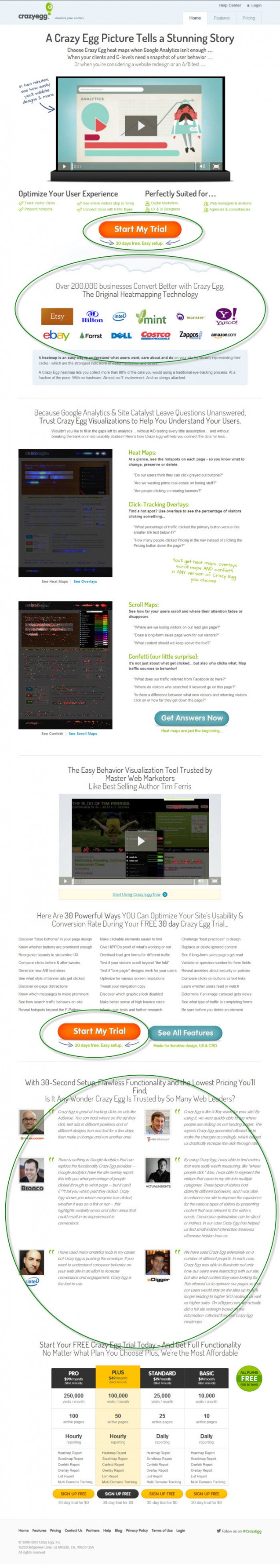
Crazyegg.com made huge changes to the layout in order to boost conversion. This is what the homepage looked like before the changes were made:
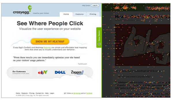 Screenshot taken 10/25/2013
And here’s a look at their website after the change: the page was significantly lengthened, and various trust symbols were added for the purpose of establishing trustworthiness and encouraging users to complete an action by removing doubt.
 Screenshot taken 10/25/2013
Their checkout page was also changed, and it currently looks like this (notice the prominence of the trust elements):
 Screenshot taken 10/25/2013
Another website we can learn from, and one of the best websites I’ve encountered, is Dr. Jonny Bowden’s unleashyourthin.com. This website is rich in trust signs and its checkout page is clearly built to establish a sense of reliability, thus preparing the visitor to complete a purchase and strengthening his or her faith in the product and its developers. Dr. Bowden could have easily opted for a less cluttered checkout page since he already displayed all these trust signs in previous pages, but he was wise enough to realize the importance of displaying these prominently on the final stage of payment – when it is most crucial to give the user the utmost information and reinforcements necessary to complete the action.
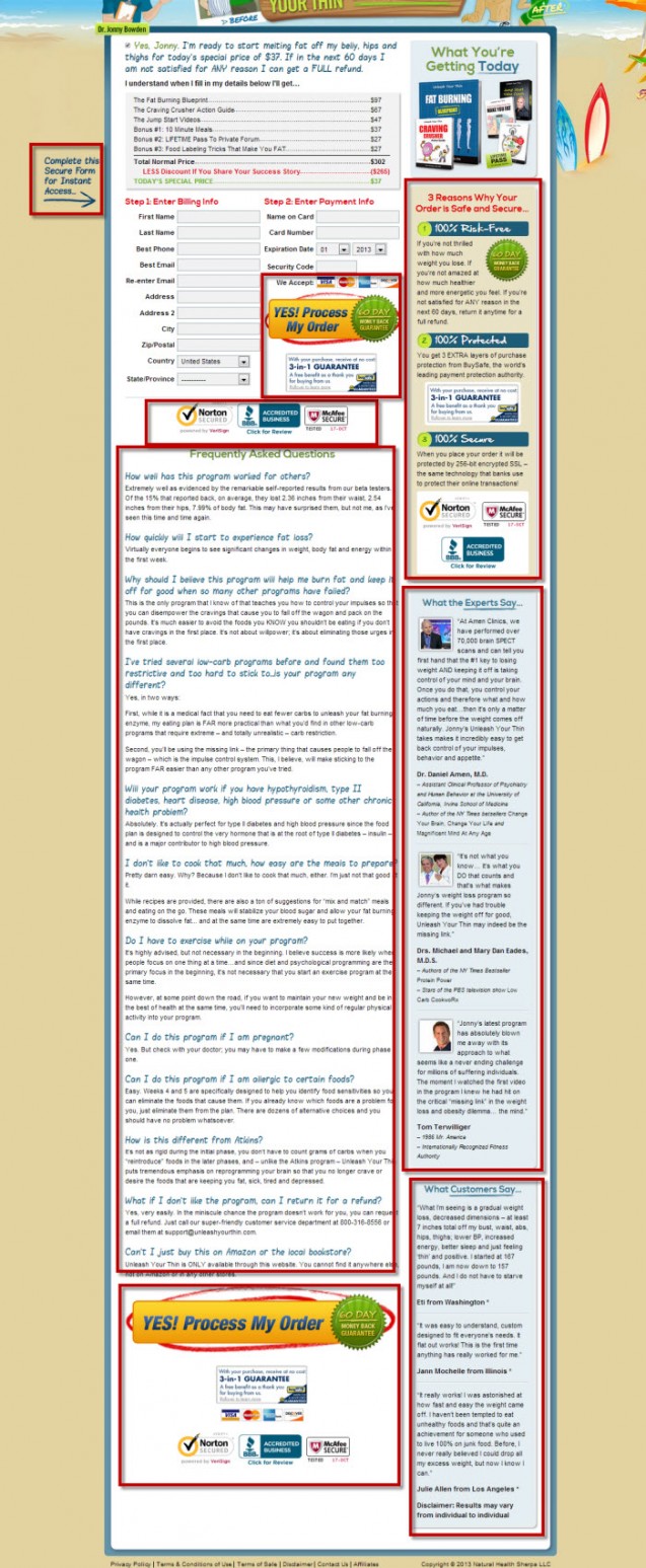 Screenshot taken 10/25/2013
Another great site is tycoonU; their shopping cart abandonment rate was at about 80% before they introduced a thorough redesign of their checkout page. The results came back quickly, and their abandonment rate had dropped to 54%!
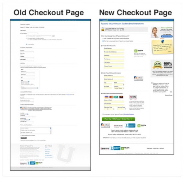 Screenshot taken 10/25/2013 – experienceblogger.com
As a testament to our belief in the power of trust signs, display the symbols of our partners, the software we use, a number of important industry organizations we are members of and, naturally, data security companies we rely on to keep our information safe right on our homepage.
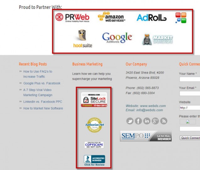 Screenshot taken 10/25/2013 – webs.com
CONCLUSION
As we’ve seen thus far, there are many factors that determine our conversion rate. Some of these factors are technical and product-related, but some have to do with the user’s sub-conscious. Clearly, there isn’t one definitive formula – what works for one website may not work for another. Realizing this, we have to adjust our strategy specifically to the website at hand.
The more familiar we become with our users, their motivations and their behaviors, the better the interaction we achieve with them will be. This is true for social media and for interaction on our website itself – since we will adapt the variables to their needs, thereby favorably influencing their decision. This is not considered a manipulation – simply highlighting the ways in which our product or service complements our users’ needs and desires, to ensure they realize its benefits.
As with every conversion-targeted process, you’ll need to conduct A/B testing here and tweak your website until you find what works best for your audience. Don’t give up too quickly: unlike brick & mortar shops that rely on foot traffic, opening hours and window displays, the internet holds an immense variety of clients for nearly every product imaginable! Research your customers, draw conclusions and make changes – you can turn your conversion around at a fraction of what it would cost for a brick & mortar business to do so.
Struggling with boosting conversion? Do you have a success story about turning your website’s conversion around? Tell us about it!
