


StumbleUpon’s founder Geoff Smith, recently announced to their Beta group members that SU is testing a new interface they plan on implementing. The new design is based around simplicity, which can be seen in the beta changes to the user homepage, submission comments, subscriber options, and even the rating system. The new interface has also undergone a programming update, which seems to be AJAX filled. Below is an excerpt from their official announcement:
“The new design is simpler, more social and search-able. It preserves the functionality of the previous interface while adding the most frequently requested features. The new version is now available to Beta Group members, and will be accessible to the entire community soon.” (source)
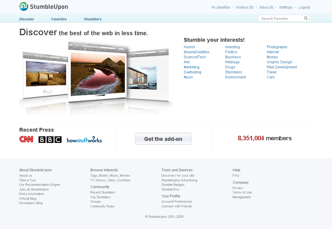
Below is a comparison of the current SU homepage and the beta homepage:
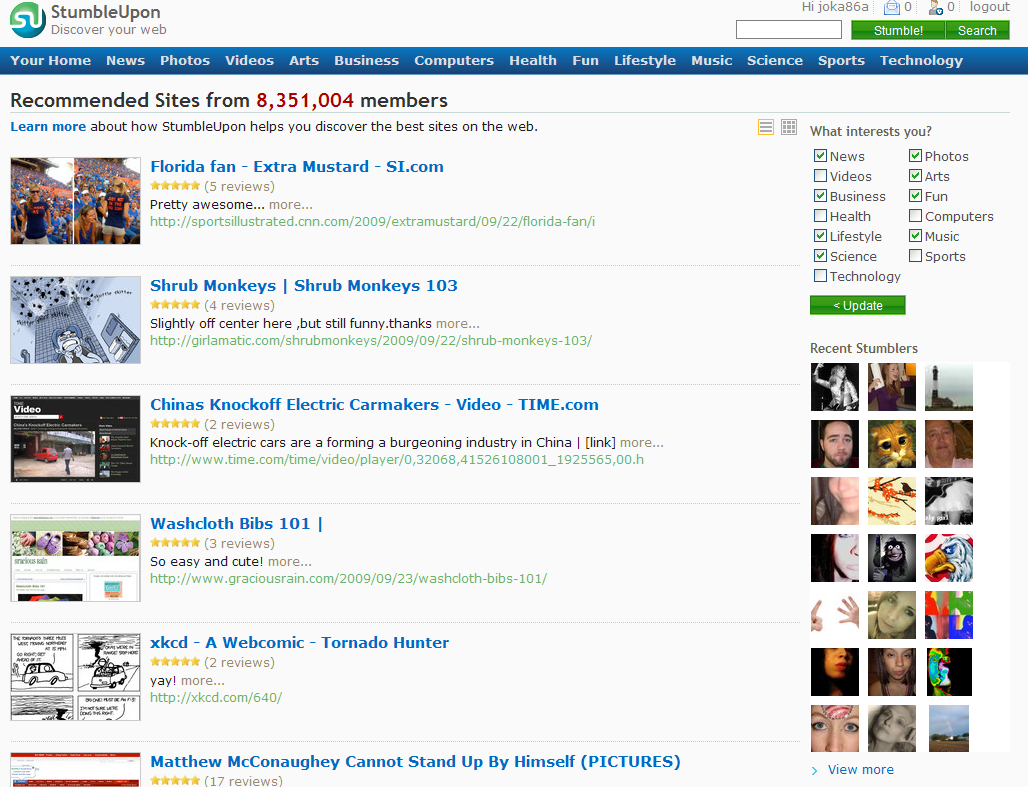
As you can see (all images are click-able to improve your viewing experience), SU has removed a lot of the clutter that filled the homepage and created a simpler, clean design. They have also removed some of the recommended stumbles, something they might add back in the future or keep in a separate tab under “Discover”.
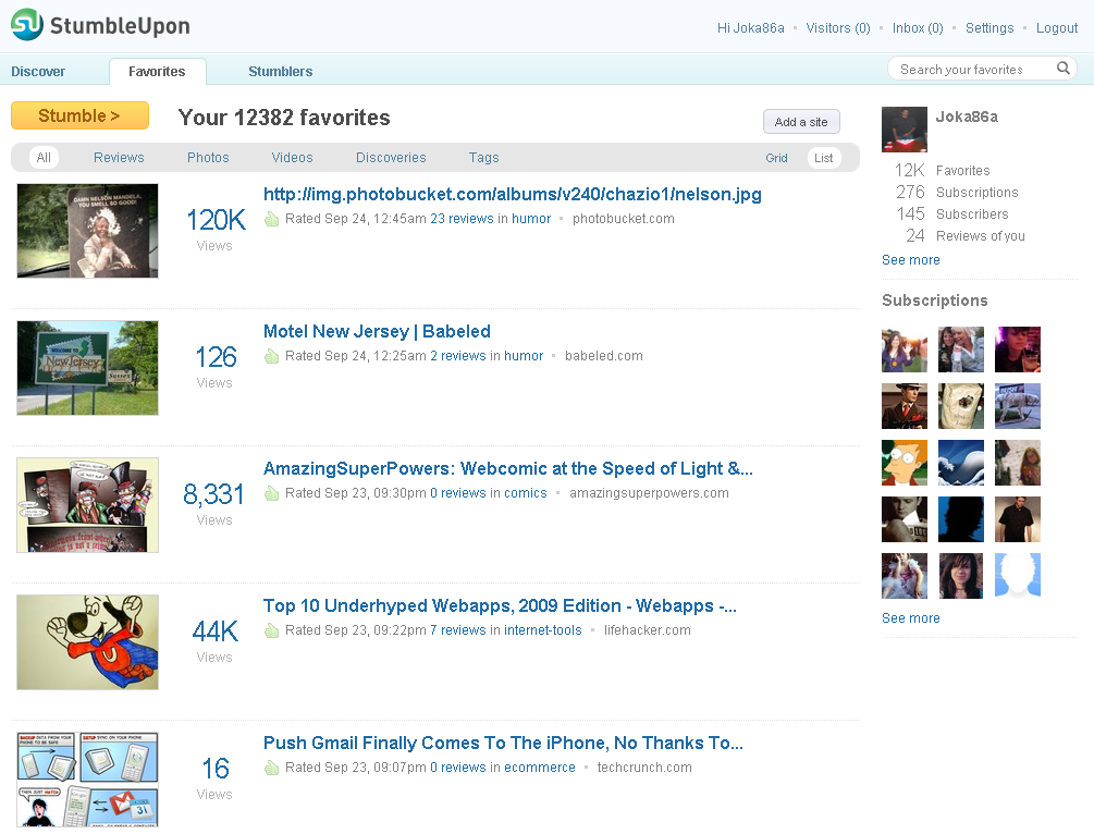
Personal Home Page/Favorites
They have also made some drastic changes to user’s personal homepage. The layout is much simpler and easier to navigate. If you look closely you will see the Star Rating system has been replaced with the number of current views for that submission. The sub-tool bar has not been changed that much, but the main navigation has been simplified to three sections, “Discover”, “Favorites”, and “Stumblers.”
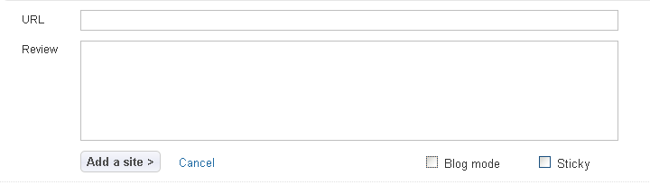
They have also simplified the submission process; when you are adding a new link, photo, or post to your personal blog. I noticed the visual editor options was removed, and now there is only one section to submit video, pictures, add a site link or create a blog post.
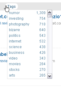
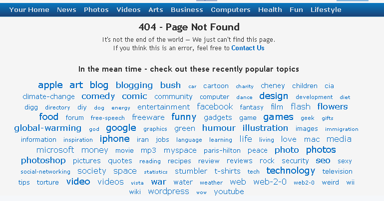
They have also made some improvements to browsing by tags. They have moved away from the enormous tag clouds, to a simpler drop down menu in your “favorites” section
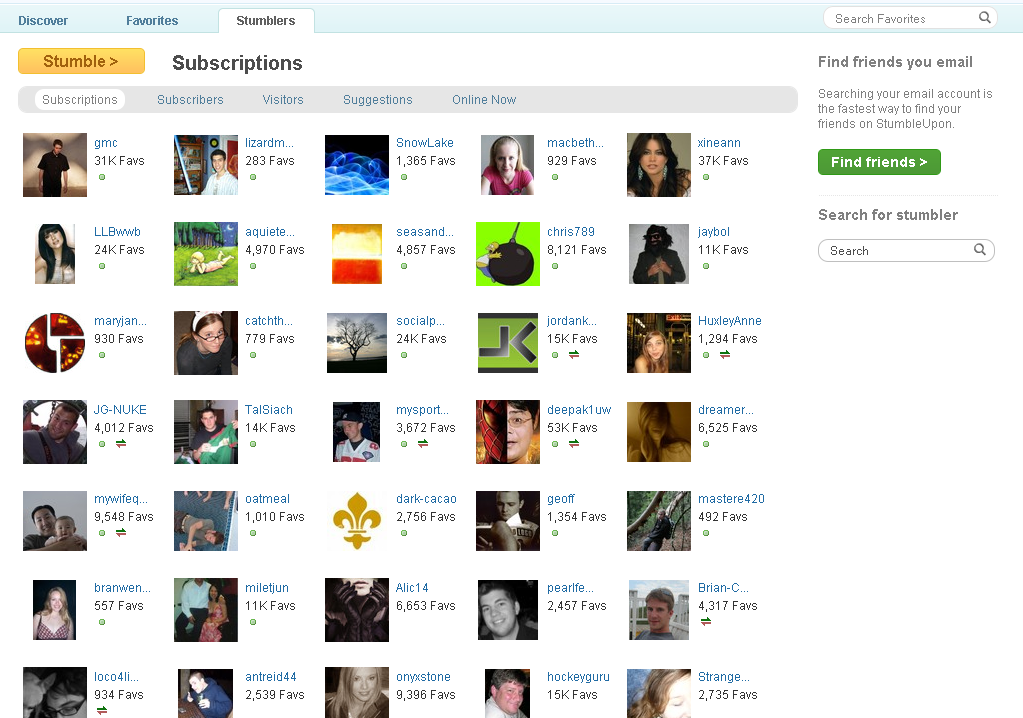
Friends & Subscriptions
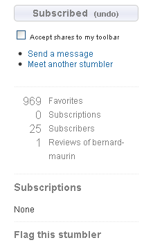
The biggest change to this tab is the organization of this section. In the previous version “Your Friends”, “Your Subscriptions”, “Your Subscribers”, and “Meet People Like You” all appeared on one page, which looks confusing and cluttered. They have improved this buy creating a sub-navigation with those options and couple new ones in separate tabs. Another big change I noticed was the move back from having both friends and subscribers to just having subscribers. You will notice that some of your subscribers will have small arrow icon beneath their names. This icon lets you know if that person allows you to share content with them via the toolbar.
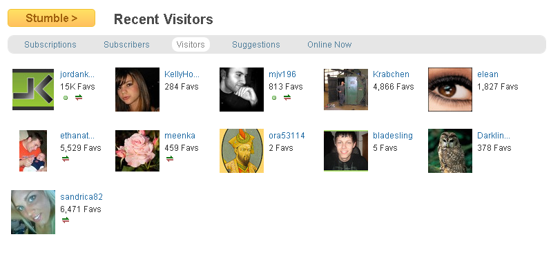
One of the new tabs, called “Recent Visitors” takes an old feature and organizes it in its own section. Previously recent visitors would appear in the right column of your personal homepage. You will noticed the icon I mentioned above next some of my recent visitors.
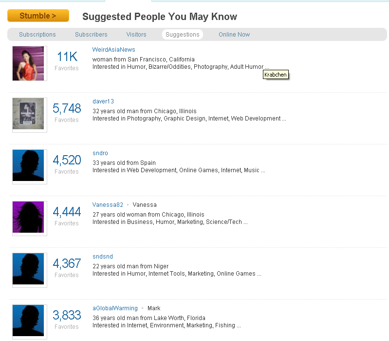
Stumble has always had the option to find users that relate to you based on the content they stumble. Previously they used a venn diagram to show how similar your favorites were to another user. Another new tab in this section called “Suggestions” shows you people you may know. This feature reminds of the suggestion feature currently being used by Facebook.
I mentioned above, SU has gone back to only having subscribers and people you subscribe to. But they have a new option to help you prevent spam in your toolbar. Below is what the new right column will look like when you visit a user you are not subscribed to. They have removed the Venn diagram on how similar you are and the “Your Interests” section.
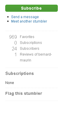
The new feature only appears when you click subscribe. You will notice there is a selection box below the subscribe button that gives you the option of allowing shares from that user through your SU toolbar.
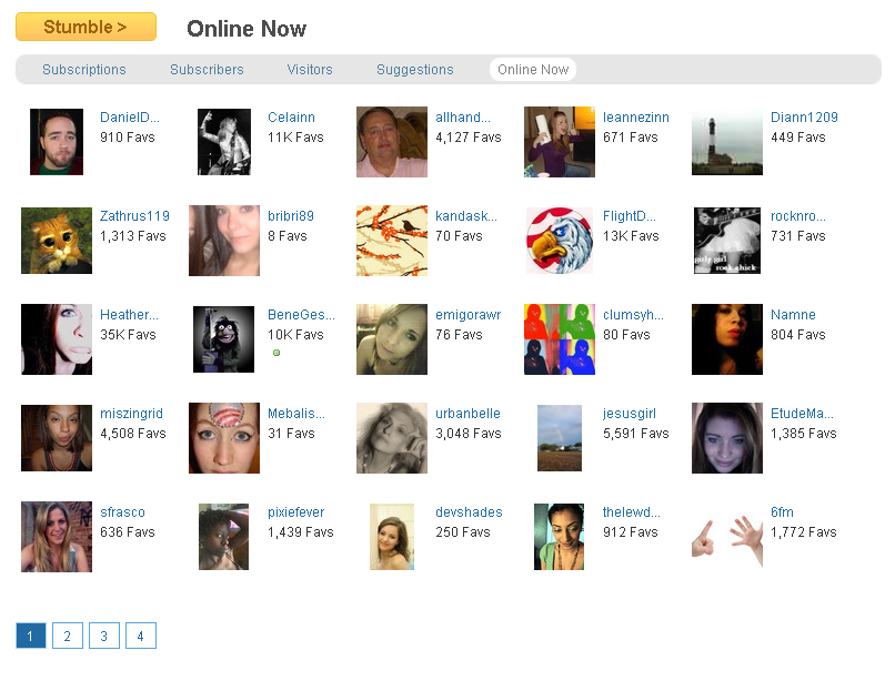
They have also replaced the little green dots that would appear next to your friend’s user icons with an “Online Now” section:
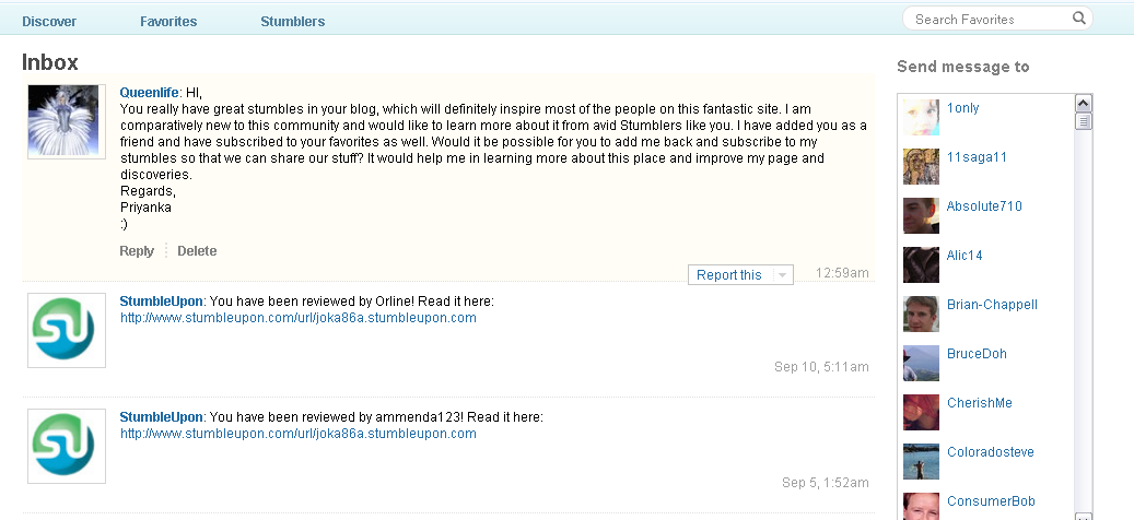
They have also simplified the inbox layout, adding an embed scrolling list of your friends to choose from.
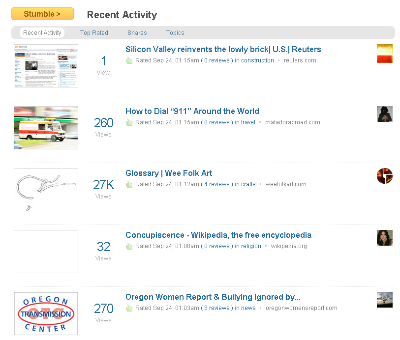
Discover/Friend’s Recent Activity
By clicking on the “Discover” tab you are brought to a section where you can view your friend’s recent activity, SU’s top rated sites, recent shares, and browse by topic. Again you can see that SU is planning on moving from the star rating system to a views based rating.
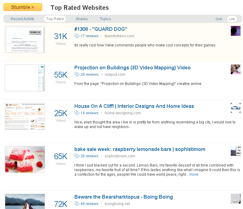
As you can see below, the “Top Rated” tab is a new section, which displays the most popular websites being viewed by StumbleUpon users. The list of popular content usually found on the homepage will be moved to this section.
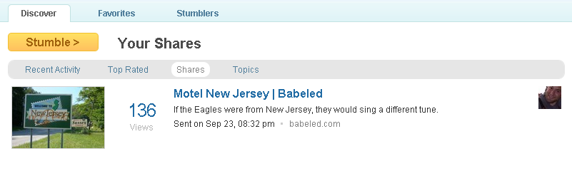
I know I have had this problem with the SU toolbar sporadically. You receive a share and before you can read the message it disappears. Previously you would have to go to your personal homepage, then to your inbox and from there you would be able to access your recent share history. In the new interface they have created a sub-section under Discover that easily allows you to see recent shares.
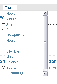
Instead of the sub-navigation that lists all the different topics on SU, they have created a simple drop down menu that allows you browse each category.
Discoveries/Submissions
When I looked at the new interface on the first day of the release, the first change I noticed was the removal of the star rating. Which has been replaced with the ability to see how many views a submission has received. They have also expanded your ability to see which users thumbed your submission. In the past you were only able to view some of the users. Unfortunately when I checked again later, there seemed to be some issues with the comment sections for users in beta mode. Below is what I got:
I tried it in non-beta mode and the comments section seemed to be working. As soon as the beta comment section is functioning, we will post an update on it. But why wait on us? StumbleUpon beta is available to anyone in the beta group, below are GMC’s instructions on how to participate in the testing:
“To access the new interface, make sure you have joined the Beta group first. Then go to your Preferences and click on “Switch now!” on the sidebar. In the new interface, the Switch button is located under the Settings menu (you can also click on stumbleupon.com/switch.php [stumbleupon.com] to toggle back and forth).
This interface doesn’t yet support themes, but those will be coming soon. Groups can be accessed via “Groups” in the footer, and then “My Groups”. Groups are still a work in progress, but we’ve started to update them. A new feedback system has also been set up for the new interface Beta testing. Please click on the dark gray “Feedback” tab located on the right side of your screen and enter your question or comment” (source)
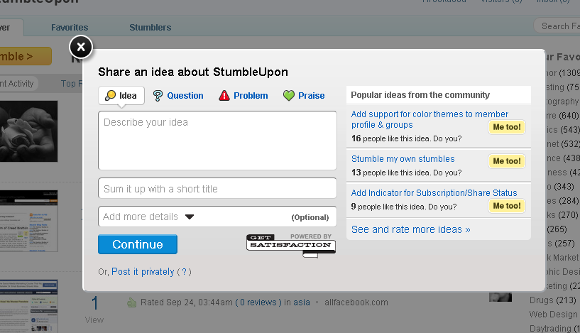
You can keep up with current user feedback on the comments thread. SU also has added a feedback button that appears on the right side of the screen that is powered by GetSatisfaction when you are in beta mode:
Notice changes we didn’t cover? Please let us know in the comments below. We will continue to update the SEJ community on StumbleUpon Beta interface changes as the weeks progress. Happy stumbling!
Ryan Sammy is an SEO & Social Media Analyst at Search & Social. Ryan is an active member of many social media communities, and has worked to understand the intricacies of social interaction and engagement from the inside out.
