


It’s a question that marketers and designers ask themselves every day: What is the key to a conversion-based design? And the answer: As little design as possible.
According to a 2012 Google study, users consistently rate visually simple websites as more beautiful than their more complex counterparts. Further, highly prototypical sites (or sites with layouts that are commonly associated with sites of its category) with a simple design are considered the most beautiful sites of all. In other words? Simple is beautiful. And beautiful converts.
But why? In this article, we’ll explore the concept of simple, prototypical design and examine its role on cognitive fluency and visual processing, two factors which greatly influence user appeal and ultimately help conversions.
Prototypical Website
If I asked you what color represents “boy,” you think blue. And naturally, pink represents “girl.” But did you know that in the mid-19th century, blue (a calm, tranquil color) was associated with girls, and pink (a bright, passionate color) was associated with boys? You can’t even imagine it, can you? But why not? What is inherently blue about boys, and inherently pink about girls? The answer? Nothing.
So why do you automatically associate boys with blue and girls with pink? Because your brain has seen those combinations so frequently that it created a shortcut for future reference. “Boy=blue” is a prototype that your brain has created in an effort to categorize information. Your brain’s job is to make sense of as much information as quickly as possible. By creating these shortcuts, your brain makes it easier for you to make sense of the world.
This same concept can be applied to website design. Copying is the sincerest form of flattery, and flattery happens a lot on the Internet. If a certain design element or layout works for one car dealer’s website, it’s only a matter of time before other car dealers start to follow suit.
This results in a car dealer prototype, or a certain look that users come to associate with car dealers. These exist for tons of different website categories, from “fashion sites for 20-somethings” to “mommy blogs.” Is there a prototype for your category? If so, do some research to learn what that prototype looks like, and try to incorporate similar elements.
Cognitive Fluency
The brain creates these prototypes because it prefers things that are easy to think about. This is called cognitive fluency. It stems from the mere exposure effect, which states that the more you are exposed to something, the more you prefer it. Cognitive fluency means that people will prefer sites where they instinctively know where things are and what actions they need to take. For example, there is a fairly standard structure that all blogs share. And all ecommerce product pages are a combination of the same base elements, including a product image, the price, a product description, and a button to add the item to your cart.
If your blog or ecommerce product page were to deviate from the norm, it would not be nearly as easy to think about. This lack of ease could result in your users rejecting your site. Your goal then becomes to make your site as cognitive as possible.
Visual Information Processing
And the best way to make your site more cognitive is to make it easy to process visually. A 2013 Harvard study found strong mathematical correlations for what different demographics found to be “aesthetically pleasing.” While different people seem to have widely different tastes for web design, one concept was found to be universal: the more visually complex a site is, the lower its visual appeal. (You can take the test yourself here.) By simplifying your site, you can create the most appeal for the largest amount of people.
Simple is Scientifically Easier to Process
Why does everyone feel that simple is more beautiful? Probably because simple is scientifically easier for us to process. Low complexity sites don’t require our eyes and brains to work as hard to process and store the information.
Here’s how it works:
- Your retina converts visual information into electrical impulses, which it then sends to the brain. These impulses transmit color and light information.
- The more color and light variations are on the page (visual complexity), the more work your eye must do to send the impulses to your brain. Your brain must then work harder to translate and store the information.
You can watch this YouTube video to get a better understanding of this process. Basically, the less complex a site is, the easier it is for your eye to receive it and your brain to translate it. And that’s that cognitive fluency concept again.
Every Element Communicates Info
By now, you’re probably thinking that simple is a great concept and all, but how do you communicate all of your messages without making your site too cluttered? The answer – communicate as much as you can with as little as possible.
Every element (typography, logo, color scheme, layout, etc.) communicates subtle information about your brand. This goes back to basic psychology, which impacts how people respond to different colors and typographic faces. Optimizing your site is then about communicating as much brand information as you can, using as few elements as possible.
Take MailChimp, for instance. In 2013, MailChimp took the time to redesign one of its most important brand elements – its logo. As part of a larger branding revamp, MailChimp wanted to make the logo appear more modern without drastically changing it.
The original looked like this:
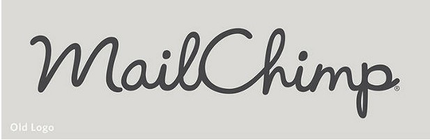 Image credit: fastcodedesign.com. Used under license.
The designer opened up some tight areas for better legibility, straightened the baseline (while maintaining the penmanship feel), decreased the line and stroke weight and separated the words.
The result:
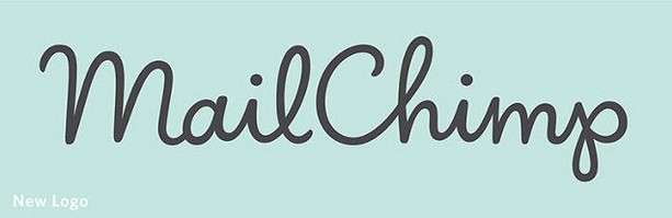 Image credit: fastcodedesign.com. Used under license.
Along with a million new users.
While I’m not trying to suggest that a million people joined MailChimp due to a logo redesign, these results are still impressive. And by optimizing your individual elements, you could enjoy impressive results as well.
Working Memory
Another reason simple is better has to do with your short term memory (also called your working memory). Your working memory is the part of your brain that temporarily stores and processes pieces of information. It allows you to focus your attention, resist distractions and make decisions. However, it can only effectively store 5-9 pieces of information at a time. That’s why the less information your site has, the better. A simple, highly prototypical design reduces the amount of noise that gets into the working memory, allowing your important elements (like guarantees, product descriptions, prices and offers) to be the 5-9 pieces that get stored.
Deviation
Guess what happens when you deviate from the simple, prototypical design? Those 5-9 pieces that your users store will become whatever elements didn’t quite meet their expectations.
There are many ways you could deviate from expectations, including:
- Higher prices
- Unusual color scheme or layout
- Slow loading speed
- Blurry images
- Confusing navigation
When you deviate, those pieces are stored instead of the pieces that matter. That’s why it’s really important to consider your visitors’ web standards when designing your site. You can do this by researching the blogs they read, the sites they shop on, the browsers they use, their ages, their locations, etc. By understanding what your users expect, you can meet their unique needs and help them process useful information in their working memory.
The Skinny Ties Case Study
Want proof? Here’s a successful case study of a simple redesign for Skinny Ties. Skinny Ties is a family-owned and operated company that designs and sells neckties.
Until 2012, Skinny Ties’ website looked like this:
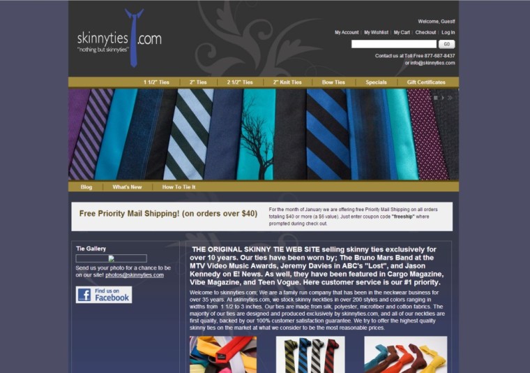 Image Credit: Redlightblinking.com. Used under license.
In October 2012, Skinny Ties wasn’t getting the web traffic and conversions it was hoping for, so the company decided to completely redesign their website. The designers decided to follow prototypical e-commerce layout themes for things like category and product pages. They allowed for more open whitespace, and they opted for high-res, single-product images with contrasting colors.
The new Skinny Ties website looks like this:
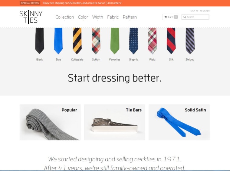 Screenshot taken 10/24/2014 of skinnyties.com
Just 2.5 weeks after the launch of the new site, Skinny Ties saw the following results:
- 4% revenue growth for all devices (377.6% revenue growth just for iPhone users)
- 6% conversion rate increase (71.9% conversion rate increase just for iPhone users)
- 2% bounce rate decrease
- 6% visit duration increase
And those results speak for themselves.
Conclusion
Bottom line is that, if users can’t find what they’re looking for, they’re not thinking about how innovative and impressive your site is. They’re just wondering why things aren’t “where they’re supposed to be.” And that’s not really the best frame of mind when you want them to convert.
Simple sounds easy, but remember that you have to be strategic. You can’t just take down important information for the sake of white space. Consider what information your users need and how to present it with the least amount of space.
When designing/redesigning your site, keep the following steps in mind:
- Research audience and the sites they view most
- Put things where your visitors expect to find them
- Rely on your own colors, logo and typeface to communicate – don’t add elements unless they communicate something your visitor actually cares about
- Keep it as simple as possible and utilize as much white space as you can
- Double check to make sure your site matches expectations in pricing, aesthetics, speed, etc.
- Don’t try to make every aspect of your site prototypical
By keeping your site design simple and prototypical, you can provide your visitors a clear, user-friendly path to conversion.
Featured Image: Peshkova via Shutterstock
