


Designing your website for screen resolutions of 1024×768 or higher can achieve a richer user experience and dramatically increase performance and usability. As users upgrade to larger monitors, websites can take advantage of new layout options like never before with increased content, additional graphics and larger fonts. Your wider website will give a user more options to navigate your website without having to scroll, which often leads to higher conversion rates.
Keeping 800×600 Users in Mind
While it has been noted that most of today’s computer and Internet users utilize a screen resolution of 1024×768 or above, there are still some who will visit your website in the 800×600 resolution, and many in the web design industry believe that sites should still built with these users in mind. Submitawebsite customers are typically more sophisticated computer users who would benefit from the larger screen resolution, but in order to make sure that we aren’t alienating a significant amount of potential customers, we’ll use tracking software to discover what screen resolutions users view our site with.
Using Google Analytics to Track Screen Resolutions
In this example we’ll be using Google Analytics, the most popular free tool on the market today. We’ll use information from our website, Submitawebsite.com, paying specific attention to our web stats from January 1, 2007 through May 1, 2007. These statistics will allow us to see how our users navigate to our site, as well their physical location and what type of resolution they have their screens set to.
In order to get the best results for your own site, you’ll want a good range of web stats with which to work. I would recommend looking at a minimum of 6 months, although 90 days should provide an adequate amount of statistics for you to look at.
Once we reach the main screen of Google Analytics for Submitawebsite, we’ll navigate to the Content Optimization section and select the Web Design Parameters. Within that section we’ll click on Screen Resolutions which will take us to a page showing the different resolutions people have on their computers when they come to our website.
I would say that you want at least 95% of your users to be able to view your site properly according to their resolution settings, keeping in mind that designers generally create websites around the size of the lowest common denominator. Looking at these statistics, we find that 10.42% of Submitawebsite viewers utilize the 800×600 screen resolution, which is a bit more than we would want before we redesign the site for 1024×768 users. Though the remaining 89.58% utilize a 1024×768 or higher resolution, it would seem that we have a significant enough number to cause us to refrain from upping our site’s resolution.
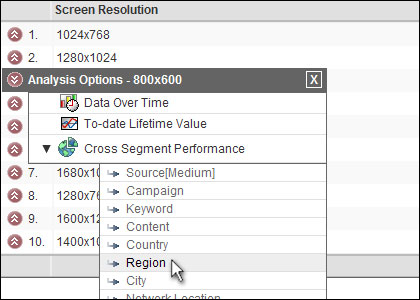
Let’s use Google Analytics take a closer look at these numbers. Clicking on the double arrow to the left of the 800×600 row in the table, we can access the Cross Segment Performance of this statistic and see our where the users at that particular resolution are coming from, broken down by region.
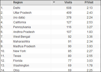
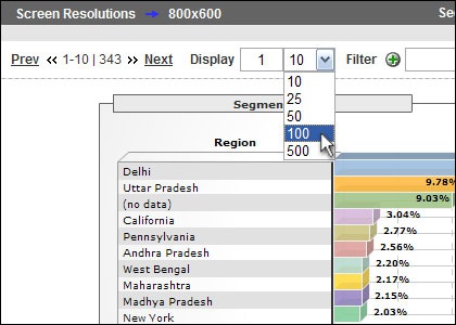
Looking at the top 100 results, which will give the most accurate representation of user location, we can see that the top two regions for 800×600 users on our site are Delhi and Uttar Pradesh. Both of these locations are in India, which is a region we’re not too worried about at this time. As you go down the line you can see that while there are a significant amount of people in the United States, the vast majority of the referrers are from parts of the world we aren’t particularly interested in targeting, especially the top three which are in India or labeled as “no data”.
What this tells me is that the top 96-97% of people that I want to target visit Submitawebsite with a 1024×768 or higher screen resolution, and because I know that my customer base is slightly more sophisticated than the average user, this exercise proves to me now that I can and should move over to a 1024×768 website. Again, the increased real estate on the user’s screen will allow for bigger images, larger font and a richer experience with more information, which has been proven statistically to increase conversion rates on my website and gives us more presence.
Joe Griffin is a Vice President at Website Pros, and is the current acting President of Submitawebsite.com, a company he co-founded in 1997.
